Good data chart examples in this Kleiner Perkins presentation
This Kleiner Perkins presentation introducing their iFund makes good use of data charts to prove points.


Frequent updates about all things presentations since 2008. Subscribe to never miss a post.
This Kleiner Perkins presentation introducing their iFund makes good use of data charts to prove points.
“Can we make that look a bit more impressive?”
I get that question a lot. An obvious trick with column/line charts is to cut the axis. I think that is cheating the audience, putting at risk the trust in the content of all your other slides in the presentation.
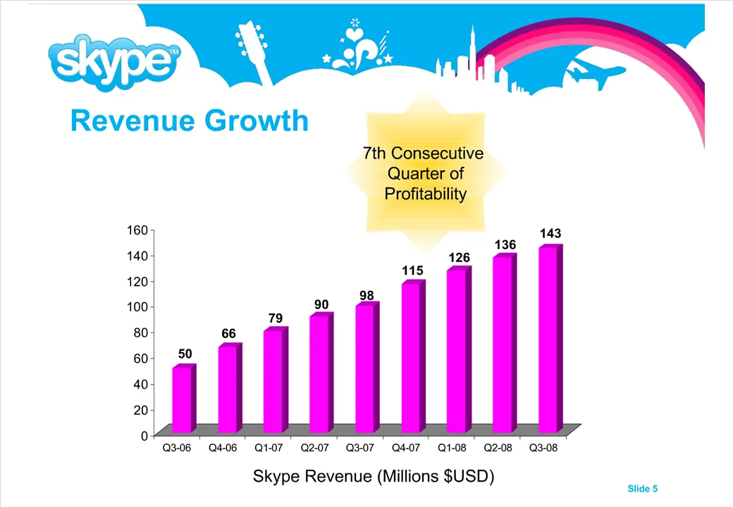
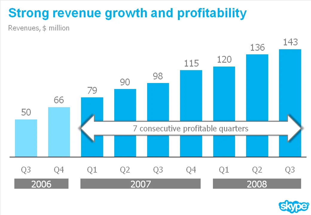
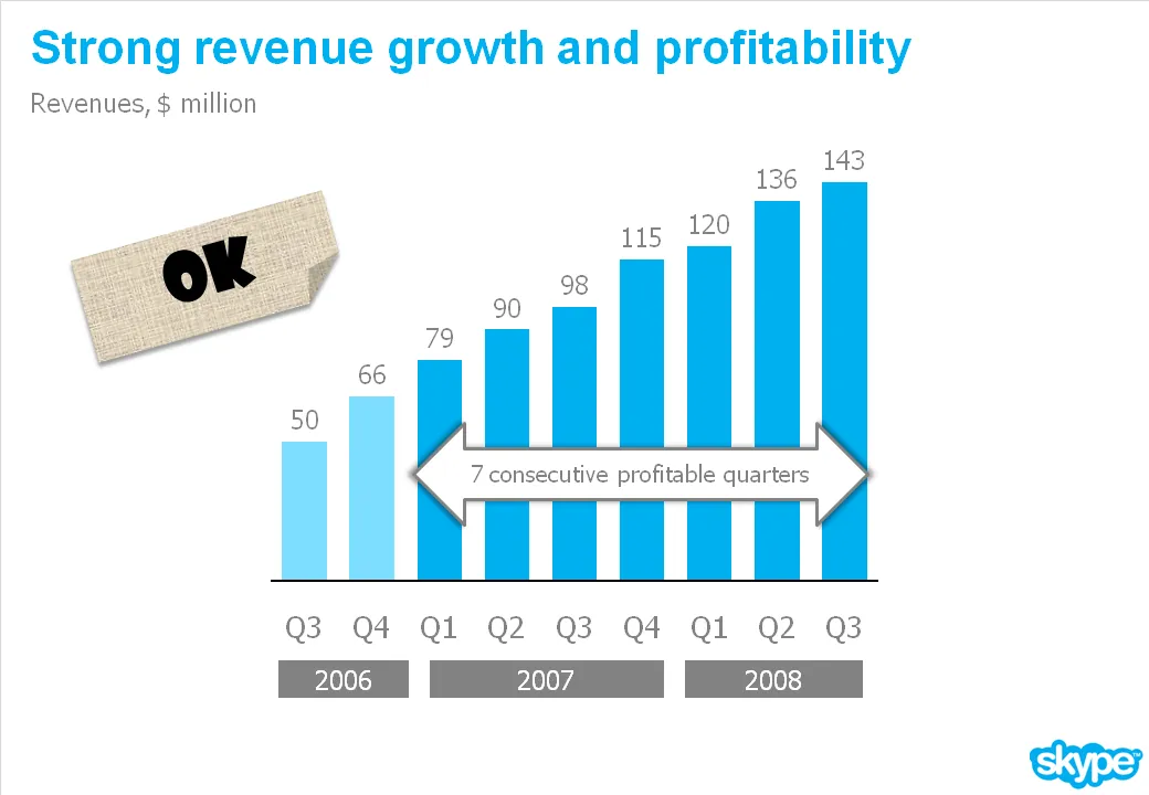
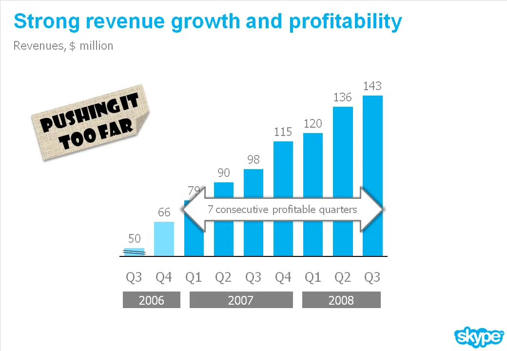
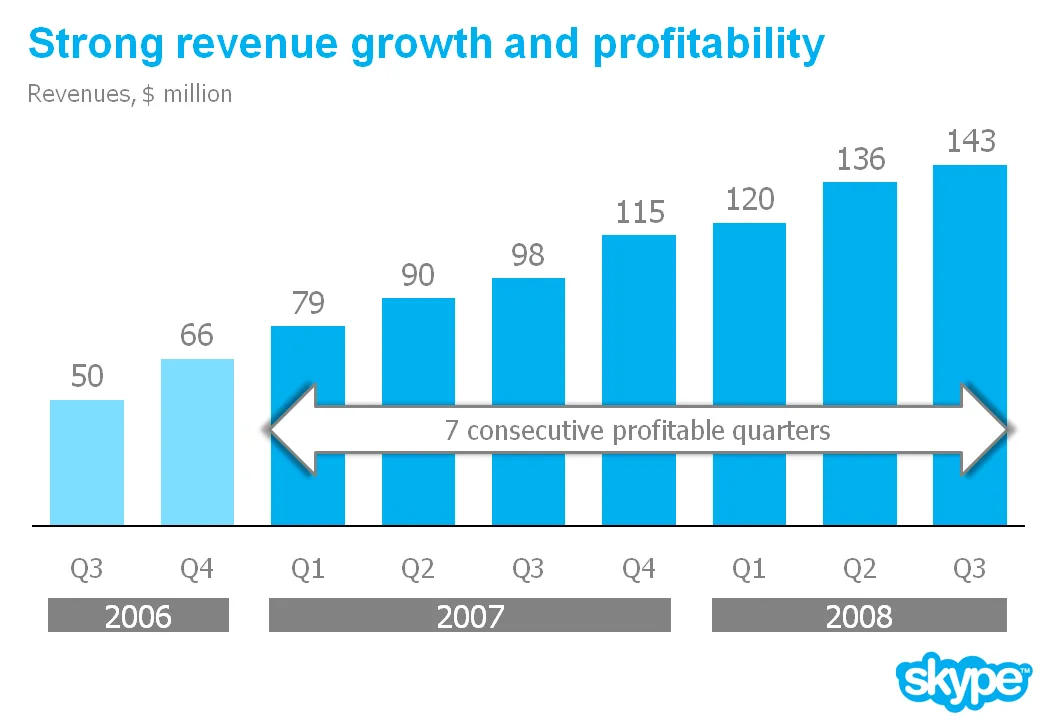
What you can do is play with the aspect ratio of your chart. As an example see the make-over of a Skype chart I used earlier. People in the comments were suggesting that the new version actually looks less impressive than the original. Maybe squeezing the chart horizontally while keeping the vertical size the same fixes that.
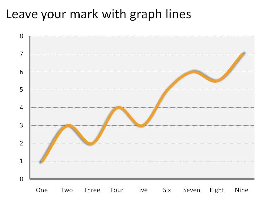
The standard chart templates in Excel and PowerPoint create fragile, thin graph lines. No one can see them. Right-click the line and make it bold and fat and it will stand out.
One of the last pages in every venture capitalist funding presentation is the “hockey stick” of revenues and profits shooting through the roof. VCs expect a bit of optimism from a startup, but at the same time want to do a reality check on these numbers.
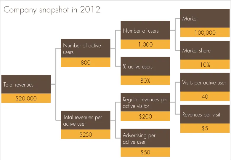
I often use a company snapshot, a tree of the key factors that add up/multiply to the projected revenue figure. Make sure the factors are real things you can touch: people, visits, etc. CORRECTION: Also make sure the tree adds up and calculates through, something that cannot be said about the example below.
Sometimes you cannot avoid building up a busy data slide to take your audience through it step by step. In case of data-driven charts, it is tricky to create 3 independent graphs that are nicely aligned. I tend to create one big chart and use a white box to cover part of the information. Gradually I unveil more information by taking the white boxes off, instead of creating animations with new elements popping up.
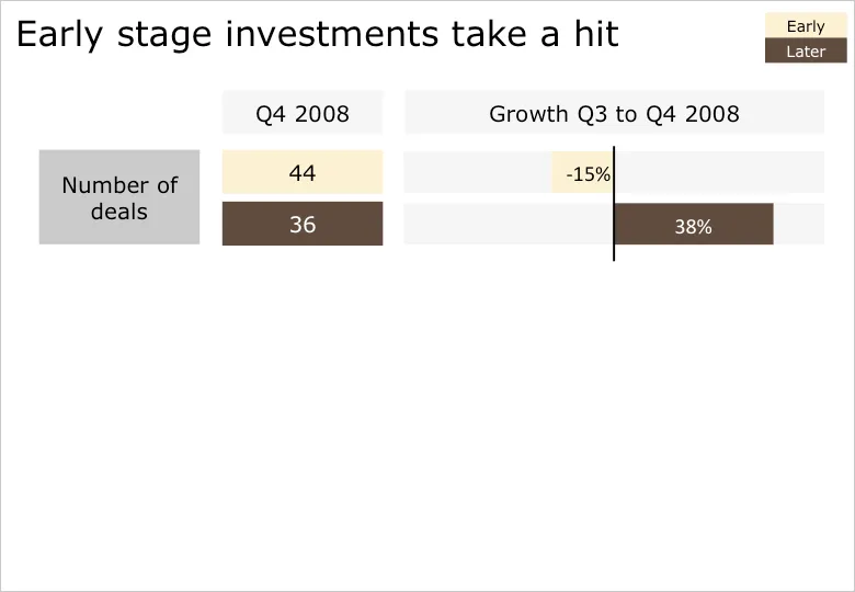
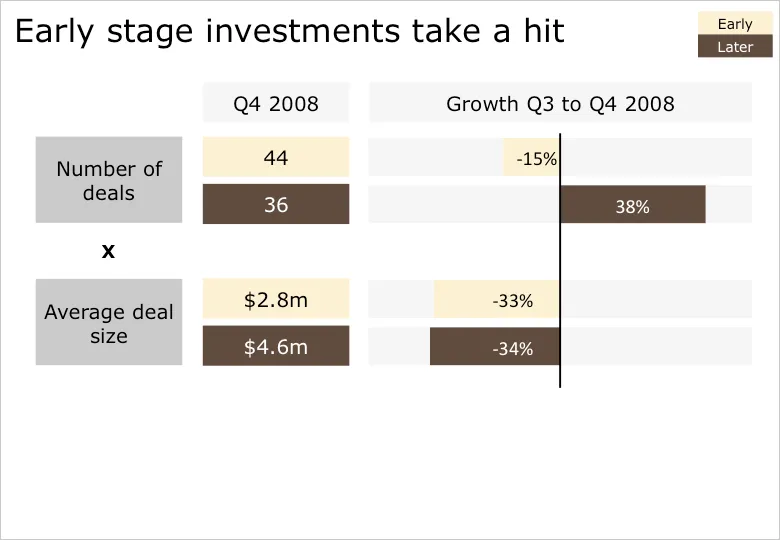
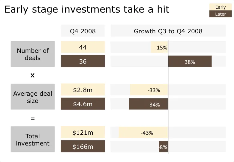
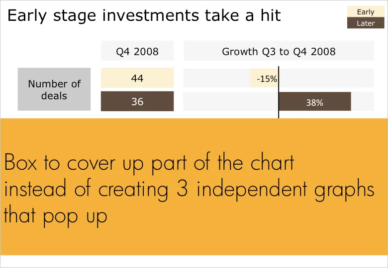
B.t.w. for those interested: the data above is the quarterly overview of VC investments in Israel, compiled in PwC’s Money Tree report for Q4 2008.
I am preparing a speech and needed a case example for a chart make over. Sorry to be picking on Skype again… A great color scheme plus a chart I discussed before. I have nothing against Skype, this is just for educational purposes.
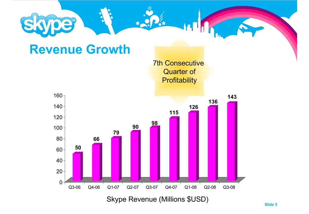
Here is a list of changes:
The idea is to make the data as calm as possible. Also note that through consistent use of corporate colors there is no need for additional “house style” graphical elements on the pace. You can see from a mile’s distance that this is a Skype chart.
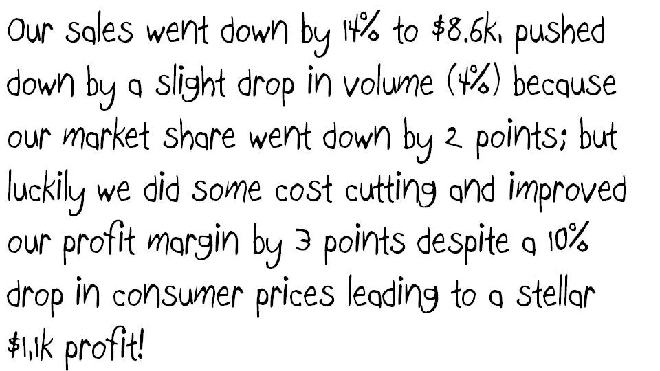
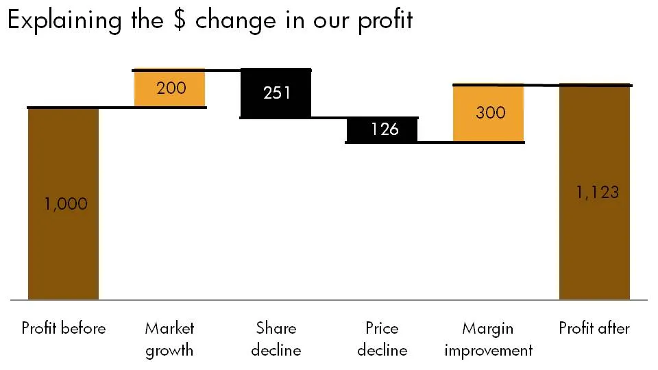
Some numbers today. The source of change is a tool to explain the delta between two numbers in terms of its components. Assume you need to get the story below across in a crisp presentation.
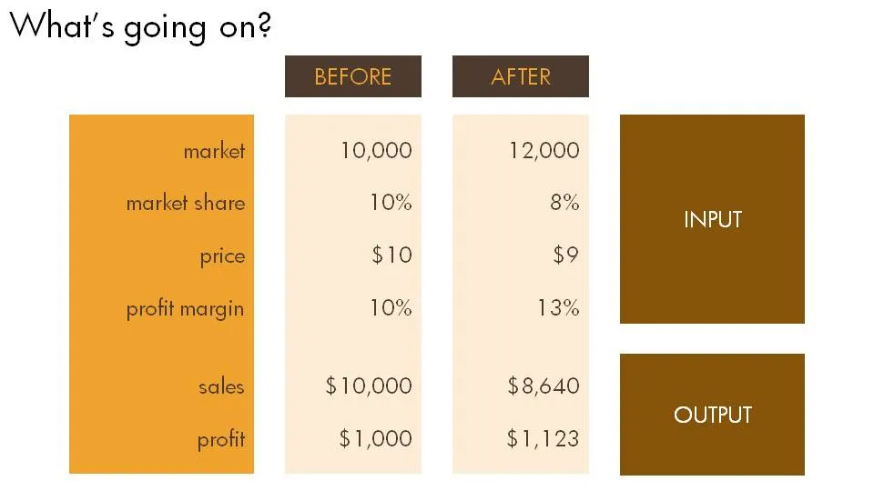
The first thing is to understand what’s going on. Get some more information until you have the full picture in a clear table.
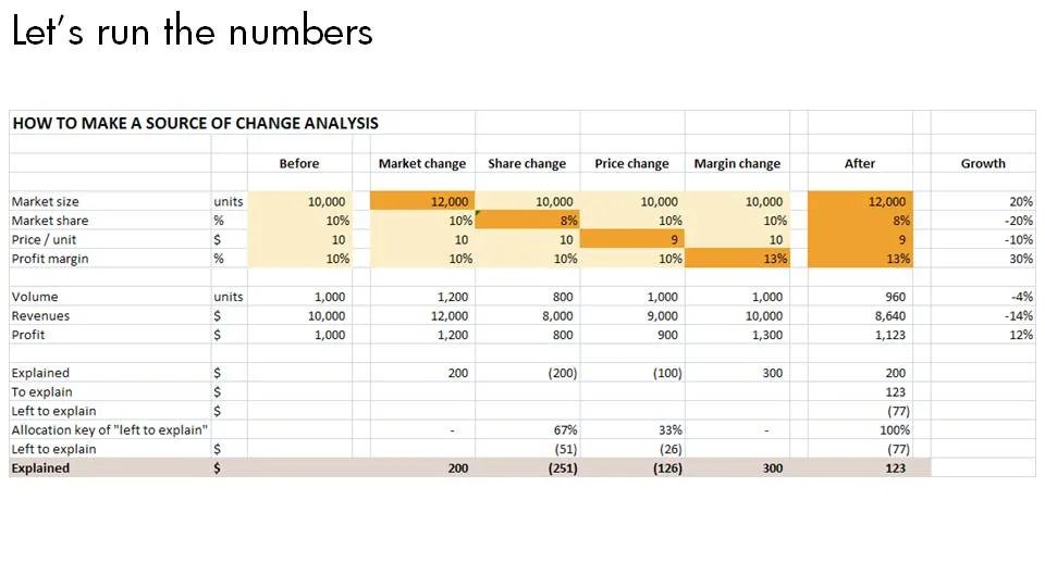
Now let’s do the analysis. This is the tricky part, the text below does not do a good job in explaining this, you can click the spreadsheet for a bigger and more visual explanation.
Finally put the values in a
chart.
It is Holocaust memorial day today in Israel. Sometimes it has hard to graps/visualize big numbers. I tried below. Let’s not forget.
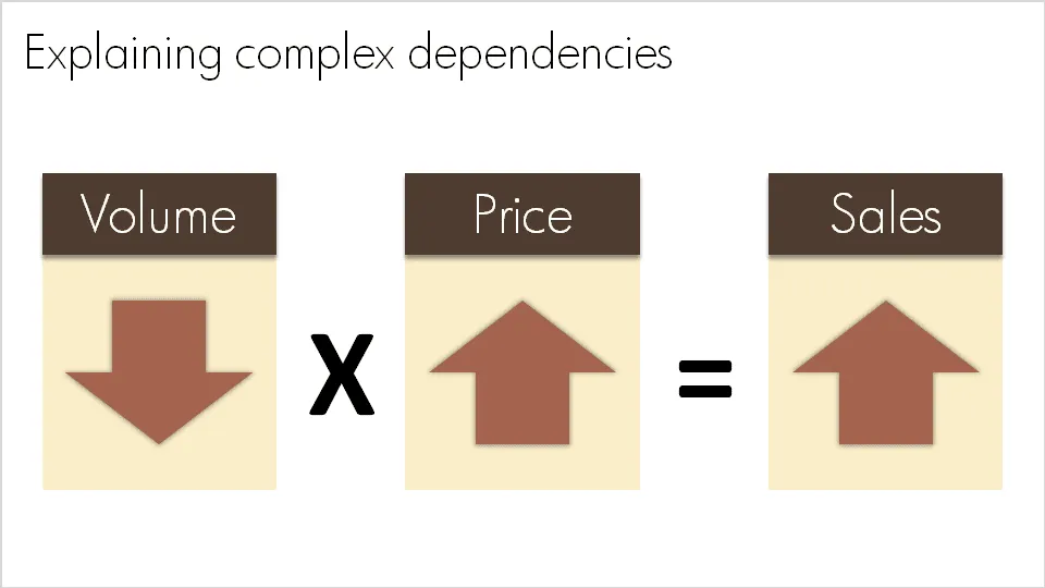
A question like “What happened to sales last year?” sometimes requires a complex answer. “Well, it is a bit complicated: volume went down, but then prices went up, but as a result sales were up”. A simplified mathematical equation can help you visualize this.
Sometime in the near future I will post here how to do a proper “sources of change” analysis.
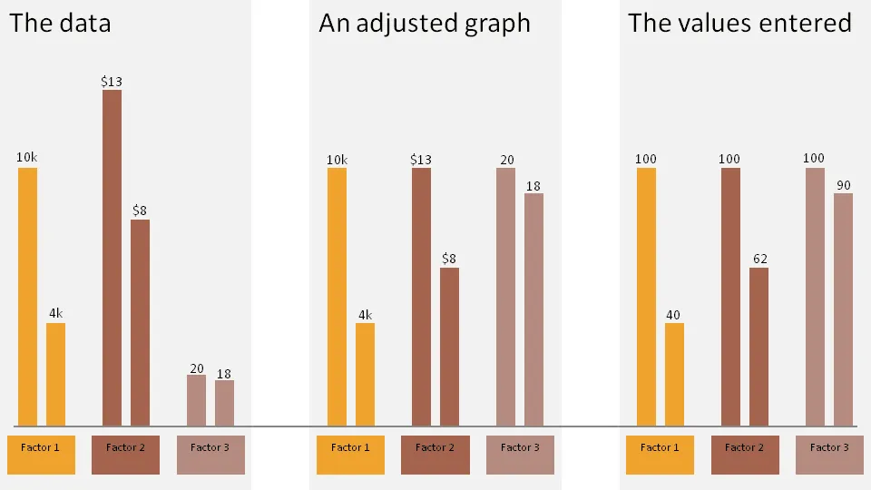
Sometimes you want to show 3 data sets in one chart with very different data ranges, for example:
One solution:
The chart below gives an example:
Click on the example image below for a larger image.