

Sometimes you want to show 3 data sets in one chart with very different data ranges, for example:
- 1,000s of customers
- $ sticker price per unit
- Number of products bought per customer
One solution:
- Set the column of the first data point of each series to 100
- Calculate the 2nd value relative to the 100
- Manually paste data labels with the correct factors
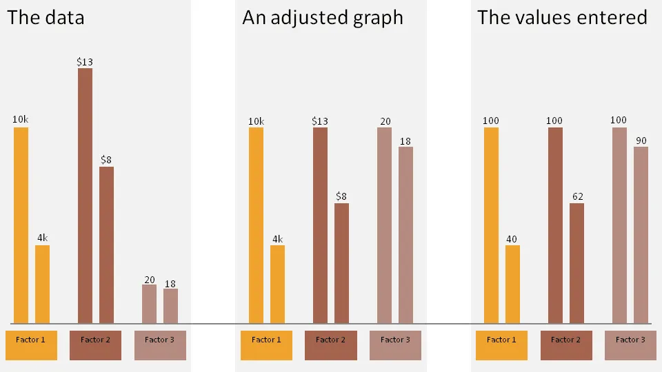
The chart below gives an example:
- The first chart contains the unadjusted data
- The second chart shows the adjusted version
- The third charts shows the values I have entered in the PPT columns
Click on the example image below for a larger image.
3 comments
If the audience feels that you're trying to pull a fast one on them, even if you're not, the rest of your presentation will lose its believability.
No fast ones here.
10,000 customers, $13 sticker price per unit and 20 products per customer are just completely different metrics. I try to show the trend in each of them.
The minimalist mathematical approach would have been to show 3 bars: % change in each of the categories. This would have a bit too abstract for me though.
My brain wants to compare things across in the same chart, and 1000's of customers and the number of items each buys are quite different.