

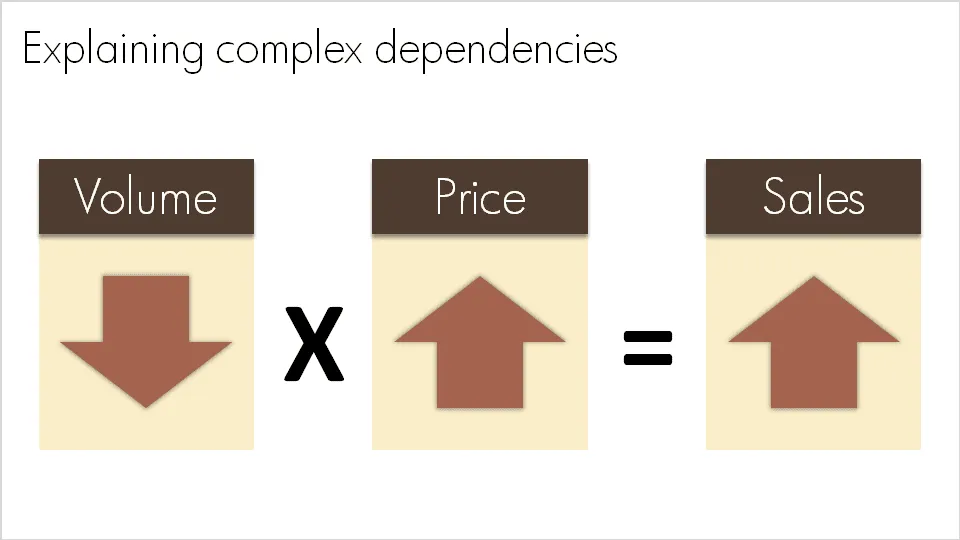
A question like “What happened to sales last year?” sometimes requires a complex answer. “Well, it is a bit complicated: volume went down, but then prices went up, but as a result sales were up”. A simplified mathematical equation can help you visualize this.
Sometime in the near future I will post here how to do a proper “sources of change” analysis.
2 comments
This is where a waterfall chart would come in handy. Last year's sales is the first column in the chart. Loss due to declining volume is a floating bar starting at the top of last year's sales and extending downward by the amount of the loss. Gain due to increased price starts from the endpoint of the previous loss, extending upward by the amount of the gain, and this year's sales goes from the baseline to the endpoint of the last gain.