

I am preparing a speech and needed a case example for a chart make over. Sorry to be picking on Skype again… A great color scheme plus a chart I discussed before. I have nothing against Skype, this is just for educational purposes.
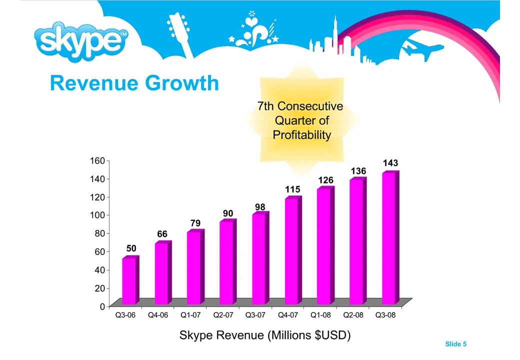
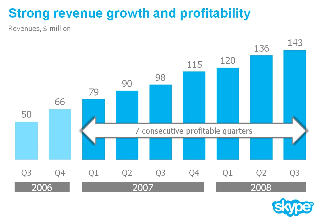
Here is a list of changes:
- Reduce the template to a logo at the bottom right of the page, eliminating all other distracting elements. I really like white space.
- Rigorous application of the corporate colors and fonts.
- Simple column chart without 3D
- No need for a vertical axis if you use data labels
- Re-wrote the headline
- Replaced the yellow star to give the text more connection to the numbers (still it would have been better to show the actual profit numbers)
- Smiling, I made a typo in the revenues of Q1 2008
The idea is to make the data as calm as possible. Also note that through consistent use of corporate colors there is no need for additional “house style” graphical elements on the pace. You can see from a mile’s distance that this is a Skype chart.
9 comments
"The sky's the limit"
This is a powerful message that seems compatible with the graph (whether or not it is realistic).
On some level I got this message (see above posts) but only now am I able to reproduce this phrase.
Above someone notes the image could also suggest that revenue must come down like the end of the rainbow. That is a clever response but I doubt it works the same way psychologically. I expect most English speakers are familiar with the phrase "the sky is the limit." And we have all noted rainbows high in the horizon. Who has seen them crash to the ground?
There are three things that advantage the first slide (which I admit looks cheesy) in my opinion:
1. Short, bold title that is consistent with the graphic - Revenue Growth. Incidentally, it does seem like pretty impressive growth, doesn't it?
2. Background graphics, that to me at least, psychologically convey positive images compatible with the slide title
3. Chart with 0 axis that depicts striking growth. The thin bars, 3D effects, and $0 reference point all suggest more striking growth to me than the revised graph with wide bars, no axis, and no effects.
I don't think I would ever make a slide like the original but I'm just noting my contrary opinion because I think it is worth acknowledging that even a technically deficient slide might communicate its point better than a slide preferred by online viz data experts.
I plead ignorance to how the 3D effect on this slide makes it more confusing. Like the revised chart, it is the height of the bars that tells the story. Would the slide appear more jumbled to a dyslexic reader? Would the 3D effect be more of a problem than the small text?
I don't think the original slide is pretty. But for at least two people in the world, it seems to tell the story of Skype's revenue growth more powerfully than the revised slide.
Good point. While stretching the chart makes it more attractive, it simultaneously undermines visual emphasis on the dramatic growth. You win on style. Maybe Skype wins on emphasizing their story. Seems like a third alternative could combine your style with some of the psychologically influential elements of the original slide. I have just enough free time to make these posts but not enough to redesign the slides.
The point isn't to make the slide pretty - it's to get the information over.
S
A problem with 3D charts is that the reader doesn't know what represents the heights of the bars. There is an interesting discussion of these charts on
While from a stylistic point of view, your changes are improvements, I wonder whether the original slide might nonetheless be more effective on a psychological level for conveying optimism about the company.
No question in my mind that your makeover is better.
It's cleaner and the information is much easier to access/understand.
Michael Schwartz
Business Power