SlideMagic Blog

Frequent updates about all things presentations since 2008. Subscribe to never miss a post.

RSS
all posts

Category Data visualization

·AI

AI is good at reading data from charts

Need to make over a slide but don’t have access to the data in a graph? AI to the rescue. Upload a screen shot to an LLM and you get back pretty good estimates of the data values in the chart. It might not be scientifically 100% accurate, but good enough to recreate the graph in your own presentation software.

·Data visualization

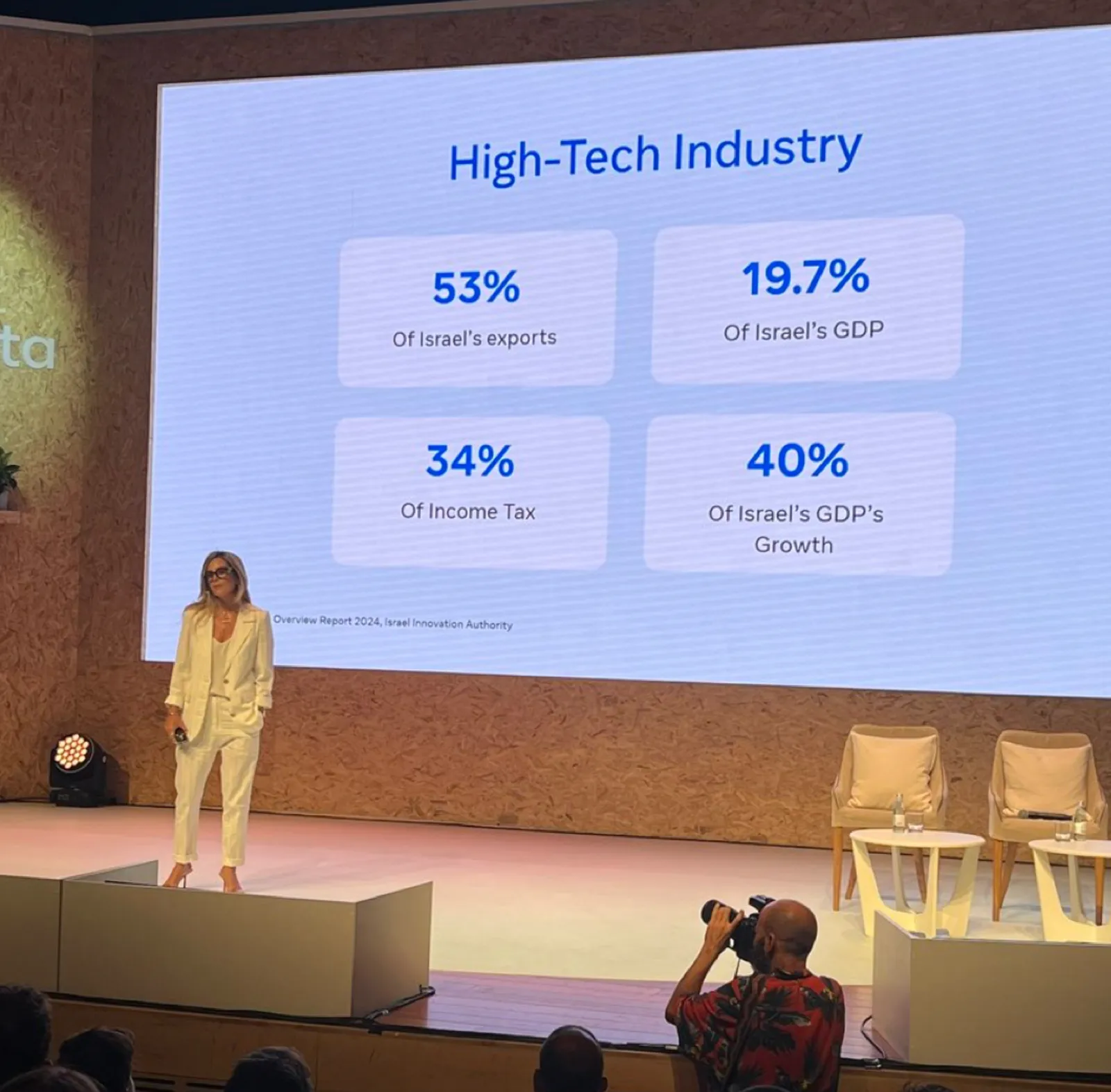
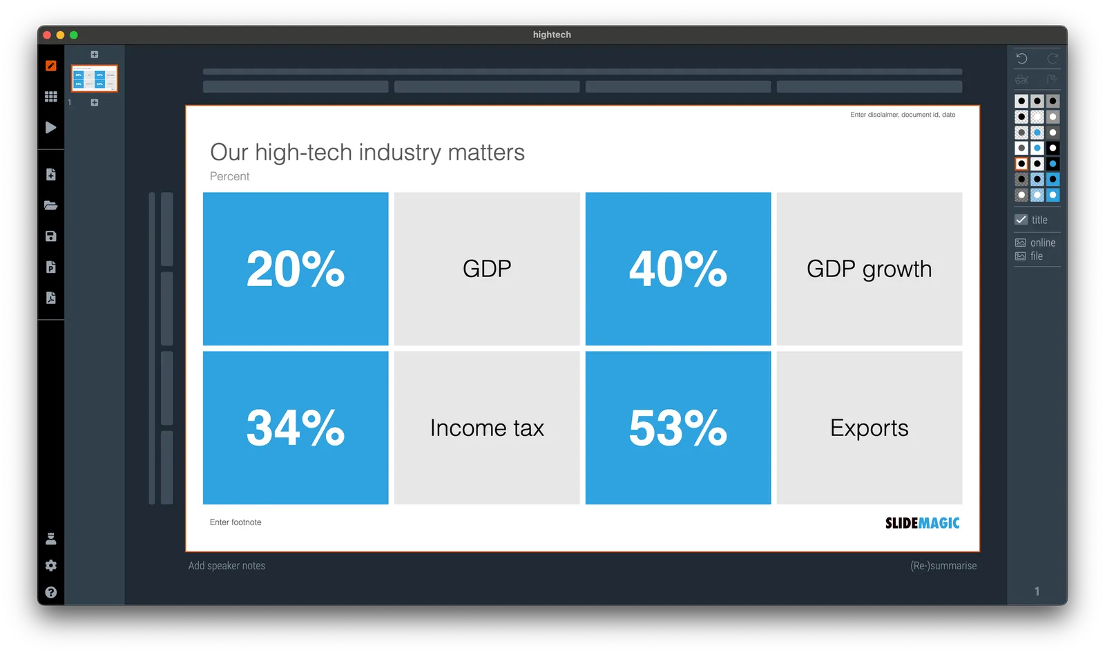
Quick makeover: our high-tech industry matters

I saw the following slide coming by in my Twitter feed (original post):

Here are some things I fixed:

  • Message in the title
  • 19.7% -> 20%
  • Simplification of the labels

(For those of you interested in the political context: Israel is fragmented in many population groups, the Israeli high-tech sector which is mostly secular, pro-democracy, situated around Tel Aviv, and not really represented in the current government is making the case that it generates a big chunk of the Israeli economy and is bank rolling many other sectors.)

·Data visualization

Data chart labels: inside or outside?

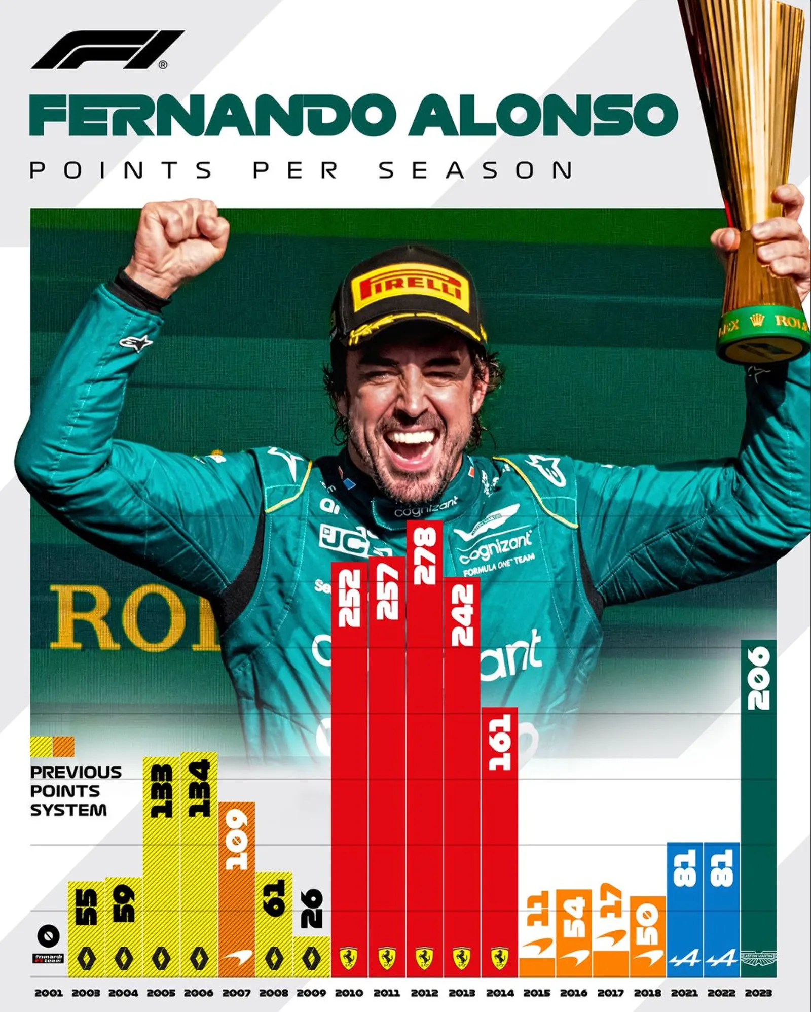
This post on the F1 Instagram account has an interesting solution to the labels of a data chart:

  • When the column is tall enough, the label is put inside with a contrasting white font color
  • If not, the label is put on top, if possible with a font color that matches the column

The advantage is that this enables you to make the column graph taller as a whole (no need to budget extra space for the labels), and it is easer to put a background image as most labels (in tall columns) have enough contrast against them.

The vertical orientation of the labels though…

·Data visualization

Combining column and line charts

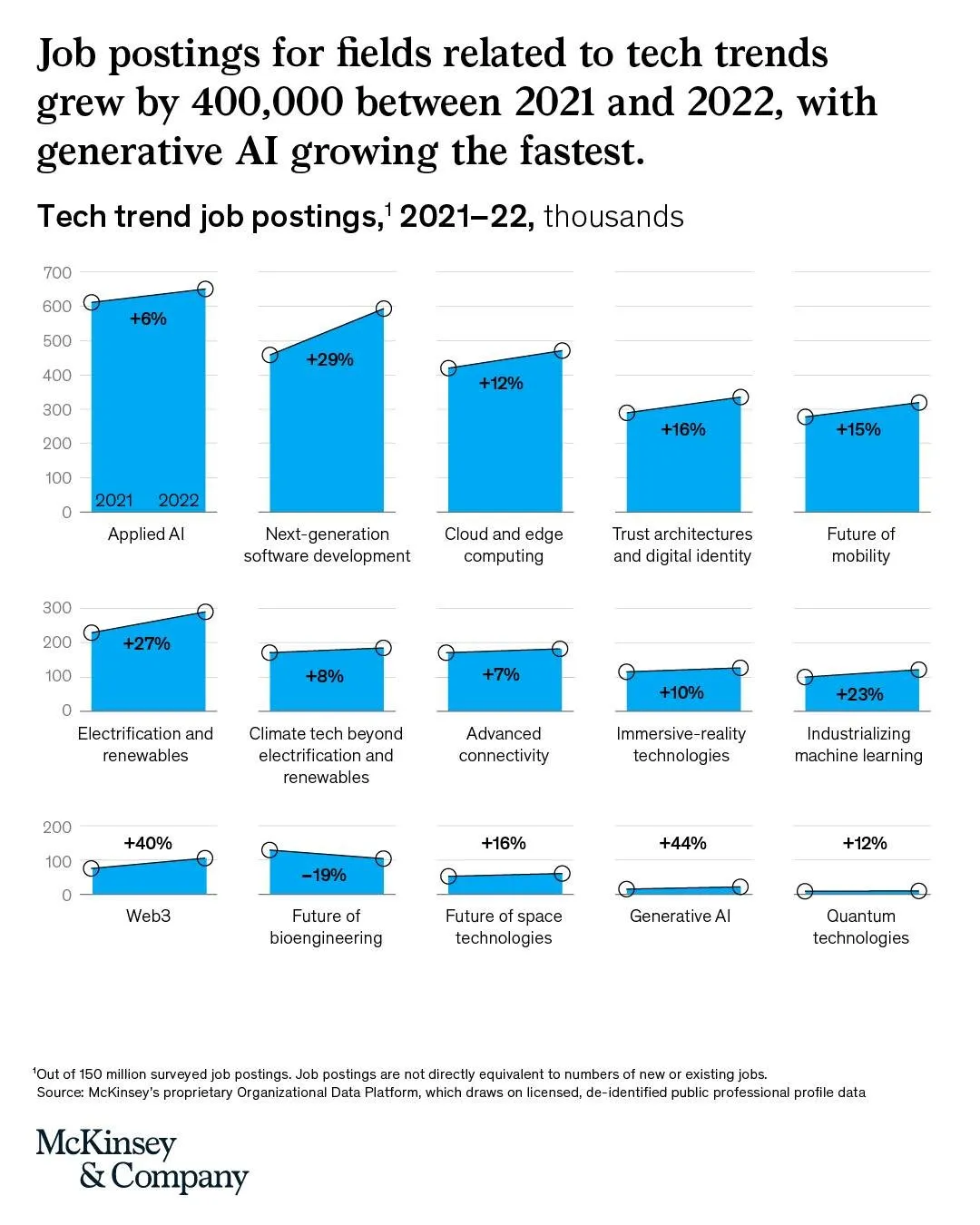
Below is an interesting chart from McKinsey. It combines a column chart with a line chart. The chart only works when a column has a reasonable size though.

I am not aware of any presentation software that can produce these (including SlideMagic), so this might have been bespoke illustration work.

Link of the original post.

·Layout

Dashboards and reports

For periodical update meetings, you often can use the same presentation with just the numbers updated. When the audience is internal to the company, many will just use a spreadsheet printout rather than transferring the data to a presentation.

The result, a presentation that looks like, well, a spreadsheet.

  • There is more information presented than needed for the meeting
  • Numbers are highly precise and not rounded up
  • Fonts are tiny, as the spreadsheet tries to show everything on 1 page’s width
  • Colors and fonts are those of Excel, not the company
  • The last 2 rows of the table moved over to the next page
  • Etc.

If you need this report often, it is worth investing some time in setting up your spreadsheet properly.

  • Leave your “engine” untouched and create an entirely new work book that is your “presentation”
  • Get rid of spreadsheet gridlines and show the page cut offs so you get a clear view of the boundaries of your “slides”
  • Set colors and fonts the same way you would do in PowerPoint
  • Now build your slides page by page, by pulling in the data from the engine sheet, round numbers up as you go ( / 1000, show 1 decimal, etc.)
  • With these types of reports, you variability between slides will be in the column widths, not so much in the rows. To keep your “deck” all in one workbook, move horizontally, and add pages to the right rather than below
Continue reading →
·Data visualization

Diversity

This is an interesting graphical representation of the US workforce:

Source: https://www.visualcapitalist.com/american-workforce-100-people/ on Visual Capitalist.

It is very cute, but does not do a good job at communicating the actual data (percentage breakdown by sector). Also, since this graph tries to make the point of diversity, the characters in the illustration do not represent the gender and race balance of the work force.

One idea to tackle this. Add multiple dimensions of data: sector, gender, etc. to the characters, and then render multiple iterations of the 100 people, each time grouped differently to focus on a specific statistic. The opening slide is a random permutation of the entire group.


·Data visualization

Useful graphics illustrations

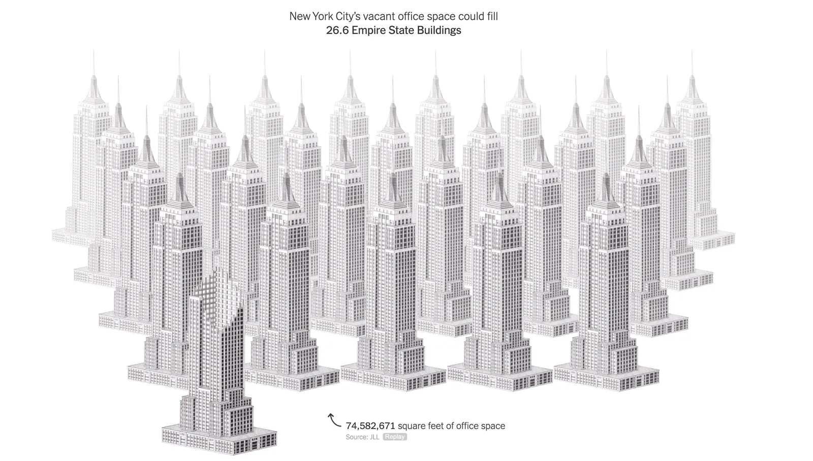
I am usually not a big fan of illustrations that visualize data. Below is an example (with data from February 2022). The soldiers might as well have been represented by straight bar charts.

This article in the NYT though, was pretty effective. Representing unused office space with repetitions of well-known landmarks. People can instantly relate to, understand, and internalize the amount of space we are talking about.

(BTW, these illustrations are made by Kaylie Fairclough)

·Data visualization

Women in the workface

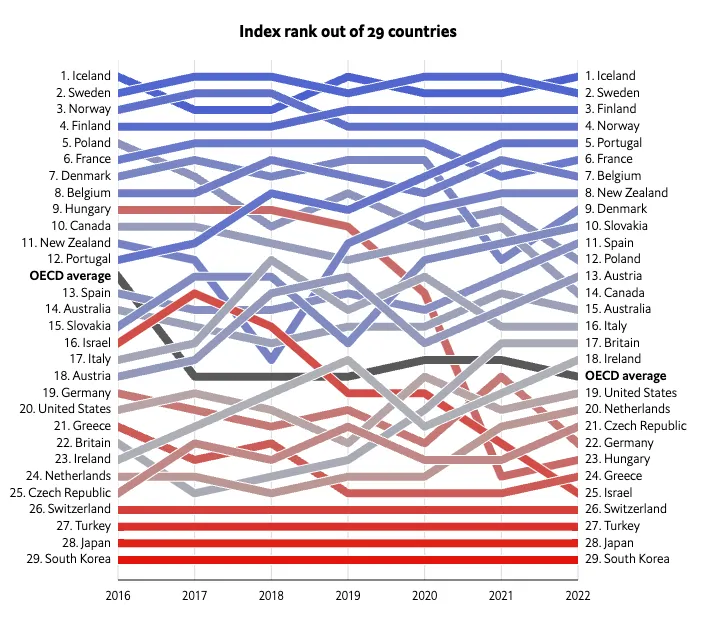
On women’s day, here is an interesting visualization by The Economist to show the role and influence of women in the workforce:

What is used:

  • Big, bold, fat lines
  • Color coding using a gradient based on the last available year’s ranking
  • (Not visible on the static image) When you hoover over a line, it lights up with the rest being faded out

Lines that break the pattern will pop out (Israel, Hungary).

One caveat though, these are all 29 reasonably wealthy countries. The situation might be a lot worse in the other 150+ countries that are not on this list.

·Data visualization

The little details

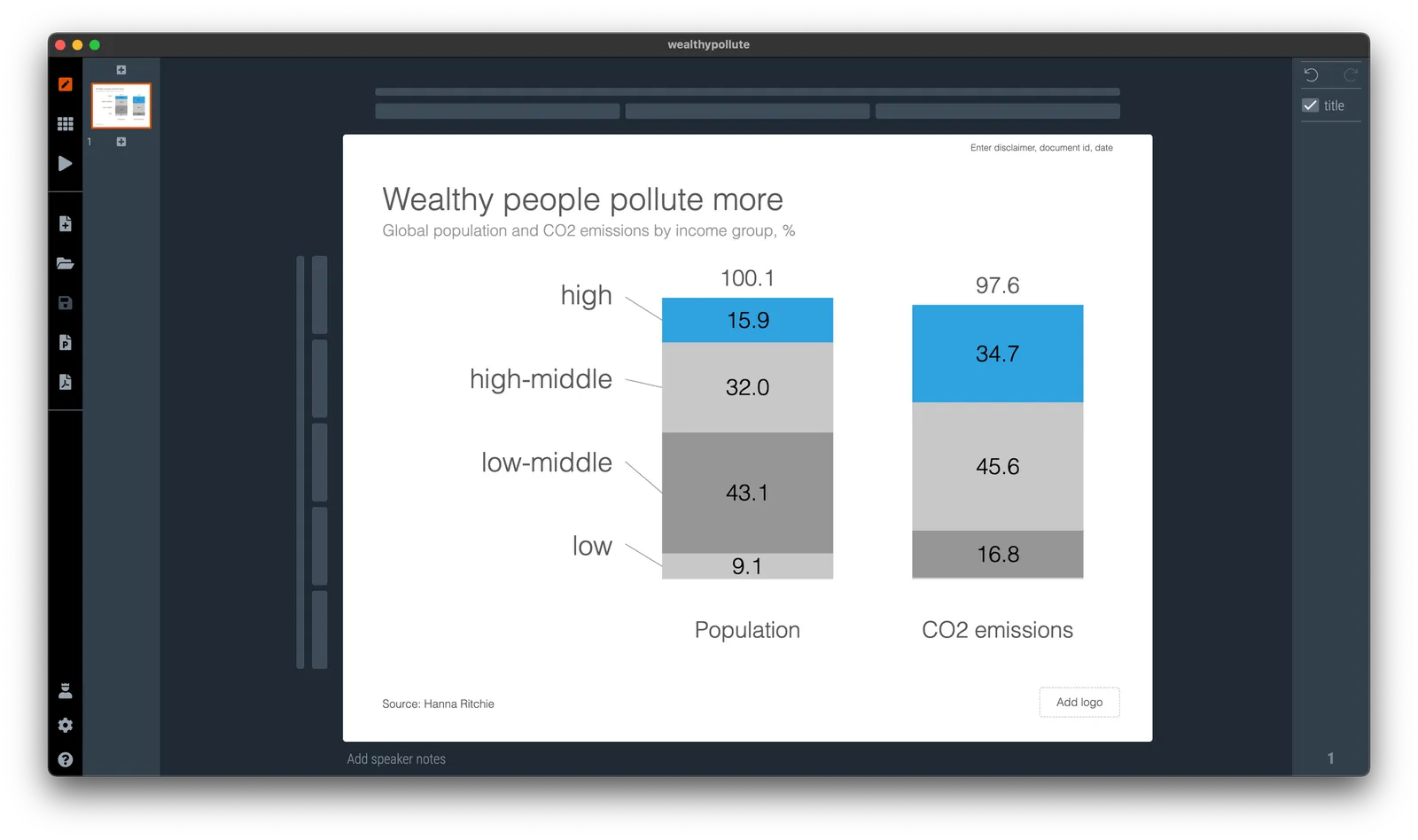
I was busy doing a chart makeover of the following chart:

To get to this result:

To found out that the columns don’t add up. In case of the left column, it is probably a small rounding error, but on the right, something got lost in translation.

About errors:

  • Don’t blame the spreadsheet, you are presenting a chart, not your backup model. If there is a rounding issue, fix it manually (I usually adjust the biggest category, so 43.1 would become 43.0 in this case). I always argue to disconnect your chart from the spreadsheet for your final document.
  • Even tiny mistakes can make people doubt all the numbers in your entire deck. Number charts should be simple, and it is a 5 minute investment to quickly check them on a calculator. Worth the investment!

In this case, the hidden calculation error shows the flaw in the type of chart chosen. The stacked column is more intuitive and shows how things are related. For the horizontal bar, I had to think for a second to understand what it means, and I did not instantly spot the error.

·Software

Agario-style

This amazing visualization shows the history of Europe and the coming and going of various empires in the style of the Agario video game, where bubbles collide and merge.

This video was made using Adobe After Effects. In theory you could do something like this in PowerPoint: a slide for every year with animations and then loop the whole thing. It is a lot of work though.