SlideMagic Blog

Frequent updates about all things presentations since 2008. Subscribe to never miss a post.

RSS
all posts

Category Data visualization

·Data visualization

Obama infographic and picking the right metric

The infographic below released by the Obama administration (here) is a good example of using the full arsenal visual techniques to make your point stand out.
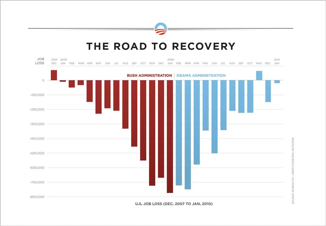
  • Use fat columns to make the trend stick out (much better than a thin line, earlier post here)
  • Use recognizable, contrasting colors
  • Pick a metric that is favorable (monthly job loss)

On the Fast Company site, Prof. Charles Franklin put out a second graph depicting exactly the same data, but using a different metric, cumulative job loss:
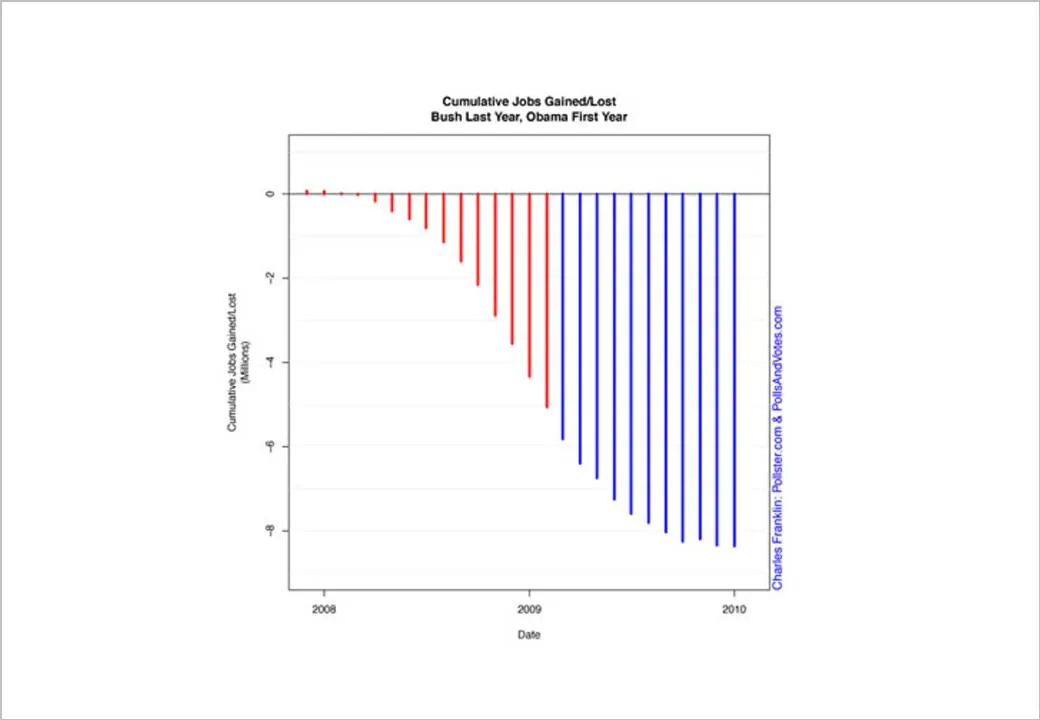
The formating of the graph is a bit improvised, but it shows the power of picking the right metric. Someone speed-reading a newspaper first notices the sea of blue, and a trend that does not seem to reverse.

Fast Company seems to have taken down the story, so I had to source Franklin graph from Google chache. Thank you Ellen Daehnick for pointing me to this.

·Data visualization

Measurements that people can visualize

Mathematics has given us the ability to perform complex calculations, reducing real world quantities to simple numbers and variables that can be manipulated without interpreting what they actually mean.

In your presentations, try to go back to the stage of a child before the first mathematics class. Describe measurements and quantities in a way that they can be visualized, internalized.

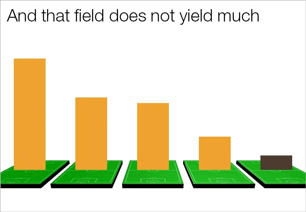
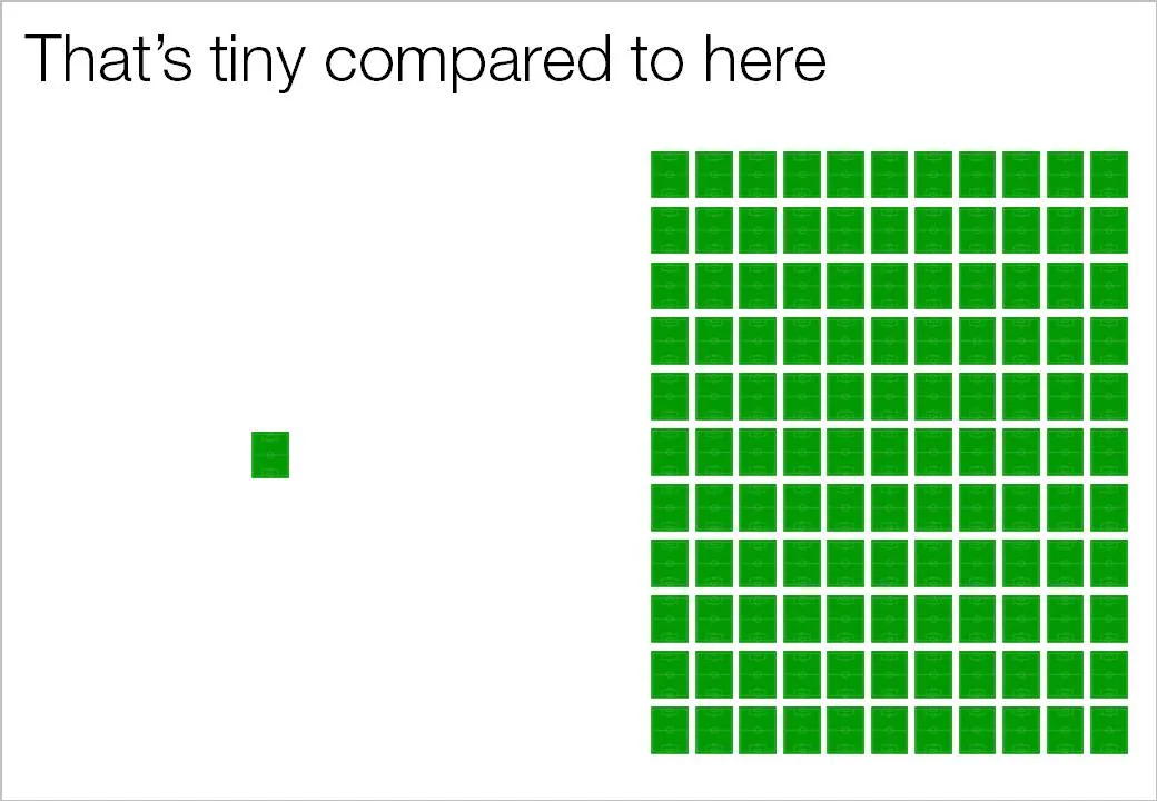
Recently, one of my presentations covered agricultural land yields in emerging markets. Rather than using abstract hectares and tons, I decided to use the soccer field analogy. It is easy to re-calculate figures from tons per hectare, to tons per soccer field, and maybe even going further: truck loads per soccer field.

You can even use the visual of the soccer field:

·Data visualization

Formating an Excel table in PowerPoint (under time pressure)

At 11PM on the evening before the Board meeting, the finance department emails you a horribly looking PowerPoint deck full of copied tables from Excel with the latest quarterly results. There is no time to start designing beautiful data charts. What emergency fixes can you do?

Here are a few suggestions:

  • Select the the table and set the fonts and font sizes to the ones you are using throughout the presentation. (Get rid of that Excel Arial)
  • Remove as many abbreviations as you can
  • Right-align the row labels
  • Right-align the numbers
  • Take out decimal points, or add decimal points so that the numbers align
  • Round up to whole millions, billions if you can
  • Select the columns with data and distribute them, set them to be exactly the same width
  • Put repeated words (“M&S” in my example) to the right
  • Center the column headings
  • Bold up the totals
  • Get rid of as many borders as you can
  • Add some subtle grey tones to differentiate columns

Click on the image for a bigger picture.

·Data visualization

PPT hack - custom chart templates

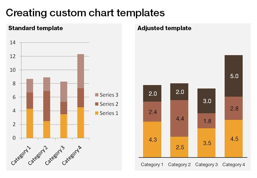
The standard PowerPoint templates do not look very good. The standard slide layout invites people to write presentations through endless lists of bullet points. But even more time-consuming to change are the standard templates for data charts.

This earlier post with a make-over of a column chart in a presentation by Skype shows some of the pain a presentation designer has to go through over and over again to create decent data charts. It took me around 17 years to discover the option to create your own templates. Let’s save you this time, right now.

If you click a chart in PowerPoint 2007, you can find the “save as template” button in the “design” ribbon of the chart. (Confusingly, two “design” ribbons pop up when you have a chart open, one for the chart, one for the slide). Give your template a name and PowerPoint 2007 will save it in the appropriate directory (with a “.CRTX” extension, but you do not need to worry about that).

The next time you select “insert chart”, a folder appears at the top of the standard PowerPoint options, open it to create a data chart using your own customer templates.

·Data visualization

As promised my solution to the NYT infographic

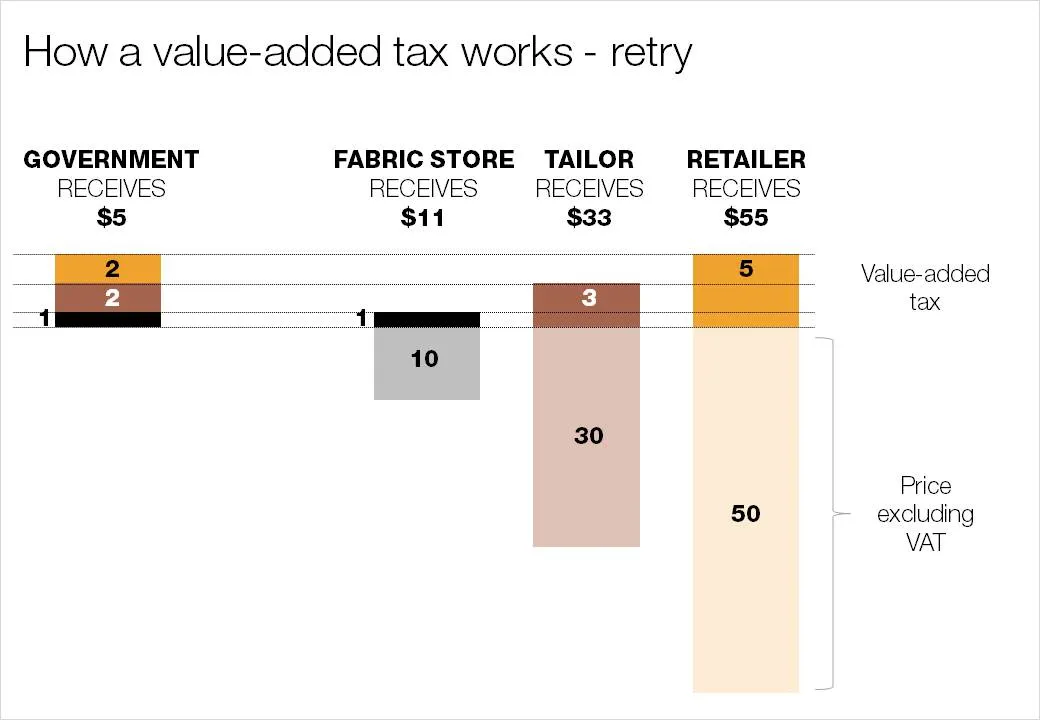
Here is my suggested solution to yesterday’s puzzle: improving the NYT’s infographic that explains how a value-added tax works. Let me know what you think and/or whether you have alternative suggestions. You can click on the image for a larger picture.

·Data visualization

Puzzle for tomorrow: improving an NYT infographic

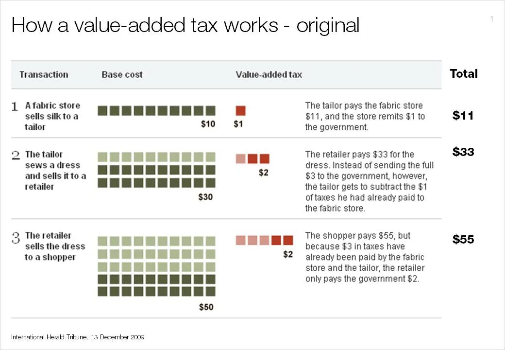
If you see it for the first time, value added tax is a bit tricky to explain. The NYT (equals the Herald Tribune) gave it a go in the infographic below. I am trying to do a better job and will post it in tomorrow’s blog post. I am actually not that happy with my result so far.

This is a heads up: give it a try yourself and we can compare notes tomorrow.

I had to modify the image on the NYT web site slightly and added the right column with totals that appeared in print, but was omitted in the online version of the graphic.

·Data visualization

Sometimes a simple table is best

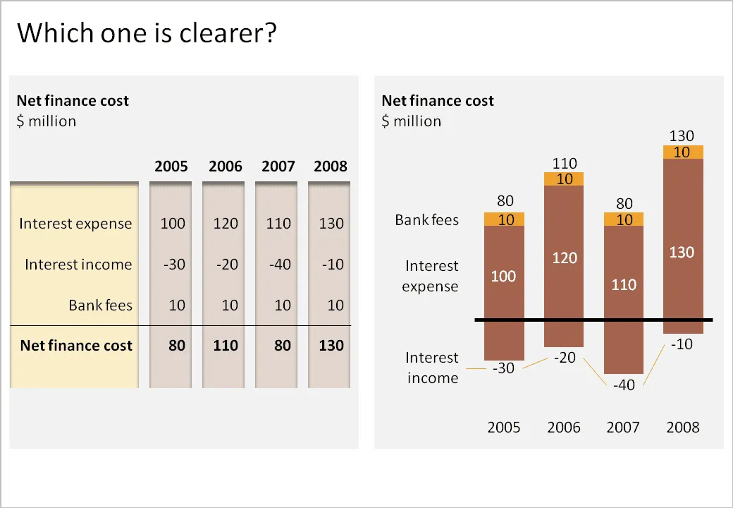
I have been thinking hard about how to incorporate negative numbers in stacked column and bar charts. The example below shows that it is possible. However, it might be the exception of the rule that graphs are usually better at presenting data than tables.

  • The chart takes a bit of time to figure out. “It’s about cost, so income is negative”. “Ah, the negative offset of the chart is revenues”.
  • The chart goes against common practice of accountants and other financial professionals to look at annual financial data in tables.

What do you think?

·Data visualization

In what order to display data series?

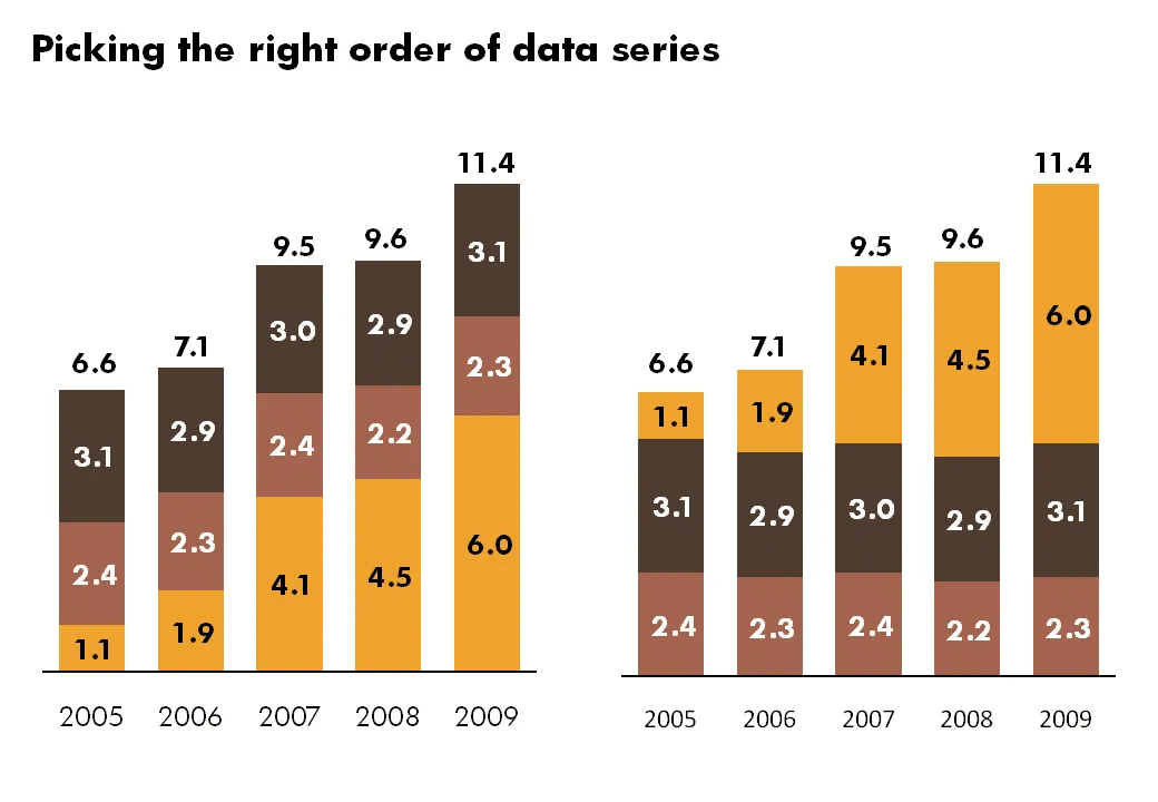
Look at the data of your stacked bar and column charts. I prefer to put the series that changes the most last, so it becomes very clear what variables are changing, and what variables not.

·Data visualization

Adoption curves - how long does it take?

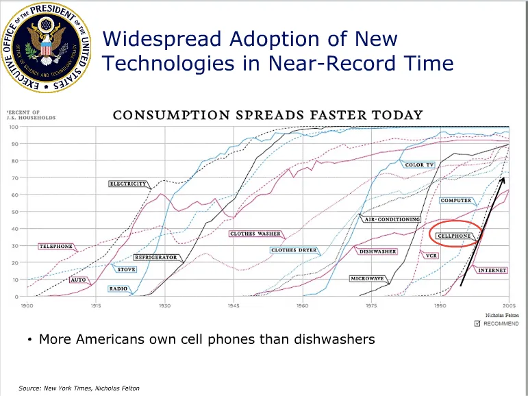
Adoption curves are a great way to compare the speed at which ideas spread, technologies were adopted or great companies were born. They are basic line graphs with the starting year set to zero. An alternative visualization would be a simple bar charts with “number of years before x reached y”. While simpler, this approach loses a lot of information: the absolute size, the rate of adoption, and changes in the rate of adoption over time. The classic use is to show that new technologies are getting adopted faster and faster. A good example can be found in Mary Meeker’s 2009 Internet presentation:

Mike Pulsifer found a chart that does not make all starting years zero, here is what happened:

Finally, interactive data visualization tools can add another dimension to adoption curves. See this example of a chart that shows how many years it takes to transform a startup into a large company (thank you Michael Eisenberg). The opening chart is far too busy to show in a PowerPoint presentation, but that’s not the objective here. These charts are designed for pondering over: select and de-select lines, mouse-over data, etc. If you had to translate this chart into PowerPoint, you would have to use a number of slides to highlight the messages you want to stand out.

·Data visualization

Visualizing 1 in 8,000

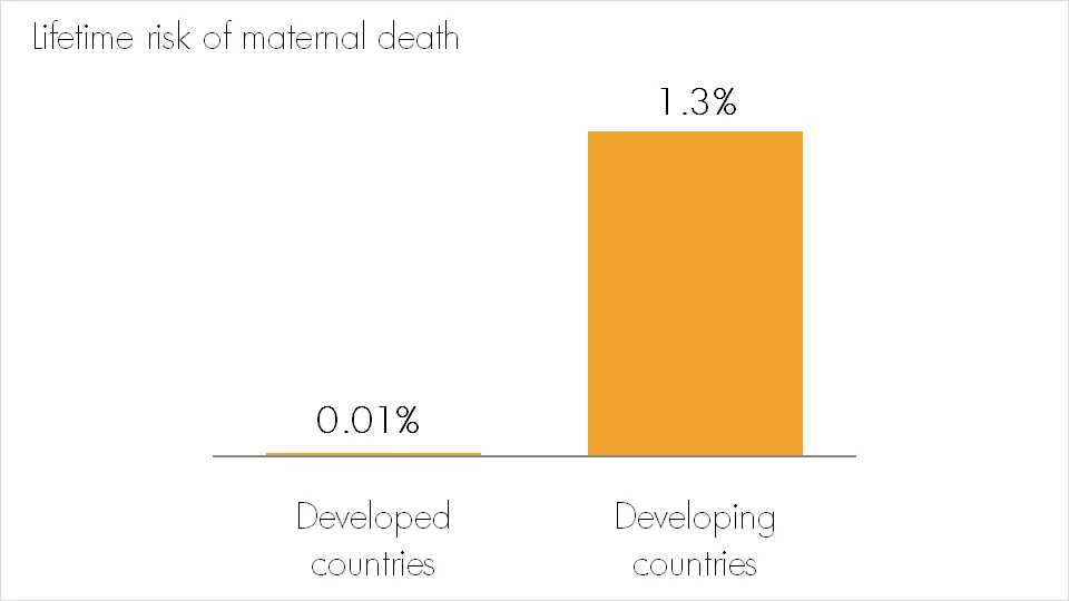
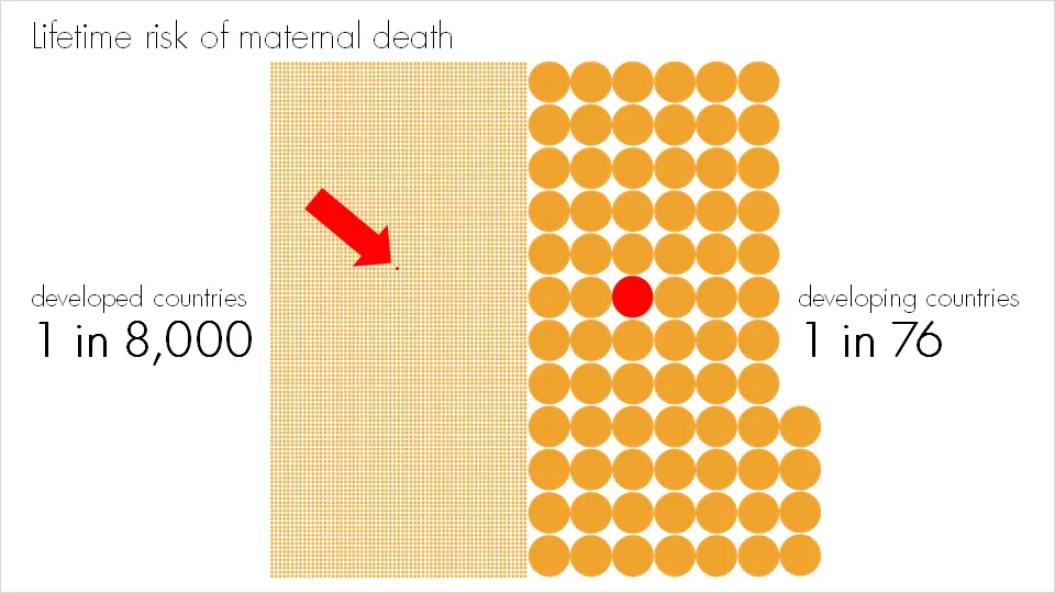
Bar and column charts are my favorite data visualization tools. I do not like pie charts, although they are in theory the best way to highlight relative proportions. Both of these graphs break down when you try to visualize very small proportions. In these cases I fall back on a technique that simply repeats the number of objects on a slide as done in the example below:

Note that especially for small proportions, it is very hard to internalize what things mean. “A 1.3% chance? That’s seems OK. What, 1 in 76? That’s a lot!.” Tap “1/x” on your calculator to translate a probability into a “1 in” number. For example: 2% translates into 1/0.02=50, 1 in 50.

More information on the issue of maternal death here.