

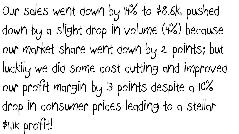
Some numbers today. The source of change is a tool to explain the delta between two numbers in terms of its components. Assume you need to get the story below across in a crisp presentation.
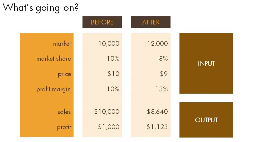
The first thing is to understand what’s going on. Get some more information until you have the full picture in a clear table.
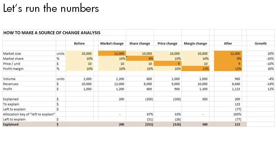
Now let’s do the analysis. This is the tricky part, the text below does not do a good job in explaining this, you can click the spreadsheet for a bigger and more visual explanation.
- Calculate the profit in the “before” scenario using a formula that just uses inputs
- Now stretch each of the variables that change to their “after” value, jot down the value, and return the value back to its original number
- Repeat for all the variables and see what delta in profit you managed to explain.
- Calculate what is left to explain, and allocate that to the individual values.
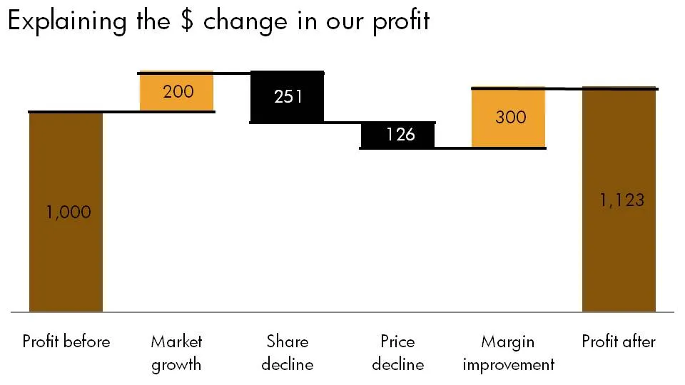
Finally put the values in a
chart.
4 comments