“Can we make that look a bit more impressive?”
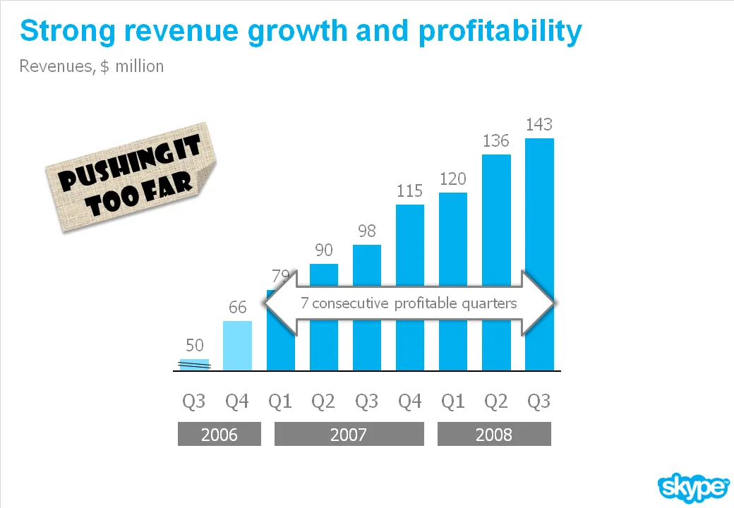
I get that question a lot. An obvious trick with column/line charts is to cut the axis. I think that is cheating the audience, putting at risk the trust in the content of all your other slides in the presentation.
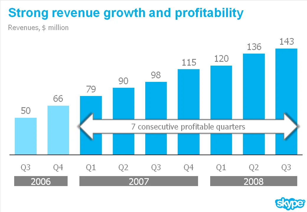
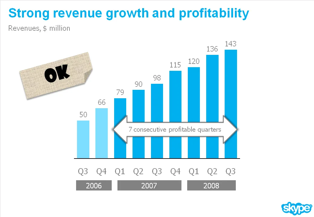
What you can do is play with the aspect ratio of your chart. As an example see the make-over of a Skype chart I used earlier. People in the comments were suggesting that the new version actually looks less impressive than the original. Maybe squeezing the chart horizontally while keeping the vertical size the same fixes that.