SlideMagic Blog

Frequent updates about all things presentations since 2008. Subscribe to never miss a post.

RSS
all posts

Category Data visualization

·Data visualization

A different approach to data visualization

It is hard to get the magnitude of a huge number across on a slide. A $700bn bailout,how much is that? Photographer Chris Jordan takes a different approach. Repetitive patterns of miniaturized objects that form a bigger picture. Images have a political message, many of them try to put current “consumerism” into perspective.

The image below is inspired by Seurat’s “un dimanche après-midi à l’Île de la Grande Jatte”, and constructed from 106,000 softdrink cans.

Check out more of his images here. Via Village of Joy.
·Data visualization

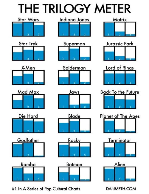
Visual power of many small repetitive data charts

A nice set of bar charts showing Dan Meth’s excitement about episodes of movie trilogies.

Many, many, similar small data charts on one slide can create a powerful visual effect. It is possible to create Zen charts that contain lots of detail.

Via Randy Krum

·Colors

Need your help: colors in data charts PPT 2003 versus 2007

Colors in data charts. This 2003-2007 compatibility issue drives me crazy. Many of my clients still use Office 2003. Does anyone have a solution?

  • PPT 2003 uses Microsoft Graph for data charts, PPT 2007 Excel
  • I create a chart in 2007
  • I save the 2007 PPTX in 2003 PPT format
  • I (or my client) opens the 2003 PPT file and
  • right-clicks the chart to open it: all the colors are off…

I have to change every color manually using RGB codes to set them permanently to the correct value in 2003.

There must be a better way to do this! Let me know if you know.

·Data visualization

Data visualizations - how bad is this recession compared to previous ones?

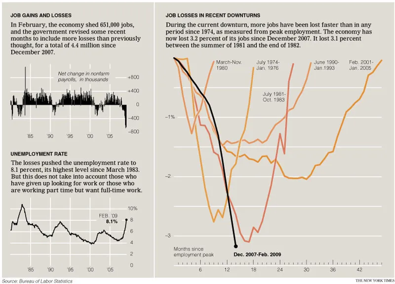
The only up side of economic turmoil is probably that there is plenty of data available for interesting visualizations. The New York Times posted this chart: (click for a larger picture)

I like it because the designer gave some thought about what metric to put in. He/she could have shown a times series of GDP growth, absolute unemployment, or unemployment rate to name just a few. That’s why I do not like these automated PowerPoint chart wizards, it makes you skip the step of actually thinking about what metric really makes your point. (And more importantly, what are the 15 metrics you can get rid of without changing anything to the message of your slide).

Via Junk Charts, an excellent source of data visualization discussions. For more frequent updates about the financial crisis (including many data visualizations) follow Paul Kedrosky.

·Data visualization

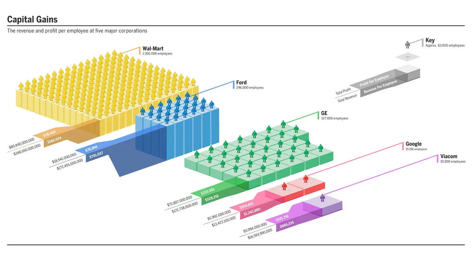
Infographic example - poor info / great graphic

Infographics can look great, but can do a poor job in getting data across. This data could have been brought out better with simple bar charts. I am still struggling to get the point (15+ years of chart-decoding-experience as a strategy consultant is not enough in this case).

Original on Good Magazine. Click the image for a bigger picture.

·Data visualization

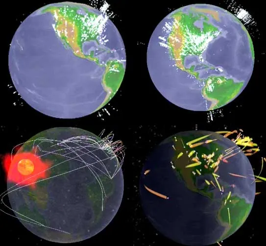
Great visualization of people connecting on Facebook

See the video here. Full details in the original post on TechCrunch.

Update: if you like these type of visualizations, Mashable has a whole stack of them, including videos, in this post.

·Data visualization

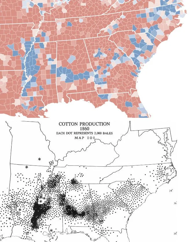
Data visualization - correlating 2008 election and 1860 cotton production

The issue of race and the 2008 U.S. presidential election sparks big discussions everywhere, I am staying out of this here. This blog is not about politics. From a presentation point of view, the election offers some interesting data visualization opportunities. Maps can be powerful presentation tools.

Via strange maps, which also has a chart overlaying the 2 maps. I actually think that visually, leaving the 2 charts separate looks better, keepin the ancient look and feel of the 1860 map intact.