

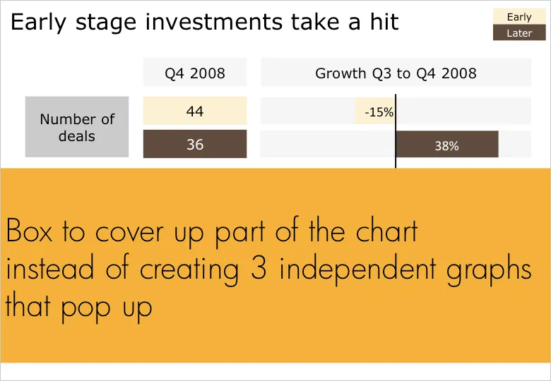
Sometimes you cannot avoid building up a busy data slide to take your audience through it step by step. In case of data-driven charts, it is tricky to create 3 independent graphs that are nicely aligned. I tend to create one big chart and use a white box to cover part of the information. Gradually I unveil more information by taking the white boxes off, instead of creating animations with new elements popping up.
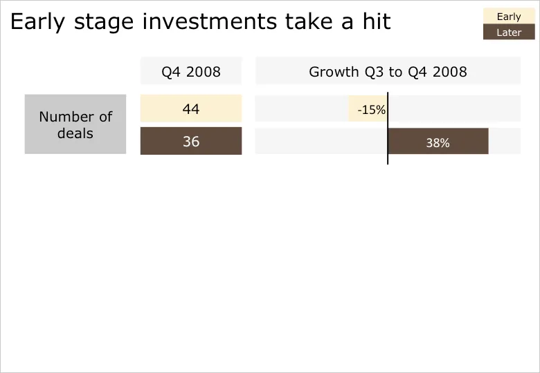
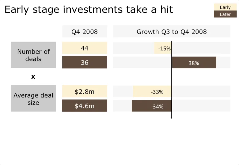
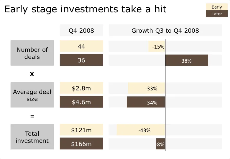
B.t.w. for those interested: the data above is the quarterly overview of VC investments in Israel, compiled in PwC’s Money Tree report for Q4 2008.