SlideMagic Blog

Frequent updates about all things presentations since 2008. Subscribe to never miss a post.

RSS
all posts

Search results for “mckinsey”

·McKinsey

How to create a McKinsey-style waterfall chart
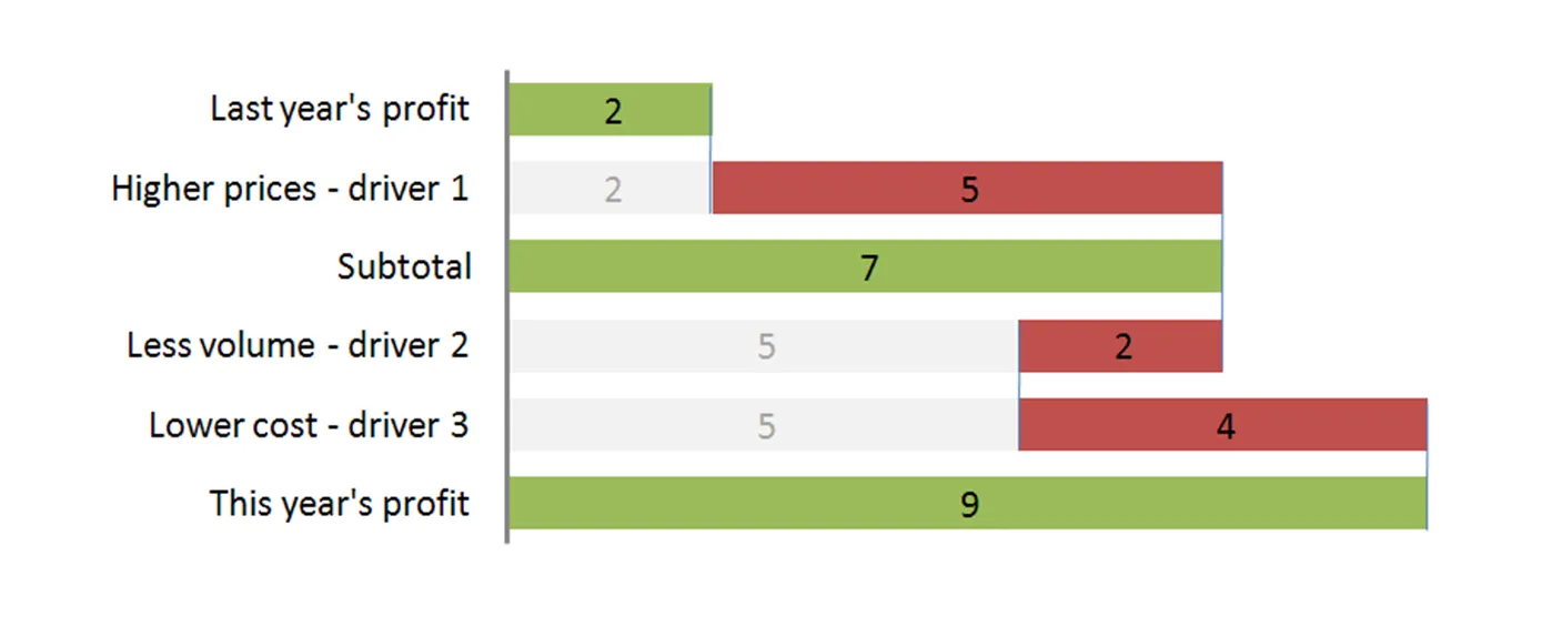
The “water fall” chart is an effective way to summarize the quantitative impact of a number of drivers. For example, you need to put the following story in a chart: “Our profits went up by 7, the positive effect of higher prices and lower cost was offset by a lower sales volume.” A waterfall chart would look something like this:
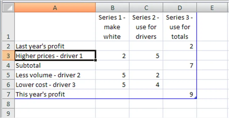
For illustration purposes I left the light grey color and data labels of the supporting series in so you can see how to make the chart: it is basically a stacked bar chart with 3 series:

  • A “white” series to support the drivers
  • One series for the drivers
  • One series for the (sub)totals

The data table for this chart (Powerpoint 2007):

For a final touch, make the color of the light grey series white, take out the data tables and that’s it. There is the temptation to make automated tools (in Excel) that do the work for you. Like almost all my charts, I start with a piece of paper and make my waterfalls manually, to make sure that they

  • Are correct (negative numbers can make these charts a bit tricky to get right sometimes)
  • The chart tells the story I want it to tell (what subtotals to use, in what order to list factors, etc.).

UPDATE 1: here are two other posts related to McKinsey waterfall charts:

Continue reading →
·McKinsey

Googling for free McKinsey PowerPoint templates

Doing a Google search for “McKinsey PowerPoint templates” highlights many entries that are almost all a violation of copy right. Moreoever, the templates are of little use to someone who is not working at McKinsey team on a client engagement. First of all: presentation starts with substance, then follow the frameworks (if any) A bit of historical context. I recognize the frameworks from my time at McKinsey, almost all of them are from the early 90s, when McKinsey was still working with an early pre-PowerPoint presentation tool called “Solo”. Solo was developed specifically for McKinsey, later marketed as an independent application. It vanished when PowerPoint emerged, not because PowerPoint at that time was neccesarily better, but all of McKinsey’s clients were running it and using it to edit presentations. (A slightly outdated looking site is still offering it for sale?). Your graphics assistant (nobody knew how to make charts themselves then), would dive into the template database to find “something that uses 4 arrows”. All these frameworks were meant to be used in densely written strategy/micro-economics documents, not in convincing on-screen presentations. If you would like to learn about McKinsey’s approach to graphics and presentations, try this:

  • The content available on the McKinsey Quarterly site (most of which look actually better than “day-to-day” work)
  • For the chart “Bible” that was used in the early 90s, flick through a copy of the book “Say it with charts” by Gene Zelazny. (I see he’s updated it since I last saw it).
  • The foundation of McKinsey’s approach to writing logical story lines (but not always the most compelling stories that are important in presentations) can be found in Barbera Minto’s book “The Pyramid Principle
  • UPDATE: I posted about a question I get often: how to make a McKinsey waterfall chart here.
Continue reading →
·Layout

McKinsey chart make-over

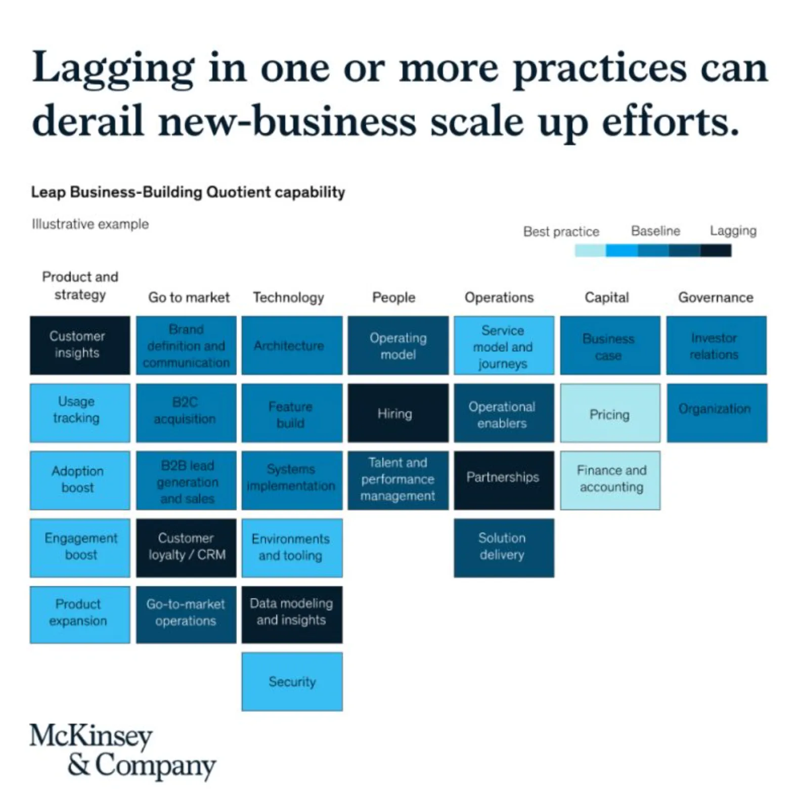
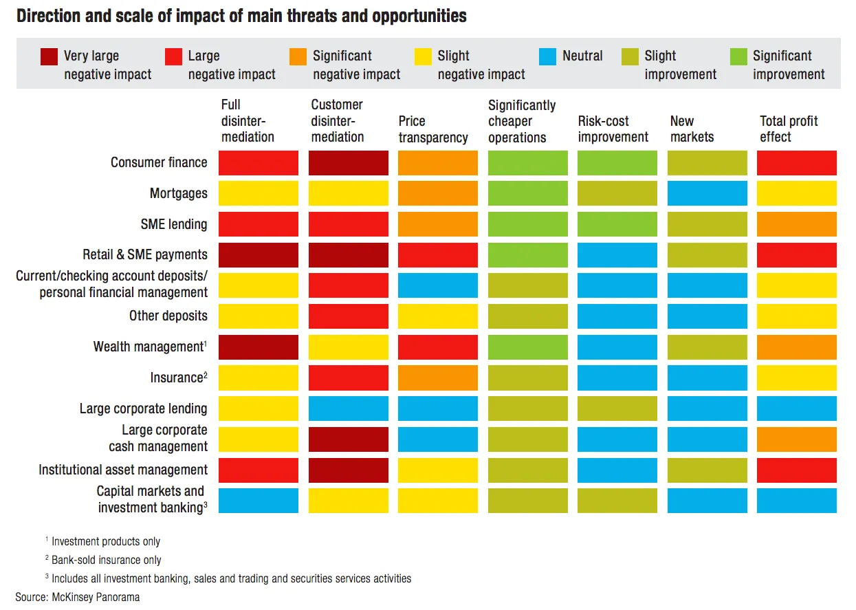
See the following McKinsey framework (background here):

The slide does not look bad, but there are a few things that I would change:

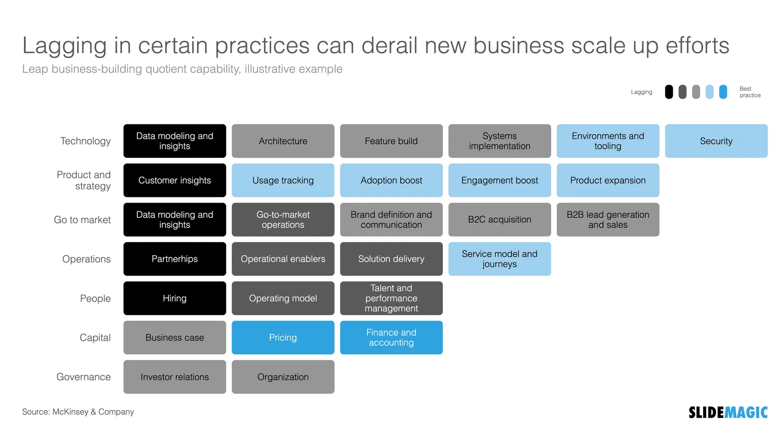
  • Flipping the columns and rows of the table, there are more columns than rows, I tend to put the axis with the most data in rows
  • Sorting the categories by number of boxes, to get a more visually pleasing line (McKinsey probably sorted the columns by importance)
  • Sorting the boxes within a category by color (and not by importance)
  • Fixing the color coding, the dark colour is actually the worst score.

Below is a quick makeover in SlideMagic, you can find this chart in the SlideMagic slide library for you to use.

·Data visualization

McKinsey slide makeover

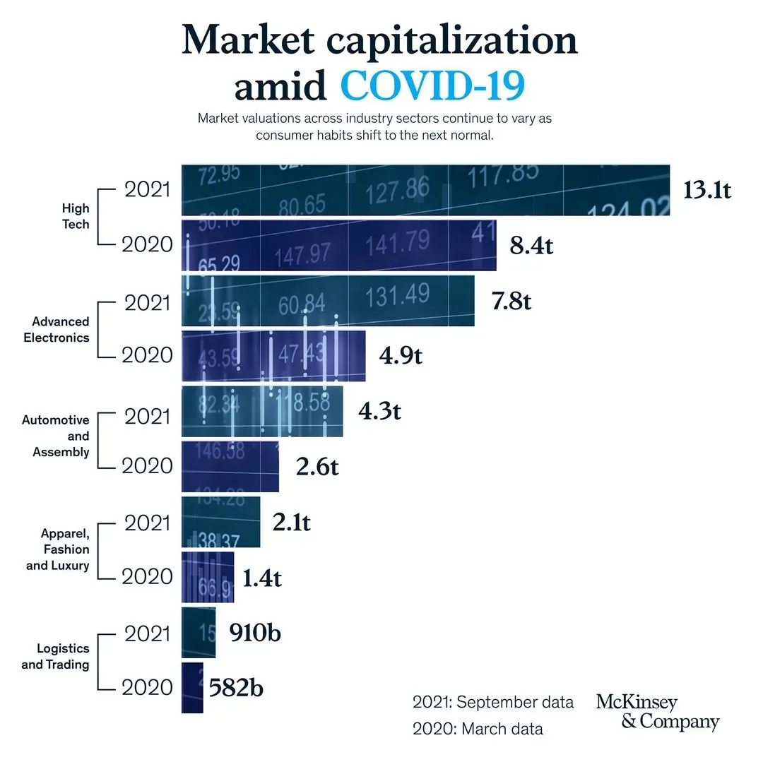
A saw a slide by my former employer coming by:

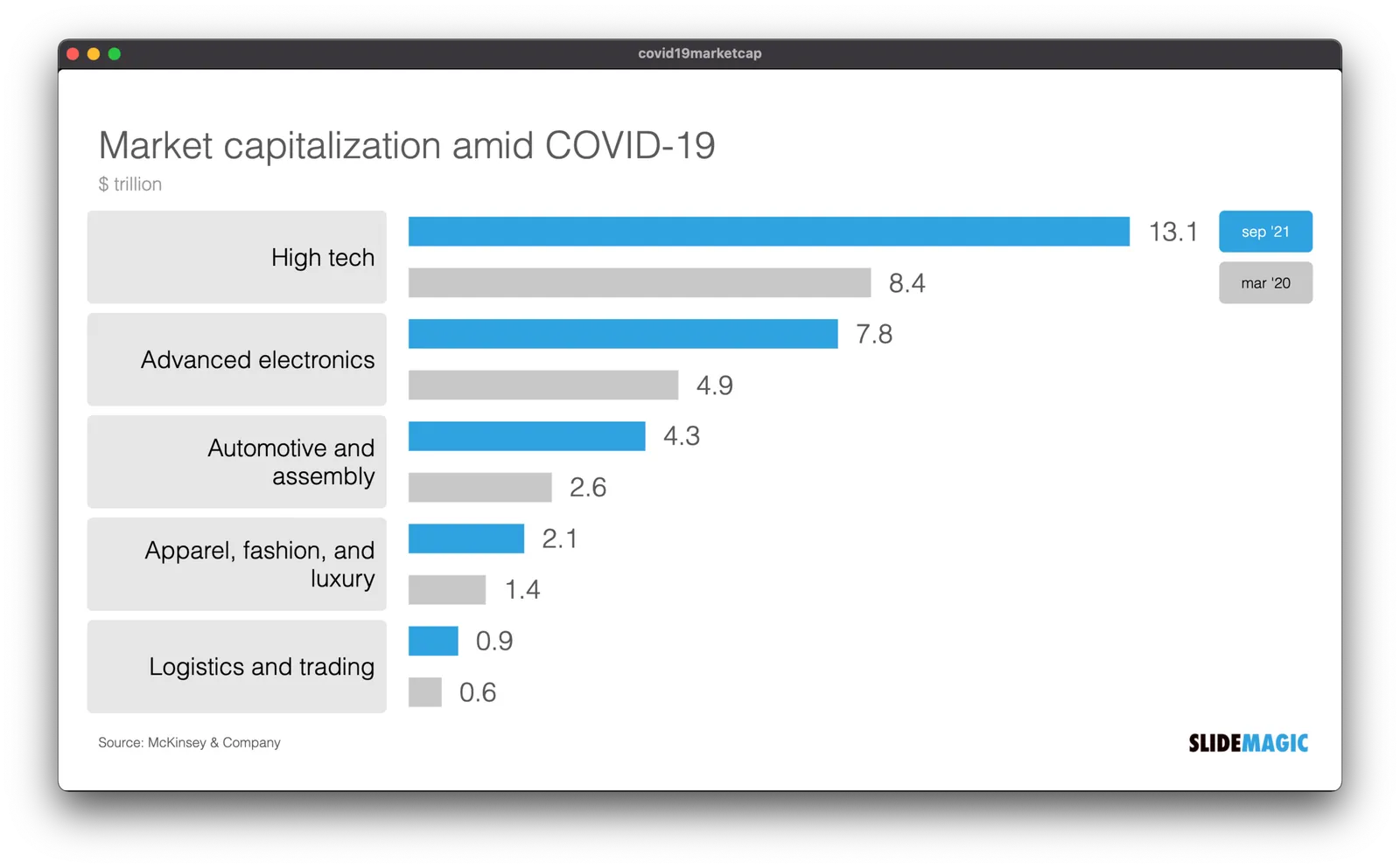
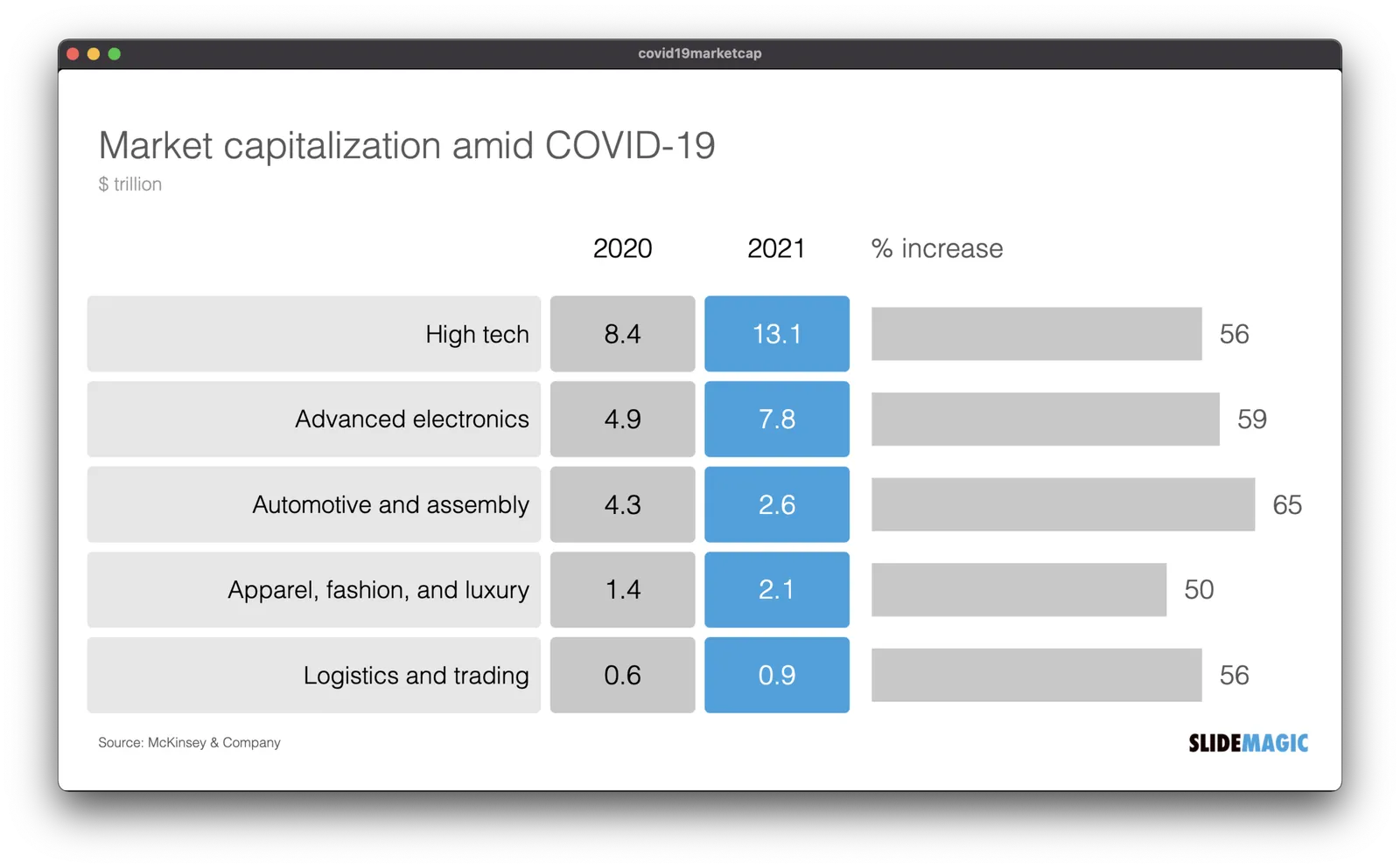
It has a very sophisticated image effect: look how the background of the bars in the chart are part of one image. Still, there is room for improvement. I quickly replicated the chart in SlideMagic with a few changes.

  • I brought back the more traditional, very in-your-face alternate coloring of the bars, blue for 2021, grey for 2020 and a legend, instead of the repetitive text labels with the years.
  • I increased the size of the industry sector labels
  • By replacing 910b and 582b by 0.9 and 0.6, I could get rid of the “t” and “b” in the bar label.

But the analysis of the slide can be pushed further. The main point of the slide is how markets have bounced back over the past year, which is independent of the ranking of the market capitalizations of the sectors. As an alternative, I constructed the combined table/bar chart below, de-emphasizing the absolute value of the market capitalizations, and using the bar chart to highlight the % increase in market valuation. The inside here is that all sectors grew more or less the same over the last year (except fashion, probably reflecting less dressing up for work.

I have added the slide to the SlideMagic slide library, look for “COVID” and they will show up. Emails subscribers: if the slide images don’t show up in the email, please open the link to the full blog post.

McKinsey slide make over

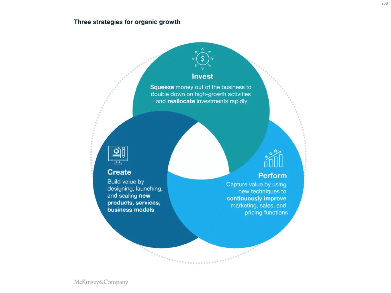
I found this slide in a recent McKinsey article:

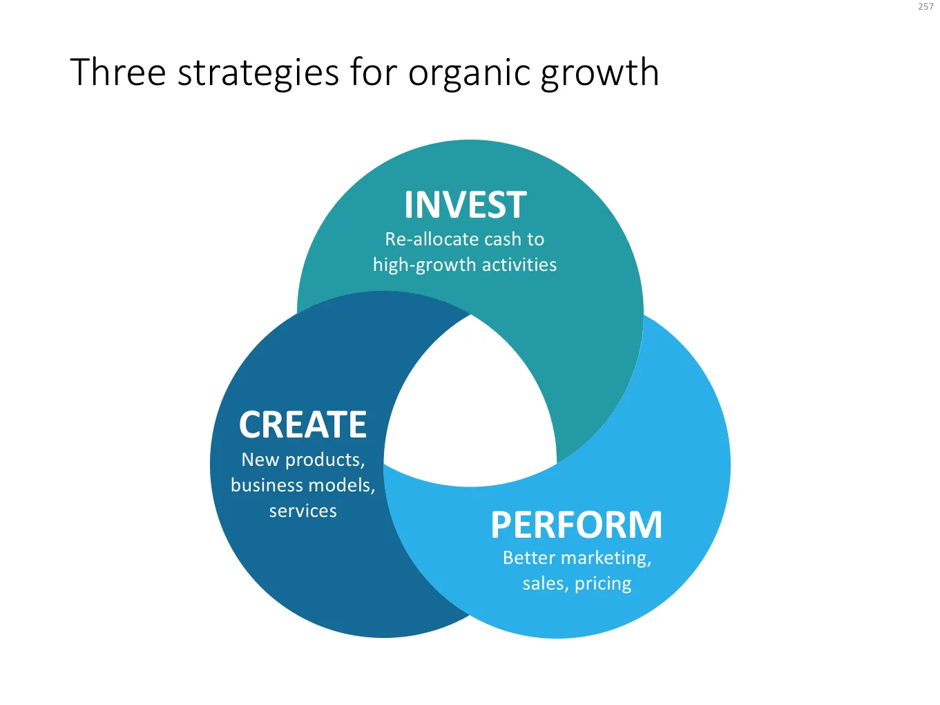
I created a make over of this chart, making it simpler:

  • Remove the icons, they are faint and not clear
  • Cut down unnecessary text: capture, create value, out of the business, you can say the same thing with much less text
  • Use this created space to increase the font size
  • Center the text, the paragraph shape of the existing text in the round shapes does not look good.
  • Re-order some of the terms in the text, to make it fit the shape better, some might not like “business models” now appearing before “services” for example.
  • Move around the text blocks until they fit the shape more or less. The off center moons will never lead to a perfect composition.

Here is the result:

The slide might look a little bit less sophisticated, but it is definitely easier to understand, and quicker to create. And that’s what business presentations should all be about.

I have added a modified version of the original 3-circle Venn diagram to the SlideMagic template store, you can find it here. Subscribers can download this template free of charge. If you are interested in learning more about McKinsey presentations, check out older McKinsey-related posts on the blog

·Layout

McKinsey's presentation template

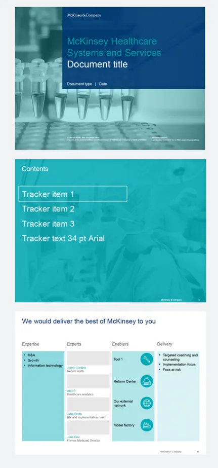
I did not know this, but McKinsey has put its entire visual branding guidelines online. Beyond the usual instructions about fonts and colours, there are interesting documents about formatting exhibits and data charts. Most of it seems to be focused on print or web content, but overall it provides an interesting insight into template management of an organisation which basically produces presentations as its main product.

McKinsey exhibit make-over with SlideMagic

See the McKinsey exhibit below. (I found it in a LinkedIn stream, so I cannot source it to the original article.)

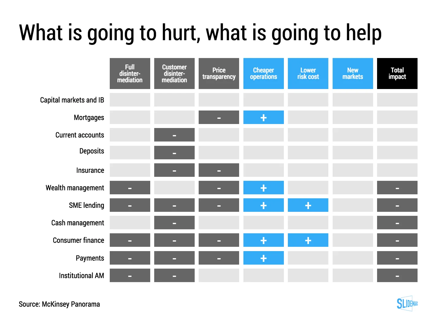
This table is an example of a pros/cons trade off or feature comparison matrix. I find them very useful to visualise the impact of multiple trends, or to trade off complex issues. Still there are a few things that can be improved:

  • The finance sectors are not ranked, it is better to sort them based on the total profit impact
  • There are too many steps in the scale, resulting in too many colours. And, the colours are not chosen according to a consistent colour scale. Especially the greens, they are different types of green
  • The title of the chart is woolly
  • The row labels are too long and complex
  • Column headings are not centred, they look weird
  • The foot notes are too prominent

I have tried to recreate the chart in my presentation design tool SlideMagic. Manipulating tables in SlideMagic is especially easy since it uses a very strict grid system. I collapsed a number of categories into one. The result is that I lost some precision, but I gained a much better visual representation of the effects. If you want, you can add a second layer of data to this chart, by inserting numbers (on a scale from 1 to 7, or on a scale of -3 to +3) to show more granular data.

If you want to use this chart as a template for your own presentation, follow this link and clone the chart in your own SlideMagic decks.

·Design

McKinsey flashback: logic, rhetoric, and presentations

Recent tweets by Nancy Duarte about her reading up on classic rhetoric and a clean-out of my book shelf with old McKinsey training material triggered this post. How can we use the ancient rules of logic and rhetoric in our presentations? Some of my observations.

Logic is necessary but not enough to convince. The perfect logical argument often fails to make people believe your message with their heart. There are still many people that smoke despite this:

  1. Smoking causes cancer
  2. Cancer kills
  3. People do not like to die
  4. Therefore: stop smoking.

The Greek philosopher Aristotle was well aware of this. Logic and rhetoric are often confused to be the same thing. Actually, logic (logos) is one of three components of rhetoric. The other two 2 are ethos (credibility of the speaker) and pathos (emotional appeal to the audience).

Why is logic so popular among McKinsey consultants? A number of reasons:

  • Lack of time. There is an often overlooked difference between a problem solving structure and a solution presentation structure. Logic is a great tool to solve a problem: cut your issue up in pieces, find facts and other evidence to solve sub-problems, and finally build up the overall solution again from the component solutions. Management consultants often stop there and do not invest time to translate the problem solving structure into a compelling and convincing story to communicate the solution. It is not that they don’t want to, at 2AM before the final review meeting there is often simply no time left.
  • Like-minded people. Management consultants usually are very logic-driven people. It is logical work, that attracts logical people, who hire more logical minds. So, the language between management consultants among themselves is highly logical. Some people however have a totally different brain structure (clients of management consultants included).
  • Collaboration. A logical language and structuring technique is very well suited for people that need to work together but have never met each other before. Once you have learned the methodology, you can put a team of consultants from different countries together that can produce results almost immediately.
Continue reading →
·Keynote

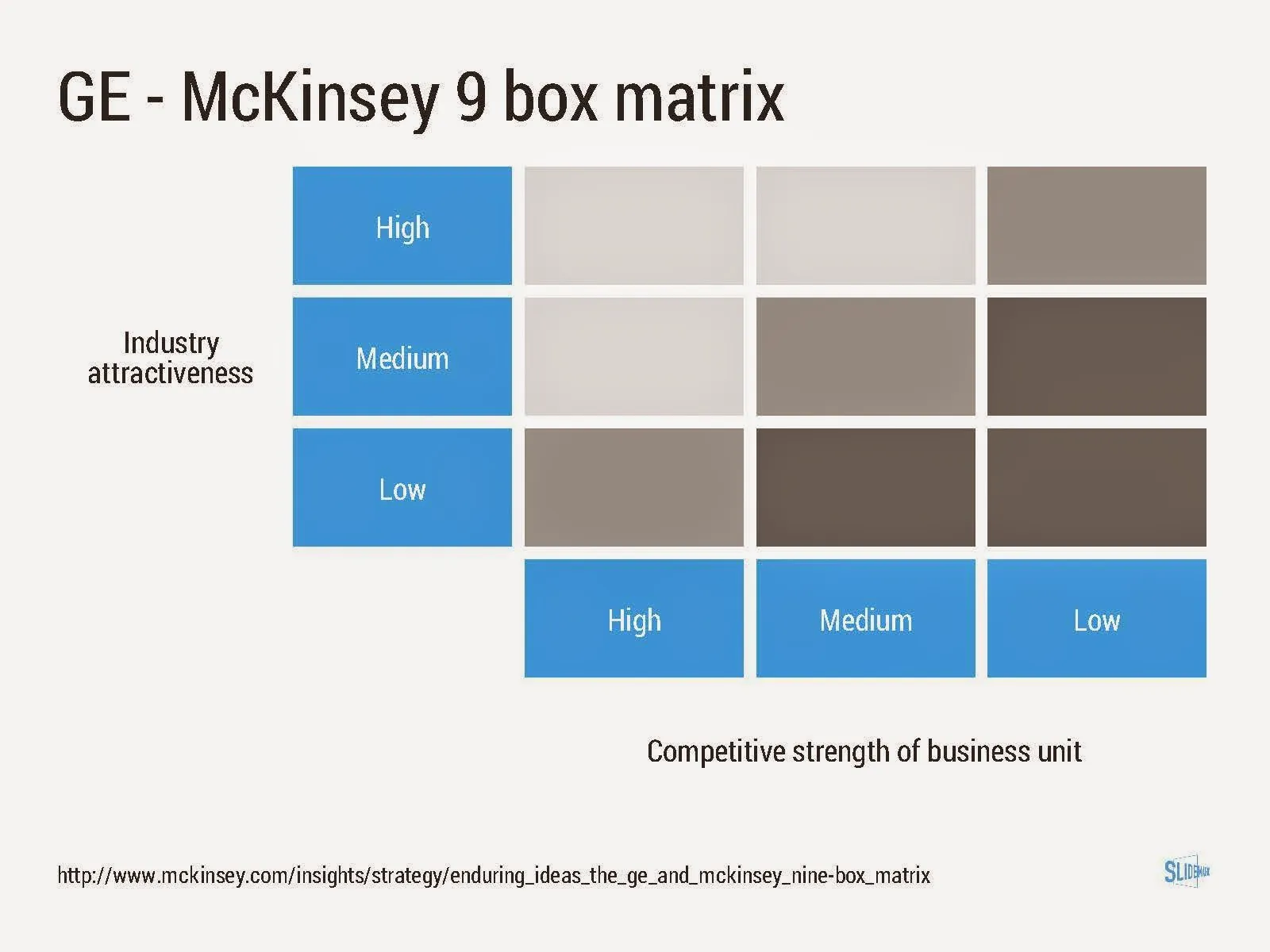
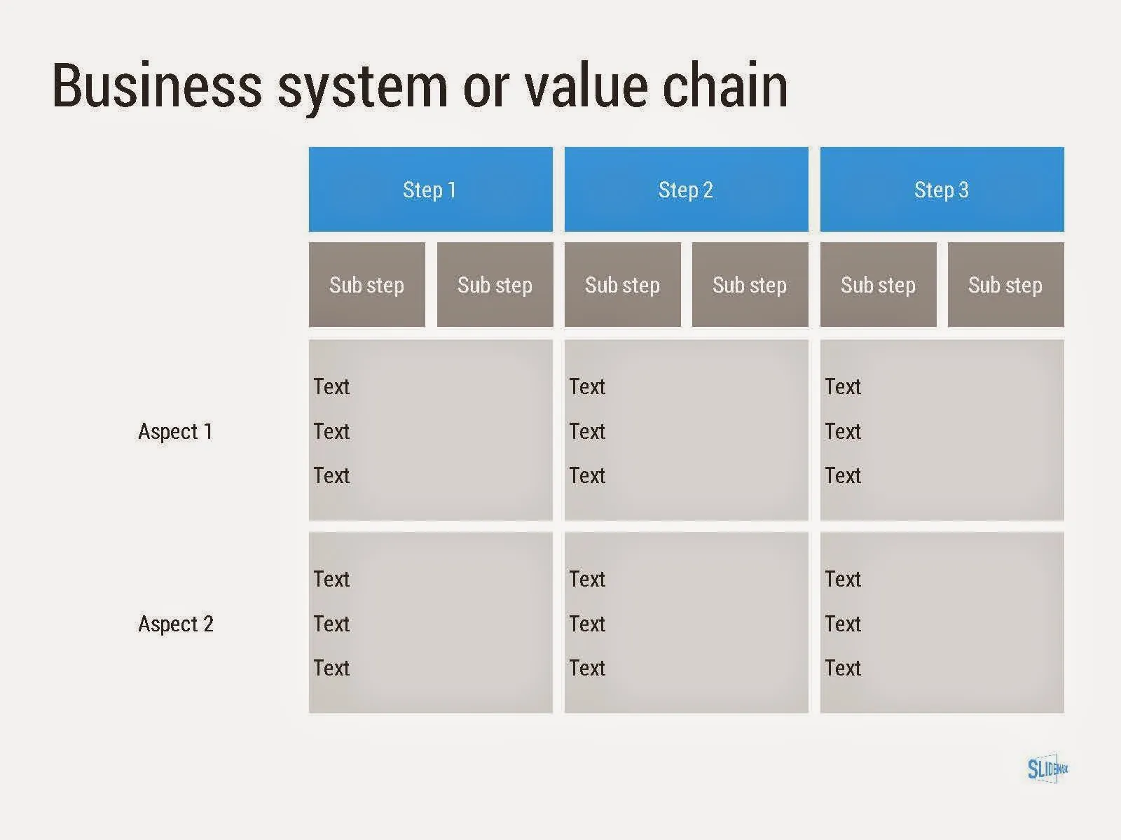
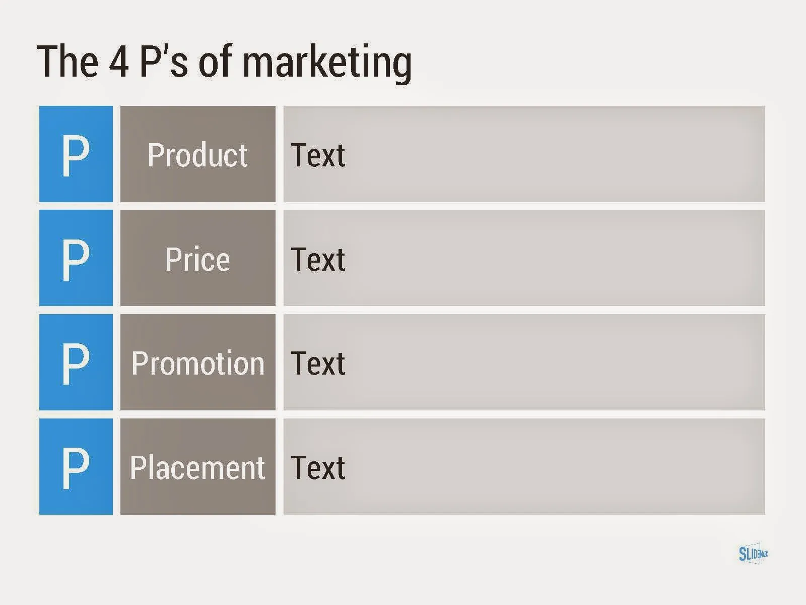
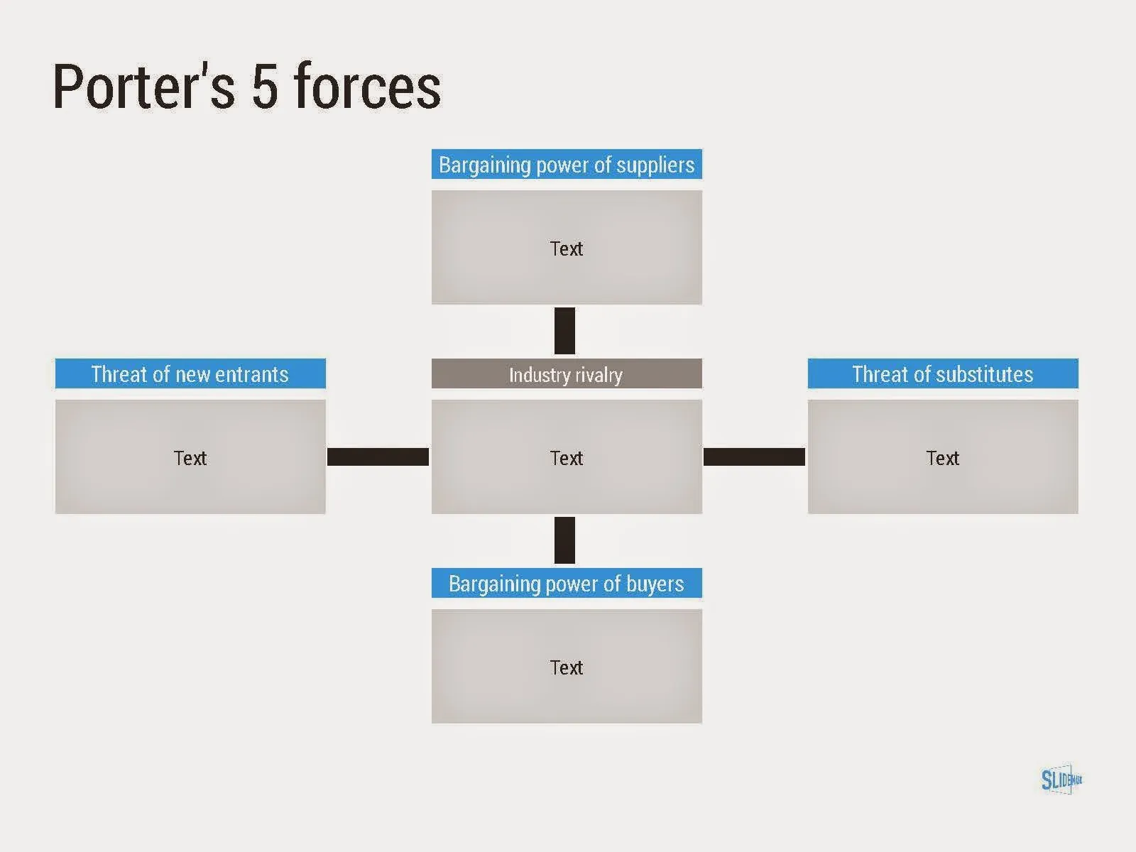
Consulting frameworks

I added a new set of templates to my presentation design app SlideMagic: consulting frameworks. It was an interesting journey back in time (I used to work for 10 years at McKinsey back in the 1990s).

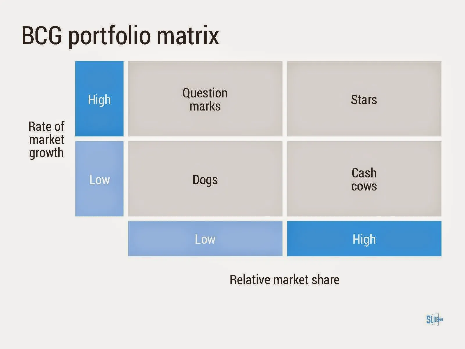
Putting them in SlideMagic was interesting, it shows exactly what SlideMagic is supposed to do for business presentations. Take unnecessary complexity out of visual designs down to a level that the chart still says what it needs to say, but that you do not need to have a degree in graphics design to make them. I had to make slight deviations from the original here and there (Both SlideMagic and layman designers do not like curved shapes for example), but the end result is pretty good.

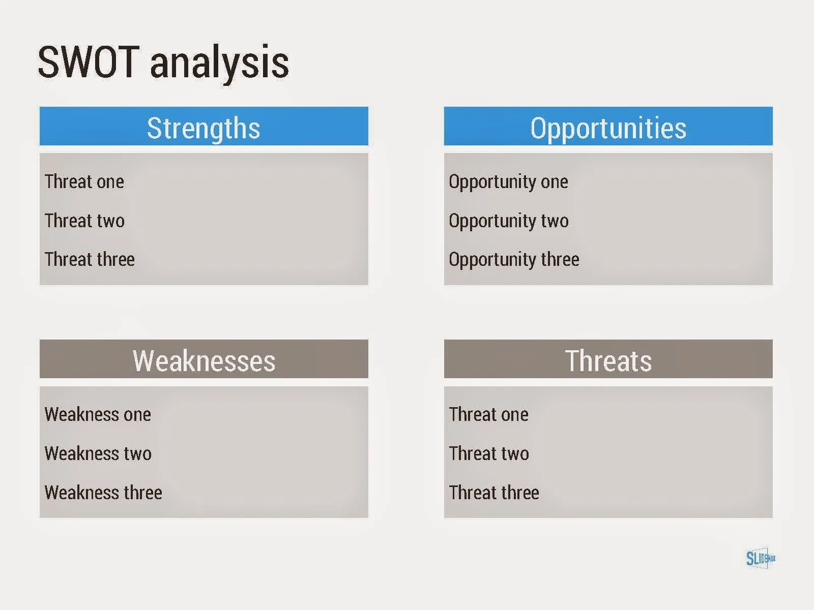
As to the content of these frameworks. They are more tools to help you think about a problem than slides that will get your audience jumping out of their chairs. Many of them are linked to classic micro-economics theory (demand/supply/competition). I think the strategic issues of many companies today have moved beyond these problems. Still some frameworks can work to kick start a discussion, they good old SWOT works great in group white board discussions.

·Design

How did you get there?

Many people who read this blog are considering a career in the world of presentation design themselves, I get many questions about how I got to be who I am today professionally.

The answer: it happened somehow over many years, there was no deliberate career planning. Once I was free from a big corporate structure, you can shape the projects you choose to work on. Finding the first projects was hard, and the work I did closely resembled my strategy consulting work at McKinsey.

When you build up your initial base of happy clients, words start spreading and you get increasing freedom to pick those project that interest you. There is a reinforcing loop here: you do your best work in the type of projects you like, which gives you more demand for more projects you like. In my case, I loved presentation design work, and the prize was: more pie.

But. This transformation took years. It required a certain skill base to start off with (10 years of work experience in consulting in my case). At first, you get highly unpredictable income. As a freelancer, you need to like working on your own. A super-specialised freelance business is hard to scale beyond increasing pricing. (See Seth Godin on dumbing down/scaling up, I smarted up and scaled down).