

A saw a slide by my former employer coming by:
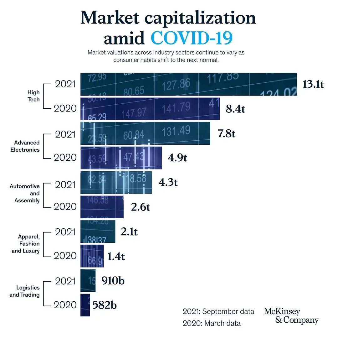
It has a very sophisticated image effect: look how the background of the bars in the chart are part of one image. Still, there is room for improvement. I quickly replicated the chart in SlideMagic with a few changes.
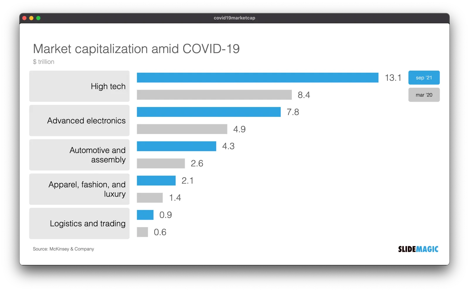
- I brought back the more traditional, very in-your-face alternate coloring of the bars, blue for 2021, grey for 2020 and a legend, instead of the repetitive text labels with the years.
- I increased the size of the industry sector labels
- By replacing 910b and 582b by 0.9 and 0.6, I could get rid of the “t” and “b” in the bar label.
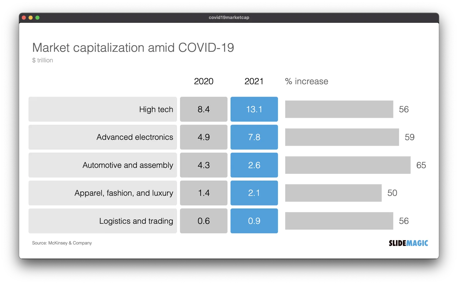
But the analysis of the slide can be pushed further. The main point of the slide is how markets have bounced back over the past year, which is independent of the ranking of the market capitalizations of the sectors. As an alternative, I constructed the combined table/bar chart below, de-emphasizing the absolute value of the market capitalizations, and using the bar chart to highlight the % increase in market valuation. The inside here is that all sectors grew more or less the same over the last year (except fashion, probably reflecting less dressing up for work.
I have added the slide to the SlideMagic slide library, look for “COVID” and they will show up. Emails subscribers: if the slide images don’t show up in the email, please open the link to the full blog post.