SlideMagic Blog

Frequent updates about all things presentations since 2008. Subscribe to never miss a post.

RSS
all posts

Category McKinsey

·Keynote

3 things with 3 things each

Management consulting stories are always divided in 3 or 5 components (optimally starting with the same letter), and each of these is then divided into 3 sub components as well.

Connect, communicate, control. And to achieve connect we need to aggregate, accumulate, and accelerate. This works reasonably well in documents for reading (if the verbs are chosen meaningfully and not using a dictionary looking for words starting with C).

Verbal pitches are a bit different though. A human, person-to-person story is flatter, more linear. It is hard to go up one level, down to the second point if we do not have the hierarchical structure in front of us. Also, using too many words that start with a C make you sound like a consulting report, not like a genuine speaker.

Listen to yourself: if it sounds wrong it probably is wrong.
·Keynote

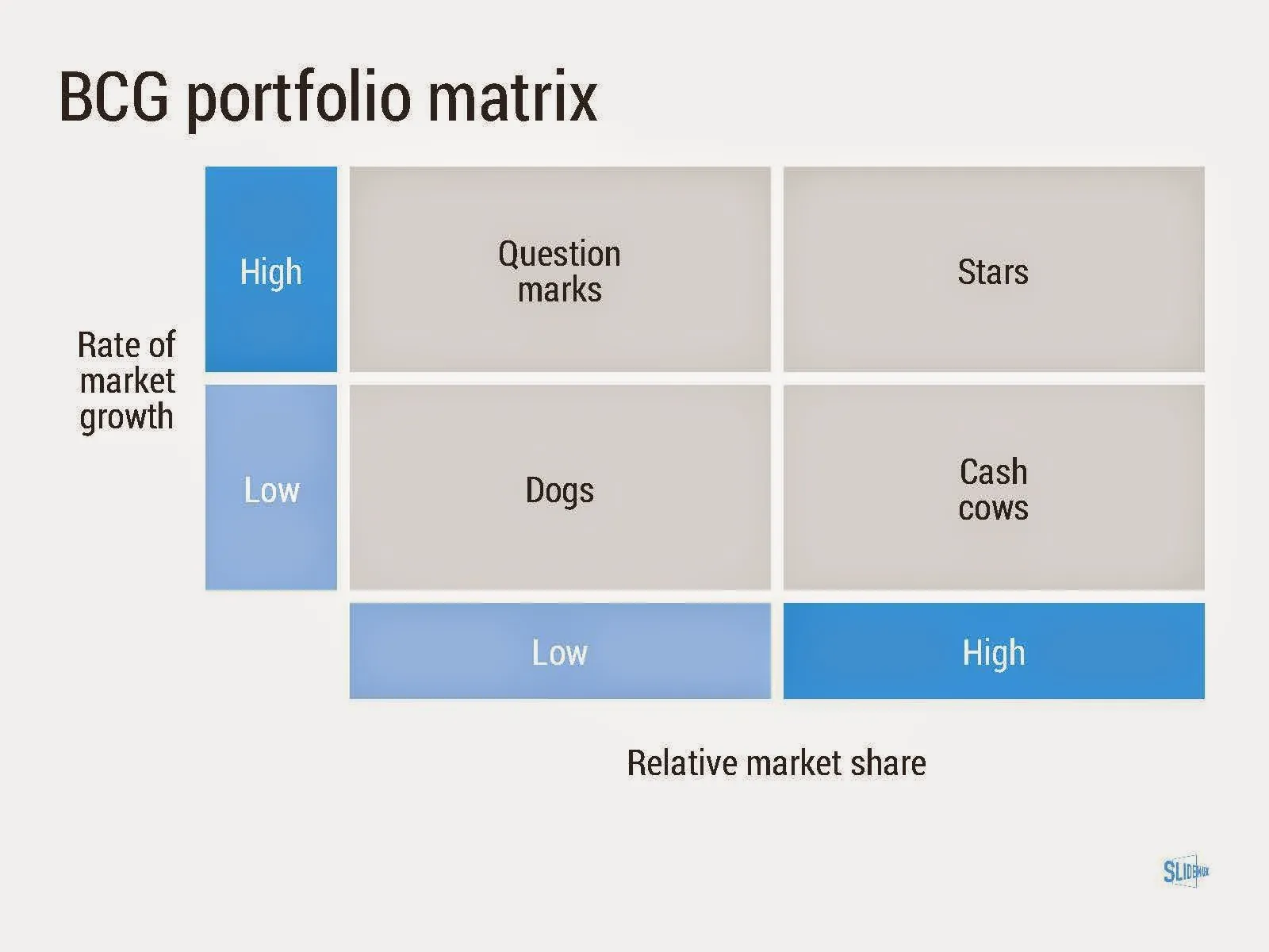
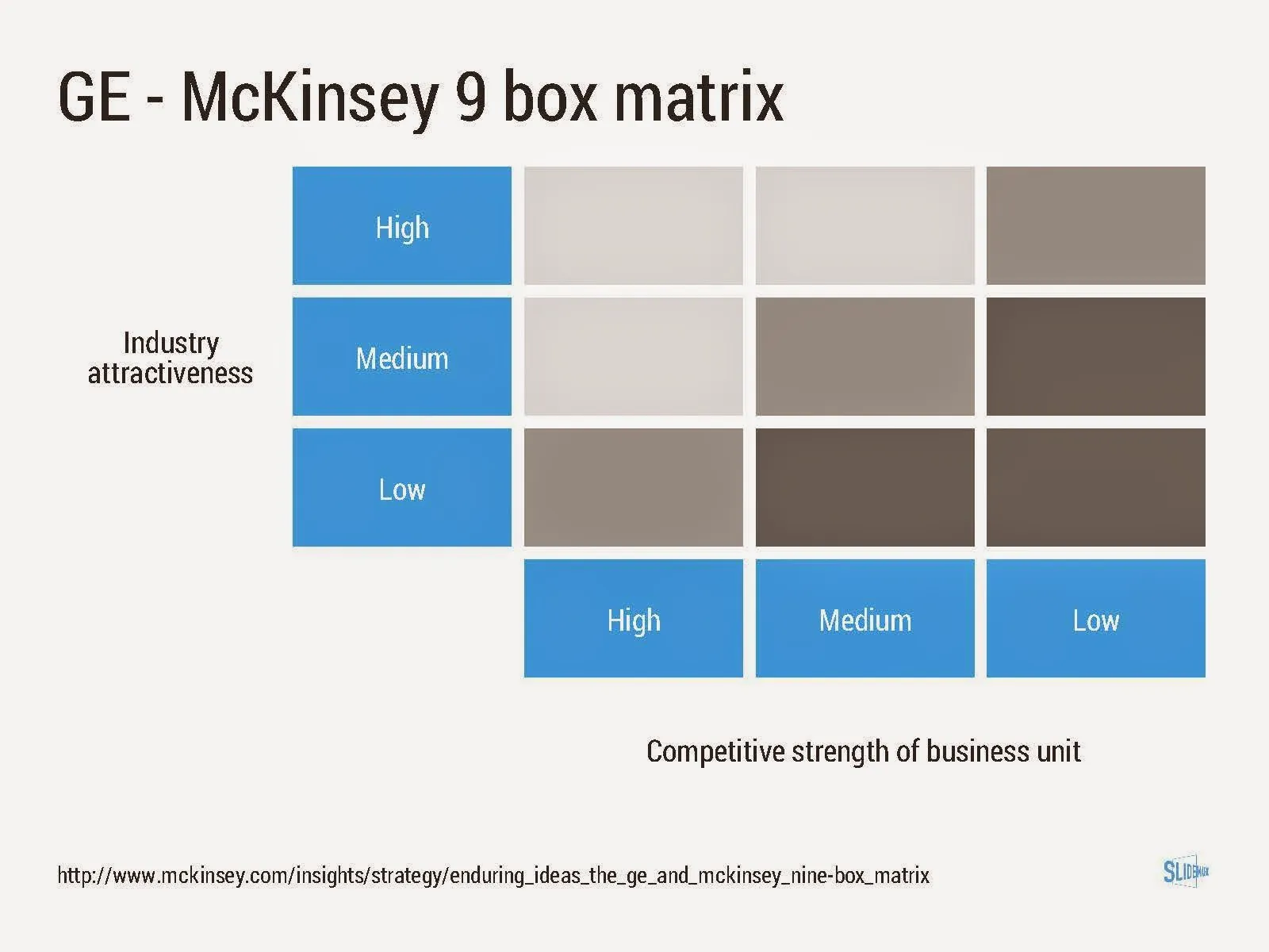
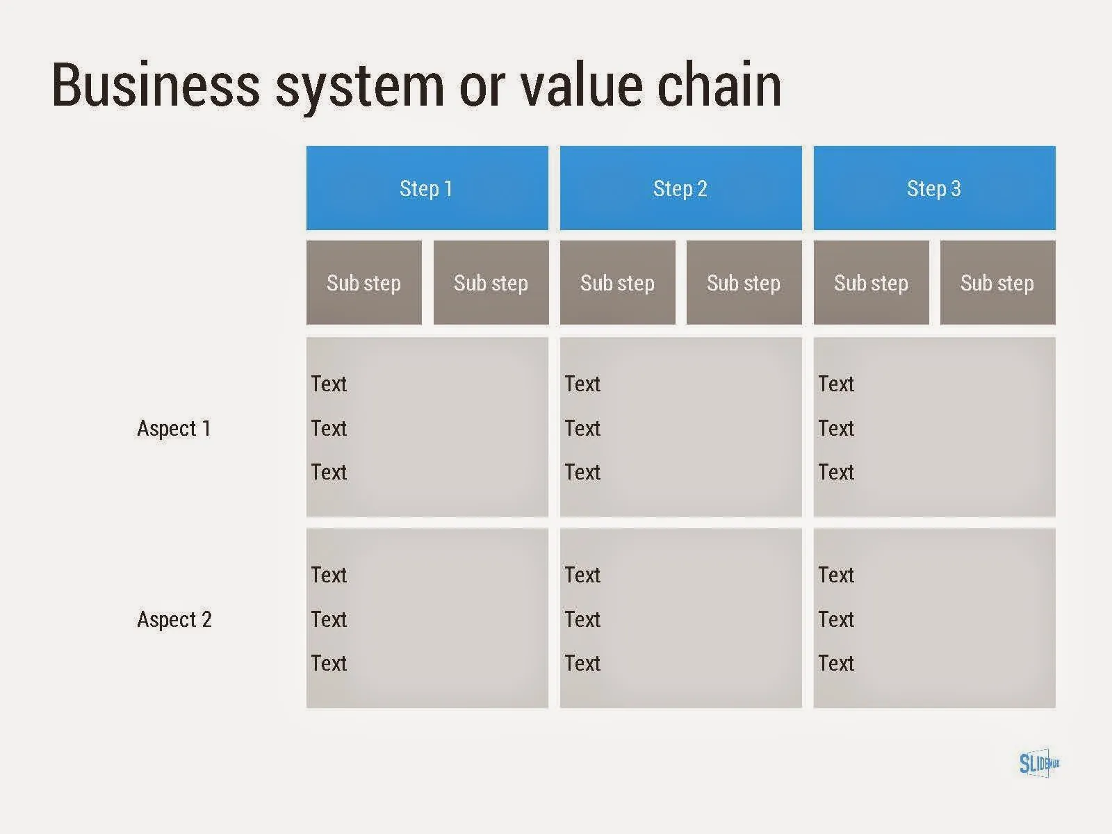
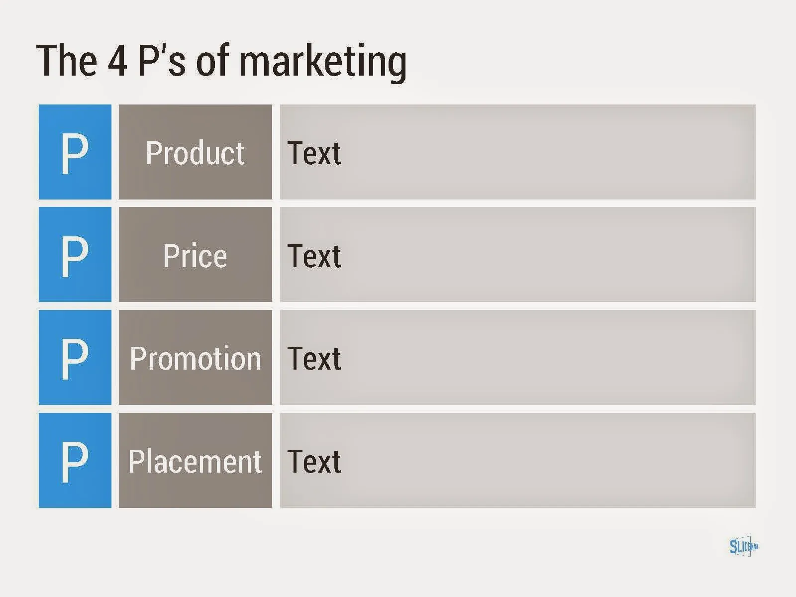
Consulting frameworks

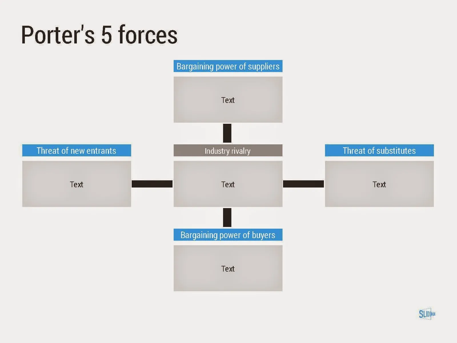
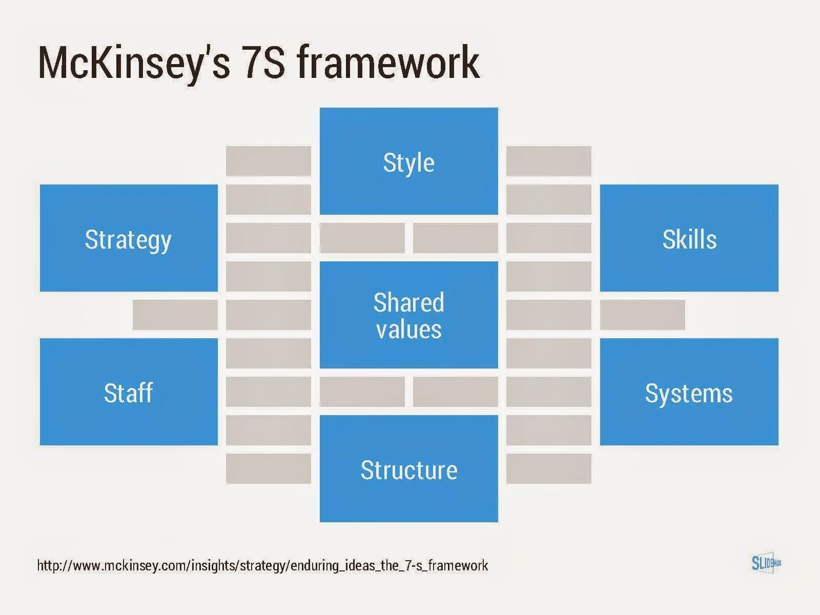
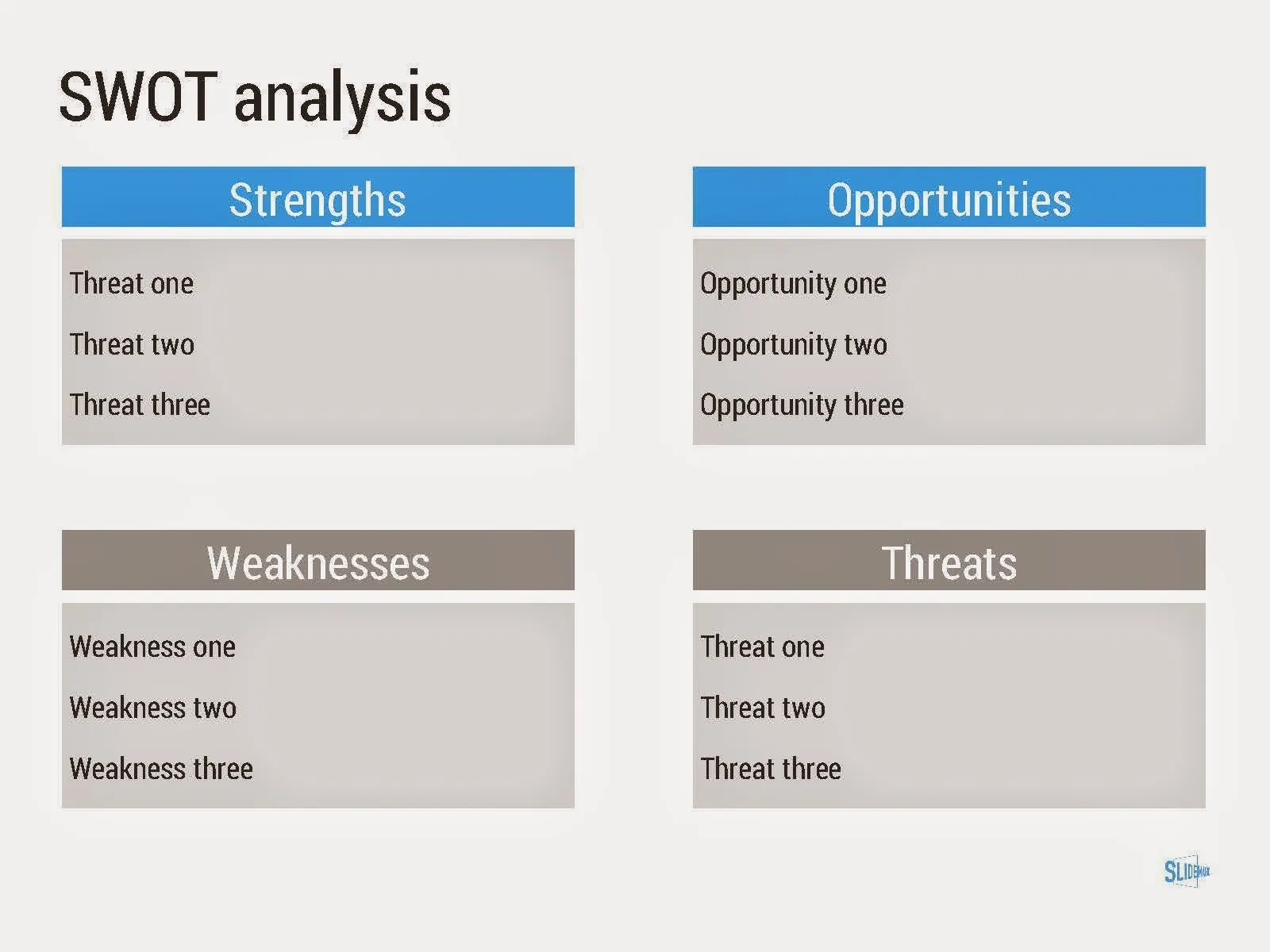
I added a new set of templates to my presentation design app SlideMagic: consulting frameworks. It was an interesting journey back in time (I used to work for 10 years at McKinsey back in the 1990s).

Putting them in SlideMagic was interesting, it shows exactly what SlideMagic is supposed to do for business presentations. Take unnecessary complexity out of visual designs down to a level that the chart still says what it needs to say, but that you do not need to have a degree in graphics design to make them. I had to make slight deviations from the original here and there (Both SlideMagic and layman designers do not like curved shapes for example), but the end result is pretty good.

As to the content of these frameworks. They are more tools to help you think about a problem than slides that will get your audience jumping out of their chairs. Many of them are linked to classic micro-economics theory (demand/supply/competition). I think the strategic issues of many companies today have moved beyond these problems. Still some frameworks can work to kick start a discussion, they good old SWOT works great in group white board discussions.

·Design

How did you get there?

Many people who read this blog are considering a career in the world of presentation design themselves, I get many questions about how I got to be who I am today professionally.

The answer: it happened somehow over many years, there was no deliberate career planning. Once I was free from a big corporate structure, you can shape the projects you choose to work on. Finding the first projects was hard, and the work I did closely resembled my strategy consulting work at McKinsey.

When you build up your initial base of happy clients, words start spreading and you get increasing freedom to pick those project that interest you. There is a reinforcing loop here: you do your best work in the type of projects you like, which gives you more demand for more projects you like. In my case, I loved presentation design work, and the prize was: more pie.

But. This transformation took years. It required a certain skill base to start off with (10 years of work experience in consulting in my case). At first, you get highly unpredictable income. As a freelancer, you need to like working on your own. A super-specialised freelance business is hard to scale beyond increasing pricing. (See Seth Godin on dumbing down/scaling up, I smarted up and scaled down).

·Keynote

Do you have it all?

Business presentation design requirers a combination of skills:

  1. Content story: the strategy consultant. Somehow all the raw material, content need to be in place. All in a logical order, no holes, no overlaps, all the items of check list need to be ticked off: need/problem, solution, market, competitors, business model, financials, etc. etc.
  2. Slide layout: the designer. Colours, fonts, look and feel, white space, layout, image cropping/scaling/positioning, diagramming.
  3. Data visualisation: the strategy consultant. Challenge one: pick the right message you want to emphasise from the thousands of options that a data set gives you. Challenge two: actually emphasise it with the right chart, the right colours, the right rounding.
  4. Pitch story: the movie director. Now take all the structured, analytical, and boring base material, and turn it into an exciting, emotional, convincing 20 minute pitch. (Note the difference between content story and pitch story)
  5. Outside reality check: seasoned business executive. What are the weaknesses in the story, what are the difficult (and/or obvious) questions the audience will ask, what elements of the story are totally obvious?

I was trained in 1 and 3, got 5 through the years, taught myself 2 (clean, good enough, but not at the level of a master illustrator), and trying my best at 4.

Many professional designers in the market will lack 1, 3, and 5: but they will still do fabulous work on presentations that have less hard core business content.

Many corporate executives lack 2, 3, and 4. They also will have trouble with number 5: being able to look at their story from a true outside perspective.

Continue reading →
·Data visualization

Data backups

A good presentation uses very simple data charts. Often, in the last minute, changes are made to the data: it is easy to change a number in PowerPoint here and there.

In most cases the first versions of these simple data charts were extracted from very complicated Excel sheets. And here is where the trouble starts. After a few PowerPoint iterations, the presentation and the backup model is no longer consistent. This is fine if the presentation was a one-off event, but most of the time, the Excel model will live on for future iterations.

The solution is to include a worksheet in your Excel model that pulls the data exactly as it goes in your charts. Put in the correct rounding, everything. Anyone who wants to change the numbers, need to make changes in the Excel model to get the numbers to change.

And yes, sometimes that might involve a goal seek.

If these charts frequently change, you might even consider designing a presentation in Excel. Excel has the same chart and shape design tools as PowerPoint, and you can create direct links between charts and work sheets without having to copy things across. See a previous post (2009) on this technique.

·Keynote

Templates -> boredom

In big corporates, preparations for an important presentation often start with one person preparing the template for the presentation, emailing it around to all relevant business units to be filled out. The final presentation design is simply a matter of slapping the filled in templates together into one big, boring, 30MB, 200 page, 10-hour slide deck.

I am repeating my hobby horse here, this presentation is the problem solving deck that contains all the relevant data. The challenge now is to distill from all that information a compelling story. And that story might well have a different structure/flow for each business unit.

So, my suggested process:

  1. Yes, create that template, send it out
  2. Create the monster file, clean it up
  3. Have a conference call with each of the business units about the data
  4. Then, give them freedom to express their story in their own way, with their own slides, within a strict time constraint
  5. Share the monster document as backup/bed time reading

The word template can have 2 meanings. One is the standard background layout of a slide (many use banners, logos, and other graphics, I mostly use a white page), and the second one is a series of tables and data charts without numbers and/or words in them. In this post I refer to the latter.

·Keynote

Content before structure

The other day I had a potential client on the phone who was under time pressure. She asked me whether I could work on the structure/framework of the presentation (and the template) while in parallel they would start filling things in.

When you start a project and need to cut up work among multiple team members, a skeleton or presentation framework can be really helpful: someone works on the market, someone works on the competition, while someone else takes on the financials.

When you get to the stage where you have to present your conclusions to others (i.e., the analytical work is done), putting structure before content is wrong. As a presentation designer you need to know the content first, translate that into a story, and in the process you come up with a structure which is engaging and convincing, a structure that often will deviate from business school presentation templates, consulting pyramid structures and other logical frameworks.

Problem solving: structure first, then content. Convincing: content first, then structure.

·Keynote

Consolidation chart

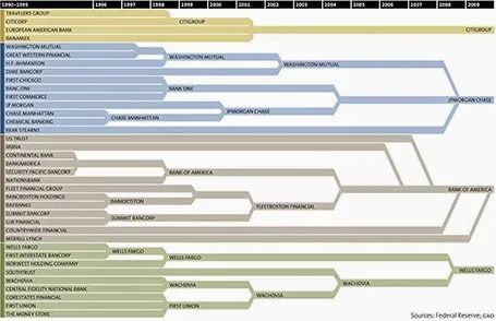
This is a nice way to show consolidation in an industry. You can digest the chart in 2 ways: on the podium you see the big picture of consolidating financial institutions, reading in close-up on the screen, you can see the details. The chart could have been better if the width of the arrows would represent the assets under management of the banks, some of these acquisitions were bigger than others.

[Off topic] There is a populist discussion going on in the comments of the original post. I did a lot of strategy work in banking mergers and there are different ways to look at the concentration in an industry. The top level player count is an easy statistic, but what is more relevant is the choice that customers (especially small businesses) have on the ground. How many different bank branches are within a 10km range at any point in the US? If there are 30 banks, but each concentrate on a specific state, then the market looks very competitive, but on the ground, customers face a monopoly. On the other, if all 4 banks are represented in most small villages, the market could be competitive.

·Data visualization

Boring frameworks

If your business has 15 sales channels, it makes sense to review their performance using the same framework: easy to compare, and you make sure that you are covering everything that needs to be covered.

If you work with management consultants, you will notice that they love this approach. You get presented with a framework, asked to fill it out and then - here is the mistake - the 15 analyses are put on the overhead projector for a nice morning-filling channel performance review session.

Analysis slides are not the same as presentation slides. Keep the boring, structured deck as reference material. But, when presenting: try to break the logical structure. Focus on what is different, remarkable, requires attention. And since each of the 15 channels are different, you will find that these stories do not fit into one framework.

·Keynote

How did she spot that?

When I just started out as a junior analyst at McKinsey I always wondered how my project manager was able to spot a mistake or inconsistency in my slides in a second. I had been working on this all night (sometimes literally), build all the spreadsheets, mastered all the detail, and in she comes and says after a few seconds: “that number looks wrong to me”, and yes, there was a bug in my analysis.

The secret is take some distance from your work. Look through the slides without connecting them to your Excel sheet. Sales numbers on page 3, should be the same as sales numbers on page 16. A soft drink can is unlikely to cost $50. Simple checks and a cool head.

If you do not check your slides, your manager, or your client will for sure.