SlideMagic Blog

Frequent updates about all things presentations since 2008. Subscribe to never miss a post.

RSS
all posts

Category Design

·Design

It's just a draft

When quickly putting a draft presentation together, it is tempting to not spend any effort at all on design and layout. “We can always fix that later”.

I would argue the opposite. Make the draft look as good as the final product will be. It sets the entire mood for the project. Looking at messy / ugly charts is not a big motivation to do great work. Messy / ugly charts encourage people to add bullet point and too much text, because you can always remove it later.

The good news is that a simple chart with simple content does not take a lot of effort to design properly. Fix proportions, alignment and colors and everything looks great in a few clicks.

(Pro-tip: use SlideMagic for your draft documents)

·Design

Parking allowed?

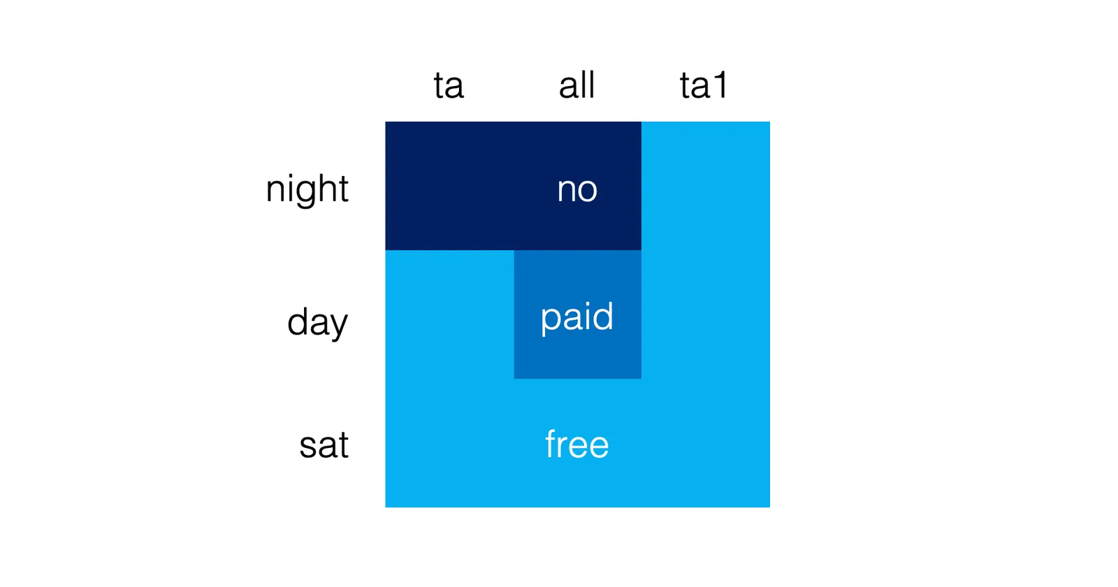
Tel Aviv is trying to improve the clarity of their parking signs, who can park when. The sign below is the new format. (If you do not read Hebrew, you will get tickets…)

I would have gone for a much simpler shape that would make the table easier to read. Here is a sketch (obviously not a final design)

Put all the details (hours of day and night, etc.) in a dense footnote at the bottom. Once you have read the footnote once, you can just glance at the shape anywhere in the city and now what you are up to.

My guess is that the detailed table with explicit instructions was selected to make it easer to deal with law suits of people disputing their tickets.

·Culture

Design culture

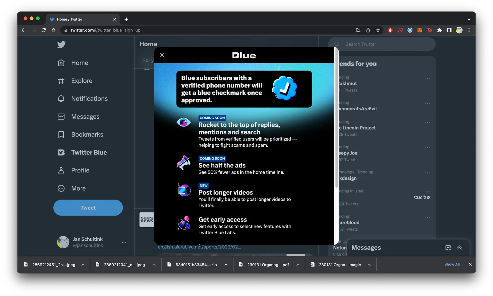
It is tricky to get a big company all aligned behind one consistent approach to design. Twitter is going through a lot changes: changes in strategy, changes in people, etc. You can see it in inconsistencies in the web site. Colors, language, layout, icons, other design elements, etc…

·Design

How do people glance over a corporate web site?

There is a lot of science and analytics available for eCommerce web sites. Changes in layout, design, and content immediately translate into changes in clicks and sales. The story is a bit different for a corporate web site that is not transactional, it does not sell anything, it does not have a big signup button, but plays the role of a digital business card for a company. Let’s say the first web site of a startup aimed at investors and the first enterprise customers.

Some things to look at:

  • The most important aspect is probably the look and feel of the site, regardless of the content. Does it look professional and serious (as in of a serious company). If that funky or complex graphic somehow does not look quite right and you can’t put your finger on the spot why, take it out. A professional looking simple graphic is always better than a botched attempt at a complex one. Make sure that copyright year is the current one.
  • This seems obvious, but is often lacking, the site should actually state what it is you do. Try it on people that have no background at all in the market you work in, try it on people that love to put you in well known boxes (i.e., venture capitalists)
  • Different companies need to emphasize different things. For most companies, the founding team and its head shots will be buried in some ‘about’ section of the web site, for very early stage startups, it might need to feature prominently on the first page since it is basically the only asset it has.
  • No one reads a web site top to bottom like a newspaper article. Instead, people glance. Read a headline, look a the small text below a photo, read a random paragraph. Don’t arrange content in order of importance solely, but think about the visual hierarchy. A small picture might grab more attention than the big cliche headline.
  • It is tempting to lift stories from presentations and translate them to the web site. The founding story of how it all began to where you are now including that big pivot in 2020, the market gap analysis that is the start of your investor pitch deck. These stories need a place, but maybe not on the home page of your web page.
  • Avoid jargon. “Ah, this site is filled with blah blah” and people will stop reading. But do include language that is common in the industry you are working in.
  • Make sure that the site has the details that should be there: contact details, etc.
·Design

Car dashboards

I grabbed this screenshot of the evolution of dashboard design in Mercedes cars (can’t find the source anymore). I think the fake “analogue” looking displays do not look good at all in modern cars. On top of that, information that you don’t always need is screaming at you. combined with shiny interior materials and LED lighting makes the whole cabin look cheap. It does not look good today, for but will for sure age pretty poorly.

(The first one though would look a lot better without the wooden background though).

·Design

Perceived quality

The real quality of a car is expressed in how little time it spends in the repair shop. You are unlikely to be able to figure this out in the showroom, or in a test drive. Problems will only show up after a few months of driving.

The perceived quality of a car is a different story. The sound of a door closing, little rattles. They might have nothing to do with the actual quality of the car, but have a huge impact on how we perceive things.

Car manufacturers spend a lot of time and money on ironing out this little imperfections. Testing, testing, and testing at different speeds, different surfaces. As soon as the tiniest noise is heard, take out the statoscope (the passenger tester), locate the sound source and fix things. (A heavier material, some padding, a different screw).

There is a parallel here for your slide deck. The actual quality of the raw story, and the perceived quality of its presentation.

·Design

Should the fonts of your logo and presentation match?

No.

Now that mobile devices are becoming the dominant screen on which we look at brands, more and more logos become text-based. The font is the key design aspect of the logo. To set your whole presentation in a funky font would not make sense.

Having said that, the fonts of your presentation and the logo are very close, but just a bit different, a design nerd might find it bothersome. (Arial - Helvetica for example). This would only be an issue for big, bold headlines. Though.

Some brands do force the match between logo font and text font. Think of the ads produced by the Absolut Vodka brand. Slogans and headlines are in Extra Bold Futura Condensed all caps and it matches the brand exactly.

·Design

Black flags

Many visual identities use a dark or even black background. It looks great on web sites, or presentation slides, or print ads, even billboards. One place where it does not work: flags. Flags should be happy and/or vibrant. A row of black ones looks depressing and even scary.

If your identity does not have any happy colours: go for black on white which should work fine.

·Design

A sense of space

Consistency between slides is important in your presentation. There are the obvious elements that need to be consistent: fonts, layout, colours, etc. But also pay attention to more subtle ones in images. Color vs B&W, and the style of images. Peaceful landscapes, busy ‘real’ images, threatening thunder clouds, stylised super stock photo model images, “funny” face expressions, etc. etc.

Modern movies are a good analogy. In the good old days, movies would be filmed on an actual location. The story is set in a city, village, a house, a place where characters roam around and visit places from multiple angles all the time. Bit by bit, you start to understand the space in which the story is et.

New technology allows you to create pretty much any movie background you want, projected behind actors saying their lines in front of green screens. The result is that that sense of place is lost. The movie is set against a series of random backgrounds that do not seem connected. High resolution screens emphasize the disconnect between characters in the foreground, and the backgrounds. Something does not seem right…

Interestingly, I do not find this effect with classic cartoons, with totally artificial backgrounds, but the whole story seems cohesive

·Design

Furniture ads

Why does furniture always look great in ads? The beautiful castle or villa as its backdrop is only a small reason. The big visual trick is space: lots of it, not only square meters, but also very high ceilings.

Most houses and apartments are designed functionally, rooms with just enough space to put a sofa and chairs against the wall to sit a normal sized family with a few guests. If there is more floor space available, we tend to add rooms rather than giving the furniture more space to breathe.

The same is true for museums. Huge open spaces with big white, clutter-free walls. Paintings are made to look good in museums. Put that masterpiece (or a copy) on your kitchen wall, and it looks less impressive.

When making presentations, you are not constrained by white space, so add it freely.