SlideMagic Blog

Frequent updates about all things presentations since 2008. Subscribe to never miss a post.

RSS
all posts

Category Keynote

·Software

Microsoft VBA versus Applescript

I am dusting of my coding skills that were pretty much put on hold in the early 1990s and have started to program macros to automate the mechanics of the template store: creating individual slides and thumbnails for PowerPoint and Keynote in different aspect ratios of these design.

Things in the Microsoft Office ecosystem run smoothly (“VBA”), for Mac, a lot less so. Applescript is a language that aims to automate pretty much everything you can do in Mac OS. It has been around for a very long time, but it is falling short.

At first sight, the language looks very friendly, almost human-like. And here is a problem: human language is ambiguous. It is incredibly hard to use it to program computers. When I look at example Applescript code, it looks very easy to adjust and re-use, but it is an incredibly pain to get it actually working and iron out the last bugs. Writing macro scripts will never be something that the average Apple user will do, so you might as well stick to a programming language that an engineer can work with.

The second problem is the what Applescript can actually do. As Apple put development of Mac OS on the back burner and gave priority to its iOS devices, the functional power of Applescript has been watered down. Old tutorials online show functionality that has been removed in later versions of Keynote.

Now, I am not saying that all esoteric features should be supported in a scripting language, but I am struggling to get the most obvious and basic one that anyone wants to use a Keynote script for: batch conversion of PowerPoint files into Keynote.
Continue reading →
·Concepts

Creating an infinity symbol in PowerPoint

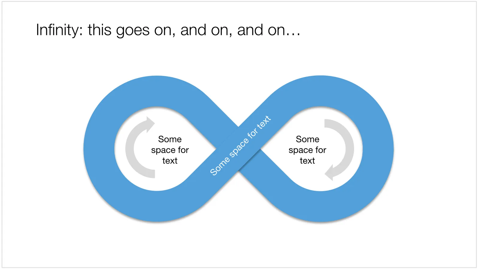
It is tricky to create an infinity symbol (or lemniscate) in PowerPoint, it is a shape that needs to overlap with itself and requires Escher-style (impossible) layering of shapes. The only way to do it is cheat, and construct the final shape of many individual shapes that are grouped together cleverly.

I managed to get it done, and you can see the final result here (hmm, those arrows point the wrong way around though):

 An infinity symbol in PowerPoint

An infinity symbol in PowerPoint

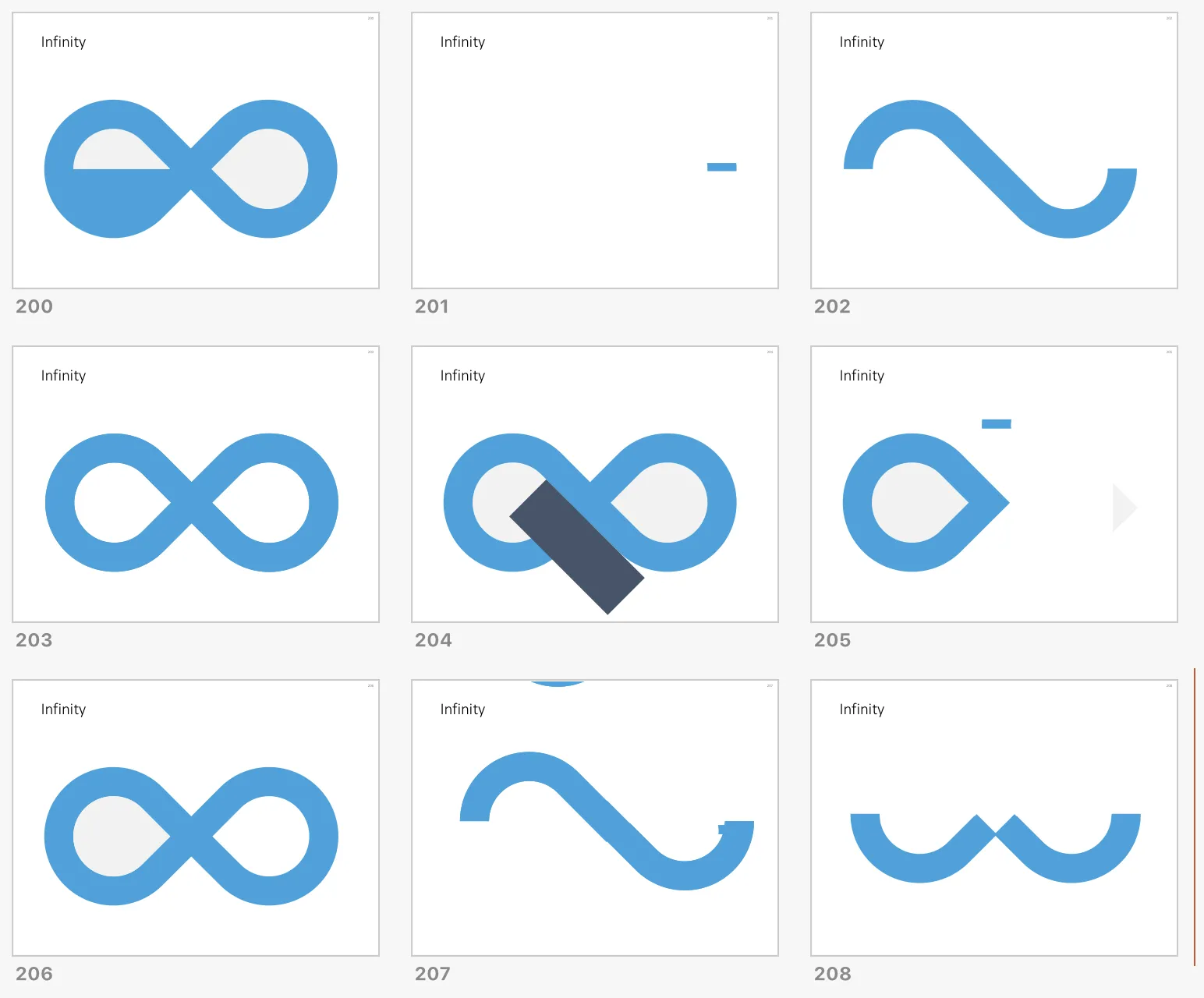
I don’t have the exact workflow anymore that I used (I made some destructive edits), but below is a screenshot of the PowerPoint file in slide sorter mode that I used to create the shape, starting with 2 circles and a square.

 How to create an infinity shape in PowerPoint

How to create an infinity shape in PowerPoint

This shape is useful to show concepts that keep on going, or loops that you can’t get out of. You can download the infinity symbol here, or find other slides with loops. There are Apple Keynote versions available as well.

Cover image by Mark Asthoff on Unsplash

·Concepts

PowerPoint vs Keynote in 2018

Over the past few days I converted all the slides in the SlideMagic store from PowerPoint 4:3 into PowerPoint 16:9, Keynote 4:3, and Keynote 16:9. That was quite a bit of conversion and uploading work… As a result I got an even better understanding of the differences between PowerPoint and Keynote. Here is the 2018 version of the comparison.

Overall both programs are excellent, as you would expect from software that has been around this long. Bugs have been ironed out, and both programs have “learned” from each other to get to a good workflow. So the differences are not that major.

Where PowerPoint is stronger

  • Workflow for advanced users. I can customise the top tool bar with the functions I use most (aligning, distributing, moving things to the back, etc. see my full list of toolbar short cuts here). Also in Keynote it can get confusing at high speed to change colours of text and shape fills, too many clicks, and too many opportunities to get it wrong. The interface looks elegant, but it slows you down.
  • Data chart editing is better in PowerPoint with the full power of Excel behind it
  • Stretching of (groups of) shapes is predictable in PowerPoint: you can distort aspect ratios. Keynote is more restricting and protects the novice designer with stretching images. But, it does the same for large groupings of objects, as soon as you have a few connectors inside, it is no longer possible to stretch complex diagrams across the page, without also increasing its height. This cost me a lot of time to clean up my flow chart template for example. I could not understand when Keynote decides it is OK to stretch, and when not.
  • Complex connector diagrams run more smoothly in PowerPoint. Keynote is “smarter” and helps you pick/decide/suggest possible connector lines between shapes, but because of that, it is harder to convince it to something you want against its own suggestion. In more complex diagrams this becomes a problem.
Continue reading →
·Concepts

Puzzle pieces in PowerPoint

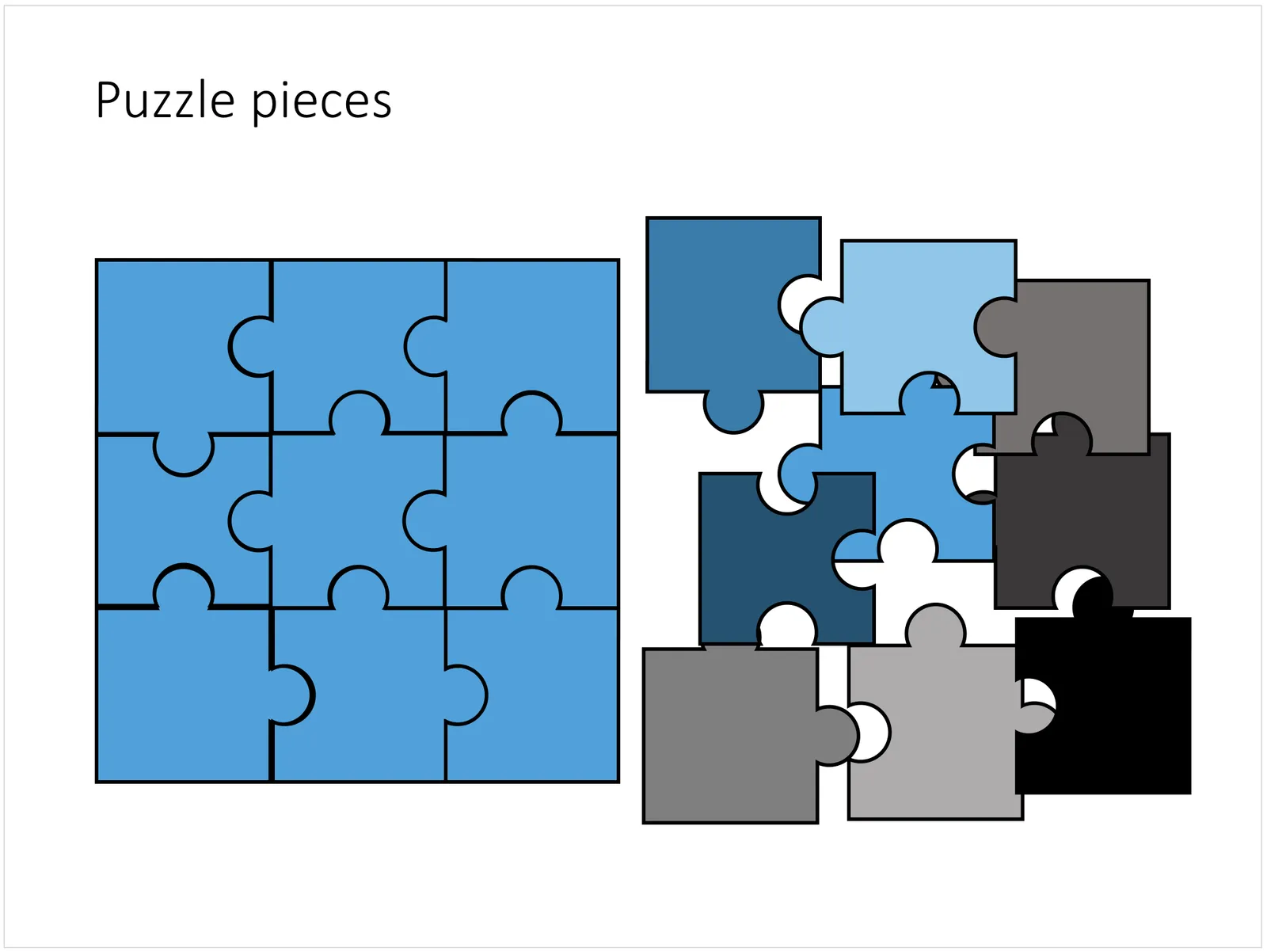
Although you could consider them a presentation cliché, puzzles can work really well in a presentation:

  • Show how things fit beautifully
  • Show how your are missing (hopefully just one) critical piece
  • Show that you finally managed to plug that last gap

Puzzle shapes can also work great when you use them in combination with images. You can go back to this blog post about making Photoshop-like image cut outs in PowerPoint.

Stock image sites are flooded with millions of puzzle piece designs, but they are not very practical for the average PowerPoint designer (especially late at night working for tomorrow’s deadline). Almost all these puzzles pieces are vector objects or images that are impossible to edit in PowerPoint. Moreover, all these puzzle pieces have wildly irregular shapes that make them hard to fit in your slide composition that requires exactly nine of them.

ThisPowerPoint puzzle slide solves the problem for you. The pieces inside are fully editable PowerPoint shapes, you can change their colour, you can put text in them, you can reconfigure and piece them together as you see fit. Yo’u can download the finished slide by clicking the image (An Apple Keynote version is available as well).

You can try to create the pieces yourself if you want, I used simple square shapes and circles, either joining or subtracting the shapes. Circles and squares might not be the most realistic shapes, but they are very practical when have to piece things together. There is a little bit of math homework to do to determine which type of puzzle shapes you actually need, and which ones you can create by rotating existing pieces.

·PowerPoint

Quote slides in presentations

Quotes can add credibility to your presentation. If experts, celebrities, and/or customers agree with you, you must be right. But, not all quotes have equal weight. They have been overused in many PowerPoint decks. (Anyone can find a picture of a serious-looking person and get her to say what you want her to say in a few mouse clicks).

Here is a check list:

  • The person needs to be relevant and credible (third tier social media “experts” do not carry much weight)
  • The person needs to be identifiable (“Senior marketing executive at major high tech firm” can be anyone and is most likely you)
  • The quote needs to be interesting, cut the buzzwords and marketing language, cut the cliches (“Wow,  these guys really have a targeted value proposition that resonates with my medium-term return on investment objectives”)
  • The text needs to be long enough that it is specific, and short enough that it reads like a headline. A full page of verbatim will not come across
  • The quote needs to be relevant, a generic motivational quote might not help close that enterprise software contract.

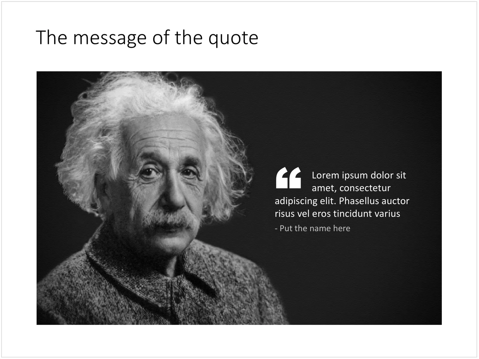
Quote slides are (and should be) pretty simple: a nice big image with a big text overlay. Still there are some things to watch out for. Below is a quote slide that I have added to the SlideMagic template store. Let’s go through the design process.

 A template for a quote slide

  • The image should have a calm background with enough “white” space for text. You don’t need to be a Photoshop guru to extend the background of an image in PowerPoint, it is easy to add a black or white box next to images. You can use the colour picker to match the precise colour, or use semi transparent overlays for the best effects
  • Make the quote symbol stand out. Regular quotes are too small, and the layout does not look good, as the quote pushes the start of the paragraph in. There are endless ways to do it and I settled on this one. One big quote at the beginning of the paragraph with a text indent. Take some time to find a quote in a good font. In the above slide, the text font is the Microsoft Office standard Calibri, but the quotes of this font don’t look that “fat”, I used Arial.
  • This slide is a framed image slide, which gives me the opportunity to add a big headline at the top of the slide with the main message (the headline can say “Customers are really happy”, the quote can say “With product [x], I no longer need to use a pencil”.
Continue reading →
·Concepts

Blue ocean strategy in a presentation

Most investor or sales presentation have some sort of slide about the competitive environment. (Here are earlier blog posts about how to present the competition). Usually, people use tables, or 2x2 / 3x3 matrices to show how they are different.

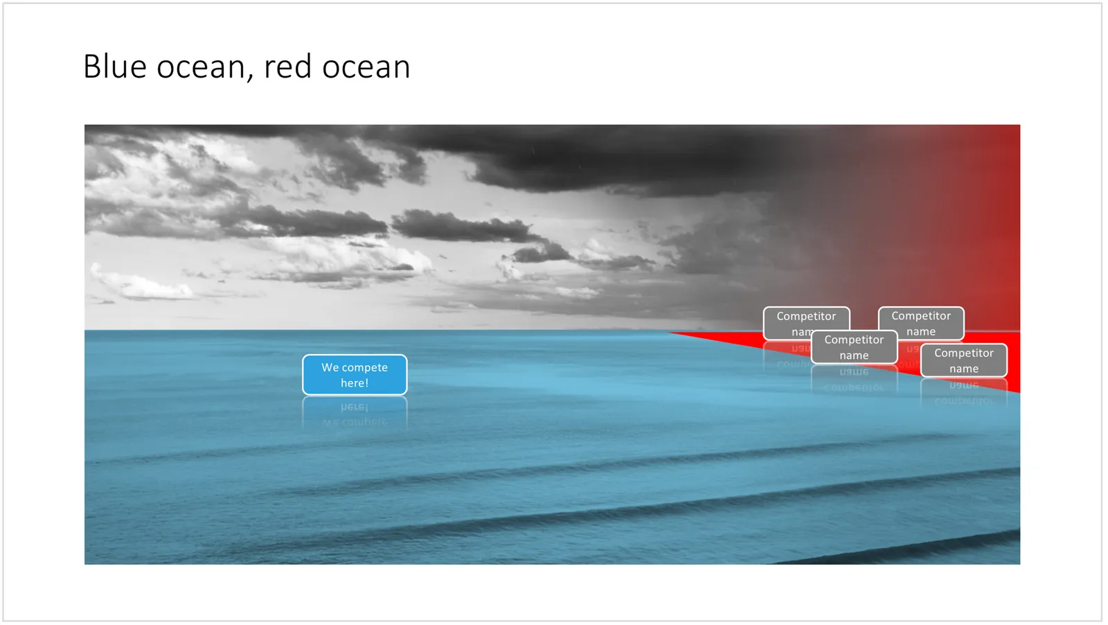
The chart below might a completely different take on the subject. The Blue Ocean strategy concept developed by INSEAD argues that is often better to define an entirely new market rather than battling with all the existing companies that go after well-established market segments. You can download the slide here.

 Visualise the competition using

Visualise the competition using “Blue Ocean Strategy” in a presentation

Cover image by Ishan @seefromthesky on Unsplash

·Concepts

Most templates now available for Apple Keynote

The template store now supports Apple Keynote, a drop down menu let’s you make a selection between your preferred presentation software. Not all templates could be converted, Keynote is missing the 3D shape rotation feature of PowerPoint that I used in some of the slides.

 The store now gives you the option to download templates either as a PowerPoint or Keynote file

The store now gives you the option to download templates either as a PowerPoint or Keynote file

 Slides in Keynote look the same except for the font

Slides in Keynote look the same except for the font

The only adjustment I made was the font: switching it from PowerPoint’s default Calibri to Helvetica Neue for  Keynote. I am keen to keep the look and feel of the charts as “standard” as possible to make it easy to integrate the design in the corporate presentation templates that people are using.

 Under pressure!

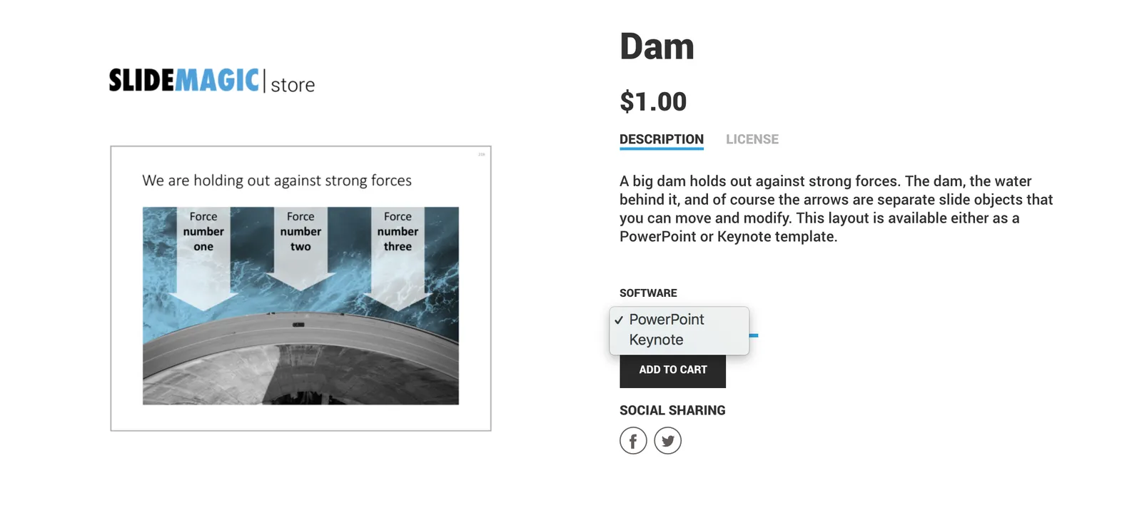
Under pressure!

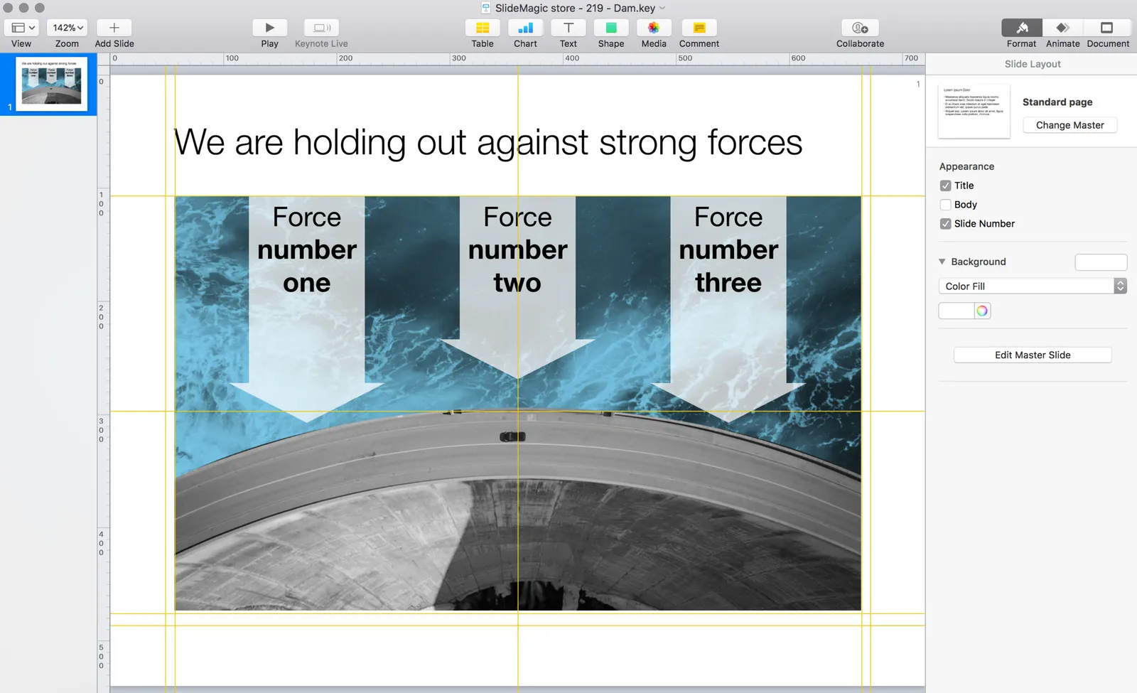
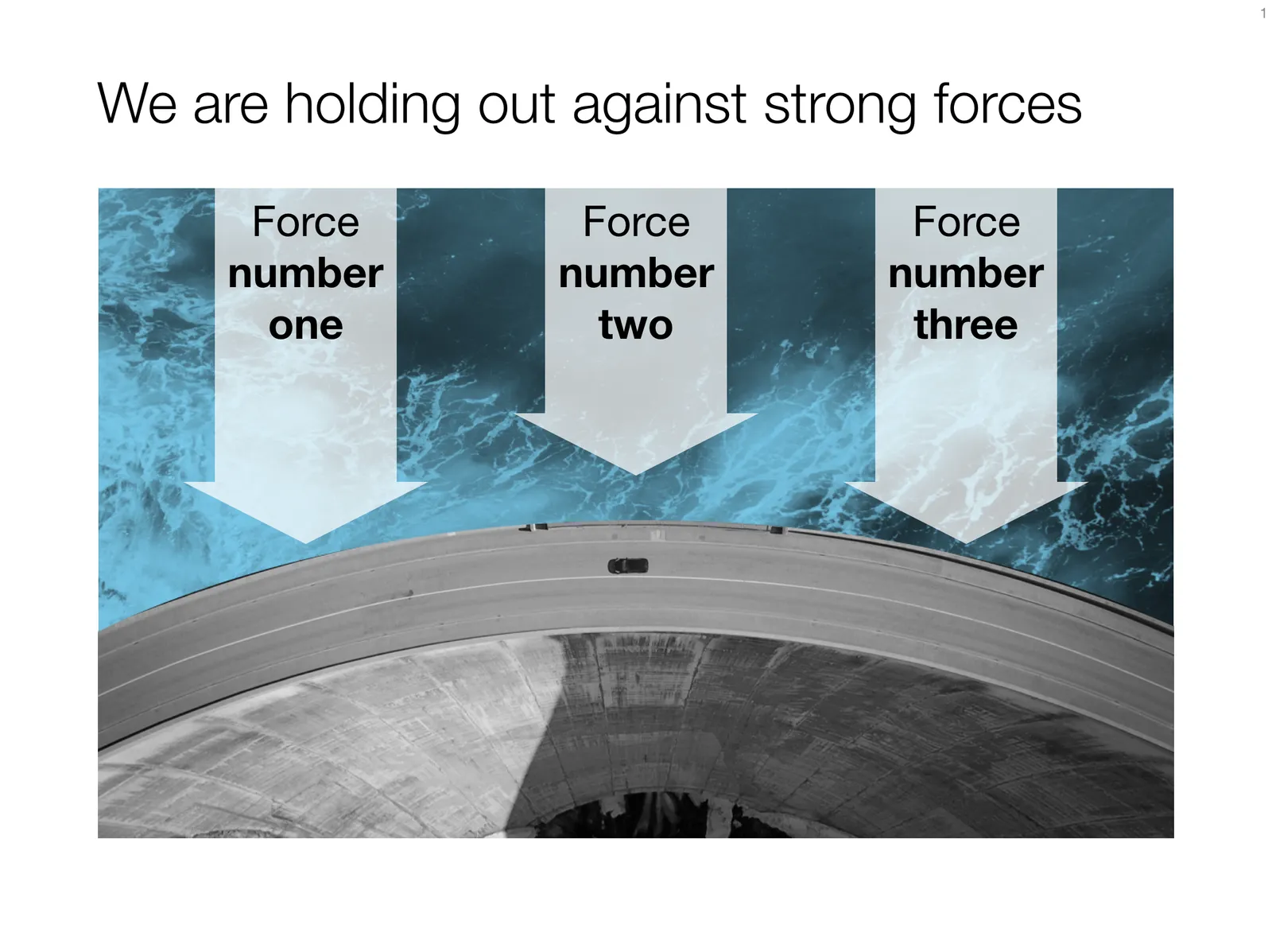
The slide above is a layering of 2 images that visualizes a big dam that is under pressure from something. You can use it either to show that something is about to burst, or the opposite, that defenses are strong and holding out well. I love the massive architectural scale of these hydro power installations, especially when you can highlight it with this tiny car driving across it. You can download this dam template here.

Looking for other visual concepts that are similar? You can try and search the store for “forces”, “down”, or this search “downward” and see what slides come up. That is my longer-term vision: no more boring bullet point charts, and no more searching for “where is that slide that I made 2 years ago”, but rather have all the relevant designs ready at your finger tips. The search engine with design ideas is almost as important as the actual design itself.

Continue reading →
·Data visualization

Rows or columns?

When designing a table there is always the question: which dimension to put in rows, and which in columns. Personally, I do what looks best, without applying any specific rules.

  • If one dimension has labels that are very long, I prefer to put them in rows
  • If one dimension has lots of data points, I tend to put them in rows (16:9 screens give more flexibility for wide designs though)
  • Years usually go in columns
  • Big options (1, 2, or 3) usually go in columns
  • Ranking different values usually is better vertically, it is easier to compare a column of numbers than have your eyes move across a row of numbers.

Art: Lyubov Popova, Air, Man, Space, 1912

Click here to subscribe to the blog

·Keynote

Text on 16:9

Many people think that the wide screen 16:9 format looks modern for presentations, a slide fills the entire LCD screen, rather than being framed by 2 black bars or worse: stretched/distorted while you cannot find the screen remote in the conference room.

There is a problem though. Widescreen was designed with movies in mind. For text it is a disaster. Even at a decent font size, there are too many words on a single line, it is hard to follow for the eye.

Solutions:

  1. Even bigger fonts
  2. Rather than list things vertically, try putting them in boxes that are horizontally spaced out
  3. Stick to 4:3 and find that sticky, dusty, old, remote control in the conference room (look for the ASP button)
·Keynote

3 things with 3 things each

Management consulting stories are always divided in 3 or 5 components (optimally starting with the same letter), and each of these is then divided into 3 sub components as well.

Connect, communicate, control. And to achieve connect we need to aggregate, accumulate, and accelerate. This works reasonably well in documents for reading (if the verbs are chosen meaningfully and not using a dictionary looking for words starting with C).

Verbal pitches are a bit different though. A human, person-to-person story is flatter, more linear. It is hard to go up one level, down to the second point if we do not have the hierarchical structure in front of us. Also, using too many words that start with a C make you sound like a consulting report, not like a genuine speaker.

Listen to yourself: if it sounds wrong it probably is wrong.