SlideMagic Blog

Frequent updates about all things presentations since 2008. Subscribe to never miss a post.

RSS
all posts

Category Layout

·Layout

Organized randomness

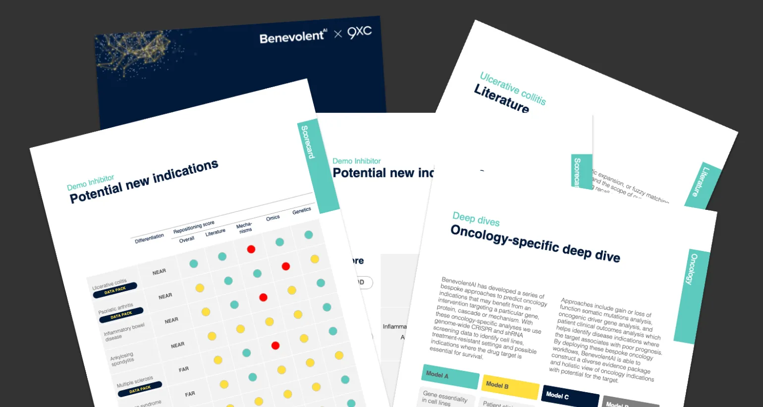
While working on my 9xchange site, I used one of my approaches to present a document. “Pages” that sit randomly on a table or surface (see below).
I use this technique as well for the banner image of this blog, see below.
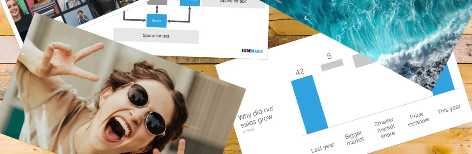
This effect is very easy to make. Take an empty slide / page in any presentation app. Save the document you want to show as individual images (good old screenshots will do as well). Drag the images on to the slide and tilt them. Add a little drop shadow behind them.

Things are not as random as they seem though:

  • The angles of the pages need to look interesting, not all the same, not too different
  • The page need to be semi-readable (i.e., not upside down)
  • Key headings should be visible and very readable
  • You need to decide whether to let pages bleed off the page, keep them 100% in the frame. It will create very different effects
  • You should select pages that look varied, and interesting and are presentative of the content of the document you want to show.
·Images

Zoom out

Professional photographs of your team can give a great lift to your presentation or web site. Either individual headshots all in a consistent style, or even better, a group photo of your entire team in one place.

A good photographer will do two things: firstly, make sure that the technicalities such as focus and lighting are perfect, and secondly, try and create interesting crops and compositions.

Having a photographer set your image crop in stone might not always be good though. What looks great in a 4:3 view finder of a camera, can look suboptimal on web sites that need to handle unusual screen sizes, all the way from big widescreen TVs to small smartphones.

The problem usually is that the center composition will stay constant (the subject area of your team that will probably occupy a 4:3 rectangle or square in the middle of your image), but the background can have vastly different aspect ratios.

The solution: have your photographer take a snap which the crop she prefers, but always add a second one completely zoomed out as a backup.

If you forgot to make that second image, you might have to revert to AI tools such as Adobe Firefly to add the missing pieces of background back in.

·Layout

About titles

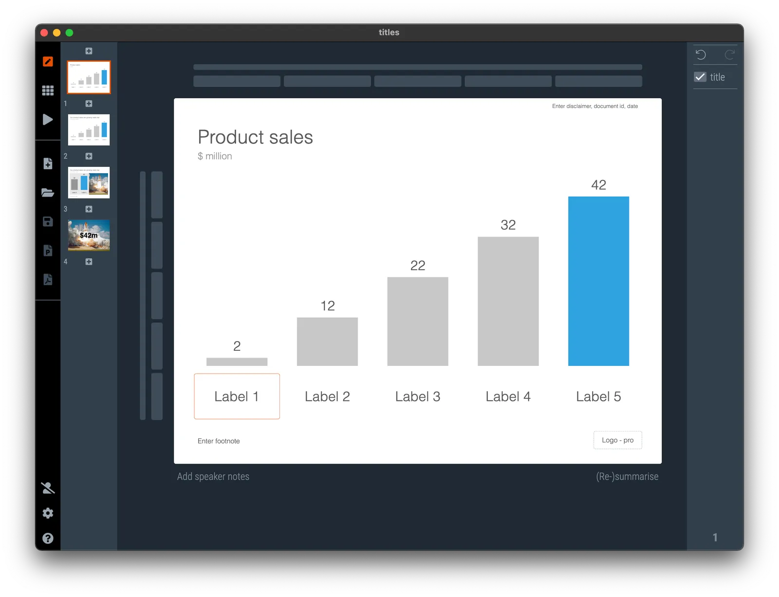
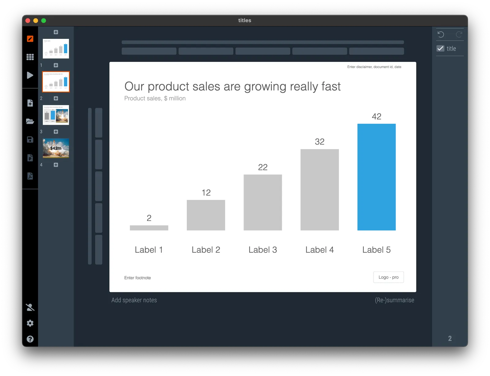
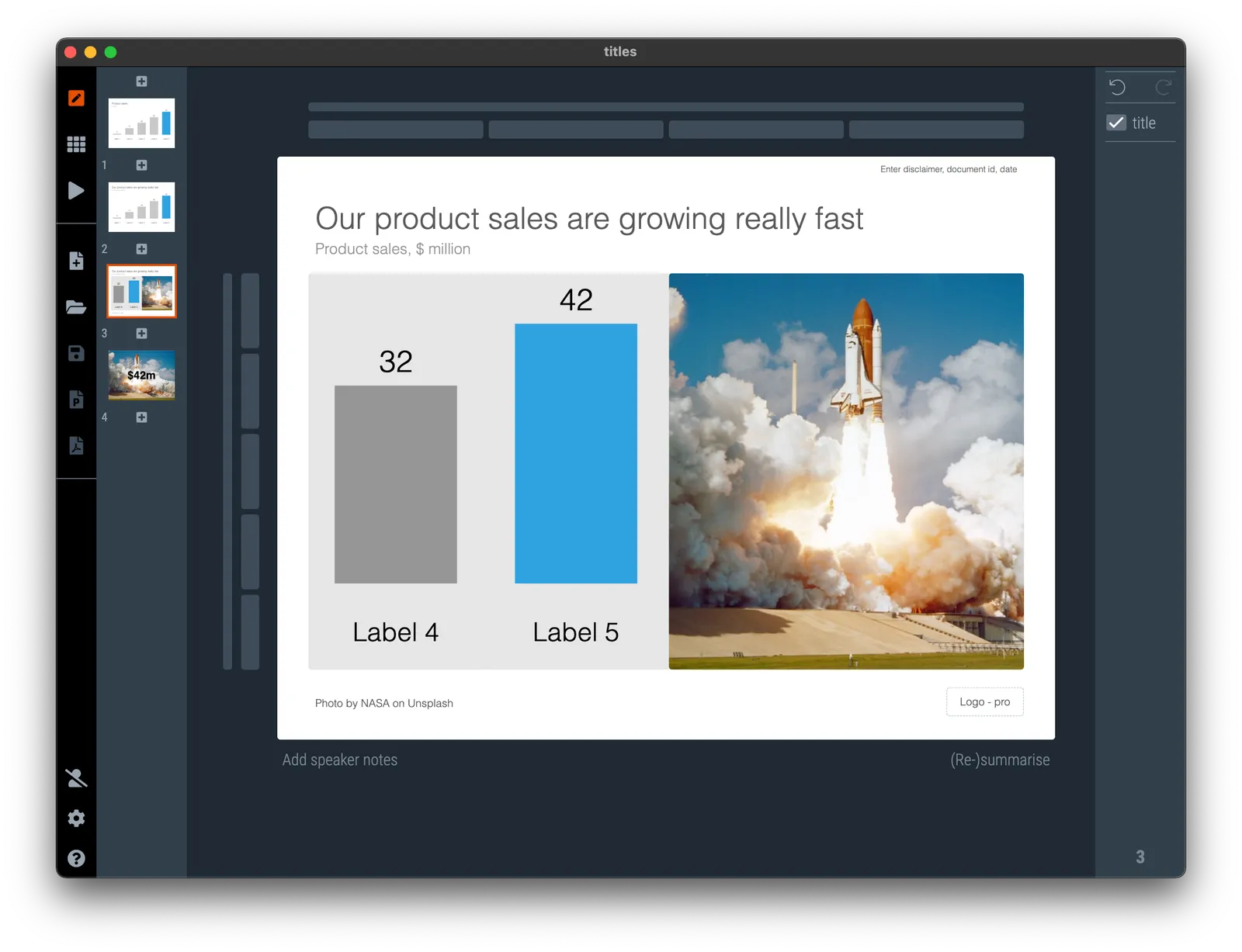
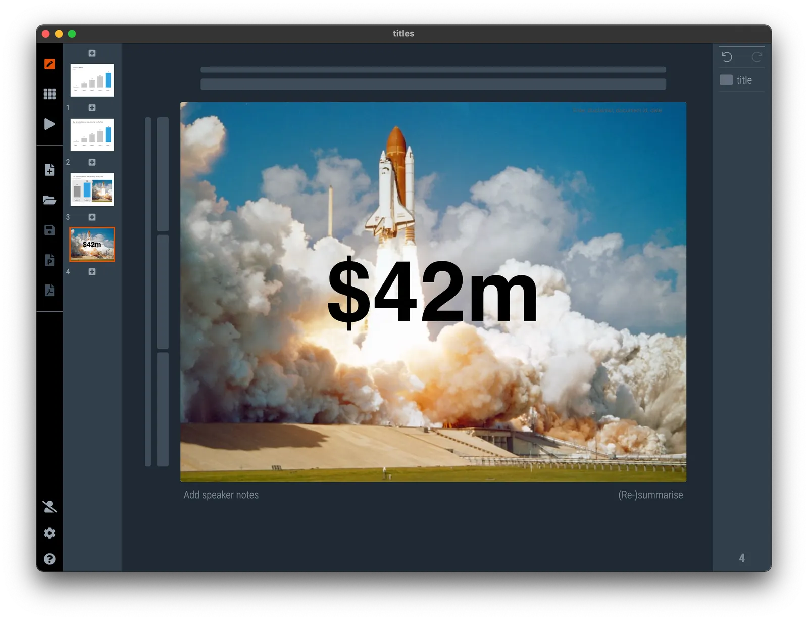
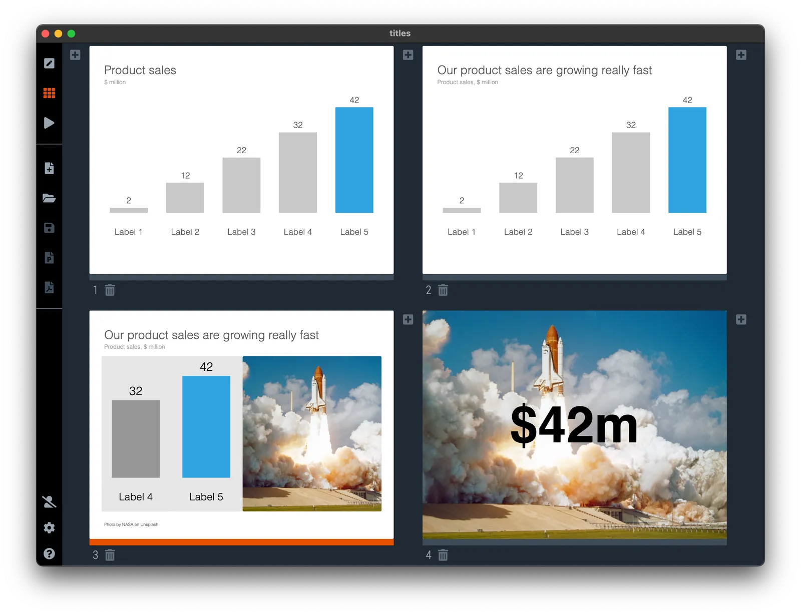
There are a number of ways you can, or cannot, use titles in your slide. See the examples below. (RSS subscribers might have to open the post on the web to see images).

The classic way is a basic description of what the chart is showing.

The management consulting approach is the message title: write out in a sentence what the chart is supposed to say, and put the description and unit of the data in a subtitle

You can spice things up with an image

And with full image slides, the traditional title does not actually really matter anymore. You can place text anywhere on the image to get your point across. If you are presenting live, you can even omit the exact description of what you are showing

·Layout

When (not) to hyper link

Clickable links are the fundamental building blocks of the web page format that was developed in the 1990s. In the early days of the web, you could spend hours getting lost in clicking the blue links in text pages. In modern web design, these pure text links are less useful though.

Sometimes I see them as a reference to a core element of the story. Our product has a key competitive advantage that helps drive our amazing financials<.ink>. He user who clicks links is leaving your story line flow. Seeing messages in the wrong order, tripping up a sequence of big picture versus detail, and is probably not returning to the point she came from.

Web design guidelines in the 1990s also prescribed not to add the work “link” to a URL, but rather put descriptive text: “the 1996 financial results” so that Google and other web search engines would index the page correctly. The result is a page where the reader never is completely sure where it ends up when clicking a URL.

How do I use plain text links? Mainly for references, in the same way academic papers use numbers to refer to relevant resources. A home page of a company, a link to a photographer for credit, download links for documents, references to previous blog posts. And often, I violate the 1990s guide line and call the link what it is, a link, so that the reader knows what to expect.

·Layout

Automated content pages

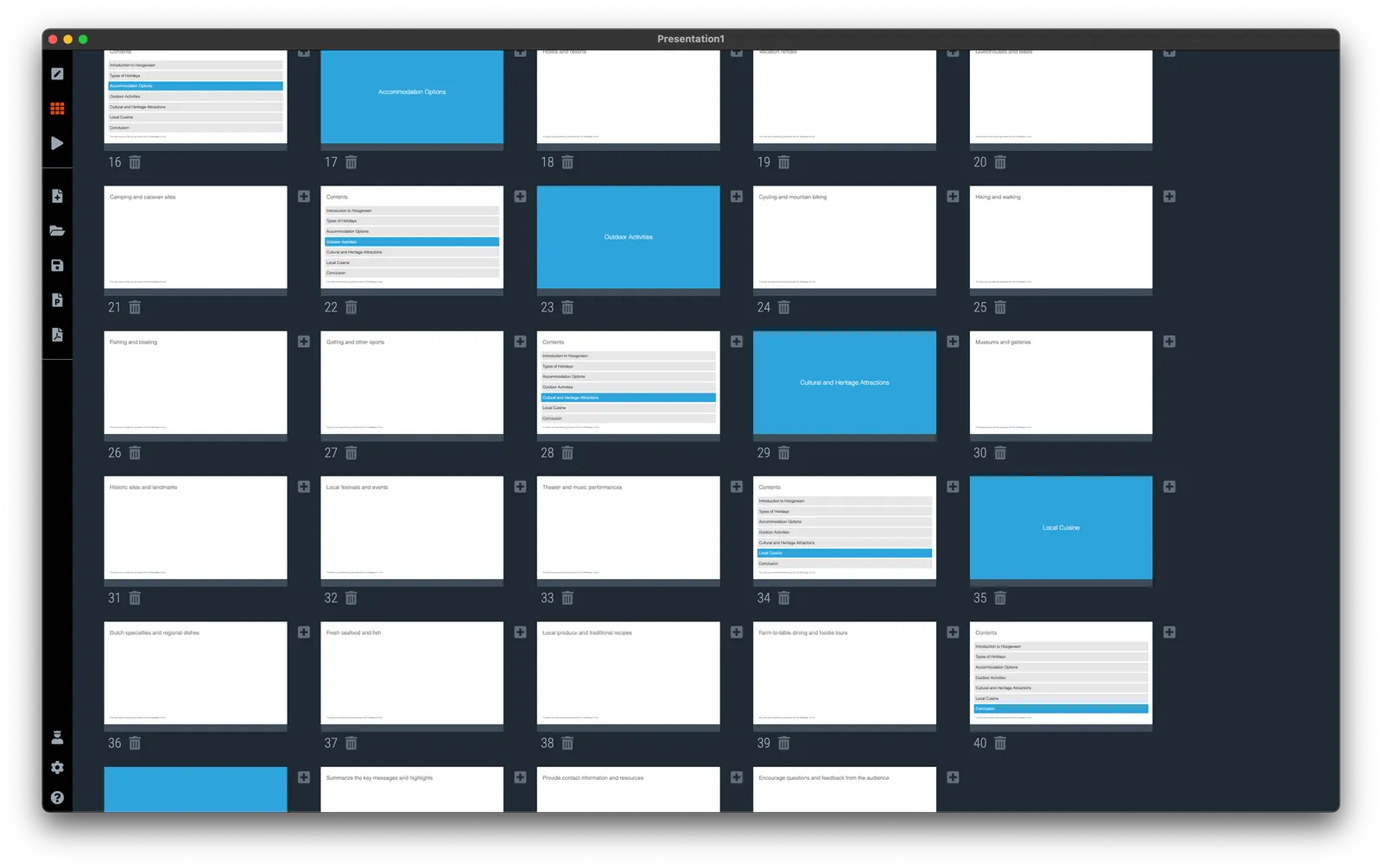
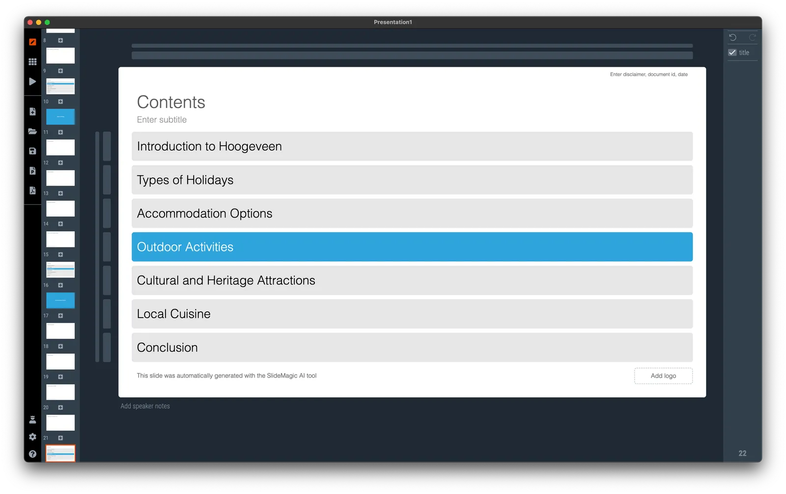
I am continuing the gradual upgrading of the SlideMagic AI capabilities. Today, I added an automated content page to the automated story line generator. For each section in your presentation outline, you now get a slides with all sections, plus the current one highlighted. (See the screenshot below).

More updates and refinements to come

·Layout

Dashboards and reports

For periodical update meetings, you often can use the same presentation with just the numbers updated. When the audience is internal to the company, many will just use a spreadsheet printout rather than transferring the data to a presentation.

The result, a presentation that looks like, well, a spreadsheet.

  • There is more information presented than needed for the meeting
  • Numbers are highly precise and not rounded up
  • Fonts are tiny, as the spreadsheet tries to show everything on 1 page’s width
  • Colors and fonts are those of Excel, not the company
  • The last 2 rows of the table moved over to the next page
  • Etc.

If you need this report often, it is worth investing some time in setting up your spreadsheet properly.

  • Leave your “engine” untouched and create an entirely new work book that is your “presentation”
  • Get rid of spreadsheet gridlines and show the page cut offs so you get a clear view of the boundaries of your “slides”
  • Set colors and fonts the same way you would do in PowerPoint
  • Now build your slides page by page, by pulling in the data from the engine sheet, round numbers up as you go ( / 1000, show 1 decimal, etc.)
  • With these types of reports, you variability between slides will be in the column widths, not so much in the rows. To keep your “deck” all in one workbook, move horizontally, and add pages to the right rather than below
Continue reading →
·Software

Why does it look like PowerPoint?

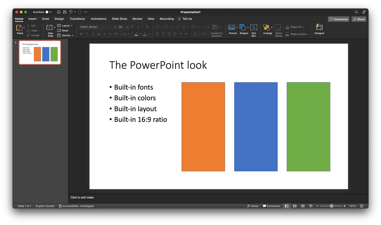
It is often quick and easy to use PowerPoint to draw a diagram. No need to install and learn new specialized software. A few boxes, lines, a screenshot, and you are done. But why the result totally obvious a PowerPoint slide, even if you are not using the program to present your visual?

Over the past years (decades for some) we have become so used to seeing PowerPoint slides with the built-in fonts, standard color palettes, that most people will recognize it instantly. But when your end product is a screenshot, you don’t have to worry about things like font compatibility and presentation templates.

  • Change colors and fonts to match the document you are working in
  • Let go of the restrictions of the aspect ratios for a slide (4:3, 16:9) and pick something that is appropriate for your diagram.
·Layout

4 types of slides

Slides can be grouped in 4 categories:

  1. Visualizations. A layout of data and/or elements with relationships that show something that is very hard to explain in linear text. Reading out all the columns of a data table is boring. Explaining the structure of DNA in words is impossible
  2. Background graphics. A nice picture or a few words that fill up that giant screen on stage and makes the overall picture frame (you + slide) look a lot better
  3. Trackers. A favorite of management consultants: some sort of table of contents that reassures you were we are in the overall story.
  4. Transcripts. Bullet points mapping 1-on-1 what the speaker is saying.

Think about when to use which one for what.

Complex visualizations might not work as a dramatic background image when you reveal your product. Background graphics will not say much in a document that you email without explanation. Trackers don’t say anything. Transcripts are horrible on stage, but might work when emailing to someone (i.e., a text document).

·Layout

The same polarity

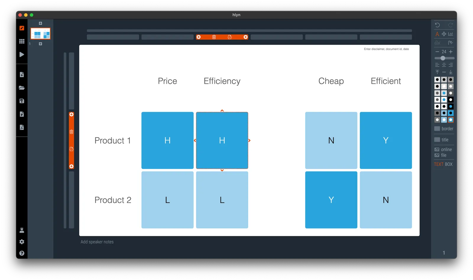
You have a choice when naming the labels in a comparison chart. For example: “price: high” is the same as “cheap: no”. Make sure that all highs and lows, or yes’s and no’s are aligned in the same direction, i.e., things that are “good” all have the same word value associated with it. See the simple diagram below.

·Layout

Designer dilemmas

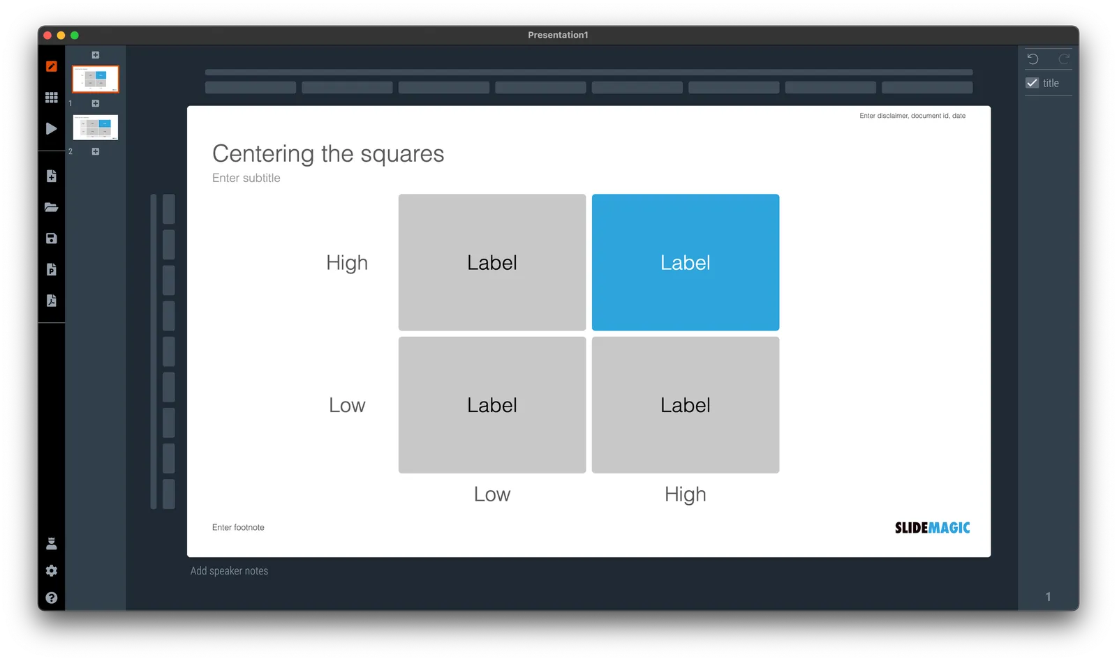
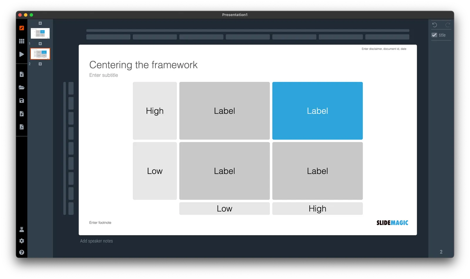
Getting the proportions on a slide right is tricky because it requires an intuition that is very hard to capture in a set of simple rules. An example below. I will have presentations where I center the diagram around the boxes of the 2x2, or other ones where I will center the diagram including its axis titles. Most people probably could not be bothered by this.

It is because of things like this (design is hard to capture in rules) that I think a ChatGPT-like algorithm for page layouts might have a big potential.