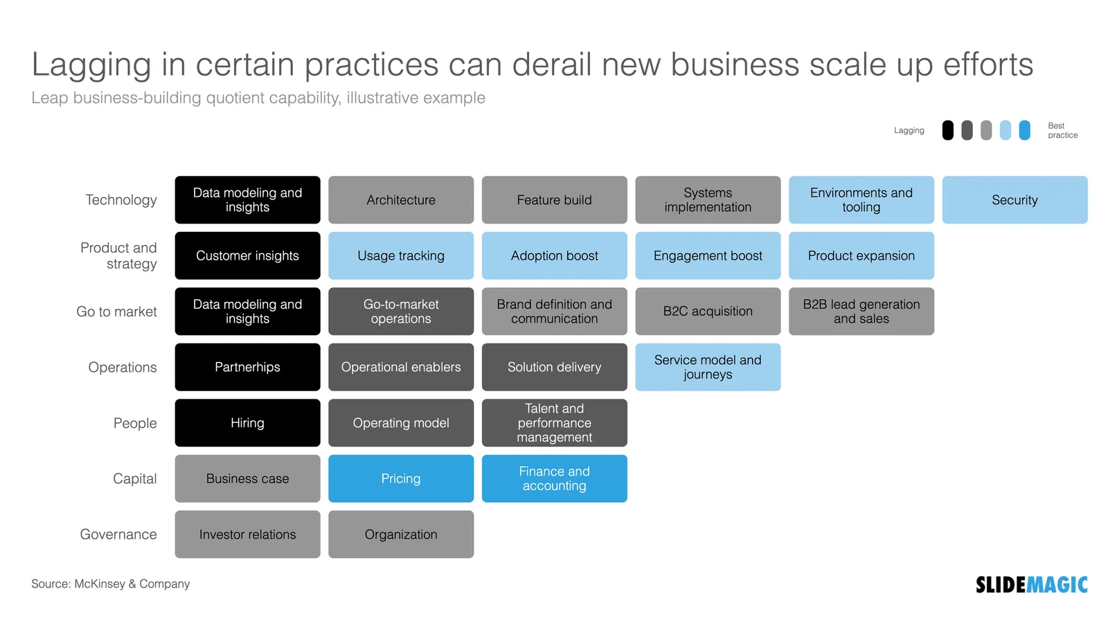
See the following McKinsey framework (background here):
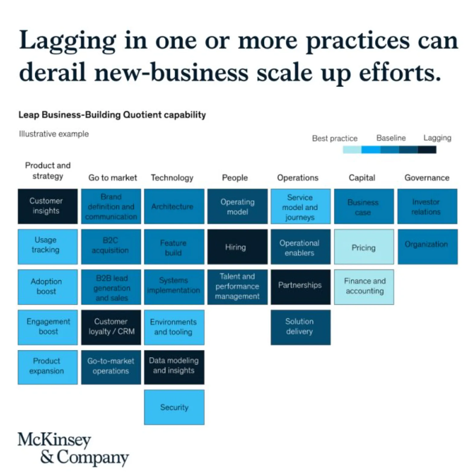
The slide does not look bad, but there are a few things that I would change:
- Flipping the columns and rows of the table, there are more columns than rows, I tend to put the axis with the most data in rows
- Sorting the categories by number of boxes, to get a more visually pleasing line (McKinsey probably sorted the columns by importance)
- Sorting the boxes within a category by color (and not by importance)
- Fixing the color coding, the dark colour is actually the worst score.
Below is a quick makeover in SlideMagic, you can find this chart in the SlideMagic slide library for you to use.