SlideMagic Blog

Frequent updates about all things presentations since 2008. Subscribe to never miss a post.

RSS
all posts

Search results for “mckinsey”

·McKinsey

McKinsey slide ruler nostalgia

Look what I found in the box with drawing tools of my children: my old McKinsey exhibit rulers! I would carry these with me 24 hours a day in the 1990s. All charts were sketched by hand before being handed over to graphics assistants who would convert them into computer visuals (first overhead slides, then PowerPoint slide shows).

The sketching by hand is a really good thing. But the limited number of available shapes restricted the creativity somewhat, all charts looked very similar as a result. See that big question mark? In case you did not know the answer (yet) :-).

·Data visualization

Re-post: creating McKinsey-style water fall charts in PowerPoint

Waterfall charts can X-ray a complicated story. Here is an explanation about the technicalities of creating one in PowerPoint, here is an example of an application.

·Design

Dusting off the McKinsey business system

McKinsey has been posting a number of classic consulting frameworks under the title “enduring ideas” on the McKinsey Quarterly site. I discussed before: consulting frameworks are great for solving problems, but often less good at communicating solutions.

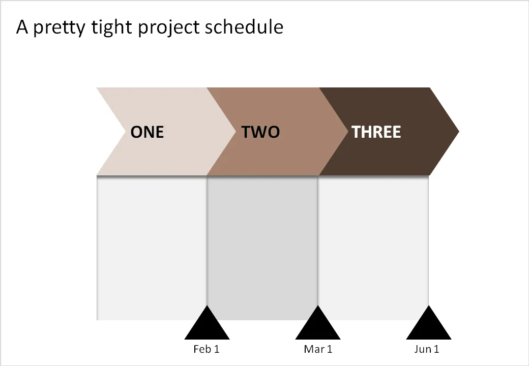
Recently, the business system was discussed. At McKinsey we used it to analyse the value chain of an industry (manufacturing, sales, distribution, etc.). The basic graphic concept of it (simple arrows) can also be used in another context: communicating a project schedule. See the example below.

Related reading:

·Design

We used to have something like this at McKinsey

Information Aesthetics is talking about visualization nostalgia. Hey, we used to have a ruler like this at McKinsey. I will continue to look for one, or a picture. They were blue, had boxes for bar/column charts and pie diagrams, and a few triangles and arrows.

The bad thing is that all your charts sort of looked the same. The good news was that, because you were trained to use this ruler, you always tried to find a graphical way to present your information, hardly ever resorting to bullet points.

·Design

McKinsey on the McKinsey cost curve

A decade of strategy consulting work at McKinsey has not made me a big believer in standard frameworks. Most business problem require a tailor-made approach without the buzz words and generic statements you find in most airport business best sellers.

There is another problem with frameworks: a framework to solve a business problem is usually not the framework to communicate a business solution. Problem solving and presentation are two different things.

McKinsey’s “enduring ideas” series periodically discusses one of the classic frameworks from the world of management consulting. This month it discussed the cost curve.

  • On the vertical axis you show the cost per unit
  • On the horizontal axis you line up the competitors in order of their production cost
  • (Unusual) you change the width of the column to reflect the production capacity of a player
  • Drawing a vertical line where capacity = demand shows you what the market price of the (commodity) product will be, and who is making money/who is not.
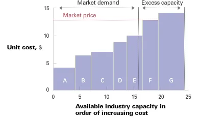
This framework is maybe an exception. A slightly modified column chart can serve both as a problem solving tool and a communication instrument. If there is incomplete information, 3 people can spend 2 months to develop it (running all the analysis), but once it is there, it shows what’s going on in a (commodity) industry on one very insightful piece of paper (piece of PowerPoint slide).


·Data visualization

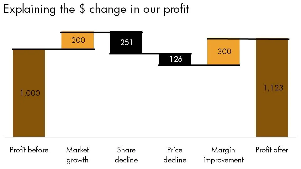
How to do a McKinsey-style source of change chart

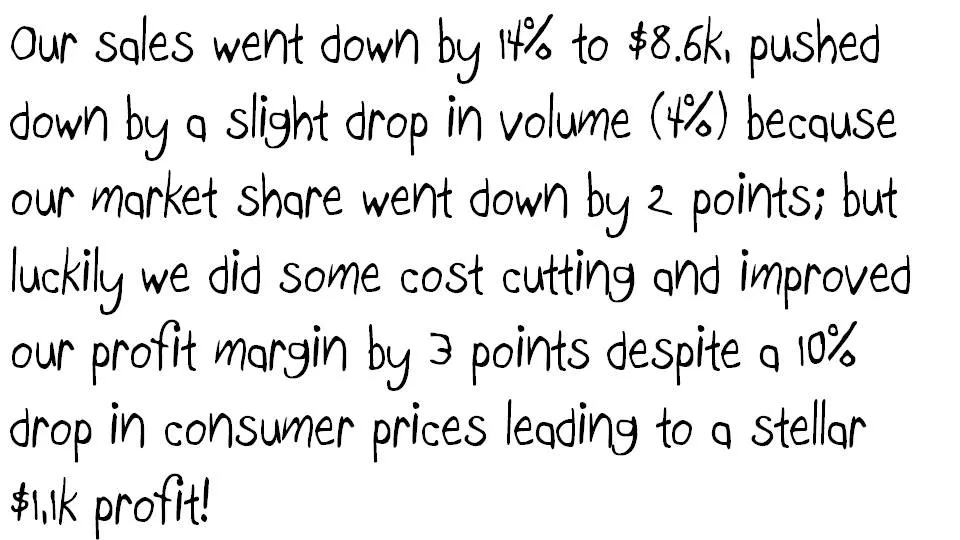
Some numbers today. The source of change is a tool to explain the delta between two numbers in terms of its components. Assume you need to get the story below across in a crisp presentation.

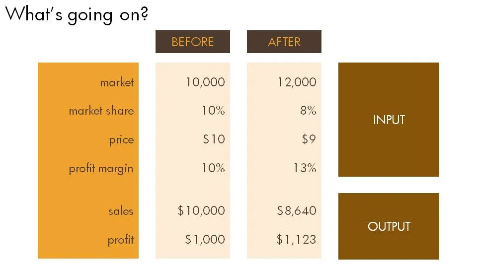
The first thing is to understand what’s going on. Get some more information until you have the full picture in a clear table.

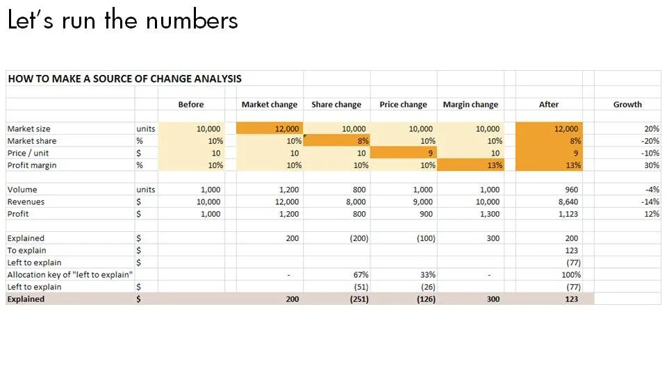
Now let’s do the analysis. This is the tricky part, the text below does not do a good job in explaining this, you can click the spreadsheet for a bigger and more visual explanation.

  1. Calculate the profit in the “before” scenario using a formula that just uses inputs
  2. Now stretch each of the variables that change to their “after” value, jot down the value, and return the value back to its original number
  3. Repeat for all the variables and see what delta in profit you managed to explain.
  4. Calculate what is left to explain, and allocate that to the individual values.

Finally put the values in a

nice waterfall

chart.

·Investor presentation

McKinsey interviews Gartner CFO on communicating with investors

Presentations to analysts and investors are very important for publicly traded companies: they have a direct impact on the share price.

In this interview for the McKinsey Quarterly, Gartner CFO Christopher Lafond lays out his investor relations strategy:

  • Segment and prioritize investors you want to talk to (in his case funds that have a long-term interest in Gartner, and do their homework to understand the fundamentals of the business)
  • Focus on a very limited number of performance metrics, not shying away from internal, operational metrics that are usually only discussed by management
  • Educate investors why these are important

Note: (free) registration to the McKinsey Quarterly might be required to read this article.

·Layout

Critiquing a McKinsey exhibit - analysis charts are not presentation slides

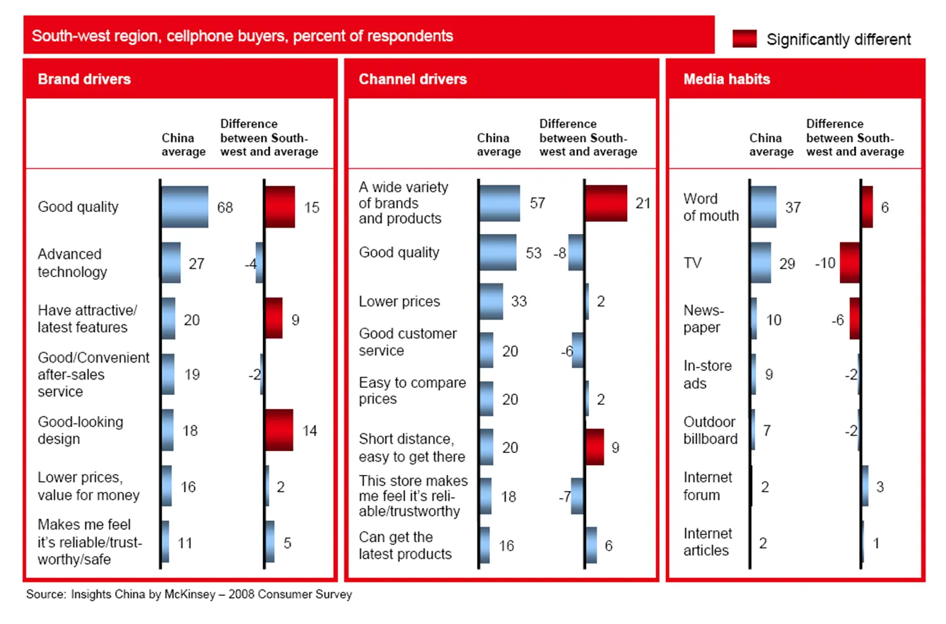
PowerPoint slides that are used to analyze data and solve problems inside a team are not always the best exhibits to be used in presentations. To illustrate the point, I am using a chart out of a publicly available McKinsey document: the 2008 Chinese Consumer Report published by McKinsey’s Insights China initiative.

The report itself is formated very nicely with beautiful pictures, the content of the report looks very interesting. I am just focusing on the cosmetics of one chart as an example. (Click image for a larger picture)

  • Overall, there is too much information on the slide, but given that this chart is used inside a long-hand document, that might not be too bad
  • Because of the red background, the title does not stand out clearly
  • The boxes around the chart are too heavy, to separate the 3 charts, it would be better to use a very light background shading
  • The box on the right is narrower than the other two.
  • Because there are so many bars in this slide, they become very narrow, and hence they almost stop helping the reader see the differences in size, maybe boxes with simple numbers work better
  • The gradient fill of the bar does not add to the understanding the chart
  • The legend in the top right looks slightly lost
  • The text labels are too long: “the store makes me feel reliable/trustworthy” is appropriate for a consumer questionnaire, but can be shortened in the chart
  • The text labels “dance”, they are not right aligned, some labels take 1 line, some 2 lines, some 3
  • The middle graph has 8 bars, the other two 7, disturbing the visual calm of the slide
Continue reading →
·McKinsey

Classic McKinsey business frameworks

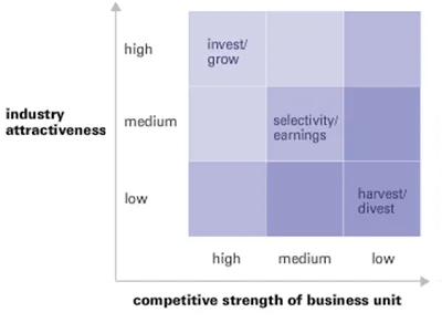
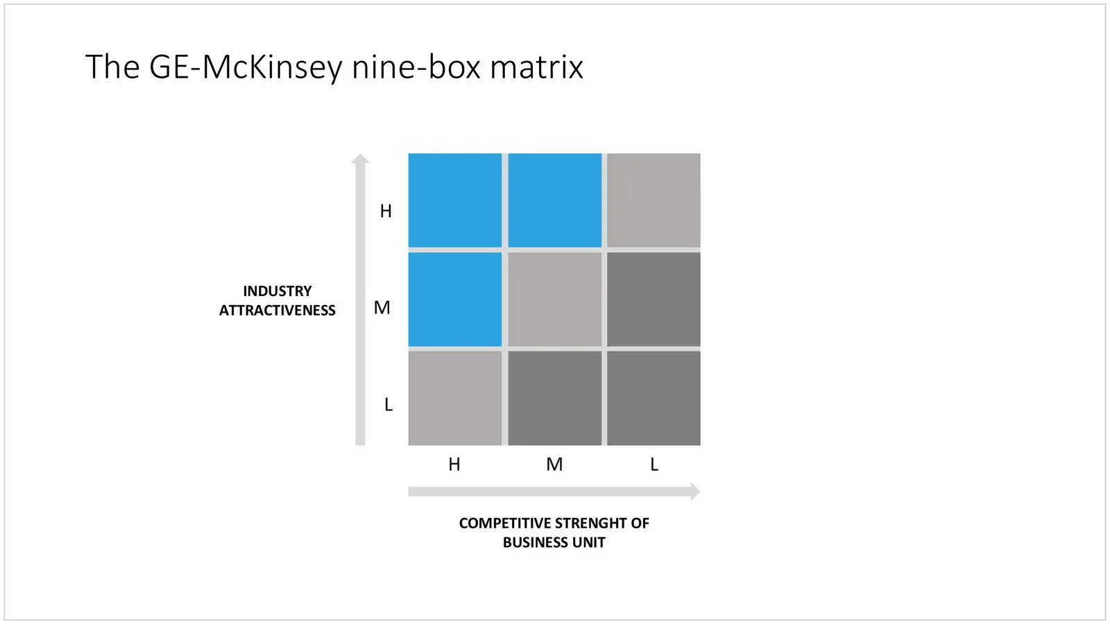
The McKinsey Quarterly added another framework to a series that discusses historic business analysis frameworks: the GE-McKinsey 9 box matrix, developed in the early 70s.

Glancing over the article and hearing the audio explanation made me realize: things have moved on. Managers have become much more skilled in absorbing diagrams, and business portfolio analysis is more than plotting industry attractiveness and competitive strength. The elaborate explanation of the 3x3 would almost be an “insult” to a sophisticated management audience in 2008. Still, today I constantly invent “frameworks” for presentation on the spot: how to present 4 steps, 3 distinctive factors versus the competition, 6 phases to launch, the best of both 2 worlds, but none of them are standard. Also, I am increasingly moving away from the urge to summarize all factors and aspects of a solution on one (the first) page. Rather, I take an audience through a step-by-step story to the final answer. The difference between a concise document and an engaging live presentation. For more nostalgic reading:

  • Classic frameworks by McKinsey & Company (7-S, Structure-Conduct-Performance [SCP], others)
  • Classic frameworks by the Boston Consulting Group (Growth-share matrix [Stars, cash cows, dogs, question marks], others)

UPDATE February 2018: I have now added the GE McKinsey matrix and lots of other consulting frameworks to the SlideMagic template store.

 The GE-McKinsey matrix in PowerPoint

The GE-McKinsey matrix in PowerPoint

·McKinsey

The McKinsey - or any consulting - presentation

The vast majority of Google traffic that lands on my site is looking for advice on how to write a “McKinsey presentations”. Let’s discuss them a little bit more, including my logic why they might NOT be suitable for just any communication situation. Why do they look so good and professional? A few reasons (some of which are good recommendations for any presentation you prepare)

  • They stick to a strict slide format: every page is laid out exactly the same, making the whole document look very consistent
  • Pages have muted colors and no spectacular animations.
  • Consulting presentations are almost always all about numbers, and this quantitative data is displayed and structured in simple and clean data graphs (i.e., not an ugly, busy cut and paste from Excel), and numbers are rounded
  • Each chart has a single message, which is written out in the chart title and clearly supported by the numbers in the chart body
  • They (sometimes over-)use a lot of frameworks to structure information: a time line, the impact of a number of forces, evaluation of pros and cons, strenghts and weaknesses.
  • The presentation has a clear logical structure, taking you step by step through an argument. A lot of energy is invested in the PowerPoint slide sorter: re-shuffling charts until the story is lined up the correct way. This process is not only for communication purposes, it is an integral part of problem solving. Trying to articulate a logical story will inevitably highlights flaws in logic, sending you back to the drawing boards to do additional analysis or change your recommendations.
  • It is full of summaries. If you have 30 seconds to read a document, you will find the full story on page 1, if you have 5 minutes, you can read the summaries of the next subsections (each section explaining 1 paragraph of the summary in more detail), if you have more time you can read the whole document.
Continue reading →