

See the McKinsey exhibit below. (I found it in a LinkedIn stream, so I cannot source it to the original article.)
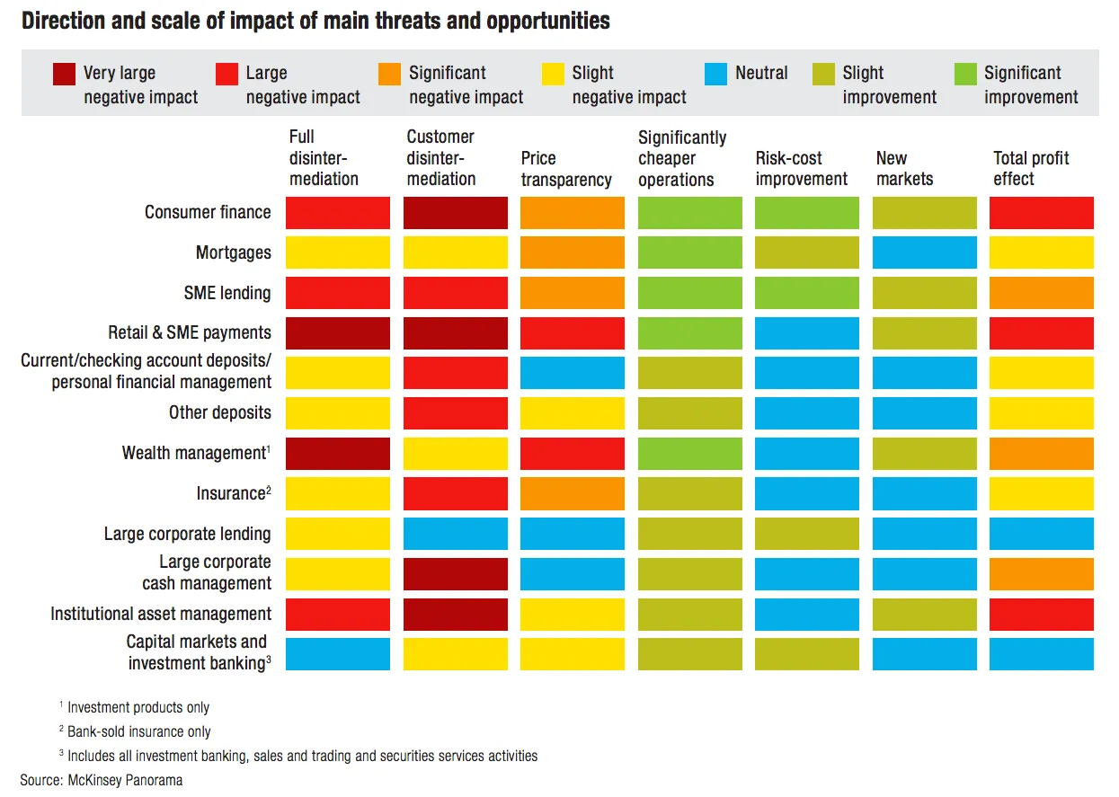
This table is an example of a pros/cons trade off or feature comparison matrix. I find them very useful to visualise the impact of multiple trends, or to trade off complex issues. Still there are a few things that can be improved:
- The finance sectors are not ranked, it is better to sort them based on the total profit impact
- There are too many steps in the scale, resulting in too many colours. And, the colours are not chosen according to a consistent colour scale. Especially the greens, they are different types of green
- The title of the chart is woolly
- The row labels are too long and complex
- Column headings are not centred, they look weird
- The foot notes are too prominent
I have tried to recreate the chart in my presentation design tool SlideMagic. Manipulating tables in SlideMagic is especially easy since it uses a very strict grid system. I collapsed a number of categories into one. The result is that I lost some precision, but I gained a much better visual representation of the effects. If you want, you can add a second layer of data to this chart, by inserting numbers (on a scale from 1 to 7, or on a scale of -3 to +3) to show more granular data.
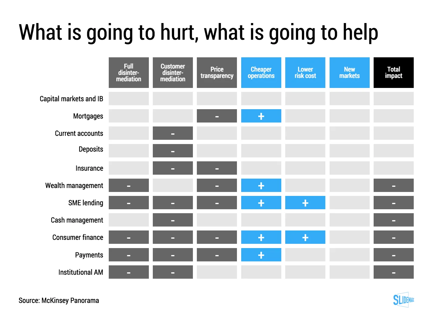
If you want to use this chart as a template for your own presentation, follow this link and clone the chart in your own SlideMagic decks.