My post about
how to create a McKinsey-style waterfall chart
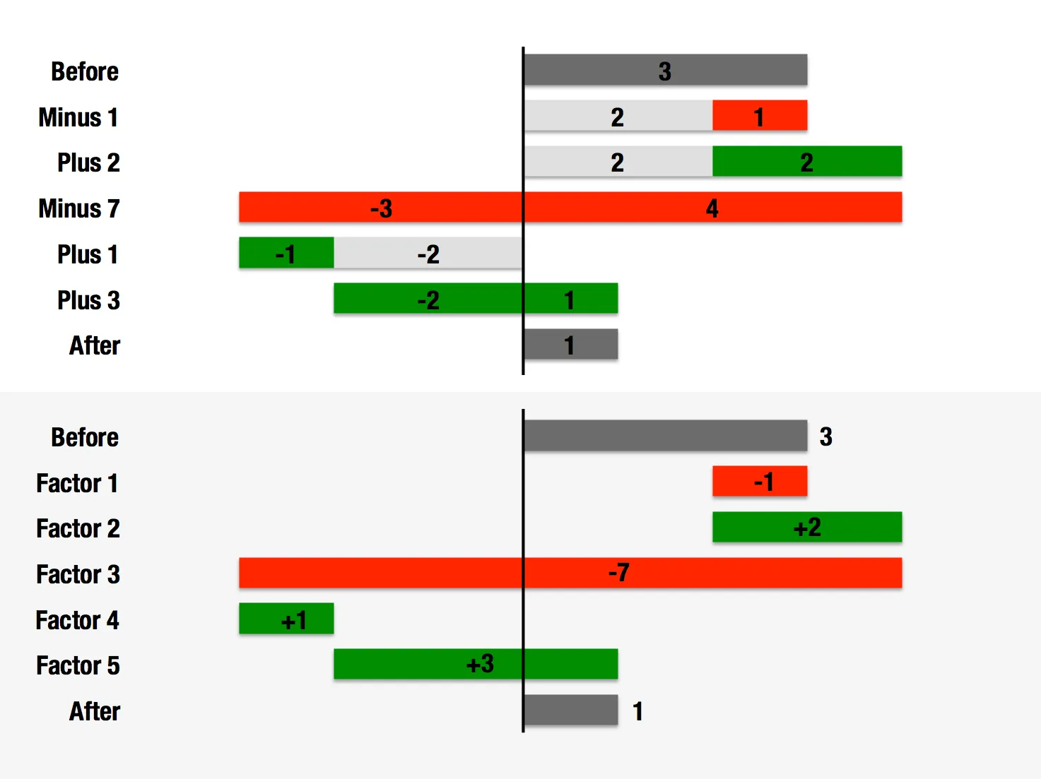
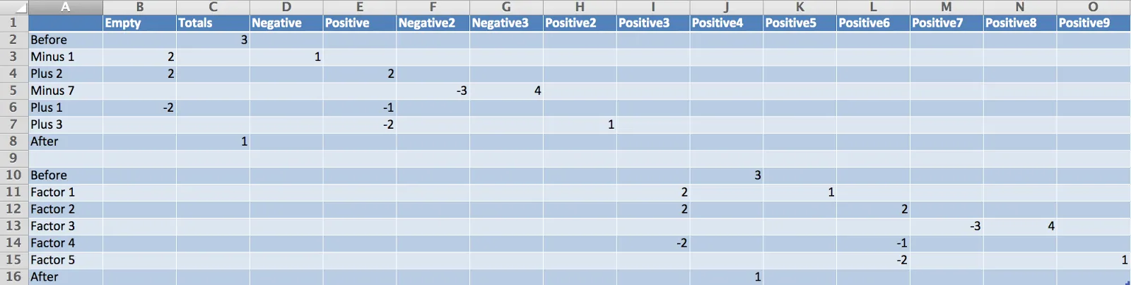
is one of the most read on this blog. The method I showed breaks down when there are many negative numbers involved. The solution is a manual one, sketch your waterfall on a piece of paper, fill in all the numbers, and fiddle with colours until you get it right. Remove the automated data labels and put text boxes with the values instead. See the example below.