

SlideMagic Blog

Frequent updates about all things presentations since 2008. Subscribe to never miss a post.

RSS
all posts

Search results for “compress image”

·Software

Some UI improvements

Version 2.3.18 went up with a few improvements including 2 noticeable ones:
  • A much brighter app user interface colour. As you know, SlideMagic mirrors the colour you use in your presentation: if your presentation uses blue, the SlideMagic app accent colours (to show things you selected for example) will turn to its complement: orange. Up until v2.3.18, this was the exact colour opposite, creating problems for users with muted, very dark accent colours. In the latest version I forced up the brightness and saturation of the app accent colour so that it clearly stands out in all cases. Look how that orange is now popping out for my SlideMagic blue colour.
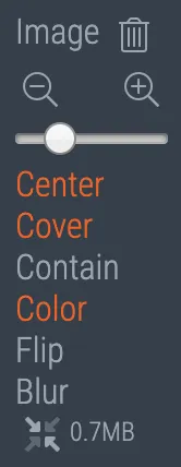
  • An improved image user interface, where the crop modes “center”, “contain”, and “cover” are now clearly highlighted. Also, SlideMagic now shows the mega bytes an image consumes as soon as you select it. Sometimes, a very large image is actually not that big in storage, but the opposite happens as well, that tiny image on your slide takes up 10MB of space and as a result you are compressing down the entire slide deck. Now it is easy to catch these memory eaters quickly and compress the image if needed. Compression no longer “flattens” the image effects (greyscale, blur, flip), so you can re and undo these on the compressed image as well.
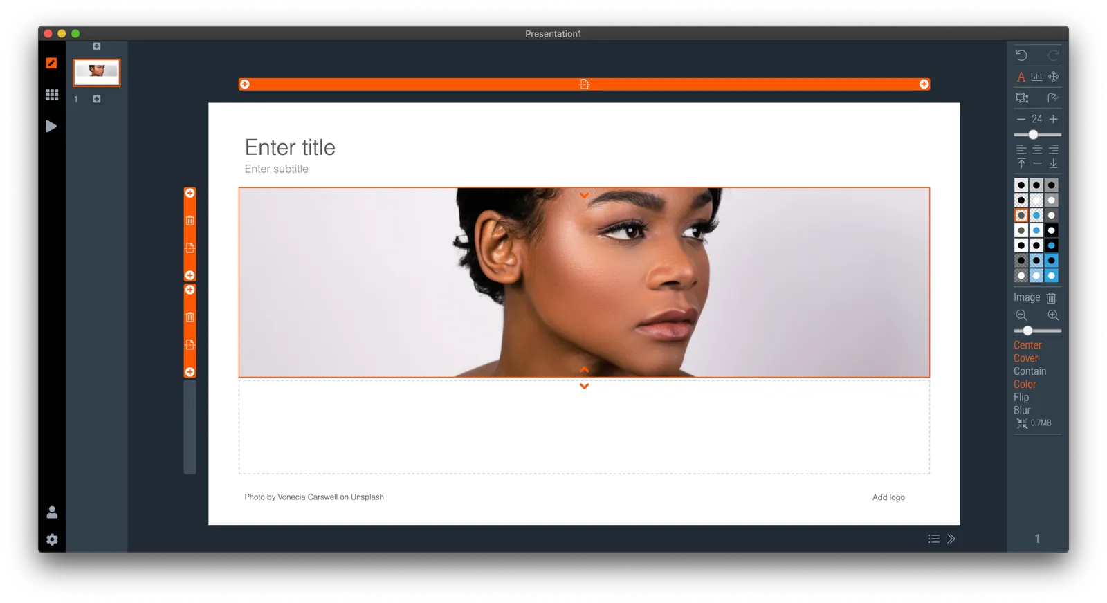
Download the latest version of SlideMagic for Windows or Mac to try it out.
V25

I just released version 2.1.25 of SlideMagic with more bug fixes and performance improvements:

  • Better integration of copy-paste and other clipboard function with Mac OSX and Windows, enabling you to copy paste things between SlideMagic and other applications
  • Fixed the mystery bug that stopped slide rendering when you flip an image
  • Fixed an issue where crop rectangles would be reset after compressing an image
  • Fixed an issue that could corrupt .magic files upon exiting the application (thank you, one of my frequent blog readers)

On the server, the browser now tells you that your password reset link has expired, rather than producing a generic message that something is not quite right.

I am starting to feel happy with the application as I am using it now myself really intensively to build the template database, but I am keeping the number of beta users small at the moment, just to make sure. One important decision that I need to make before expanding the user base, is the freezing of the file format, I am still pondering making potentially breaking changes here.

The update should install automatically in the background if you leave your existing SlideMagic app open in the background. Beta version from a few months ago have now expired as we move into 2020, please contact me if you have an issue re-starting the app.

Photo by Jeff Cooper on Unsplash

·Investor presentation

Pitching your startup

Here is a nice post on the Stripe Atlas site about pitching your startup. It is written from the perspective of a very early-stage startup pitching for a seat in an incubator such as Y Combinator. (If the entrepreneur is not yet that experienced, an achievement like having climbed Mount Everest adds a datapoint about persistence).

Here are some quotes that struck me from the post:

  • “Explain assumptions in your pitch like you would to a smart friend in a different field.”
  • “The investor is not your user, so pitching users and pitching investors are completely different.”
  • “This pitch says nothing, in 18 words: COMPANY will help e-commerce stores sell more products using cutting-edge AI-enabled algorithms and machine learning.”
  • “Clarity is particularly important when you’re tackling recently popular ideas, like blockchains or machine learning”
  • ‘Your reviewer will read literally thousands of data points today–the average pitch includes more than 10. No one can remember that many arbitrary numbers, so reviewers compress them to “zero”, “non-zero”, and “impressive.”’
  • 'Nobody has ever written in their comments on a company “Wow, their sign-in screen blew me away. I want to invest in that sign-in screen.” ’
  • “Risk-taking is encouraged in startups; stupid risks are not. Walking into the office of a person in a position of authority without a meeting scheduled is a risk, but it suggests ambition and sales ability. Describing crimes you’ve committed generally suggests poor judgment.”

The people evaluation bit of this Y Combinator screening process seems very similar to the way we were on the lookout for new talent in McKinsey. Especially for young hires with little work experience, you had to comb for indicators of possible future success, fit. In every interview you really wanted the candidate to succeed. And the dialogue with the candidate, the way she responded and thought was very important.

Continue reading →

PowerPoint 2016 for Mac bugs

I have written very positive reviews about PowerPoint 2016 for Mac, even calling it better than the latest version of Apple Keynote. But there a few annoying bugs inside. This blog is read by a lot PPT experts, so maybe one of you can help.

  • I encounter a persistent issue with setting theme colours. I tried to pick new ones and then save them as a new template, it refuses to do so. I go back to PowerPoint 2011 to set up new presentations.
  • Image compressions is now a crucial feature. In all my presentations I need to go down to 150 DPI to keep files below 10MB. But when I do compress images, often things go wrong. Especially with cropped photos. The image gets replaced by a big white box, with a miniature version of the original photo in the top left corner.
  • Many fonts have now more granular weight control: thin, light, regular, bold, black. This is great for design, but the good old “bold” button for a quick style edit does not work anymore for some reason.
  • Whenever I do copy-paste of a small item (a tiny arrow for example), an annoying dialogue box pops up, covering the entire object and making it impossible to move.
  • Still, PowerPoint crashes often, especially when working with data charts. (Here is a trick to recover your work)

Are these just me?

Image from WikiPedia

·Story

Spending time on the problem

In a pitch there is always pressure to keep things as short as possible. It is therefore tempting to compress the problem you are solving is as few words as possible: “[x] is not very flexible”, because hey, people know this, right?

I tend to drag out the problem section of the pitch a bit:

  • Remind people of the problem in an emotional way, that they “feel” it, usually with a picture or a statistic
  • Point out what is the cause of this problem, it is often soften very trivial that people did not realise. (“Did you know the reason is that there are no batteries light enough to do this?”)
  • Point out why it is so hard to solve the cause (not the problem itself). ("The law of physics that you cannot have this, and this at the same time)

Now you have set up the audience to show why your solution is so clever.

Image: Wolfgang Pauli and Niels Bohr demonstrating ‘tippe top’ toy at the inauguration of the new Institute of Physics at Lund; Sweden

·Software

Photoshop alternatives?

Adobe is moving to a subscription pricing model for its major software products (Photoshop, InDesign, Illustrator, etc.). I signed up for a $20 or so monthly introduction offer but then forgot that I got upgraded to around $55 charge after one year. This is probably good value if you use many Adobe products, and use them frequently.

As a presentation designer, I fall in between the typical user segments. Here is how I use Adobe products:

  • Acrobat:
    • Stitching together multiple PDFs into one
    • Reducing file sizes of image-heavy PDF files
  • Photoshop:
    • Removing backgrounds from images
    • Compressing, re-sizing large image files
    • Putting text on blank 3D objects
  • Illustrator: opening, selecting groups, re-coloring of stock vector files before saving them as PNGs.

Is there a combination of alternative software packages that could do these basic functions?

Some responses to an earlier tweet:

Art: Typesetter at the Enschede printing factory (was located behind the St. Bavochurch) in 1884, painting by the American artist Charles Frederic Ulrich.

·Keynote

Icons in PowerPoint

With smaller screen sizes, icons are becoming an increasingly important element of user interface design. Not everyone of you is likely to be using PowerPoint to design a web app (hey I do), but icons can also be useful in regular presentation design.

I am not talking about floppy disks and other ancient icons we still use, but stylised symbols that can be an effective visual short cut to a category of (pick the appropriate) products, benefits, user problems, etc.

One option is to create your own icons in PowerPoint, set the zoom to 400% and create miniature shapes using shape booleans. Often you can use a quick Google Image search to find inspiration for your icon.

Stock photo sites sell endless amounts of icons, but there are compatibility issues when using them in PowerPoint or Keynote. Most icons are design as a vector graphic in Adobe Illustrator. It makes them infinitely scalable (like a PowerPoint shape), but PowerPoint does not read this file format. Copy-pasting Illustrator objects (if you have the software installed) is unpredictable and results in a shape that is hard to manipulate (changing colour for example).

Cropping icons out of a JPG or PNG file is not a solution either, if you forget to compress the small image file, you end up storing a huge image file with all your icons multiple times on a PowerPoint slide. Cropping also kills the vector-like scaling of icons, and background transparency.

A recent trend in web design might provide a solution: custom icon fonts. Modern successors of Zapf Dingbats (what?) provide clean icons that are scalable and can be manipulated (colours, shadows, and - do not use this - reflections).

Continue reading →
·PowerPoint

Hidden megabytes

PowerPoint files can be very large, especially if you use high resolution images, or even videos. In the near future, all of us will have moved to a cloud-based storage solution, where we no longer email actual documents to each other, just a link. In the mean time, we need to try to keep our PowerPoint files below 10MB, the email architecture limit that was invented in the 1990s.

In the format pictures menu of PowerPoint is an option to compress images to save space, I usually go down to 150DPI. After compressing, always check what happened to the images in your presentation, the compression tool can do funny things (ruffle transparency borders, undo re-colouring, etc.)

If your files are still big after compression, or even when you do not use any images at all, have a look in the slide master (view, slide master view). There might be templates for title pages and/or separators there with full-size images. These get saved with the entire presentation. You can delete the template slides if you do not need them.

·Gadgets

Liberated from the email attachment

Clients that run conservative IT infrastructures (usually the larger enterprises) still have a cap of around 10MB on the size of an email attachment. As presentations contain more images, file sizes are getting increasingly larger. Over the past years I have been cropping and compressing to keep file sizes in check, but I think we have finally reached the time to get rid of the email attachment as the preferred way to send files across.

Solutions such as Dropbox provide a very convenient alternative to the email attachment, send a download link to a file, or sync a file both on your hard drive and the hard drive of your colleague.

Now that 10MB is no longer an issue, we can go to 100MB and beyond and this introduces incredible design freedom.

  1. Put images in at full HD resolution, keep the areas that you cropped out to change a slide design in the future, and have the option to produce very high-grade print material from your working document. There is no need anymore to do destructive compression to your source file. With new devices such as the new iPad with retina screen resolutions going to more than 2000 pixels this becomes essential. A 700 pixel image will look OK on a crappy VGA overhead projector, but will look fuzzy and unprofessional on a tablet
  2. Embed HD videos right into the presentation file. No more linking, saving files in the same directory and worrying about whether things work. Over the past months I have become convinced of the power of short 30 second videos in presentations. You could even start replacing background stills of a landscape with a looping video that show a gentle breeze going through the tree tops with some birds flying by.
Continue reading →
·Colors

What really matters in PowerPoint template design

The design of the template should be simple: minimal graphics and logos, maximum screen space (see a previous post here). My favorite is really simple: a nicely designed title page followed by a completely white page for the rest of the deck.

So what does matter? The technical PowerPoint stuff that helps thousands of employees with only a very basic understanding of PowerPoint do the right thing. Before letting the genie out of the bottle and releasing a new template to the whole organization check the following:

  • Are the RGB codes of the color scheme coded correctly as standard colors? In 99% of all templates I see, PowerPoint offers the default blue, green, red color options when drawing a shape in a template. Easy to fix.
  • Are the drawing guides set up correctly so that people align objects correctly on the page? There should be guides that align with screen graphics, and guides that help users position objects on the screen. (Earlier post here)
  • Does the standard blank page pop up correctly when hitting “insert new slide”? Most templates are a bunch of example charts that people can use for inspiration. Nobody uses them, every one clicks “insert new slide” and - if not corrected - gets served the standard Microsoft chart with a big title and a hierarchy of bullets in Calibri font. To fix this, go into view slide master, delete most of the template charts on the left side of the screen and carefully re-design the key blank slide with the correct graphics, colors, and fonts. If you have courage, delete the standard bullet page.
  • Are the standard shapes set correctly? Draw a text box, set the font, right click it and set as default shape. Repeat for a shape (rectangle, anything) and focus on the color, the font, the outline, the shadow, etc. Right click and set as standard shape.
  • Are custom fonts embedded in the file? (PowerPoint Ninja post)
  • Are the page-filling images in title pages and separator pages compressed? If not, a presentation of 2 pages can already take up 5MB in hard disk space. Go into the slide master, select the image, and compress image sizes.
  • Are the data charts formats set up correctly? This is a bit more advanced but should really pay off. See an earlier post on fixing issues.
Continue reading →