SlideMagic Blog

Frequent updates about all things presentations since 2008. Subscribe to never miss a post.

RSS
all posts

Category Colors

·Colors

Color conspicuousness

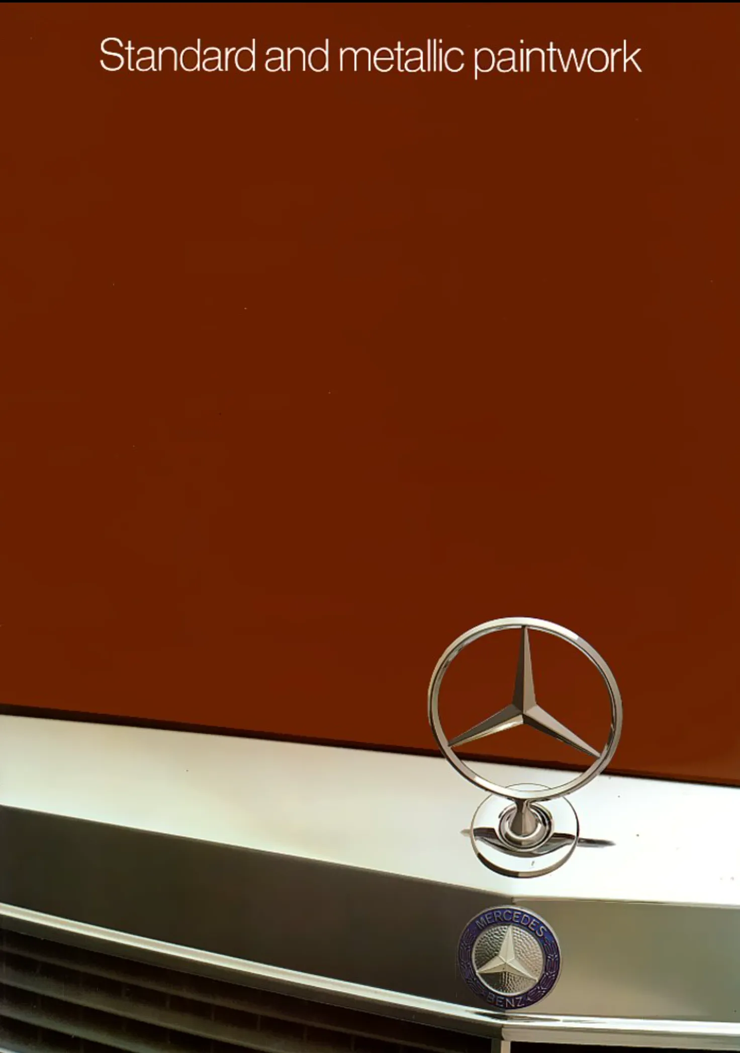
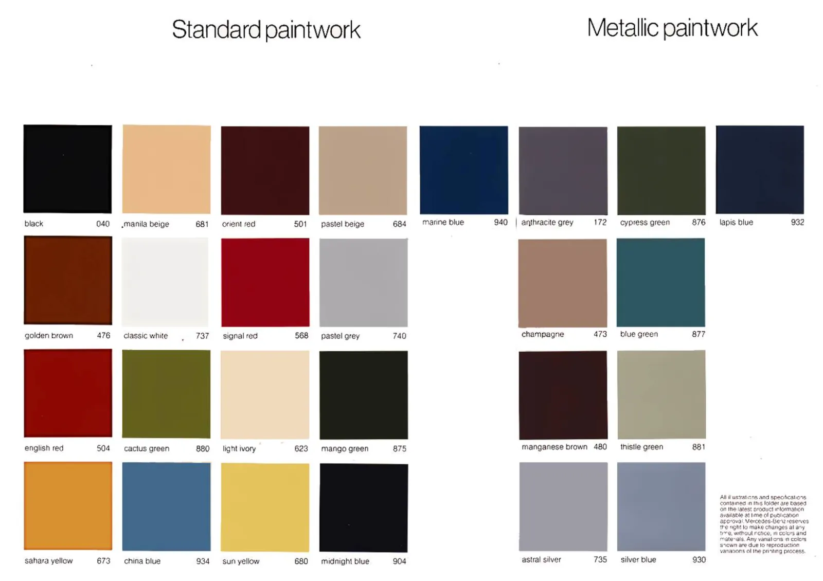
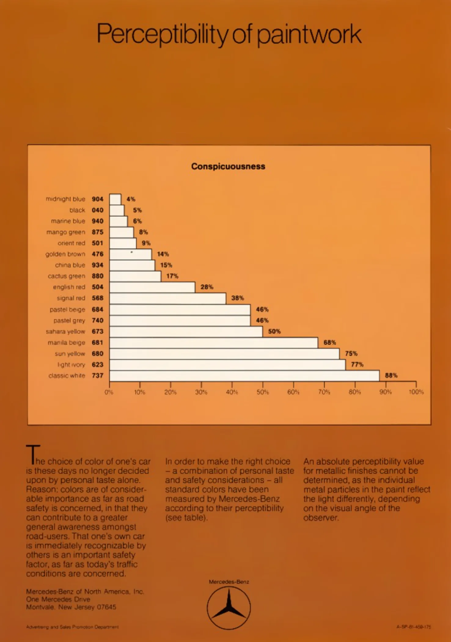
I love retro advertising. In this Mercedes car ad from 1982, body work painting is ranked by its level of “conspicuousness”. White is the most in your face. Signal red somewhere in the middle. And blue midnight blue is even more hidden than black.

The source of the car ad is here. Subscribe to this facebook group for more vintage car ads.

·Software

Finally, a color picker...

A feature that was long overdue: today we added a color picker to the SlideMagic settings page. Better late than never. Click on the big bar to reveal the pop up. If you want, you can still enter RGB codes. With the eye dropper, you can now sample colors anywhere on your desktop. Make sure to have V3.1.7 installed to use this feature.

(Proud of my daughter Mia who insisted to put this in, and actually wrote the code to do so herself)

·Colors

Changing the color of the French flag

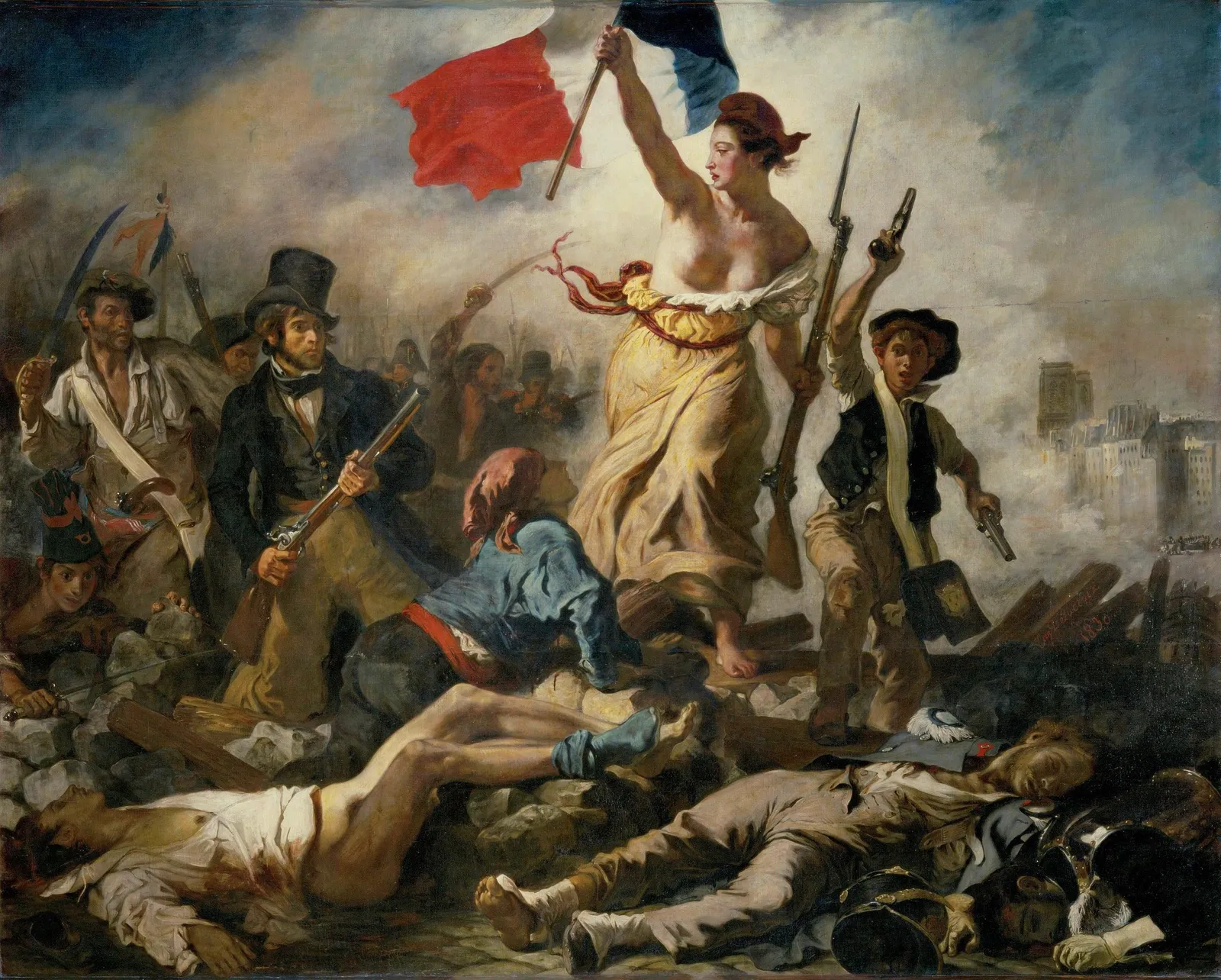
President Macron of France changed the blue color of the French flag. He made the blue darker again, after it was set to be the same blue as that of the European Union flag back in the 1970s. (Then president Giscard d’Estaing thought the different shades of blue clashed during photo ops).

I agree with Macron, the darker blue looks better, flags have a history, and i don’t think the two shades of blue clash at all. When doing design work, pay attention to flags. They have very specific colors (like logos), and very specific aspect ratios.

·Colors

Messaging group avatars

“Upload a profile picture” is the question you often face when creating a new messaging group for an upcoming event, a school parent group, etc. Most people go for a relevant picture, for example the class group photo of last year’s end of school year party.

But avatars are tiny and often have a circle shape. What jumps out most to the user is the dominant color of the image. So the best solution for avatars for these temporary messaging groups is a big bright colorful square (will be come a circle after uploading) with a big bold letter or number. “52” on green for the birthday party, 2 on purple for the 2nd grade parent group. Easy and effective.

(Pro-tip: use SlideMagic to create your avatar…)

·Colors

Think of image colour

Image libraries (including the ones that are available in within SlideMagic) have become so huge that you can afford to be very picky when it comes to image searches. Next time, don’t just use a keyword, but also pay attention to colour. And not just your accent colour of your brand book, but also complementary colours. We will add this colour filtering to the feature pipeline of SlideMagic.

I am in the process of a total overhaul of the SlideMagic web site and using this principle myself, focusing on images that fit with SlideMagic blue, or its opposite, orange.

(Still great to see how SlideMagic’s automatic image cropping gets it right in most of the cases)

·Colors

Picking a useful accent colour

SlideMagic uses a simple colour scheme: (just) one distinct accent colour and lots of shades of white/grey/black.

What are good accent colours?

  • One that stands out

  • (This is the tricky bit):

    • One with good contrast with white
    • One with good contrast with black
  • One that fits with your brand and/or industry, or the opposite one that really sets you apart from everyone else in your industry if that is what you want to do.

  • One that you like

People often forget about number 2, which cuts off a lot of creative possibilities with your design

Photo by Daniele Levis Pelusi on Unsplash

·Colors

SlideMagic slide search results now in colour

Another day, another improvement

I stuck to showing images on slide search results in black and white because I would be sure that the photos would not clash with the accent colour for the slide users had picked (most users will swap SlideMagic blue for their own logo colour). That worked, but it came at a price: slide templates all looked a bit sad. This is not only due to the greyscale colours, but also because of the way the greyscale filter was applied: many colours were translated into too dark tints of grey I think.

This morning I re-rendered the entire slide database (the server is still a bit tired) and images in slide templates now show up in colour.

It is worth the trade-off I think. Of course it is possible to go back to a black and white image in the SlideMagic app, simple untick the ‘colour’ box and the image will show up as grey scale (you can always go back to colour if you want).

The colour option is only available for the slides that I added more recently, after I switched off the colour option when ‘flattening’ or compressing slides. Obviously new templates will all appear in colour, or I will set them explicitly to black and white when I feel that it serves the slide’s message better.

This addition of colour coincides nicely with the more mature SlideMagic product I think, slowly but certainly it comes out in its full shiny colours :-)

Continue reading →
·Colors

Why are all your images black and white?

Yes, almost all the images on my blog and in the SlideMagic template bank are in black and white. Why?

SlideMagic uses (and encourages you to use) a sober colour scheme: basically different levels of grey with one accent colour that should match the dominant colour in your logo. This is a pragmatic choice. SlideMagic is all about business presentations, not art. More colours require additional design skills to get it right. Too many colours can make a slide busy, can create inconsistencies between slides, make the brand identity of your slide weaker. Yes, a pro designer can get it right, and maybe the amateur as well, but - and that is a very important but - it just adds to the time it takes to create your deck. And SlideMagic is all about speed. One accent colour and greys always looks good.

Full colour images introduce colours to your slide that might not always match your colour scheme. Colour schemes of images can also vary wildly between images, creating inconsistent slides. You often see that professional-grade designs (ads, brochures, web sites) use images that have been selected based on their colour profile. The amateur slide designer does not have time for this. That’s why keeping things black and white solves this issue: images blend in, and images look consistent.

Should all images always be black and white? Absolutely not. Personally, I would go for anonymous images to be black and white, but depictions of real things in full colour; your product, your app screen, your prototype.


Continue reading →
·Colors

Lighter variants of your presentation color

I ran into this slide (fragment) presented on an online course site the other day (I now digest tons of these to refresh my coding skills):

It shows a common problem in PowerPoint: you picked a nice theme colour (deep purple in this case) and you need variants of it. (This presenter figured out that too many colours makes your slide deck cluttered, hence SlideMagic only allows one :-) ).

The default model to make colour changes is to modify its brightness. It almost always work to make things darker, the other way around though can create a problem for very saturated colours. You don’t notice the saturation level at dark levels, but on brighter variants, that elegant purple becomes cute/bright pink.

The solution: change colour saturation as well as brightness. This post on my blog from 10 years ago (what?) describes it:

PowerPoint 2010 gives you the option of a spectrum of different shades of the same color. This is great to design charts with a consistent color scheme.

However, if your template contains colors that are highly saturated, the suggested lighter shades of your color will be too bright to use as neutral color nuances. Here is how you can fix it. (Click on the image for a larger picture.).

Create a new base color by reducing the saturation (in laymen’s speak: make it more grey). Open the color in your color template (format shape/fill/solid fill/color/more colors)Switch the color model from RGB (red, green, blue) to HSL (hue, saturation, luminance).Reduce the (S)aturation value, while keeping all other variables the same.Use a lighter shade of this new base color insteadand save this as a new color in your color template.

Continue reading →
·Colors

You can't argue about taste...

One of the very first philosophical realisations I had as a child is that there is no way to figure out whether 2 humans perceive color in the same way. This article elaborates further.

This could be one explanation for the difference in taste: each human has the same sense of style, taste, but simply sees, tastes, hears in a completely different way…

Photo by Braydon Anderson on Unsplash