SlideMagic Blog

Frequent updates about all things presentations since 2008. Subscribe to never miss a post.

RSS
all posts

Category Shapes

·Design

Simple diagrams creates well, simple diagrams

Simple diagrams (link) is a nice little tool to create simple sketches in the spirit of Dan Roam’s book “The back of the napkin” (review). You can either use it as a sketch tool to develop ideas, or as slides in your presentation. The extreme scenario would be to create an entire presentation out of these types of diagrams.
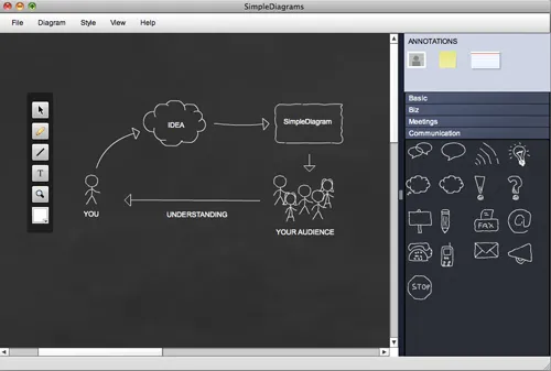
The program uses aggressive pop up messages to get you to use the full version. There are more subtle ways that will get to the same effect.
·Concepts

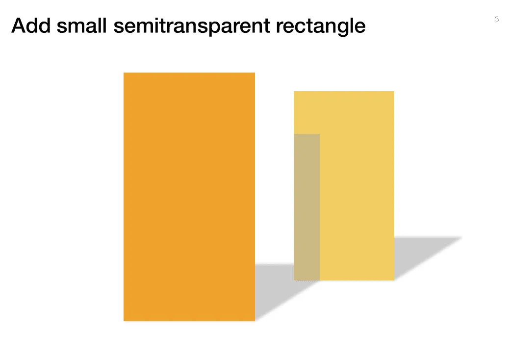
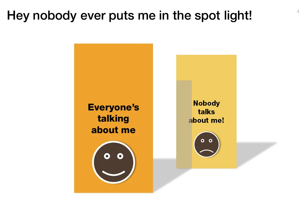
Chart concept - standing in the shadow

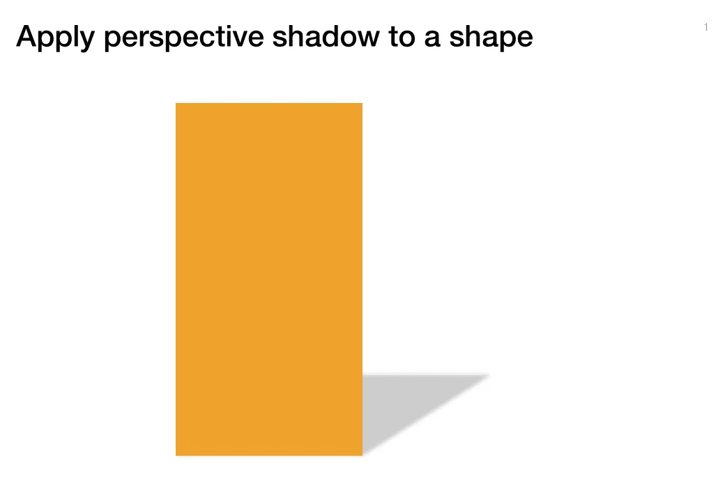
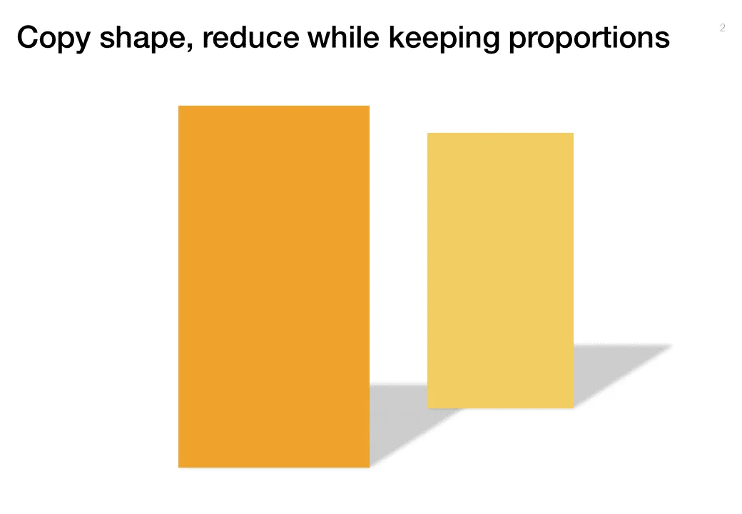
Some issues/people get all the attention, while others never get discussed. The chart below looks a bit like a child’s drawing, but the point is to show how you can play with shadows to create the effect.

·Design

Using Adobe Illustator shapes in PowerPoint

PowerPoint 2010 has now incorporated some of the shape manipulation techniques that until now were the domain of Adobe Illustrator: union, combine, subtract, and intersect (read my earlier PowerPoint 2010 review here).

Until now, I never got into understanding Illustrator. Until now, because I (ironically) start to experiment with integrating more hand-drawn shapes into my presentations (I am even thinking of picking up my old highschool habit of drawing cartoons of people). Fonts are no issue (earlier post). The line/curve manipulations capabilities of Illustrator however are still far better than PowerPoint.

Here is how to move an Illustrator shape into PowerPoint, not just as an image, but as an editable vector object.

  1. In Illustrator export your shape in an EMF format
  2. In PowerPoint, select “insert picture” (a bit counter intuitive)
  3. Right-click the object and un-group it. Say “yes” to the question whether you want to convert it

Converting is this simple. Unfortunately, understanding Illustrator is not…

·Design

Re-post: cutting up shapes

Cutting and pasting your object as a PNG image allows you to cut up regular PowerPoint shapes in random components. See an example here.

·Design

Re-post: creating a realistic blackboard in PowerPoint

With color and light effects you can create a black board in PowerPoint, an earlier post here.

·Design

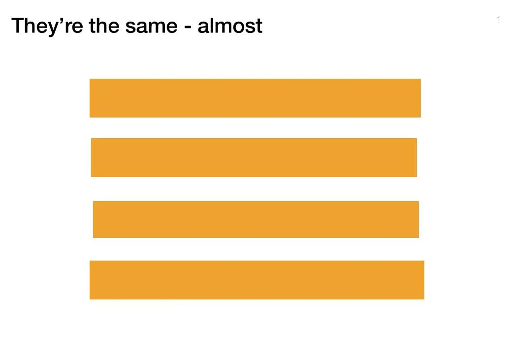
Almost the same size is not good enough

Making similar boxes the exact same size, and exactly aligned matters a  lot in slide design. The brain gets distracted when object alignments is just a bit off.

Usually the slide starts out OK, ctrl-C/ctrl-V a bunch of objects and they are all exactly identical. Over time, things start to degrade. Accidentally resizing things a bit, moving a box a bit, etc.

You need to train your eye to spot the imperfections. The quickest fix is usually to select a group of objects, select “format” and then give them all the same size in centimeters (hight, width, both). In the Arrange / Align menu you will tools to spread objects out evenly.

Little effort, big result.

·Advertising

Chart concept - mystery door

This ad reminds us how easy it is to create a visual concept with elementary shapes and nothing more than basic drawing skills.

Via Ads of the World.

·Design

Centroids

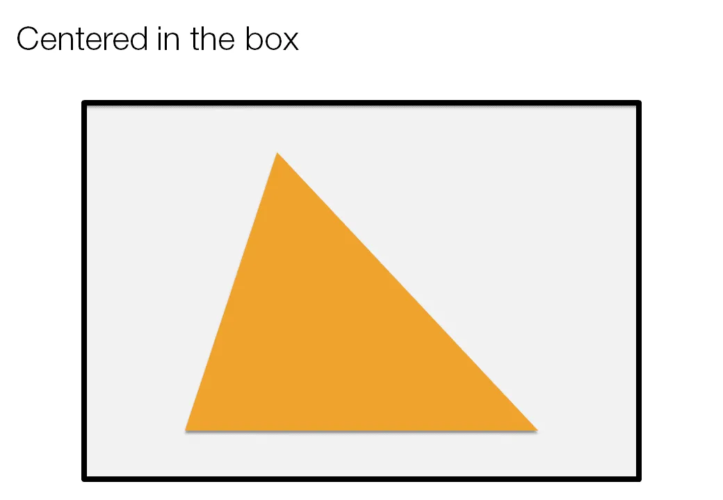
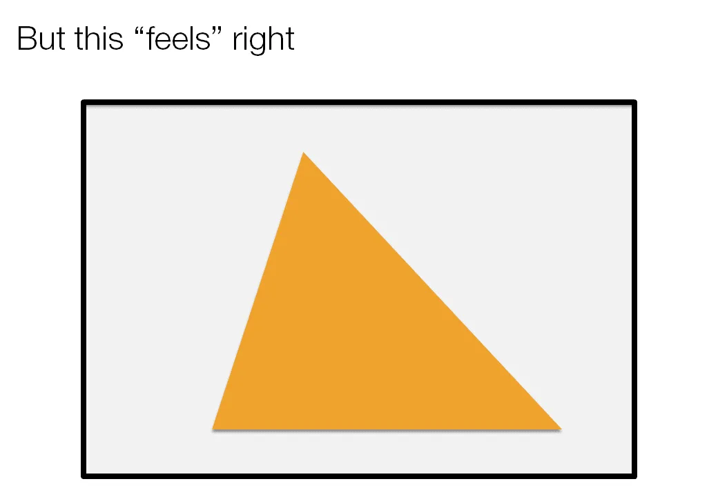
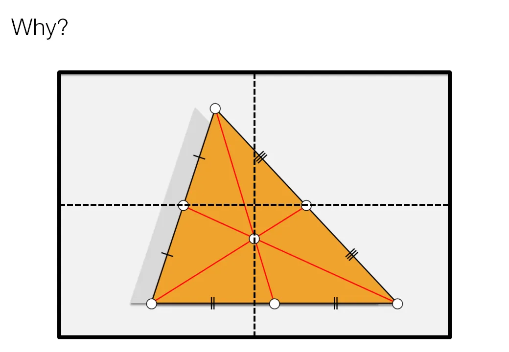
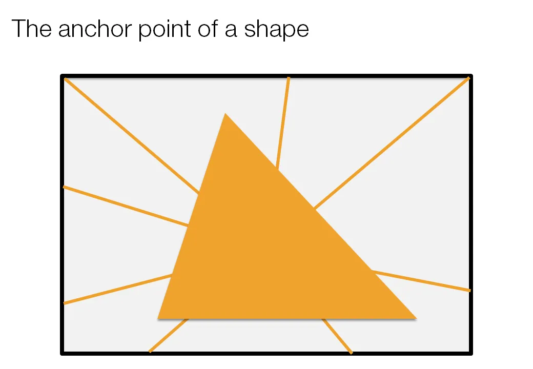
Call me a nit picker, but I always feel this urge to fix the direction of a connecting line or an arrow pointing to an object in a slide, or to position an object exactly where it feels right.

Intuitively, I am looking for the centroid of a shape. Running complex mathematical analysis every time you need to place an object on your slide would be overkill, however, keep the concept in mind.

·Design

Chart concept: cell division

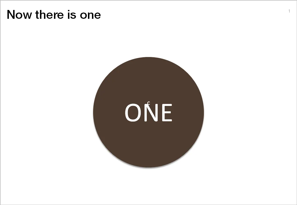
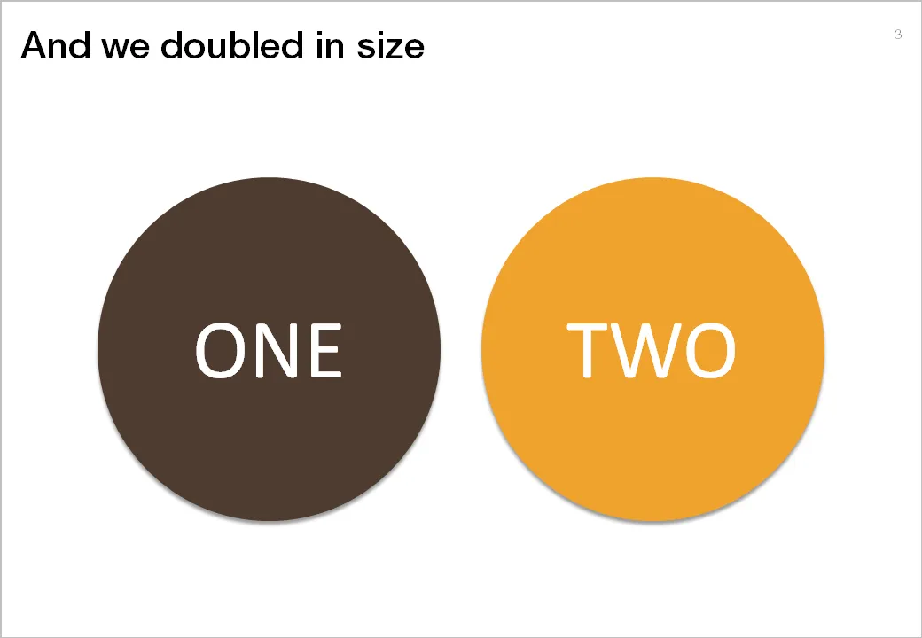
Many presentations are about ambition: “we want to double in size in 5 years”. That’s basically creating another company exactly as the one you have now. You can use the concept of a biological cell division to visualize this.

The stretching of the circle is done using the edit points function in PowerPoint. The text is stretched using the function “text effects” in the format ribbon of PowerPoint.

·Colors

Out with the shape outline

Tel Aviv uses a very dominant street painting scheme: red-white and you cannot park, blue-white and you can park but have to pay. The colors are so bright that the city looks like one big Formula One circuit. Why not use more modest colors? Grey blue and olive green? The picture below gives an example, freshly painted pavements (you have to re-paint often in the sunny climate here).

The same is true for PowerPoint shapes. Whenever I can, I omit the lines around shapes (shape outlines). It makes your chart a lot calmer.

Image credit: Flickmor