SlideMagic Blog

Frequent updates about all things presentations since 2008. Subscribe to never miss a post.

RSS
all posts

Category Shapes

·Concepts

Movement without animation

I am not a big fan of animation. It distracts the audience, can sometimes look funny instead of serious, and is not visible when you send people a PDF file, the new standard with the proliferation of platforms (PowerPoint, Keynote, mobile devices).

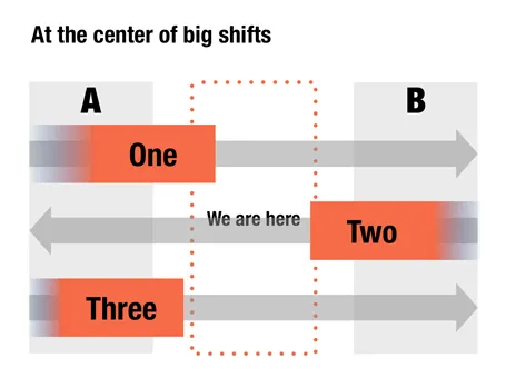
Here is an option to give a sense of movement in your slide without using animations. When filling a box, select the gradient option and let one side fade out to 100% transparent or 0% opaque. The chart below is a sanitized version for a client that is right in the center of some pretty major transformations that are going on now, so if you are an investor, that is where you want to be as well.
It has been a while since I blogged about chart concepts (here are some earlier ones), let me know if these ideas are useful for you.

·PowerPoint

Back to the 50s

I am reading up on the history of graphics design and typography and it struck me that non-professional PowerPoint presentation designers today have a similar tool set available to them as the analogue graphic design masters from the 30s to the 60s. Classic fonts, simple shapes, primitive/manual image manipulation tools.

Have a look at this poster by Joseph Muller-Brockmann(I cannot paste it here because of rights): basic fonts, basic shapes. The power of the design is solely created by proportions and shapes.

I stocked up on some more books for design inspiration.

·PowerPoint

Focus!

Here is a shape that I recently constructed to highlight that a company was doing lots and lots of things and all of it got focussed on just one area of expertise. The chart was not designed to read out the individual bits, but rather show that there are many, many, many aspects. Later, the presentation elaborates them one by one. You can see that I created the shape through a number of aligned triangles, alternating between the foreground color and white. Make sure that the biggest one is in the back, the smallest one at the front.

·PowerPoint

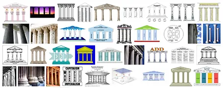
Over-used: the temple framework

The pillar template goes back to the early days of PowerPoint. A building structure is a useful concept to show that things are dependent on each other, and will already collapse if only one pillar is removed. Still, using a Greek temple will give your PowerPoint presentation that instant 1990s feel. I am not sure that is what you want…

·Hacks

An iCloud-style cloud in PowerPoint

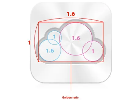
I often need a cloud shape in PowerPoint to draw a network diagram. The standard PowerPoint cloud is not very pretty. Here is a way to construct a new cloud shape in the style of the logo of the iCloud service by Apple.

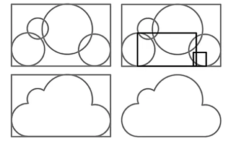
Takamasa Matsumoto originally discovered how the iCloud logo is infused with golden ratios. If you use these proportions to draw some basic shapes in PowerPoint, you can combine them using the shape union command (on the Mac right click the selected shapes, go into grouping and select union). You see that I use 2 extra rectangles to fill up the shape.

Here is the final result compared to the standard PowerPoint cloud shape, with heavier lines around the shape.

·PowerPoint

Making good diagrams in PowerPoint

This presentation contains some useful guidelines for making diagrams. Thank you Alessandra for pointing it out to me.

How to make Awesome Diagrams for your slides

·PowerPoint

A new way to use LEGO in your slides

Recently, I needed to find a good visualization of modularity in a presentation. Lego is a nice concept, but maybe a bit cliché. Not if you use this really cool LEGO design tool: LEGO Digital Designer. It is a full 3D design environment in which you can create any LEGO object you want, and even submit it to LEGO to buy a box with the pieces plus a build instruction. It comes with a large online library where people can upload and download designs.

Here is an example of the Empire State Building. You switch on an animation of how the building is built up as the bricks fly in from all directions. Great stuff.

If you are in to LEGO, here are some earlier posts about it. Christoph Niemann uses LEGO to model New York city. This ad visualizes the power of imagination that kids have, but grown ups seem to have lost.

·Layout

Borrowing frameworks

Consulting firms, market research companies, universities produce an endless amount of complex and sophisticated-looking frameworks. Often, I see people borrowing one, re-drawing it, or overwriting the labels with their own text. It is better than you don’t.

  • Frameworks are highly specific to a certain context, so they are unlikely to work when you borrow them for your own presentation
  • Frameworks are great to solve problems, to discuss issues with a small audience who has worked with it before, but are incredibly poor at communicating to a large audience

Instead, sketch your own simple, specific, and relevant diagram on a piece of paper and replicate that in PowerPoint.

·Concepts

Back to simple

There are just so many advantages to making slides with very simple shapes:

  • It focuses on what you want to say only
  • They are easy and quick to make
  • They look highly professional without a degree in graphics design and/or the full suit of Adobe software
  • It easy to create a sense of motion
  • There are no issues with images/illustrations that do not fit your color template

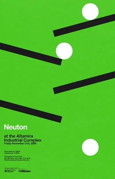
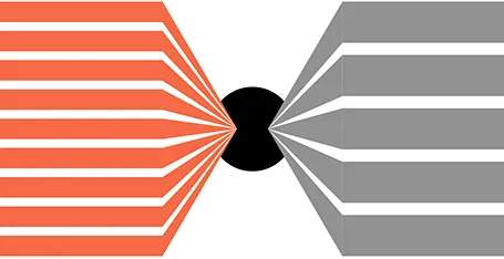
An example is this poster by Network Osaka (actually must better than a concept designed by me a year ago):

·Concepts

So how many different types of slides are there?

I think there are 4 different type of visuals,  Have I forgotten any? (The images below are taken - out of their context - from previous posts on this blog)

  1. Big picture, big emotion slide. A huge image of a squeezed orange “the competition is killing us!”, a big picture of an audience asleep “presentations are boring!”, swimmer dives in the pool “let’s go for it!” (lot’s of cliches here, but I have seen many good ones as well). These slides are an emotional shortcut, they unlock an idea/feeling that is already present in everyone’s brain quickly.

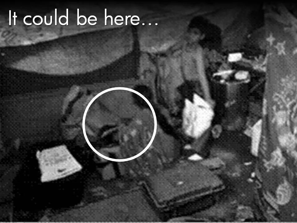
  1. Location port, a big image of a place, a street, a country, a customer. Pretty much like a movie director opening a film to bring us to a different time, a different place. An image of the interior of a messy store is much more powerful than a list of bullets: isles are not straight, labeling is unclear, lighting is poor.

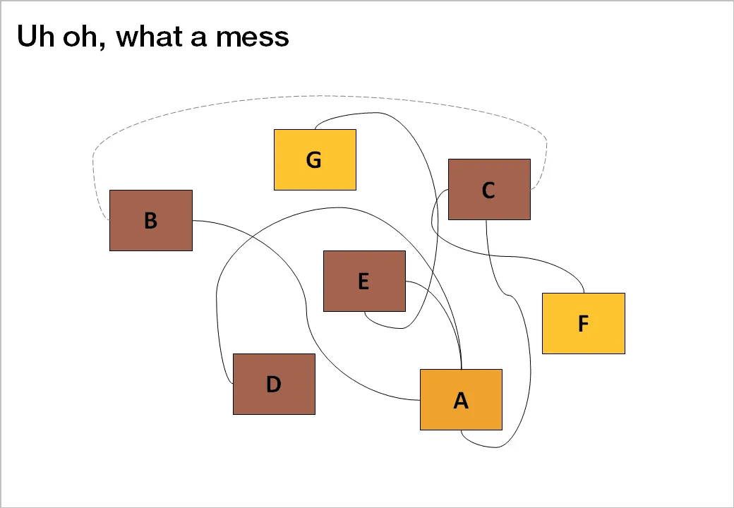
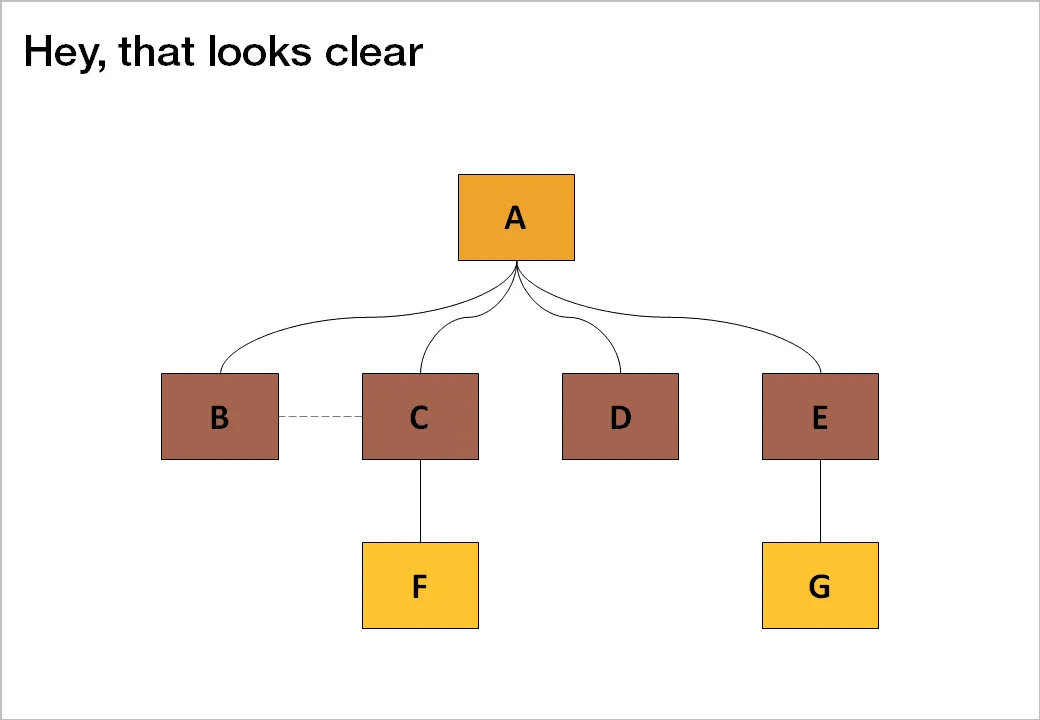
  1. Relationship slide. Shapes/boxes with text, arrows, to show how issues are related, impacting each other, are dependent on each other, sit in different places on the same map.

  1. Data chart showing us a trend, or comparing numbers.

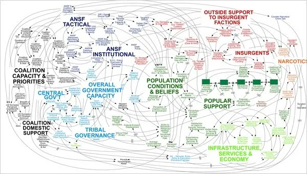
An incredibly dense relationship or data chart should actually be in the “location port” category, the U.S. army spaghetti chart is an example: it is not so much about understanding the chart in detail, rather the viewer understands immediately that “it’s complex” (earlier post).

Continue reading →