

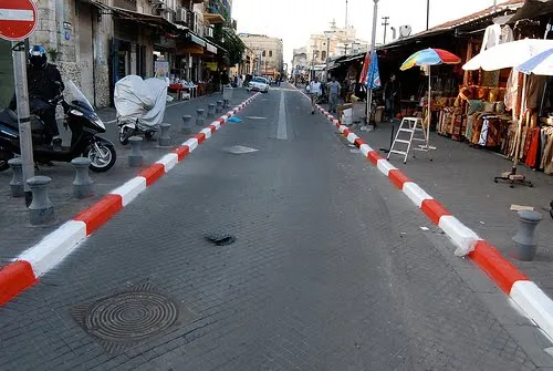
Tel Aviv uses a very dominant street painting scheme: red-white and you cannot park, blue-white and you can park but have to pay. The colors are so bright that the city looks like one big Formula One circuit. Why not use more modest colors? Grey blue and olive green? The picture below gives an example, freshly painted pavements (you have to re-paint often in the sunny climate here).
The same is true for PowerPoint shapes. Whenever I can, I omit the lines around shapes (shape outlines). It makes your chart a lot calmer.
Image credit: Flickmor