SlideMagic Blog

Frequent updates about all things presentations since 2008. Subscribe to never miss a post.

RSS
all posts

Category Shapes

·Design

Overlaps in PowerPont (redux)

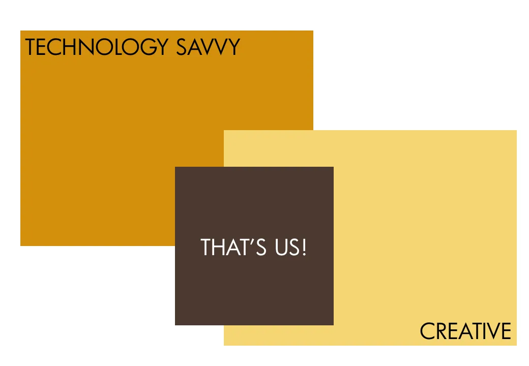
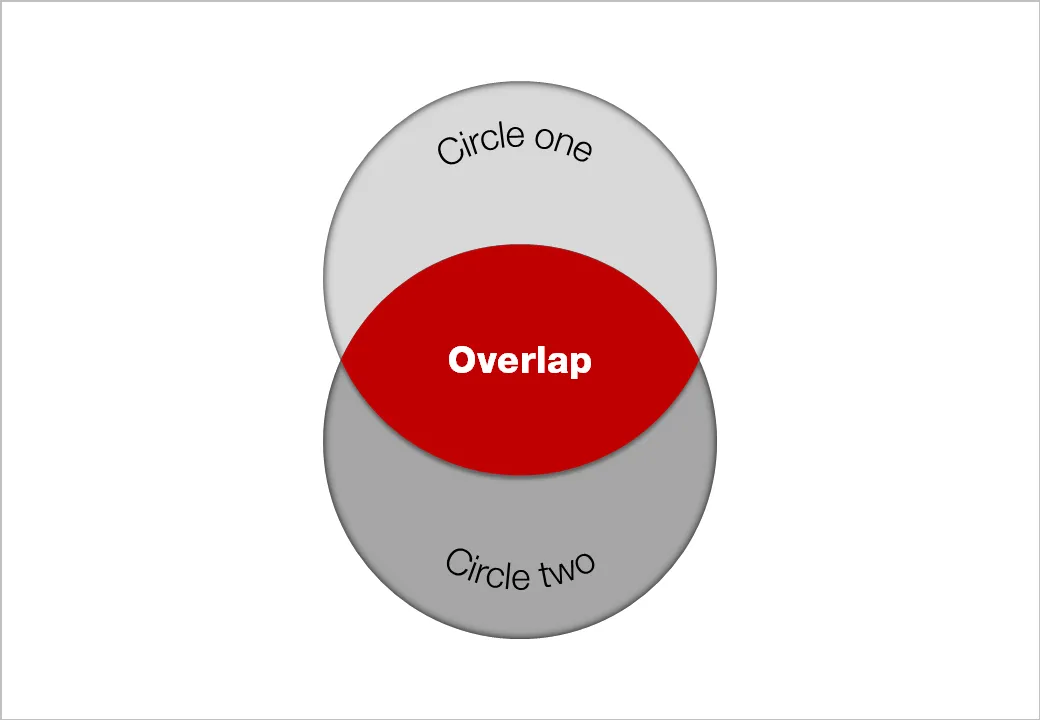
Another technical post today, giving another approach to creating Venn-like diagrams without the color limitations of semi-transparent shapes.

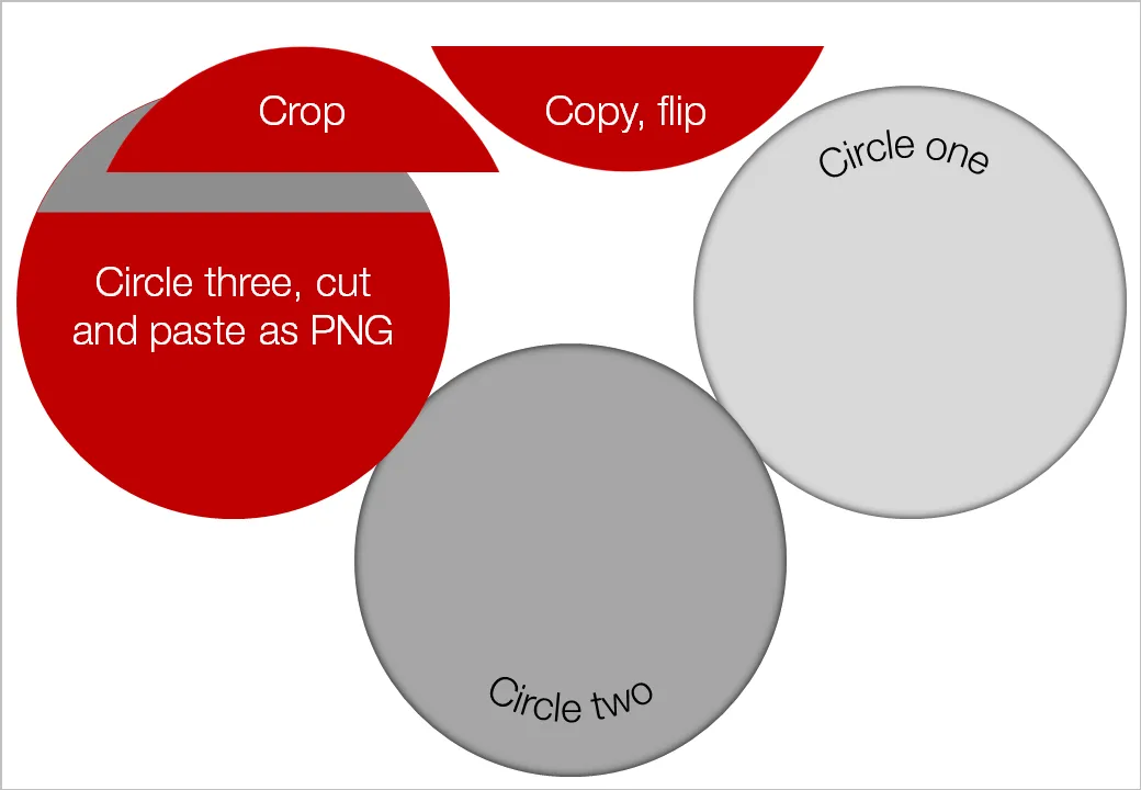
  • Draw an extra shape exactly the same size as the others, in the color you want
  • Ctrl-X it away and paste it back in as a PNG (paste special, PNG)
  • Crop excess bits away
  • Overlay them

Blog visitor AdamV provided a link to this Microsoft PowerPoint 2010 feature that will make it very easy to combine, intersect and subtract shapes.
UPDATE February 2018: I have now added several designs for PowerPoint Venn diagrams on the SlideMagic template store that make use of PowerPoint’s shape intersect function.
·Design

Turning any image into concrete

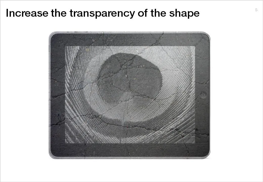
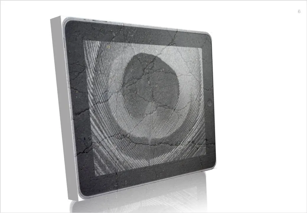
Here is a simple trick to turn any image into concrete. As an example I took an iPad and turned it into an iSlate, but it might actually work better with other images (you can turn portraits into statues for example).

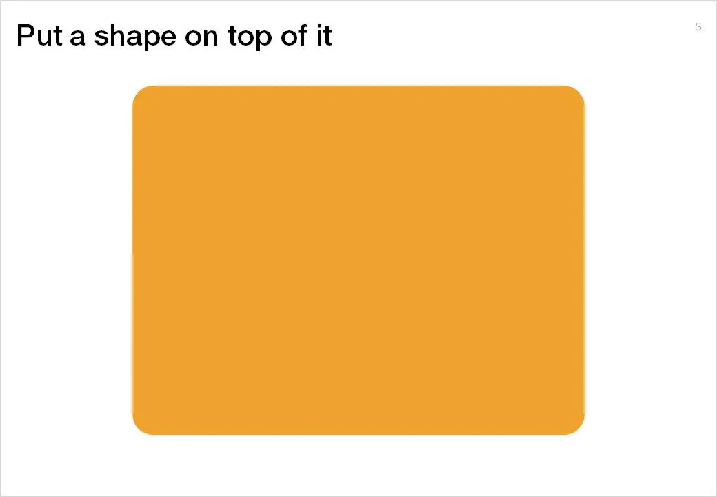
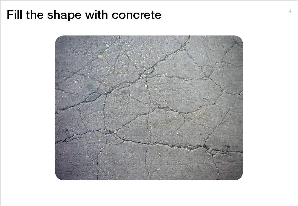
To do this in PowerPoint without the help of advanced image manipulation software you need to add a shape on top of the target image, fill the shape with an image of a concrete texture (available on any stock image site) and make that shape with the concrete texture semi-transparent.

·3D

Maintain one vanishing point when rotating 3D PowerPoint objects

3D effects can add impact to a PowerPoint slide if used at the appropriate occasion.

  • 3D for the sake of 3D adds complexity: the slide becomes harder to understand, the only thing you showed is that you know where to find advanced formating buttons of PowerPoint. 3D data charts are a good example of this
  • 3D adds value if you need to convey distance: I use 3D for what it actually is, a way to add a third dimension to your slide, to show depth… (Notice in the previous post I linked to that you often do not need to use sophisticated 3D effects to create depth, colors or differences in size can do the trick equally well).

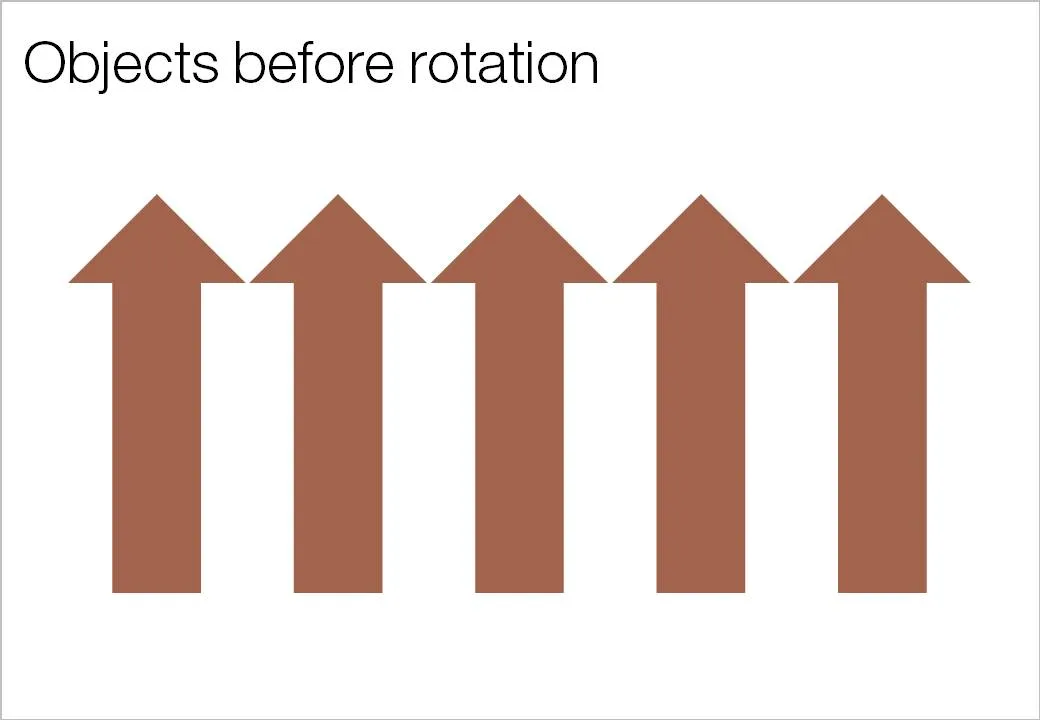
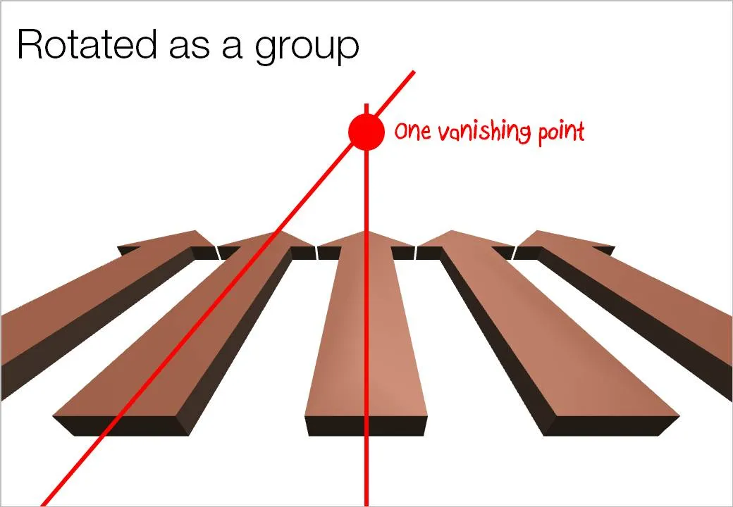
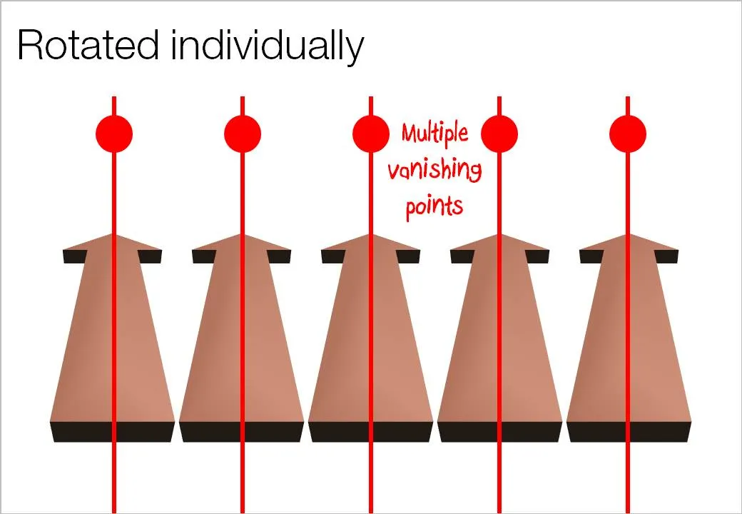
Here is an important thing to remember when using 3D rotations in PowerPoint: rotate a composition of objects as a group, rather than a collection of individual objects. Grouping them preserves one vanishing point in your slide composition. An example:

·Design

The vertical center that feels right to the eye

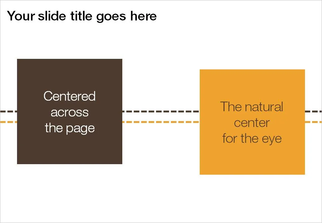
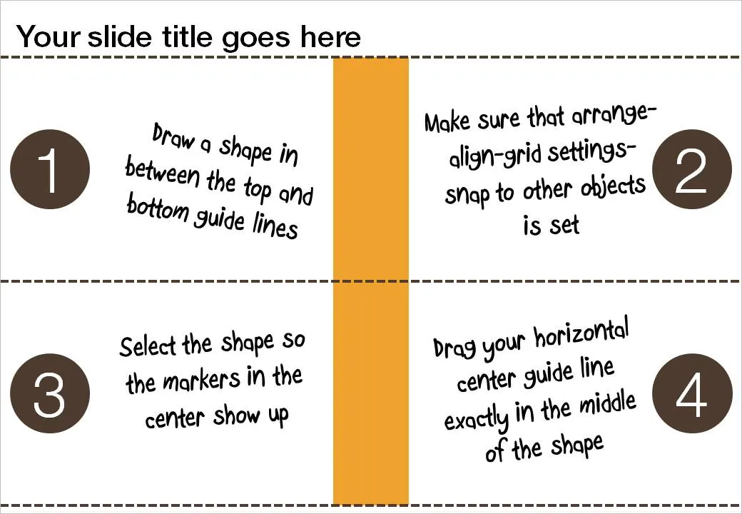
If you use big title headings on your PowerPoint slide, the exact vertical center of the slide might not feel natural to the eye. I suggest centering items slightly lower. Here is how you can find the exact location where to set your drawing guides.

  1. Draw a random shape in between the top and bottom drawing guide
  2. Switch on “snap to other objects” (arrange-align-grid settings-snap to other objects)
  3. Select the shape to make its center marker visible
  4. Drag the middle horizontal drawing guide to the center of the shape, it should “snap”

·Design

Making a photo cutout in PowerPoint (redux)

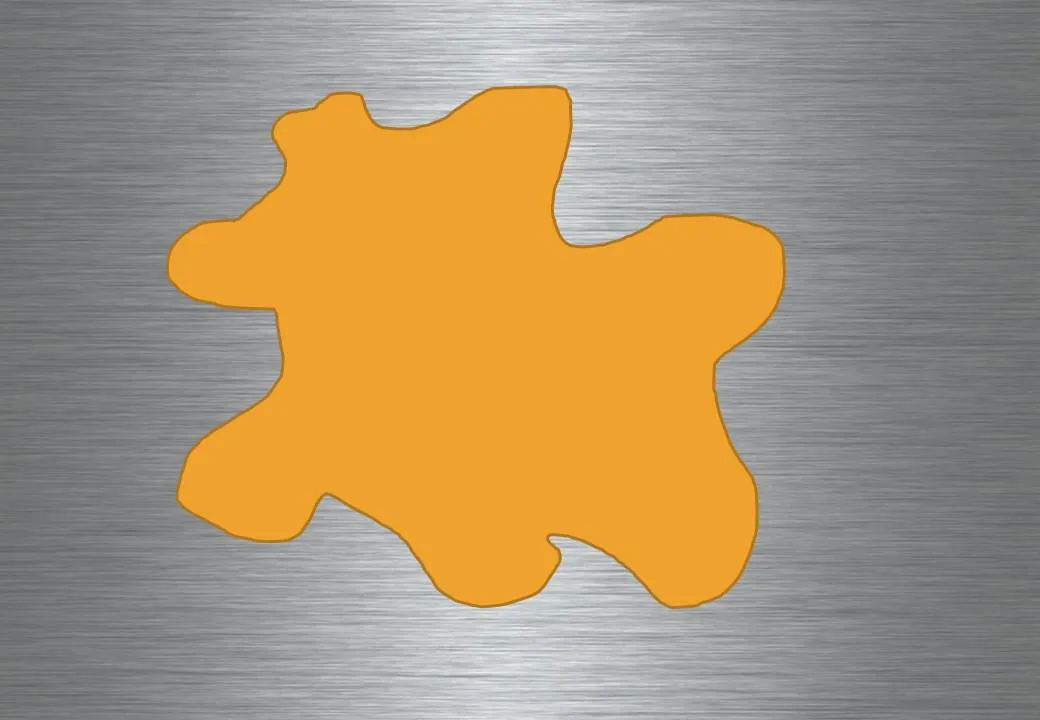
Readers from the early days will remember similar posts, but I want to bring up the subject of cutouts again. Recently, I started using them more, especially in combination with randomly drawn shapes.

  1. Fill the background of a slide with an image. Right-click the slide, select [format background], select [Picture or texture fill] and select a file. Note that this is different from simply copying a page-covering image on your slide.

  1. Copy another image over it.

  1. Draw a shape, I like using random shapes.

  1. Right-click the shape and select [Format shape], [Fill], [Slide background fill], and add an inner shadow for additional effect.

Images found on iStockPhoto.com.

·Design

Chart concept - a variation on the Venn diagram

Venn diagrams

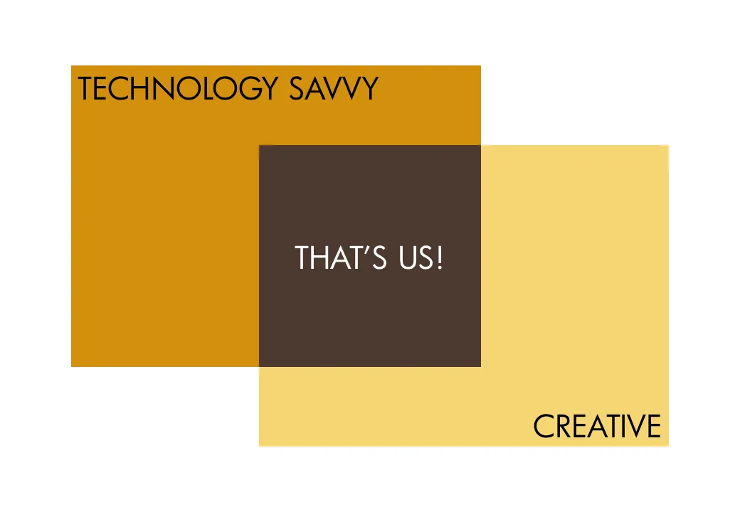
are great to show overlapping features. In practice however, it can be hard to position text in the circular shapes. I often use an adjusted version of the Venn diagram, one based on boxes. Boxes are easier to draw, and especially, you can make the center box (the most important one) really large.

As you can see below, I did not rely on semi-transparent colors to create the overlap effect. Rather, I just drew the third box in, giving me complete flexibility to decide on colors. Again something that would be hard to do in a circle Venn diagram.

UPDATE February 2018: I have now added a number of Venn diagrams in PowerPoint to the SlideMagic store, including the rectangular ones that are described above.

·Advertising

Keep your text trapped in its box

The elaborate tornado illustration of this ad is pretty, but it looks like there was not much time left to think of a good place for the punch line and the dates of the event. Eyes and brains do not like reading text over fluctuating backgrounds.

Via Ads of the World.

·Advertising

Chart concept - "Stuck!" (redux)

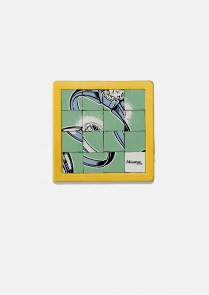
This ad uses a visual concept which I discussed in an earlier post. The easiest way to recreate it in PowerPoint is to stick to simple shapes with numbers, similar to the original puzzle with 15 pieces. You can go one level up and use an image (like in the ad). To do this, re-read an earlier post about slicing up PowerPoint shapes.

Via Ads of the World.

·Design

Consistent shadow and gradient directions

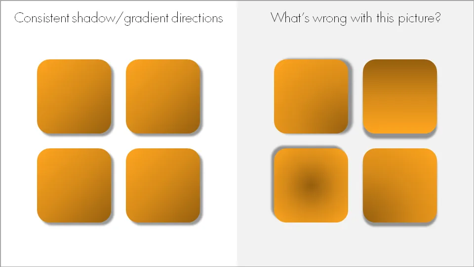
When using drop shadows and gradients, pick an imaginary source of light to guide in which direction you want to put your shadows and/or gradients. And then: use them consistently on the slide and possibly throughout your presentation.

Now that we are on the subject. I am not a big fan of these effects in general. In the example above, I emphasized them on purpose to illustrate the point of direction. Normally, I would use very subtle drop shadows only small chart elements that really need to stand out (example). Gradients, I use only to simulate a 3D effect.

·Design

Simple and complex at the same time

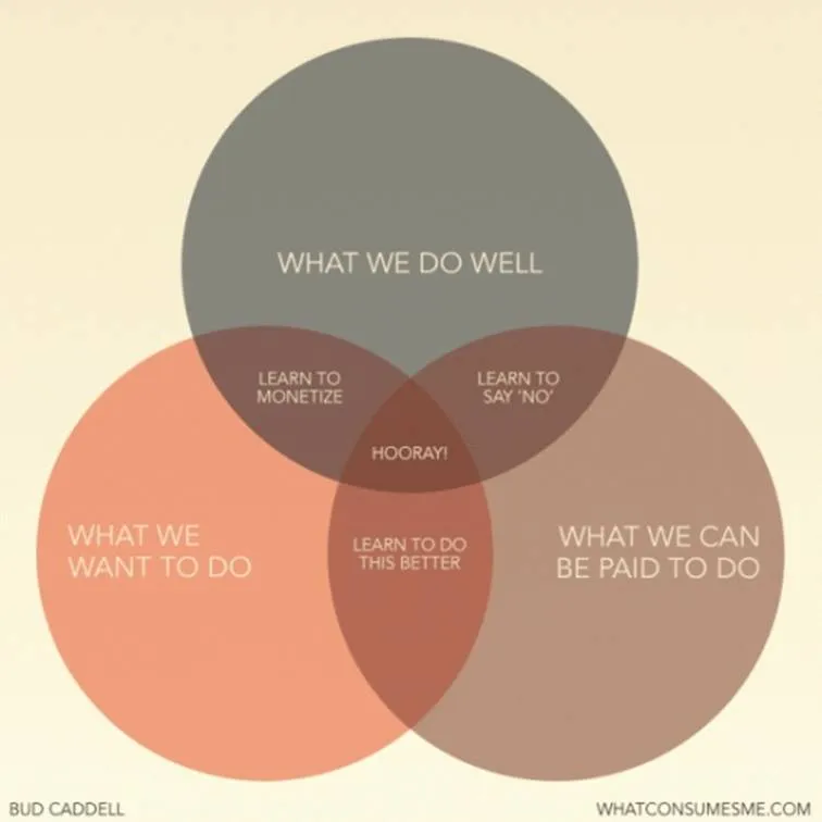
I came across this nice diagram with a useful lesson about what we should be doing in life (via Flowing Data).

A neat concept, and the Venn diagram is the right framework to visualize it.

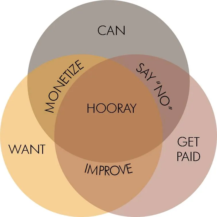
The chart is simple, but it actually takes the reader a few seconds to internalize it. If you want to use something like this in a stand-up presentation, some modifacations to the slides are required:

  • Simpler words to express the ideas
  • Create more visual space for the overlapping areas
  • Animations (unfortunately, I cannot avoid it here) to introduce the circles, introduce the overlaps between 2 of them, introduce the overlap between all 3 of them.

Unfortunately, my slide does not look prettier than the original one, and standing on its own, it does a worse job in explaining the concept. On stage though, it will work better.