SlideMagic Blog

Frequent updates about all things presentations since 2008. Subscribe to never miss a post.

RSS
all posts

Category Concepts

·Layout

Organized randomness

While working on my 9xchange site, I used one of my approaches to present a document. “Pages” that sit randomly on a table or surface (see below).
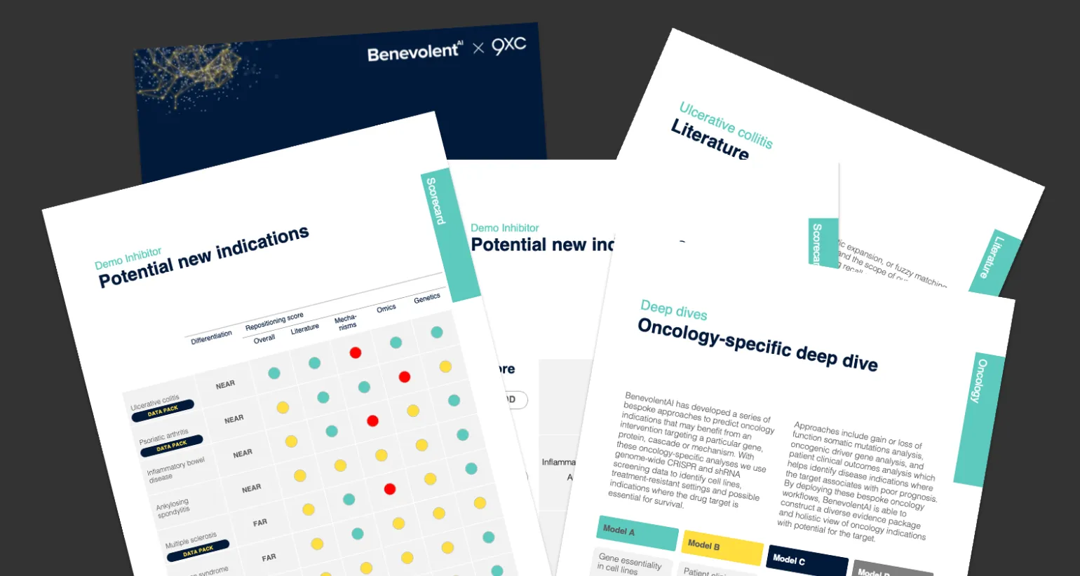
I use this technique as well for the banner image of this blog, see below.
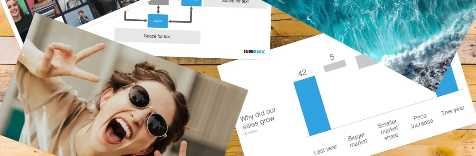
This effect is very easy to make. Take an empty slide / page in any presentation app. Save the document you want to show as individual images (good old screenshots will do as well). Drag the images on to the slide and tilt them. Add a little drop shadow behind them.

Things are not as random as they seem though:

  • The angles of the pages need to look interesting, not all the same, not too different
  • The page need to be semi-readable (i.e., not upside down)
  • Key headings should be visible and very readable
  • You need to decide whether to let pages bleed off the page, keep them 100% in the frame. It will create very different effects
  • You should select pages that look varied, and interesting and are presentative of the content of the document you want to show.
·Concepts

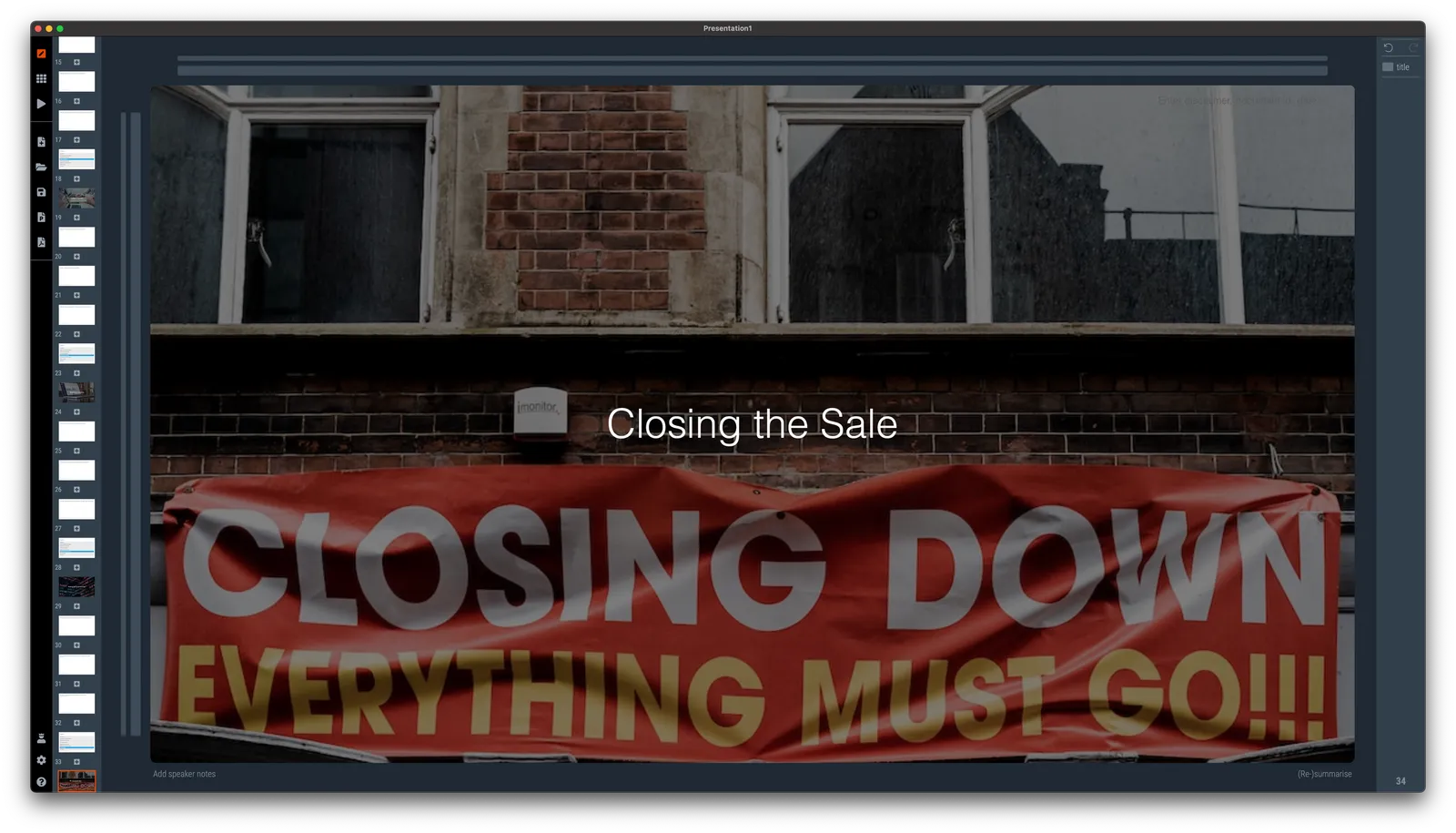
Work in progress...

See the image below. I am blending AI-generated slides and images, and things are not completely right yet…

·Concepts

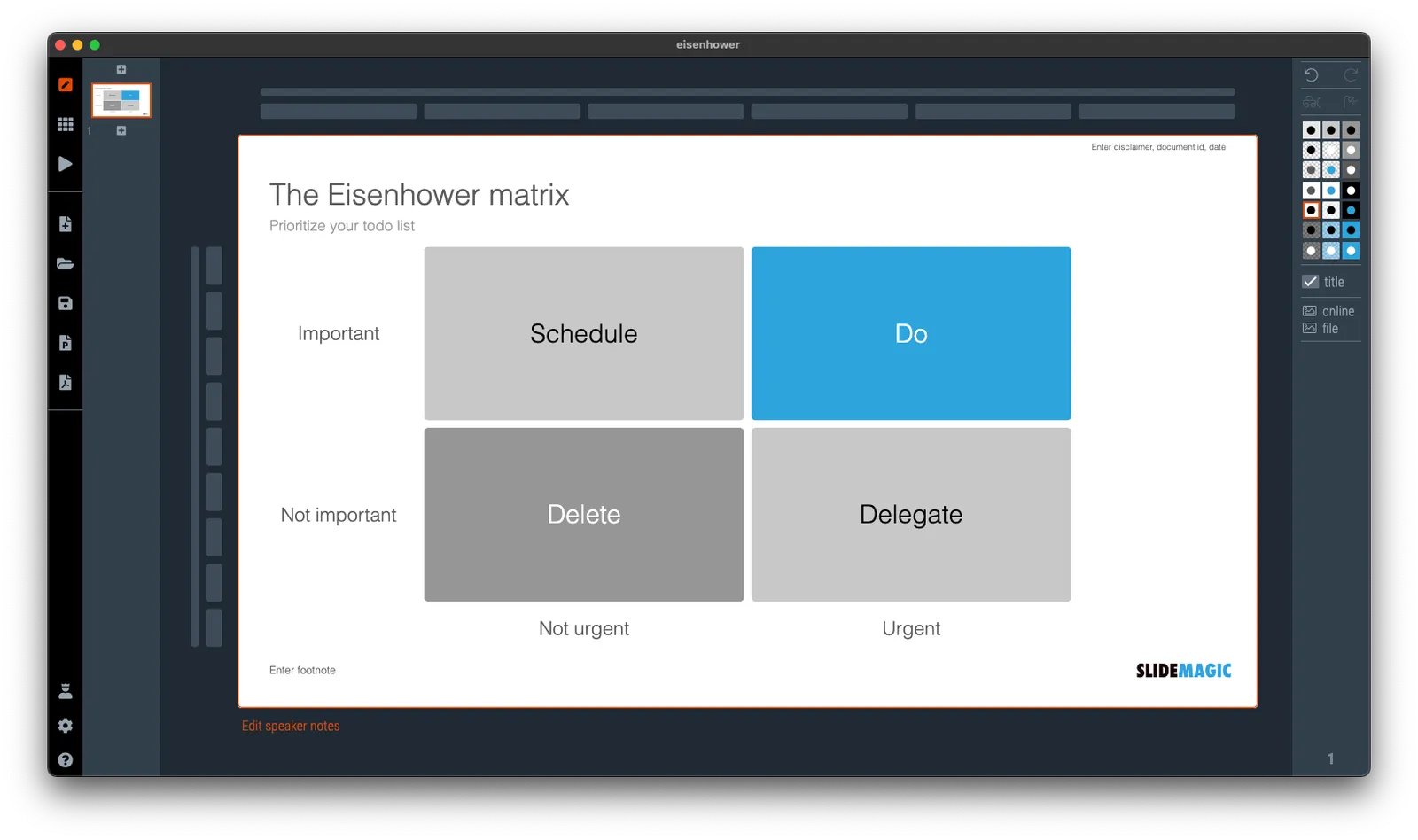
Prioritize your todo list, the Eisenhower matrix

I was talking about prioritizing your time a few days ago and remembered a time prioritization tool that was suggested to me while at McKinsey. It turns out it is called the “Eisenhower Matrix”. I added it as a template to SlideMatic.

They key insight here was to be really rigorous and actually don’t do unimportant, not urgent tasks. The problem though was that all requests added to my desk were important and urgent….

·Layout

An alternative calendar

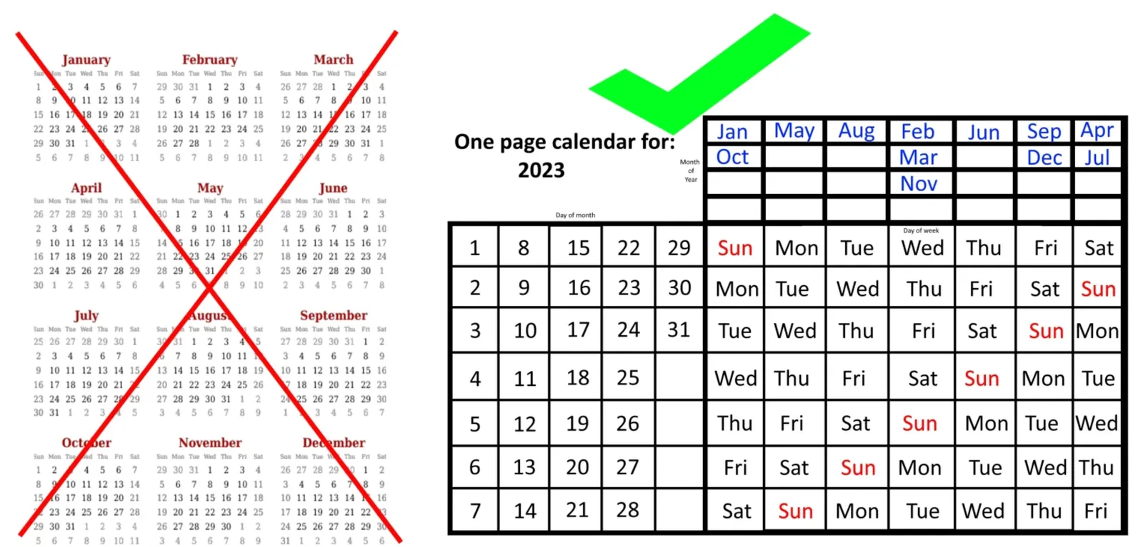
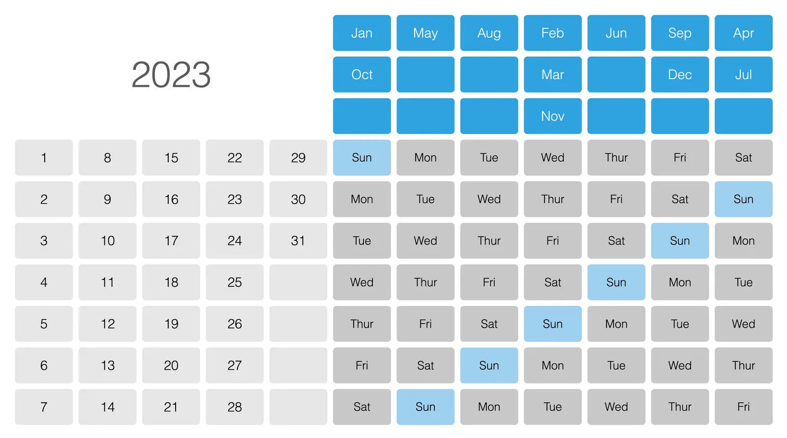
Here is an interesting twist on the traditional annual calendar:

 Image credit: https://bigthink.com/starts-with-a-bang/one-page-calendar/

Image credit: https://bigthink.com/starts-with-a-bang/one-page-calendar/

Yes, it is a lot more efficient when it comes to the amount of space it takes (or the required font size to fit a whole year on a page). But I think the point of the big, dense, calendar is to schedule and plan things across the year. Also, you need to do a few mental steps to get your head around looking at a specific month.

I added a template with this calendar to the SlideMagic template library, search for “calendar” in the SlideMagic app and it will show up.

You can read the full discussion of this alternative calendar format here.

·Concepts

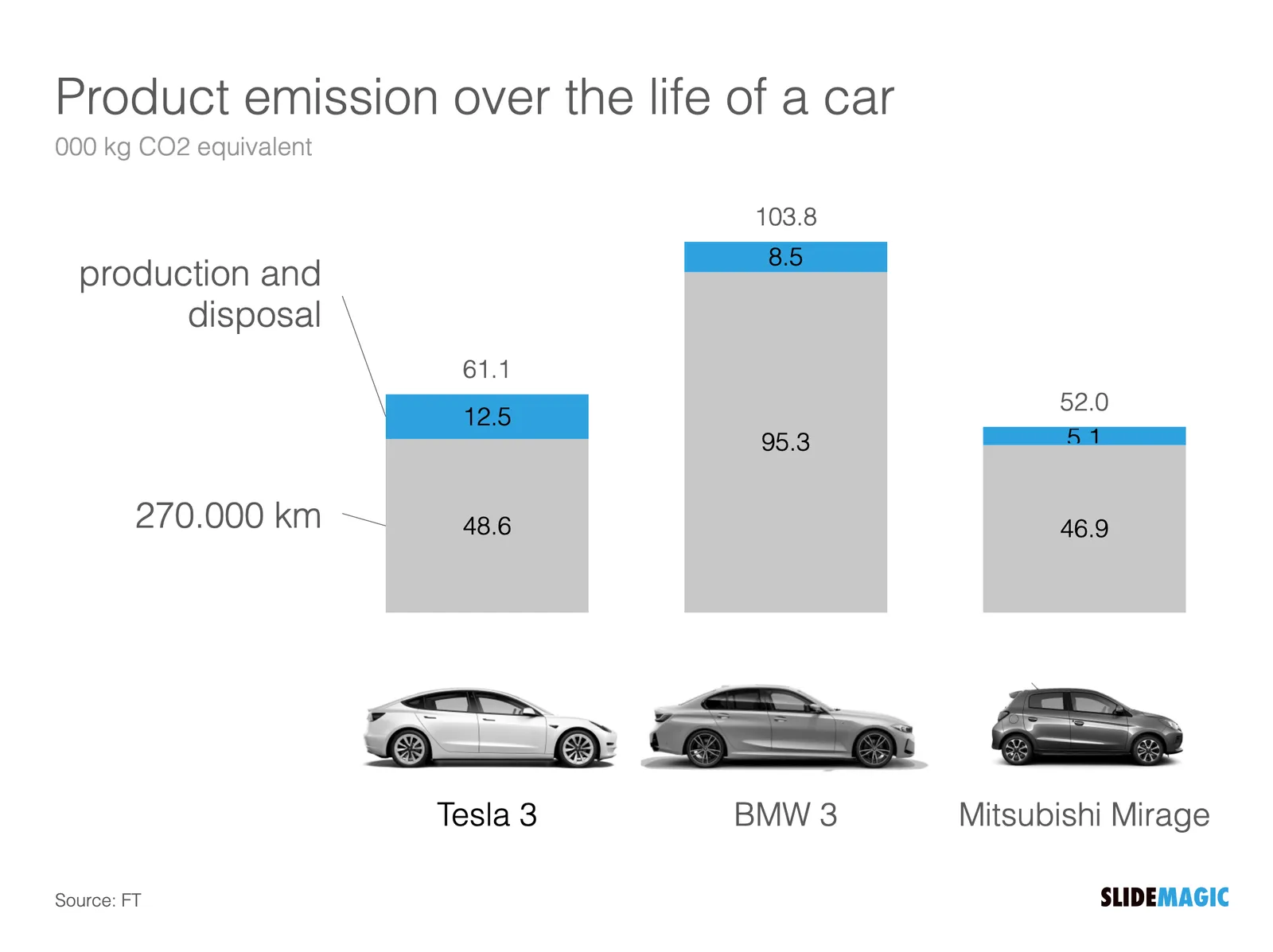
Table makeover: car emissions

SlideMagic is back in 2023 after the holidays, and a very intense, exhausting and drenched JP Morgan Healthcare Conference in San Francisco (I will share some insights about pitching from this event over the coming days).

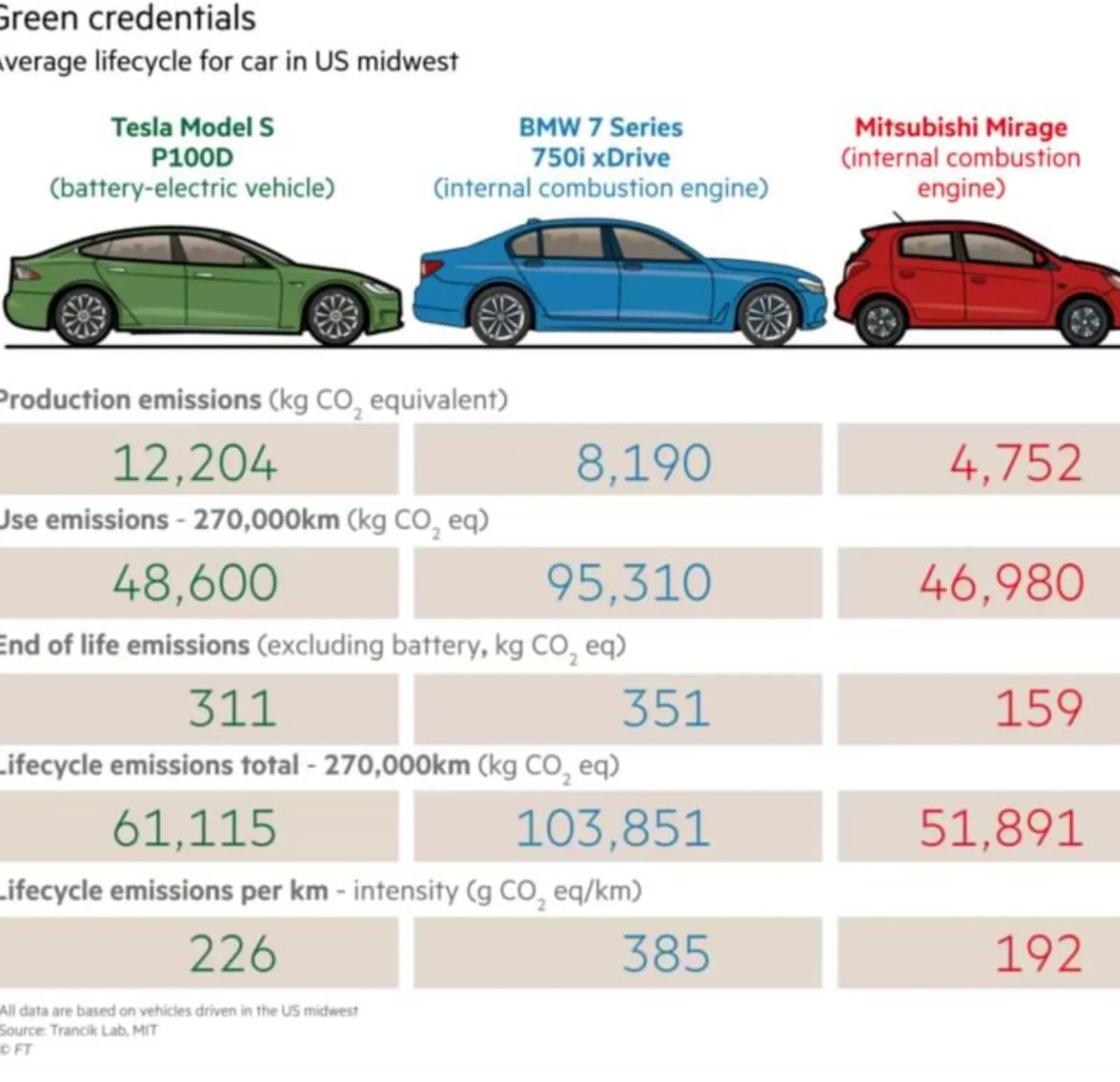
The starting point is this table:

What I did:

  • Use a stacked column chart instead of a table
  • Simplified the data to boil it down to what matters
  • Some fiddling to get the car images to a comparable scale (I hope I did it right)

The result is below:

I have added this slide to the SlideMagic template database so you can use it in your own presentations. Search for something like ‘BMW” in the app and it will pop up. Pro subscribers can convert slides like these to PowerPoint or PDF. SlideMagic has a free Pro plan available for students.

·Concepts

Joking about your own cliche slide

It happens to the best of us. Using a cliche chart. In a recent presentation, I had to refer to the so called “patent cliff”, a number of very big selling drugs will come off patent and become vulnerable to low cost generic alternatives. Everyone in the audience knows what it is.

I put an empty image (see below) of a cliff without any data or text, and literally apologized for the cliche visual. A 1 second reminder and *** click *** I could continue with the story

I have added this image to the SlideMagic slide library, search for “cliff” in the SlideMagic app and you can use this slide in your own presentation.

·Concepts

Related images

A well-chosen image creates a “visual shortcut”. While you explain your idea, the visual of the image gets stored in your brain alongside your story. Seeing the image again, immediately makes the whole idea pop up again, including its more complex nuances.

You can use this in presentations. Obviously on one slide. But it can also be very effective to use similar (or the same) image to make a connection between multiple slides. You introduce a concept early on (let’s say a problem) and when you get back at it later (with the solution), a related image can quickly pull back up the original story.

As an example, two slides I used in a recent presentation. The first image introduces the concept of FOMO (fear of missing out), in this case of a business that becomes wildly successful after you spun it out. The second image relates back to the slot machine / lottery concept.

If you are reading this blog post via an email update, you might have to open the link to the blog post to see the images. My email service can only take a limited amount of images from the blog feed (I am working to fix this).

I have added these slides to the SlideMagic template library, for example search for “gamble” in the SlideMagic app and the slides will pop up for you to use in your own presentation. Pro users can covert the slides to PDF and/or PowerPoint.

·Software

Agario-style

This amazing visualization shows the history of Europe and the coming and going of various empires in the style of the Agario video game, where bubbles collide and merge.

This video was made using Adobe After Effects. In theory you could do something like this in PowerPoint: a slide for every year with animations and then loop the whole thing. It is a lot of work though.

·Concepts

Mismatch

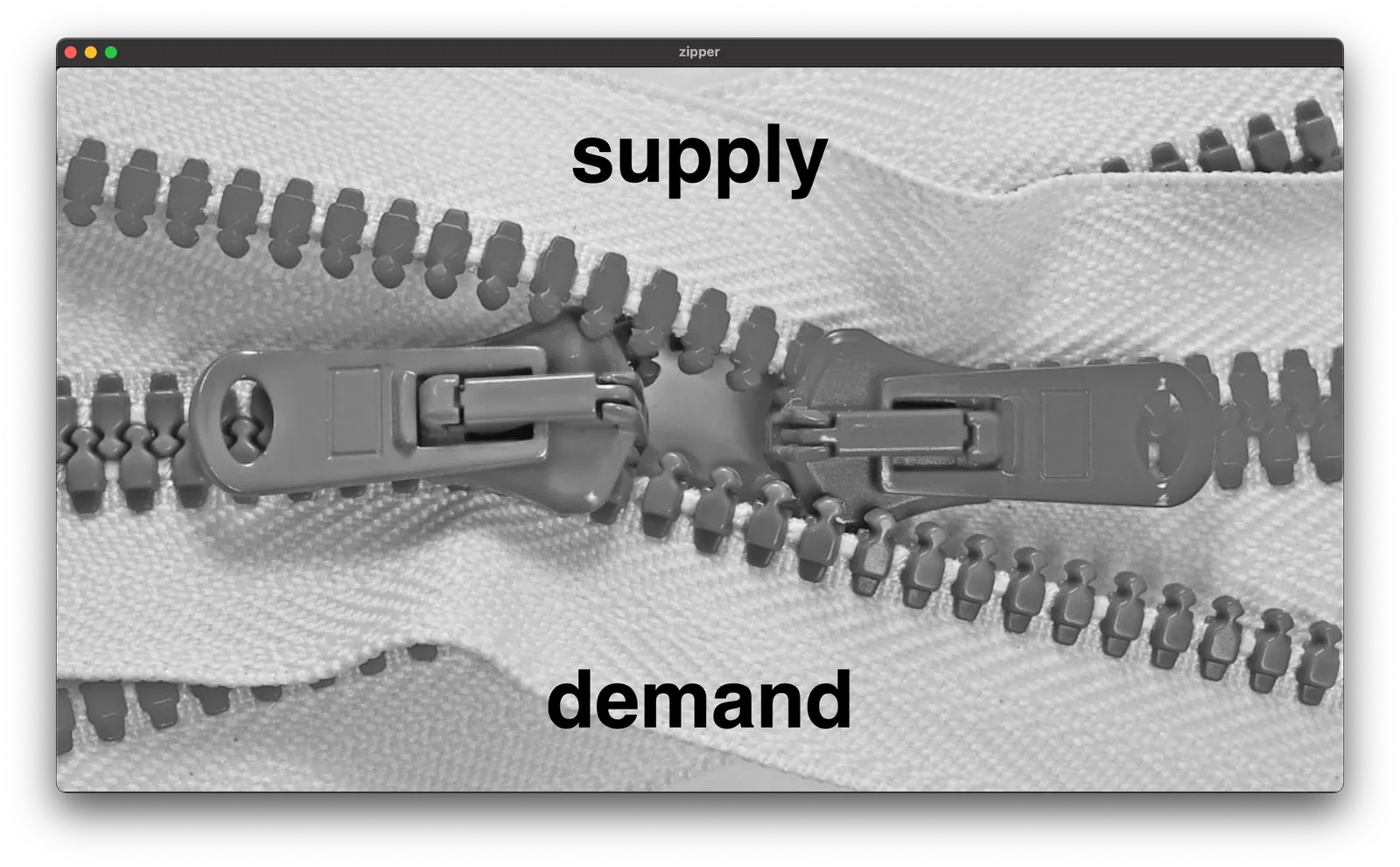
I am working on a deck for 9xchange (my other venture) at the moment, and I will post some concepts that I am using here on the blog (and add them to the SlideMagic library as well). Today, a nice zipper image to show some kind of disconnect between 2 things.

Search for “zipper” in the SlideMagic app and you can use this chart in your own presentations.

·Concepts

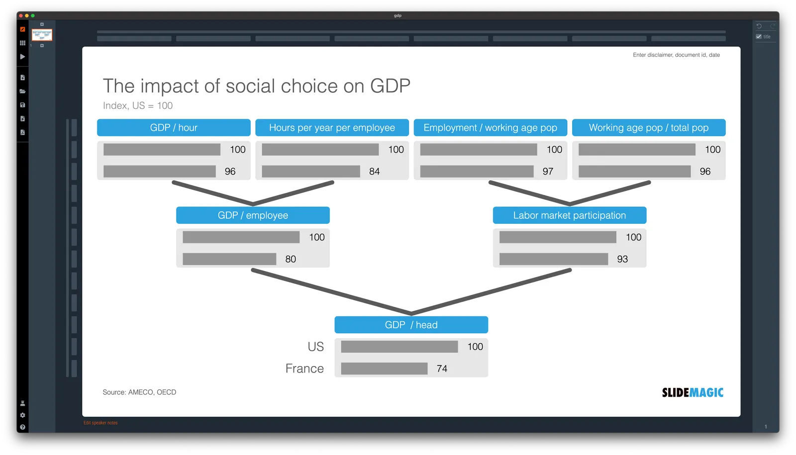
Chart template for a macro economic tree

A quick make over of a chart that flew by on Twitter, explaining differences in GDP / capital between France and the US.

In SlideMagic, it is very easy to replace tabular data in bar charts. I have added [this slide](

) to the SlideMagic slide library, search for ‘GDP’ in the app and it will show up for you use in your own presentation.