SlideMagic Blog

Frequent updates about all things presentations since 2008. Subscribe to never miss a post.

RSS
all posts

Category Data visualization

·Data visualization

More than 400,000 work days lost with Angry Birds - every day

There is a stunning statistic in this interview with the developer of Angry Brids by Hilz Fuld: More than 200 million minutes every day is spent on playing Angry Birds. This sounds like a lot, but it is still hard to put the figure in perspective.

  • Wow that’s big: 200 million minutes equals to around 400,000 full time working days. Now that’s sounds like a lot.
  • Maybe not that big yet: if around 75% of the world population has access to some form of TV and spends 3 hours watching it, you get a far bigger number than 200 million minutes

Statistics need to be put in some form of context. Pick the one that is most useful in your presentation.
·Data visualization

Why do Google map's labels seem so readable?

An interesting post on the 41Lattitude blog with a very detailed analysis of why the labels on maps by Google are so much more readable than those on maps by Yahoo! and Microsoft Bing.

·Data visualization

Sync those charts

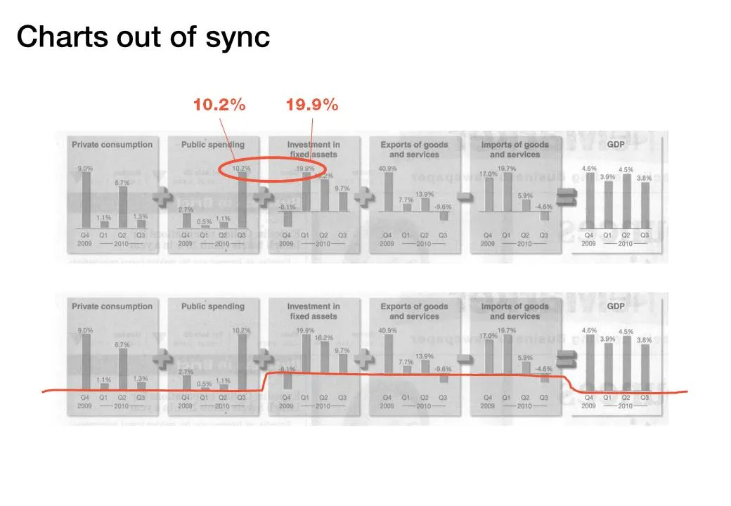
The idea behind the chart in the Haaretz newspaper is a good one: breaking the GDP growth up in its components (click the image for a bigger picture). The charts are not aligned very well:

  • The horizontal axis are not aligned
  • The scale of the vertical axis is different for each chart

·Data visualization

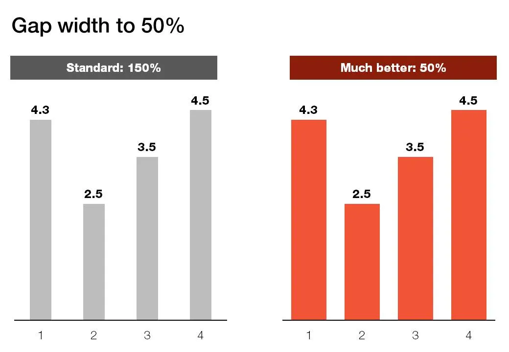
Gap width to 50%

Microsoft PowerPoint sets the standard gap width between columns or bars to 150%. Graphs look much better if you set it to 50%. Right click the columns/bars in your chart, select format data series and lower the gap width value.

·Data visualization

Setting default fonts for PowerPoint data charts

When you insert a data chart in PowerPoint, chances are that the font in which they pop up is the default Calibri. Why? Because you did not bother to change the fonts in “design” “fonts” “custom fonts”. Set the heading and body fonts to whatever you want it to be, and you save yourself a lot of time re-formating data charts.

·Data visualization

Two pies - too much

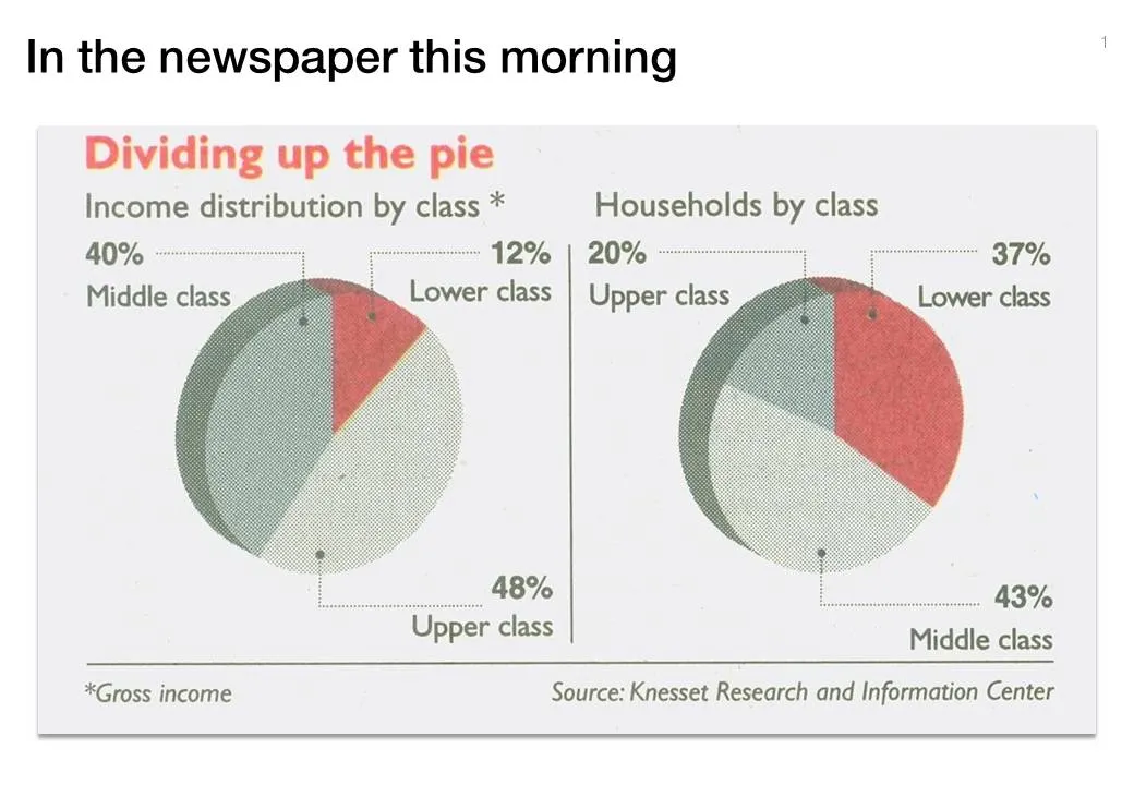
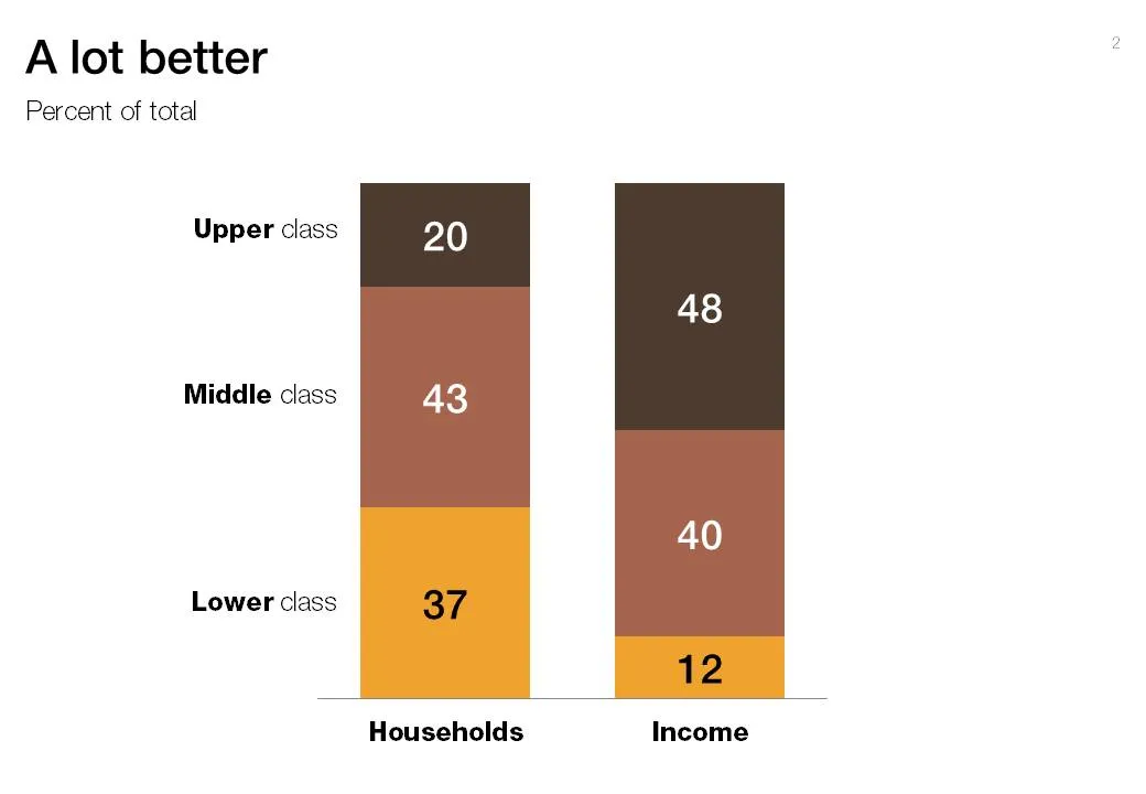
Pies are great to show relative sizes of surfaces, better than bars or columns. When it comes to comparing breakdowns on multiple dimensions though, the column chart cannot be beaten. See this example taken out of Haaretz this morning. What did I fix:

  1. Two columns instead of two pies
  2. Get rid of the 3D effects (earlier post)
  3. Use consistent coloring for data series
  4. Use consistent ordering for data series
  5. First the chart with the number of households, then the chart with the breakdown of income

·Data visualization

Blending data and typography in a chart

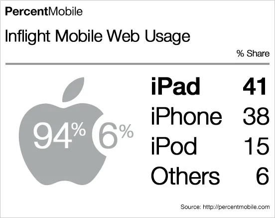
What a nice chart by Mobile Analytics. Perfect blend of data, logos/icons, and typography.

·Data visualization

Combining stacked and clustered columns

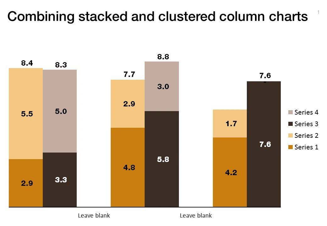
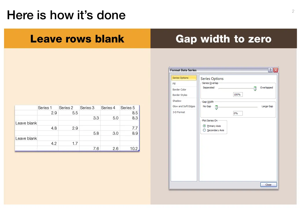
In PowerPoint, there is no standard option to create a combined stacked and clustered column chart. Here is a work around, taking the stacked column chart as the basis.

  1. Set the gap width to zero (in the format data series menu) to create the white breaks in between the columns
  2. Adjust the data points manually. The first stacked column goes in regularly. The second stacked column (that should have a different color scheme) gets added on top of the first one. But for data points of the second column, you zero out the values of the first one. Sounds a bit complicated, but the visual example below should make it clear.

Art: Canaletto, The Piazza San Marco in Venice, 1723

**Click here to subscribe to this blog**or follow me on Twitter

·Data visualization

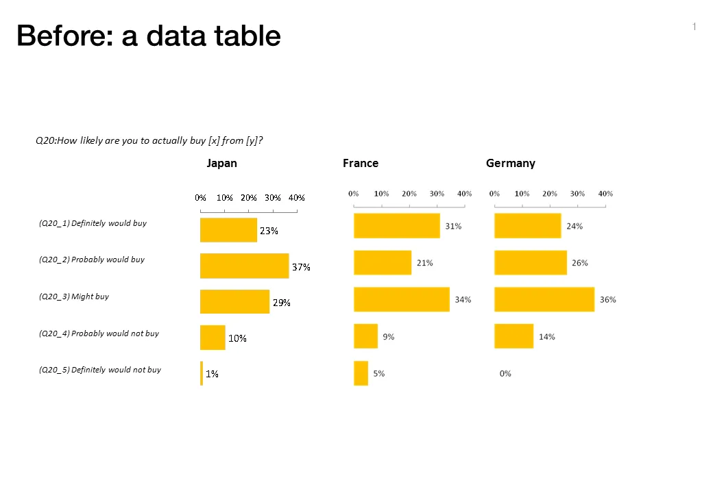
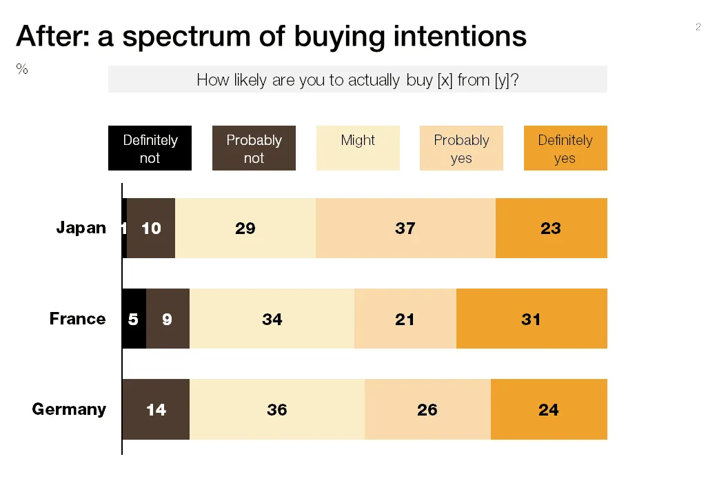
"Would you buy?"-type data from market research

Both of these charts contain the exact same data. The second is a lot easier to read, the spectrum of customer choices is neatly laid out, and the colors are picked in sequential order.

·Data visualization

Re-post: creating McKinsey-style water fall charts in PowerPoint

Waterfall charts can X-ray a complicated story. Here is an explanation about the technicalities of creating one in PowerPoint, here is an example of an application.