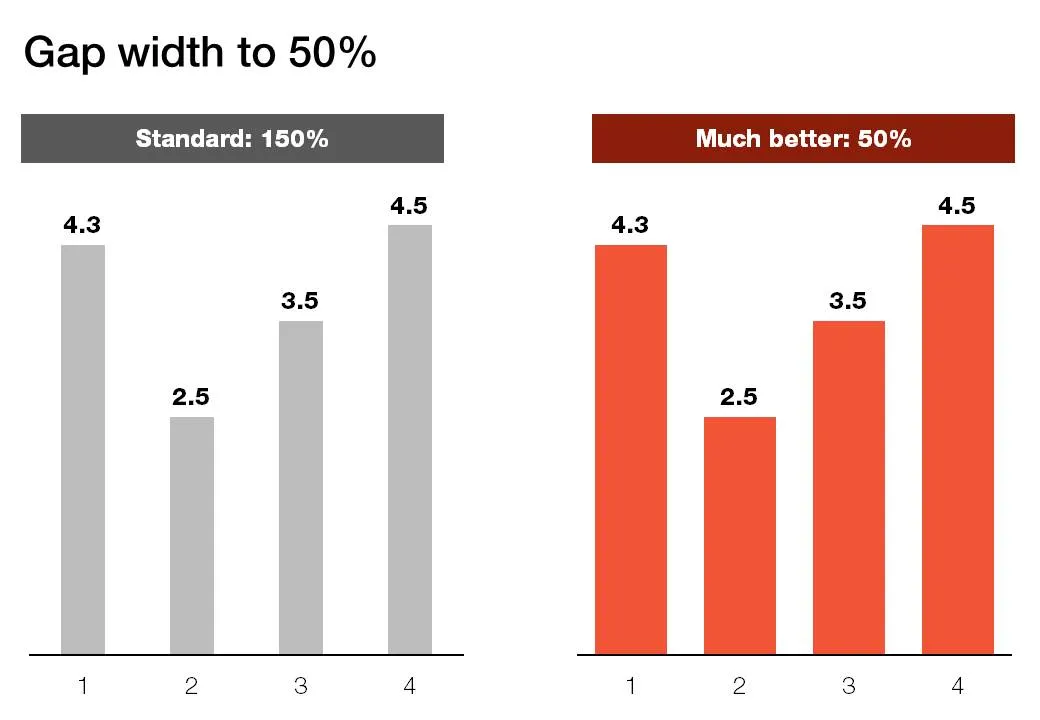
Microsoft PowerPoint sets the standard gap width between columns or bars to 150%. Graphs look much better if you set it to 50%. Right click the columns/bars in your chart, select format data series and lower the gap width value.


Blog post
Microsoft PowerPoint sets the standard gap width between columns or bars to 150%. Graphs look much better if you set it to 50%. Right click the columns/bars in your chart, select format data series and lower the gap width value.
About this blog
Notes on all things presentations — design, storytelling, and AI workflows.
Subscribe now to never miss a post.
About SlideMagic
A platform for business presentations.
A free student plan is available.
4 comments
The principle is that the gap between columns should be smaller than the widht of the column.
Repeatedly in both PowerPoint and Word, Microsoft's design defaults appear to have been set by engineers who had to supply "something" rather than being truly planned by professional designers.
My rule of thumb: Tweak everything, including style names. The installation defaults have not been optimized; presume they have been kludged.