

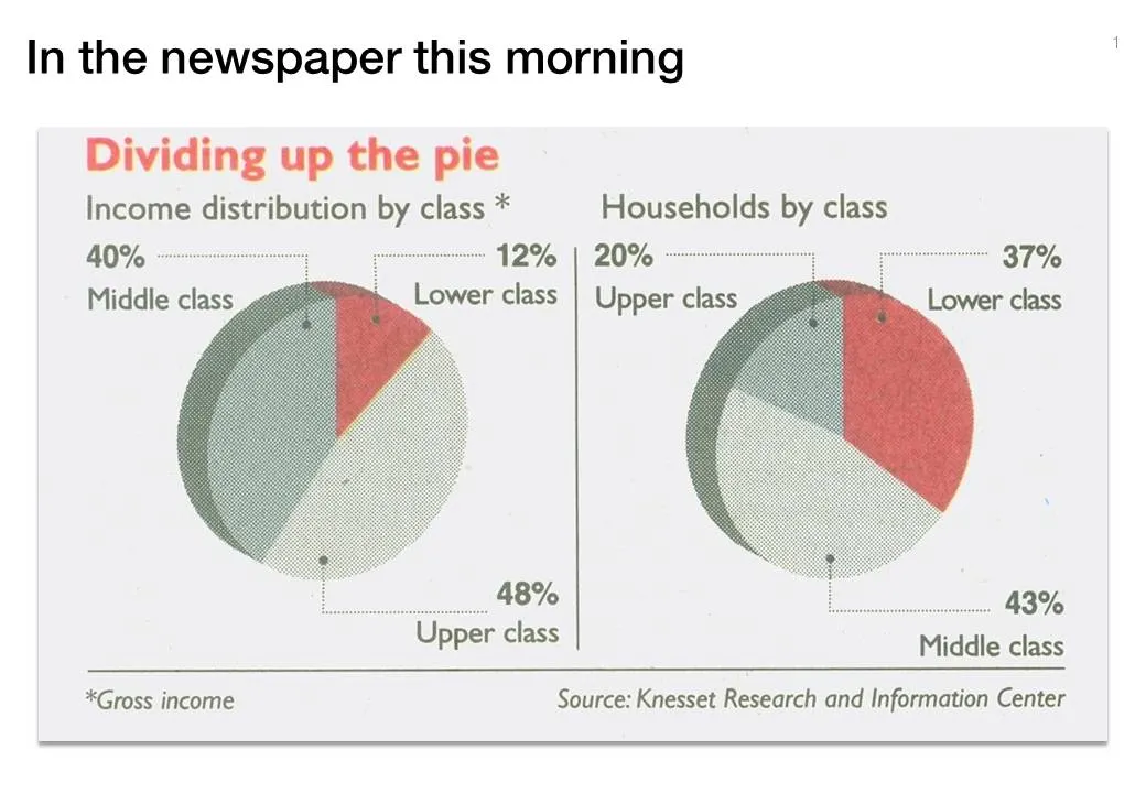
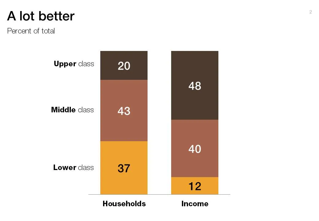
Pies are great to show relative sizes of surfaces, better than bars or columns. When it comes to comparing breakdowns on multiple dimensions though, the column chart cannot be beaten. See this example taken out of Haaretz this morning. What did I fix:
- Two columns instead of two pies
- Get rid of the 3D effects (earlier post)
- Use consistent coloring for data series
- Use consistent ordering for data series
- First the chart with the number of households, then the chart with the breakdown of income
6 comments
The bar charts that were chosen by the author used (brown, browner, etc.) are just god-awful colors to use unless you want to turn people off. People under-value what power colors have on the effect and mood of info...rmation being conveyed. The attorneys I work with are usually totally unaware of this power until it is pointed out to them. The successful ones embrace the philosophy of color=power, and we are able to turn those things into presentations that make a big difference in the courtroom. I find the chart type isn't as important as how the important information is made easier (or harder) to read by how the chart is set up.
In some cases it may also be preferable to use clustered bars instead of stacked to show multiple sets of data (i.e., to replace multiple pies).