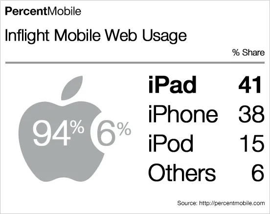
What a nice chart by Mobile Analytics. Perfect blend of data, logos/icons, and typography.


Blog post
What a nice chart by Mobile Analytics. Perfect blend of data, logos/icons, and typography.
About this blog
Notes on all things presentations — design, storytelling, and AI workflows.
Subscribe now to never miss a post.
About SlideMagic
A platform for business presentations.
A free student plan is available.