

Blog post

Combining stacked and clustered columns

September 17, 2010 · by Jan Schultink
← all posts

In PowerPoint, there is no standard option to create a combined stacked and clustered column chart. Here is a work around, taking the stacked column chart as the basis.

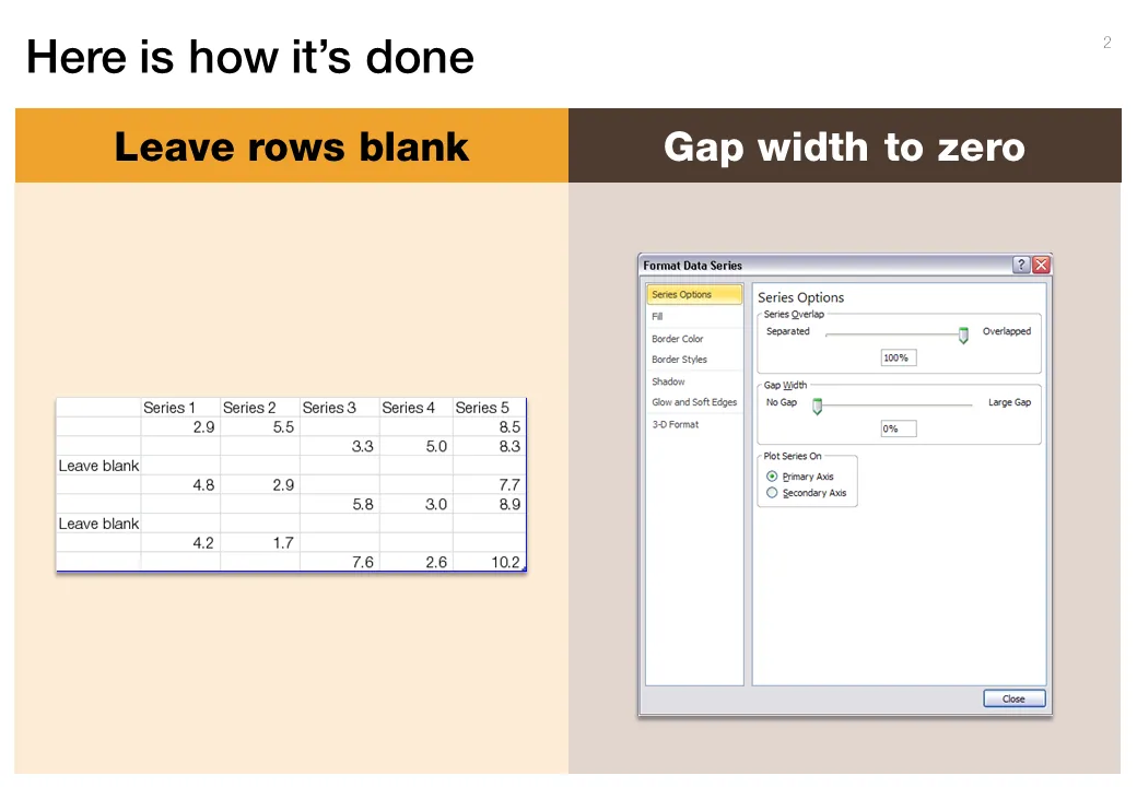
  1. Set the gap width to zero (in the format data series menu) to create the white breaks in between the columns
  2. Adjust the data points manually. The first stacked column goes in regularly. The second stacked column (that should have a different color scheme) gets added on top of the first one. But for data points of the second column, you zero out the values of the first one. Sounds a bit complicated, but the visual example below should make it clear.
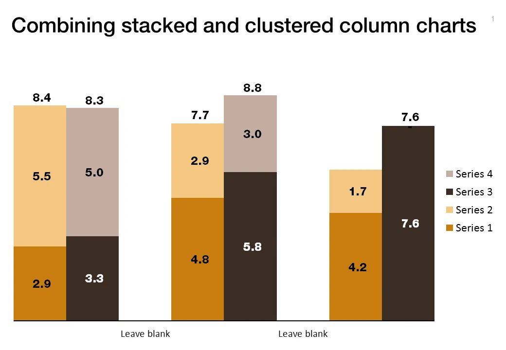
Art: Canaletto, The Piazza San Marco in Venice, 1723

**Click here to subscribe to this blog**or follow me on Twitter

Data visualizationDesignPowerPointPresentation designPresentation

About this blog

Notes on all things presentations — design, storytelling, and AI workflows.

Subscribe now to never miss a post.

RSS

About SlideMagic

A platform for business presentations.

A free student plan is available.

6 comments

Anonymous2011-06-14 06:38:53
simply genius =)
Justin2010-09-19 03:22:59
HI Jan,

Just on the topic of charts - have you had a look at w
Jan Schultink2010-09-19 03:36:56
Yes saw that. Correct link:
Anonymous2010-09-17 03:42:26
Can you post the excel file you used to do this?
Jan Schultink2010-09-17 04:04:03
The data is shown in the second image on the left. I created the totals by adding another column layer, right clicking it and changing it to a line. Set data labels to "above" and pick the line color "no line"
Justin2010-09-19 03:21:52
HI Jan,

Just on the topic of charts - have you had a look at w