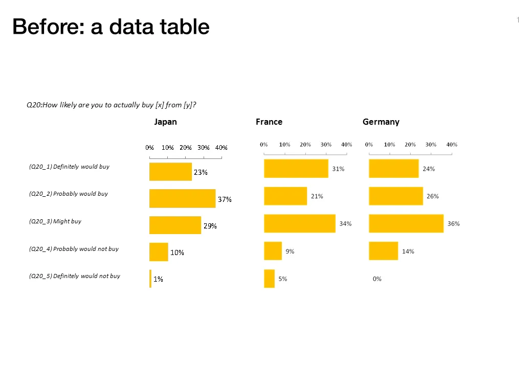
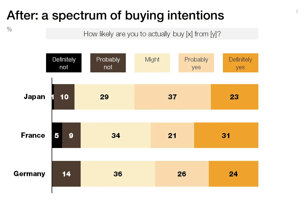
Both of these charts contain the exact same data. The second is a lot easier to read, the spectrum of customer choices is neatly laid out, and the colors are picked in sequential order.


Blog post
Both of these charts contain the exact same data. The second is a lot easier to read, the spectrum of customer choices is neatly laid out, and the colors are picked in sequential order.
About this blog
Notes on all things presentations — design, storytelling, and AI workflows.
Subscribe now to never miss a post.
About SlideMagic
A platform for business presentations.
A free student plan is available.
4 comments
Best wishes
Andy Kirk
Question Response
(using Tableau Public)
I added a reference bar for the average, and you can select a country to highlight their bars. This way you can see both the trend, and the outliers.