The lone column
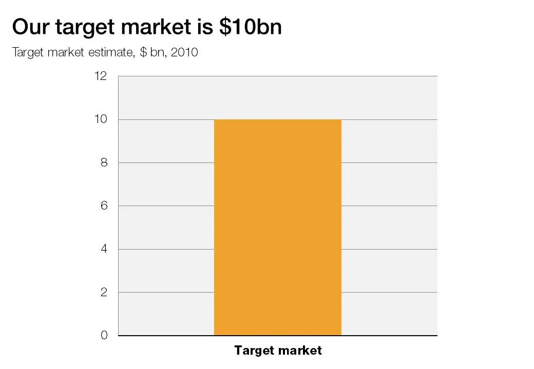
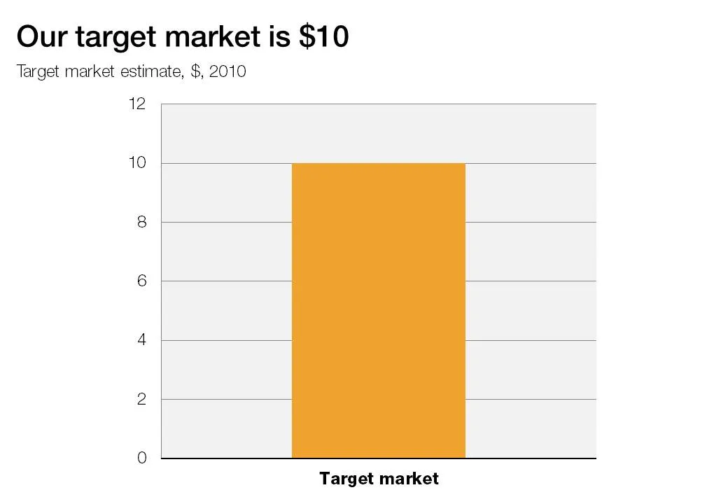
A column chart with just one lone column is not a column chart. Column chart need to compare things, show a trend over time.


Frequent updates about all things presentations since 2008. Subscribe to never miss a post.
A column chart with just one lone column is not a column chart. Column chart need to compare things, show a trend over time.
The site number quotes is a tool with a healthy dose of humor: it helps you “dramatize” a number, simply enter it and the site returns a long list of quotes. Maybe the exact quote is not what you can use in a “serious” presentation, but it might just open up a part of your creative brain that you did not yet access. Thank you Steven Duncan.
One the biggest hassle of PowerPoint 2003 was that when you resized a data chart, all the fonts got completely squeezed. Only PowerPoint pros new that you had to open the chart, and once it’s open in Microsoft Graph, you can resize the object without doing damage. Any other person (99.99% of the population) went for the squeeze.
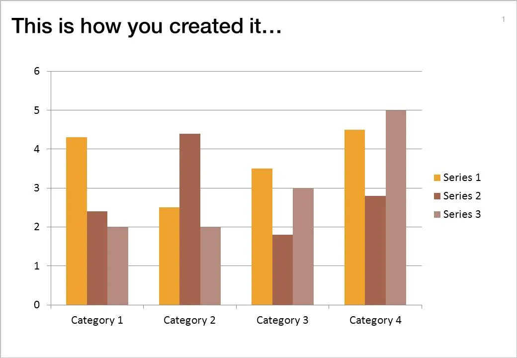
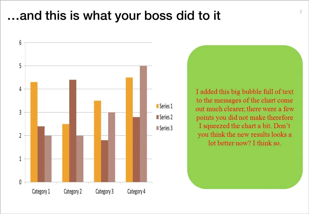
If there is one reason to upgrade to PowerPoint 2010 (2007 also solves this), this is it.
But here you are, the corporate IT department insists on keeping the company on Office 2003, and you just got your 45-page back from your boss who “edited things for clarity” and you’re on to present tomorrow morning 9:00.
This will save you:
More maps today. This simple site ifthiswasmyhome puts the size of the oil spill in perspective… using a town of your choice. It would cover pretty much the entire Netherlands (the country where I grew up).
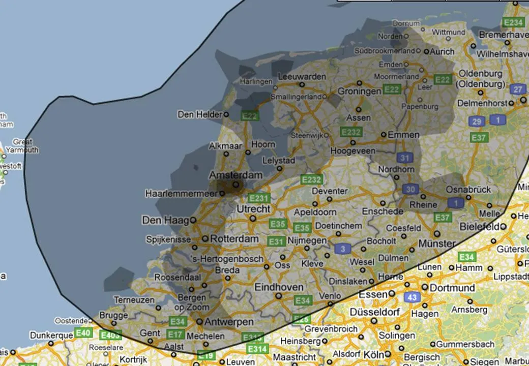
An excellent visualization, making people internalize what big numbers mean.
This interactive map is amazing: click a US county and it shows you were people who live their move to, and from where people are moving into this area. This is a (very cool) tool, but some serious DIY analysis is required to tell the story though.

I clicked around a bit and discovered some patterns:
To use this in a presentation there is no avoiding to going back to a series of screen dumps to take people by the hand through the data. (I am not a big believer in live demos during short presentations.
Some market research agencies must be paid by the page. Reports are filled with pages of text describing the market: United States: segment 1, 2, 3, volumes, revenues, pricing, Asia: the same, Europe: the same. All in long full text sentences (“The U.S. segment 1 market was $1.345bn in 2009, up 3.125% compared to the year before. On the other hand, segment 2 declined by 3.54% versus 2008 and is now $2.675bn in 2009”).
Text is not the right way to convey this information. A simple one-page table with rounded figures can replace the entire document. And hey, you might even be able to put it on one slide in your presentation.
Look at this beautiful visualization of images taken in London. Blue: images taken by locals, red: ones by tourists (more cities here).

I am using maps more and more in my presentations. A map with color-coded segments is a much more powerful way to visualize data than a bar chart with a ranking of variables. I am still struggling to find good tools. There are very few good editable PowerPoint maps available, and Google maps screen shots are a bit cumbersome for large volumes of data points. Suggestions?
Here is a video of Twitter co-founder Jack Dorsey explaining the success of Twitter and other ventures he is working on (with the benefit of hindsight). Interesting from a presentation perspective for 2 reasons:
Found via Fred Wilson
In consulting firms such as McKinsey, there are very strict rules about formating slides. Data labels for example are always placed outside the horizontal bar. The chart below (ripped out of its context from this NYT article) uses a different approach:
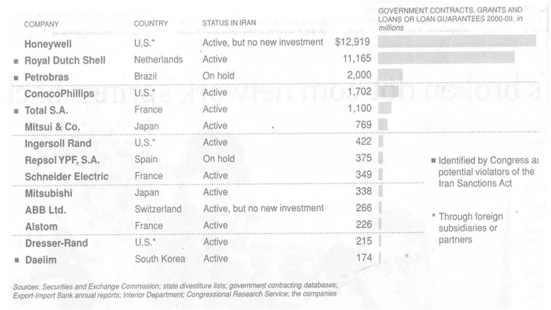
The data labels are placed next to the horizontal bars where you would expect the axis labels to be. I am fine with this approach. The relative size of the bars gives a global view of the order of magnitude of the values, and for whomever is interested the data labels provide the exact values.
Almost all presentations I design are highly confidential. Presentations of publicly traded companies to stock analysts are an exception. Recently I supported Psion in designing their 2009 preliminary results presentation.
Most of you will remember Psion as one of the pioneers of PDAs and the Symbian operating system. After some M&A transactions, Psion today is a leader in the field of rugged portable devices used in ports, in warehouses and by police forces, just to name a few customer segments.
Back to the presentation: