SlideMagic Blog

Frequent updates about all things presentations since 2008. Subscribe to never miss a post.

RSS
all posts

Category Data visualization

·Data visualization

How to pick the right data chart

PowerPoint offers a vaste number of options for designing a data chart. Which one should you choose? Here are some of the guidelines I use:

  • A ranking by size: horizontal bar
  • Development over time with a handful of data points: column, if there are many data points a (fat) line
  • Decomposition of something in its parts: a waterfall (see a post on how to make waterfalls charts), waterfalls also work great to visualize 1 year of a Profit & Loss statement
  • Showing something as a % of the total: a pie chart if it is one year/period, a series of 100% columns if it is a trend over time.

Data has multiple messages. In the analysis phase of your work, you need to study all of them. But when you are ready to present conclusions, you pick the one and only message that is worth emphasizing. If you cannot settle on one, make 2 charts and present them quickly after each other: the market grew [click], our market share increased.

If things get really complex, for example when there are 3 or more factors driving change going into difference directions, you might have to resort to a source-of-change waterfall chart, followed by a data chart that highlights each of the trends individually.
·Data visualization

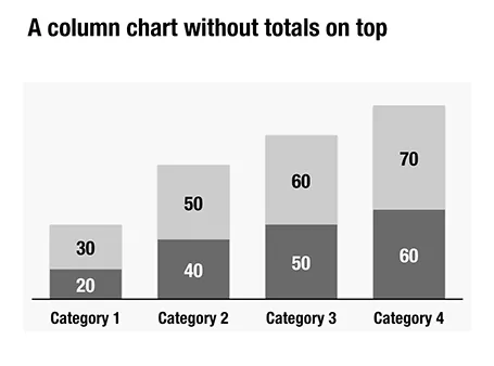
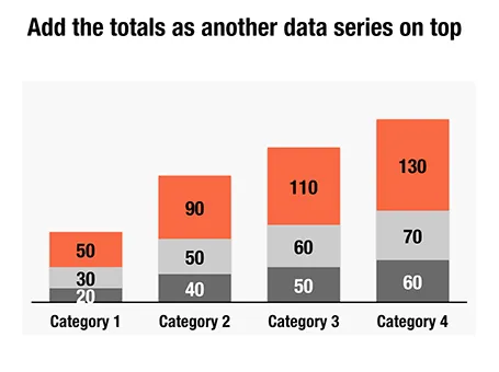
Column chart with totals

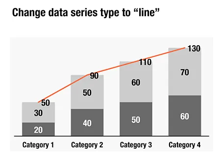
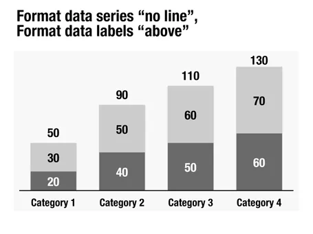
Here is a little trick to create automatic totals on top of column charts. This is an alternative to placing text labels manually, and especially useful when the data in the column charts is changing frequently.

·Data visualization

Nothing wrong with manual charts

Automated charting is great if you want to analyze data quickly; grab an excel table and turn it into a chart with one click.

It is different in presentation design though. When you generate a chart in PowerPoint, the colors are off, there are ugly tick marks, the labels do not look right. In most cases, I create the chart almost entirely by hand. The only thing that PowerPoint does is generate the actual bars or columns, the rest is put on by me as text labels in the right place.

Usually a presentation only contains a few very important data charts, and they deserve the time to get them absolutely right.

·Data visualization

Should you lie with statistics?

No. I really hate lying with statistics, for example cutting the axis of a chart to make a growth trend stronger. That is cheating. Sometimes, you are giving yourself a hard time though.

Stretching out a column chart too wide on a slide, especially when you are designing for a 16:9 wide screen format. Your impressive growth all of a sudden looks rather dull. It is fine to squeeze it back a bit, even if the graphic ends up not covering the entire screen.

Using powerful graphs to emphasize a negative trend. If you had a bad financial year, and profits turned into a loss, showing that in a line graph will look like the company is on a path to disaster. The eye extends the path downward, while the financial loss could have been a one-off event. In these cases, I go back to visualizing the data in a standard text table. Data visualization can sometimes be too powerful

·Data visualization

Simple - complex - simple

This is the path that financial analysis usually follows. We start with a simple back off the envelop, then complicate things in Excel. In presentation design, the last step is crucial: bringing down that Excel model back to a simple calculation.

And that simple calculation is likely to be completely different from the one you started off with. Building the complex model has taught you how your business really works financially. And only when you understand that, can you go back to simple.

Most of the times, presentations stop in the middle. They throw the data output form the complex model at the audience. That is a sign that you do not understand it yet, and if you don’t get it, the audience will not get it for sure.

·Data visualization

Infographic overload

The blog Bitrebels posted a number of infographics that compare the salaries of self-employed people in the U.S. versus those the U.K. Without picking on this particular design, this graphic shows common mistakes that often apear in infographic illustrations.

  1. Round up the numbers to the nearest $ 000. The digits behind the comma do not add anything.
  2. Group data together, a standard bar chart showing the 2 numbers with their delta is much clearer.
  3. Pick a meaningful comparison unit. More than 3,000 hamburgers is not.

·Data visualization

Data without context is meaningless (and boring)

The quarter is done, and here comes the day-long sales results presentation. Excel is pasted into PowerPoint, creating huge decks through which senior management has to sit through. Sales organizes by channel: small restaurants sales, growth; large restaurants sales, growth, supermarkets sales, growth. Marketing presents by brands: brand 1 sales, growth, brand 2 sales, growth.

If you are a marketing manager, looking at the Q3 sales and growth figures of a particular brand is really interesting. All the numbers of the previous quarters are more or less in your head. For the production manager though, going through these pages is mental torture, as she does not have the historical context readily available. (Read more about the Curse of Knowledge here)

The solution is the opposite of what I preach for bullet point charts: instead of breaking up slides into multiple pages, condense lots of data in 1 chart, but make it comparable. Put the quarter growth rates of all brands on a page and compare them. List the historical brand growth rates of the past 8 quarters on one page and see what is going on. There is no problem showing a massive amount of data on 1 slide, as long as it is about the same variable that is compared across different dimensions.

·Data visualization

Unconventional balance sheet visualization

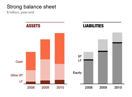
Financial statements are completely unsuitable to put on a PowerPoint slide: too dense, too much information. I like to use column charts to represent this information and dramatically cut the number of categories in the process. After a while, even accountants get used to it. The chart below gives an example of a balance sheet, in a real presentation I would add data labels rounded to 1 digit behind the dot.

·Data visualization

Finding space for labels of small pie slices

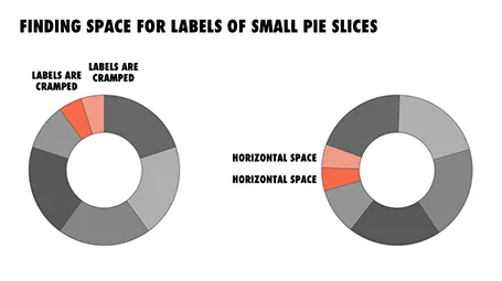
In pie diagrams, the small pieces always come in last, and end up close to the top of the pie chart. Adding readable labels becomes difficult as the horizontal space for them is small.

I find it better to rotate the pie chart in such a way that the smaller pieces get in a horizontal position, so you have space to write out the labels of them. The illustration shows an example.

·Data visualization

Reuters issues a 1-page online annual report

Slowly, large publicly traded companies are starting to experiment with Internet and social media as alternatives to the dry and boring annual report. Reuters just issued a 1-page version (see it here), with a promise that over the next few days, this will be followed up with more detailed blog posts about the company and its financial results.

Early online annual reports were a pain. They basically were print documents put online and you had to keep on clicking on “next” links to get to the following page. Rendering of tables and data in basic HTML also did not provide good results. Combine that with slow page loads and you get a pretty useless experience.

New display protocols (and certainly HTML5) will give PowerPoint-like fast navigation controls to online documents. I think a hybrid of a traditional slide presentation, advanced (and fast) web navigation, video and other multi-media, plus social aspects will give a powerful distribution platform for financial data. You get the best of both worlds: PowerPoint-style visualization of data and key strategic messes, and nicely-formated text for those who want more details. Certainly for public investor presentations such as this one, but also for confidential documents. You can distribute login details to (potential) investors you want to share your data with and exclude them from the online data room as soon as the deal process has stopped.

There are also great opportunities in sales. I rarely use a PowerPoint presentation anymore to introduce my own services for example. Rather, I just take people through a few sections of my web site, either in person or via a remote presentation tool. SalesCrunch, the company that is organizing my upcoming New York presentations, is trying to create a platform for these remote sales presentations.

Continue reading →