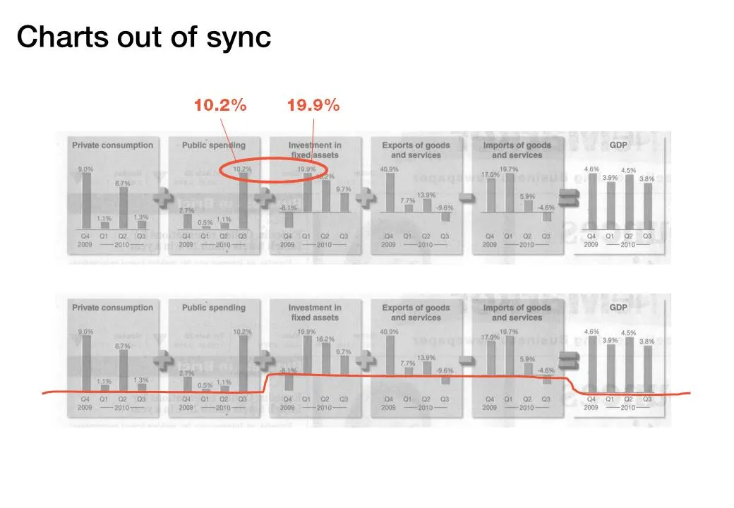
The idea behind the chart in the Haaretz newspaper is a good one: breaking the GDP growth up in its components (click the image for a bigger picture). The charts are not aligned very well:
- The horizontal axis are not aligned
- The scale of the vertical axis is different for each chart