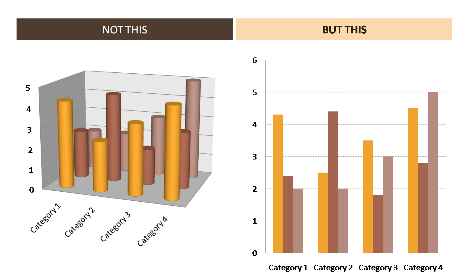
The fact that PowerPoint can apply a lot of 3D graphical effects on charts does not mean you have to use them. Simple 2D looks better and is easier to read


Blog post
The fact that PowerPoint can apply a lot of 3D graphical effects on charts does not mean you have to use them. Simple 2D looks better and is easier to read
About this blog
Notes on all things presentations — design, storytelling, and AI workflows.
Subscribe now to never miss a post.
About SlideMagic
A platform for business presentations.
A free student plan is available.
5 comments
I have a question with regards to line charts and bar charts (used for showing time-series). Is there a particular decision criteria when choosing one over the other?
I understand that both are equally adept at showing comparisons over say, year on year changes, but are there nuances that differentiate one from the other?
- daniel, singapore
I don't know the exact science here, my 2 cents:
- I tend to like bar charts better, they look better on a slide, they fill up the space under the graph, a nice repetitive pattern, if you use data labels no need for vertical axes, etc.
- Line charts could be better if there is a very smooth trend to show, or a very clear trend: i.e., going down for 10 years, or up.
- Line charts could be better if you want to show multiple data ranges
- Line charts are good to compare indices of multiple data ranges, each starting at 100 and then developing from there
- Line charts get better if you have lots and lots of data points (i.e., daily stock prices)
Good question. Might merit more thought and a separate blog post.
Best,
Jan
- daniel, singapore