SlideMagic Blog

Frequent updates about all things presentations since 2008. Subscribe to never miss a post.

RSS
·Investor presentation

Presenting your team

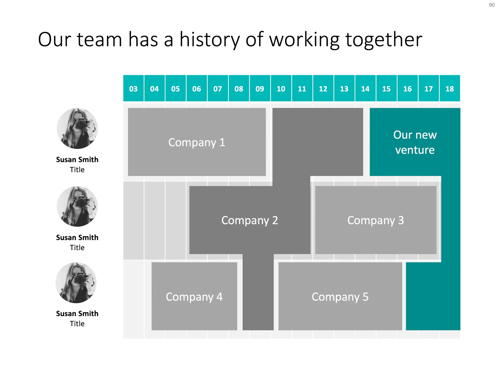
Team slides are tricky: there is so much to tell when you have 3 people with a 20 year career. Where to start?

I tend to split the problem in 2: put complete bio slides in the presentation appendix, and focus on a few messages about what makes that team special in the main presentation. What is the story of the team?

  • Do they have diverse, complimentary backgrounds?
  • Have they worked for very famous companies?
  • Have they founded and sold a lot of businesses before?
  • Do they have very unique scientific knowledge?
  • Do they have a particularly long work experience?
  • Are they a proven team, that has worked together in the past?

Each of these messages merits a completely different slide. The slide below would be an example that covers the last of the above points, a team that goes back a long time together. Rather than dry bullet points describing their background, I laid out the “CVs” horizontally on a timeline, and make very strong visual connections for periods where people overlapped at a company.

Feel free to copy the design, or download the slide from the SlideMagic template store.

Testing your slides

I have added a free PowerPoint file to the template store. It contains 2 meeting room background to test how your slides will look in a real presentation setting. Time to fix those small fonts and graphics before you are up there tomorrow.

You can download the file here.

·PowerPoint

Turning a bar chart into a Gantt diagram

Project Gantt charts are a pain to create in PowerPoint. Screen dumps from professional project management software are too detailed and don’t have the right look & feel. Manually resizing blocks is tedious, and oh boy, what if you have to add or change an activity…

I often use a disguised stacked bar chart to create project flow charts in PowerPoint.

First, you need to look at the content. Like my approach with all data charts, project plans should not be copy pasted directly into PowerPoint. Project planning, data analysis, is not the same as presenting the result to an audience, you need to disconnect the two activities. This means in most cases starting with a blank sheet of paper.

Purely from the stand point of communication (not planning): which activities should be grouped together, which separated? What is a logical phasing? Sometimes, nitty gritty activity details are crucial for planning purposes (exact roll outs for each city), but can get pretty boring in a presentation. Sometimes the opposite is true, a small pilot might be worth highlighting in the presentation.

Once you have this sketch, you can transfer it to PowerPoint. PowerPoint does not have pre-configured Gantt chart templates, but the stacked bar chart can provide a solution. See the chart below as an example:
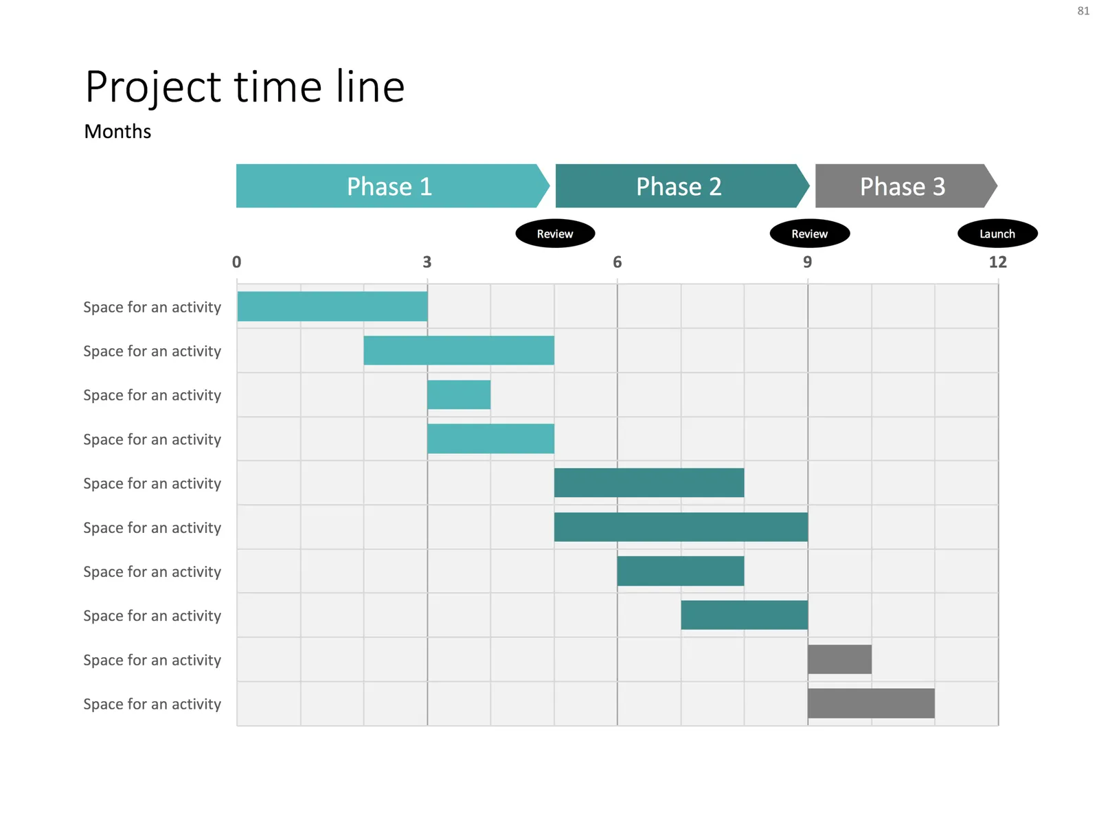
It takes a bit of thinking to set up, but once in place, it is easy to make small changes to the length of the bars and/or add and subtract activities without having to go through the hassle of lining up everything again.


Continue reading →
·Colors

You can't argue about taste...

One of the very first philosophical realisations I had as a child is that there is no way to figure out whether 2 humans perceive color in the same way. This article elaborates further.

This could be one explanation for the difference in taste: each human has the same sense of style, taste, but simply sees, tastes, hears in a completely different way…

Photo by Braydon Anderson on Unsplash

·Layout

Evidence from press clippings

Here is a slide I often encounter in draft publications: a screen shot of a news web page, with a few words circled in the middle of the article. There are a few problems with this:

  • The circled quote is often impossible to read
  • The other elements of the web page screen shot compete for attention: the big headline, the photo. The article was not designed to focus the attention on your circled text
  • Today’s web pages are crammed with screen elements that you don’t need on your slide: social media like buttons, advertising
  • A screen shot of a random news web site does not carry the same credibility anymore as a cut out article of the 1935 New York Times once did

There are better way to show that piece of evidence:

  • Incorporate data in a bar chart, comparing it to something, and putting the news web site in the bottom source line
  • Creating a big quote page, again quoting the news web site as a source

When should you use news web sites? Maybe if the headline in a very credible news source is what you need. But then, cover unwanted screen clutter with white boxes to draw the attention of the audience to that headline, and nothing else. Here is an earlier blog post about formatting newspaper screenshots.

Photo by G. Crescoli on Unsplash

·Data visualization

Presenting survey results

Here is a chart I usually use to present the result of a survey:

  • Horizontal bar chart, stripped of all axis labels, data labels, etc.
  • Consistent color coding to support the message you want to come out
  • Text place holders for the survey’s conclusion, and the factual info: what question was asked, when it was asked etc.

Feel free to copy the design or download the chart from the SlideMagic template store.

Photo by Alex Kotliarskyi on Unsplash

Generic disruptive startup pitch

For my template store, I am working on a set of standard presentation story lines that can be matched up with template designs. I am going back in my client archive and see what sort of stories I end up using. Here is a very common flow that keeps on coming back in many situations:

  1. Situation: something has not changed much for a long time
  2. Inefficiency: this creates a missed opportunity: if only we could do this
  3. Change: a recent innovation opens up the possibility to do this
  4. Complication: but there is a problem why it cannot be used
  5. Solution: enter our solution which takes away this roadblock

This is a slight elaboration of the Situation, Complication, Resolution, introduction story line introduced in the Pyramid Principle that I often used in writing documents at McKinsey.

Photo by Jeremy Thomas on Unsplash

·Concepts

Some decision charts

Simple charts are often the best. I added a few slides to visualise a decision or a trade off the store: simple boxes, the same boxes over an image background, and a minimalist scale. With the latter, it is not the objective to make a photo realistic rendering of a scale, but rather give a subtle visual hint of which arguments win.

Feel free to copy the design, or download them from the template store

·Investor presentation

We only have 5 minutes...

Looking back at more than 10 years of presentation design work, I noticed that my best decks are often the ones that were designed for very short time slots, usually pitch competitions where a speaker would have 5-10 minutes to give it all.

Why?

  • These requests would often come after the client and I completed the “regular” presentation: I went through the process of getting to know the company in-depth, but, and this is important, I had given the content some rest, and when coming back to something after a couple of weeks, you often get an even better perspective on how to tell the story
  • The all-or-nothing 5 minutes makes the client more confident to take visual risks: bolder, simpler slides
  • The client would rehearse more (it is easy to run through a 5 minute story twenty times) and as a result would stumble on imperfect story flows more often

So maybe there is a natural evolution in presentations:

  1. The internal strategy/board deck where you lay out your company’s ideas and make strategic decisions (management consultants stop here)
  2. An attempt at a bullet point story line for a pitch (most pitch presentations stop here)
  3. The properly designed company pitch deck (my projects often stop here)
  4. The “let’s give it one more go deck”

Photo by Mitchell Hollander on Unsplash

·Investor presentation

The "deck for sending"

The focus of my design work has shifted over the past years. The most important objective of my client’s presentations is to make a good impression as an attachment to a “cold email”. What is a good summary presentation that you can send ahead of a (possible follow up) meeting?

It is not a dense “Executive Summary”, one page of dense text (10 point font or less), full of buzz words and jargon. In fact, it might not be a summary at all. Investors say a huge number of deals each day, and don’t want to have to sit through a full presentation to understand what it is you are actually doing. The main purpose of that live presentation is to get an impression about you, the CEO, not to understand the business better. So in 2017,  your presentation needs to be able to stand on itself, convey the story without you being there to explain it. A teaser deck that creates interest is good, but it should not be so mysterious that the investor does not have an idea what you are doing.

Having said that, just attaching your full deck and hit “send” does not work either. I usually suggest to take certain bits out. These are usually the “admin bits” of the presentation, detailed financials, company milestones, go-to-market strategies. This is the more dry content that can be discussed after the investor has bought into the big idea. Also, some of this information might be confidential and not suited to be emailed out to investors you do not know very well (yet). So, the summary presentation is actually the full presentation with certain sections left out.

Continue reading →