SlideMagic Blog

Frequent updates about all things presentations since 2008. Subscribe to never miss a post.

RSS

Back to one monitor

My old Apple Thunderbolt screen has had its best time, so I find myself back with just on 5K screen on my iMac recently. And I must say: I might keep this desk configuration. It creates a nicer work environment where I can actually look out of the window (over the Mediterranean in my case), with less clutter and big bright light beams shining in your face.

There is now no longer space to keep Twitter feeds and other distractions open on your screen. Also side-by-side design work where I have a spreadsheet and a presentation open at the same time somehow works actually better: moving your eye from document to the next, and looking for that number is quicker when everything is right in front of you.

We will see what happens after a few weeks.

·Images

How to cut out shapes out of images in PowerPoint

PowerPoint can do Photoshop-like tricks. One of them: cutting shapes out of images. Here is how to do it:

  1. Drag your image on the slide
  2. Draw a shape on top of it (the freehand shape allows you to create a very precise shape)
  3. First select the image, then select the shape (shift click)
  4. Now select the Shape Format menu
  5. Click Merge Shapes
  6. Click Subtract

That’s it. Below is a slide from the template store that uses this technique (you can download the ready-made slide if you want)

 The final template slide

The final template slide

 The making of

The making of

Photo by Joanna Kosinska on Unsplash

·Concepts

How to create Harvey Balls in PowerPoint

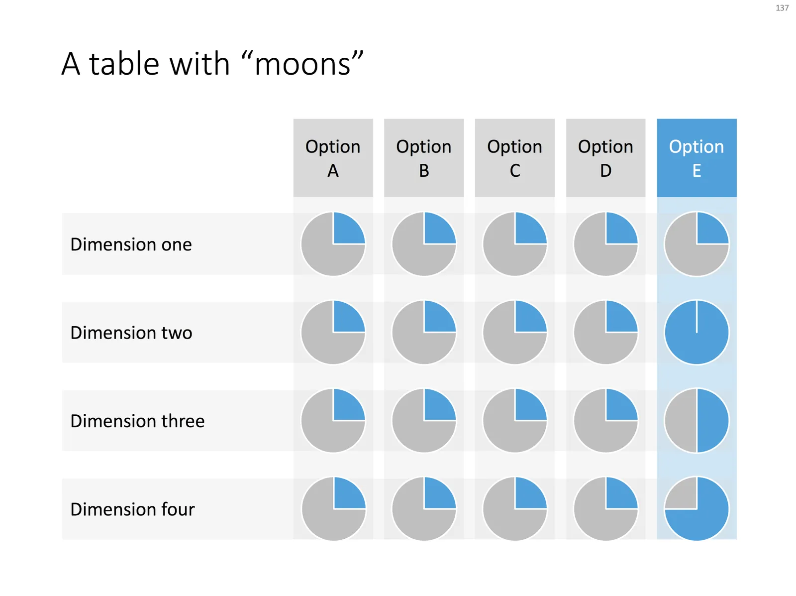
Harvey Balls are a repeating pattern of simple pie diagrams to score options among different access. Strategy consultants love them because it allows you to make qualitative assessments quickly. They work great on group discussion whiteboards as well: draw the empty circles and have the meeting participants colour them in.

Apparently they were invented at Booz Allen in the 1970s, which is probably why we at McKinsey referred to them as “moons”.

In PowerPoint they are a bit tricky to make, in the template below I tried to make an effort. To change the values, you need to open each pie diagram and change its value, make sure that you are not moving or re-scaling any of the pie diagrams in the process.

At McKinsey, I remember always keeping a “moon” diagram somewhere in my hard drive, so I could easily re-use the various shapes (these were not Excel pie diagrams, but graphic icons that came in the four stages).

Visually, I think they are not perfect. Maybe in the early 1990s, with primitive computer graphics, Harvey balls served a purpose, but now the same effect can equally be achieved by applying different colour shadings in the background colour of the cells in your table.

As always, feel free to copy the design, or download the ready-made slide from the template store.

·Layout

Pop out of the box

My slide layouts usually have a white frame around them, even big images I don not let “bleed” of the page. Why? My slide decks are usually a mix of these minimalist big image slides and more traditional, dense, consulting-type slides. The big pictures usually go in the front of the deck to sell the idea, but for financials, roadmaps, etc. I need a different format. Mixing two styles of presentations gives the deck an inconsistent look.

(The exception would be tracker pages, or section separators, which I usually stretch over a full page).

That “box” gives you some new design opportunities though; you can make things pop out by putting them outside the frame on purpose. This is technique that is often used on magazine covers. Below are some slides from the store where I used this technique (clicking them takes you to the store).

The tree

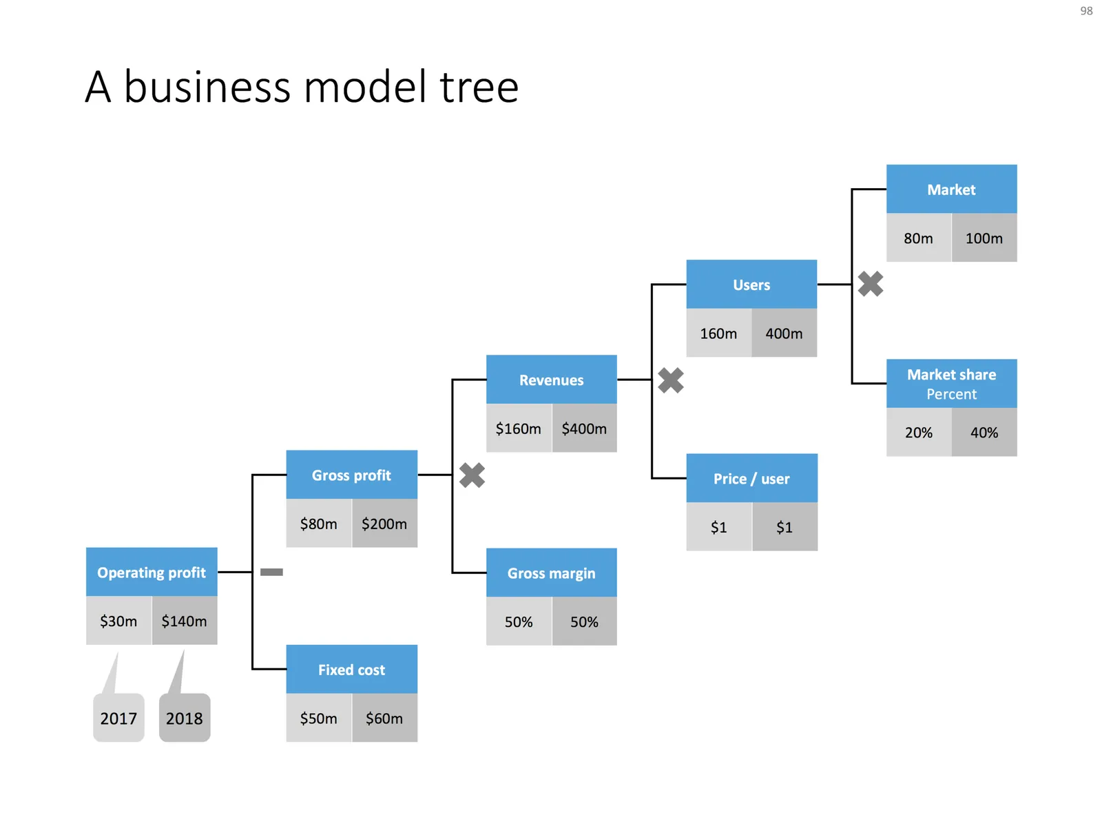
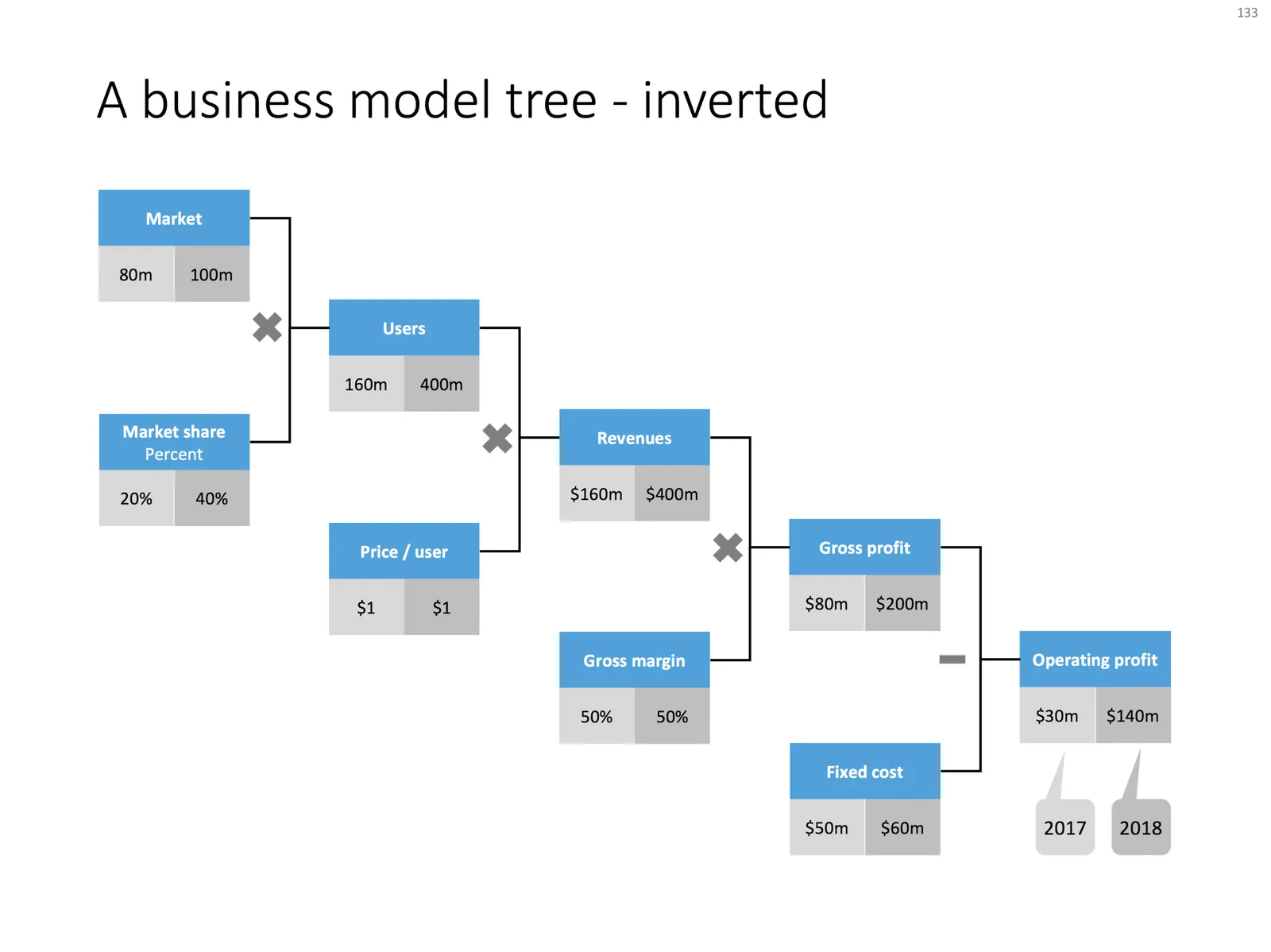
Trees like the one below are a great way to communicate a formula or a business model. It shows how factors are related. It forces you to “fill in the blanks”. For example, if you think you are going to get 200,000 customers in Luxembourg, you need to relate that to the overall population somehow. It makes assumptions very visible, and separates the ones which are relatively certain, from those which are wild guesses.

 Business model tree

Business model tree

 A business model tree - inverted

A business model tree - inverted

Use the tree to triangulate your own view of a business model or forecast, then show it to your audience and convince them of the numbers.

I always make my trees left-to-right, McKinsey style, where you would take someone from the big picture to the smaller details. Some clients have a preference for doing it the other way around, going from inputs to the final result.

Feel free to borrow this design idea, or download the ready-made slide from the SlideMagic template store.

Photo by kazuend on Unsplash

·Creativity

Finding inspiration via search

A very significant part of my efforts to get my template store up and running goes in its search engine. I am surprised myself how well it works. My bespoke client work is the test case for it, and whenever I start out on a new slide, I give the search engine a go, and voila, most of the times a suitable lay out pops up.

Business presentations are a bit like business English: you actually don’t need a big vocabulary of layouts (“words”) to make a decent deck.

You can use the search engine to you advantage without shelling out a dollar to buy a slide. Simply search for a concept, and maybe you can “borrow” the design that comes up, or the search results remind you of slides you designed before.

Here are some examples of how you can use the search engine:

  • Look for a business concept, anything to do with talking about the competition
  • Find specific well known strategy frameworks: 7S, Porter forces, etc.
  • Search for a specific layout: Venn diagrams, 2x2 matrices
  • You need a slide to visualise 4 things: look for the number four
  • And you can always try your luck with using SlideMagic as a stock image engine (try Stormtrooper), images on SlideMagic are free to re-use

I am monitoring the search terms people use closely. If a key concept is missing, I will add the slide, if a keyword does not match a suitable slide, I will fix that. At the moment, I am constraint by the search engine in the eCommerce platform that powers my site, which means that I need to work with keyword tagging of slides. As SlideMagic grows, I envision migrating to a custom search engine that can offer higher levels of intelligence. Ultimately, this will be the real differentiation of the site: coming up with the right slide layout on request.

Continue reading →
·Concepts

A multi-dimensional comparison

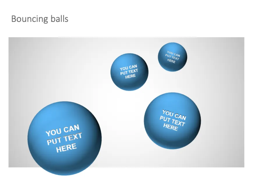
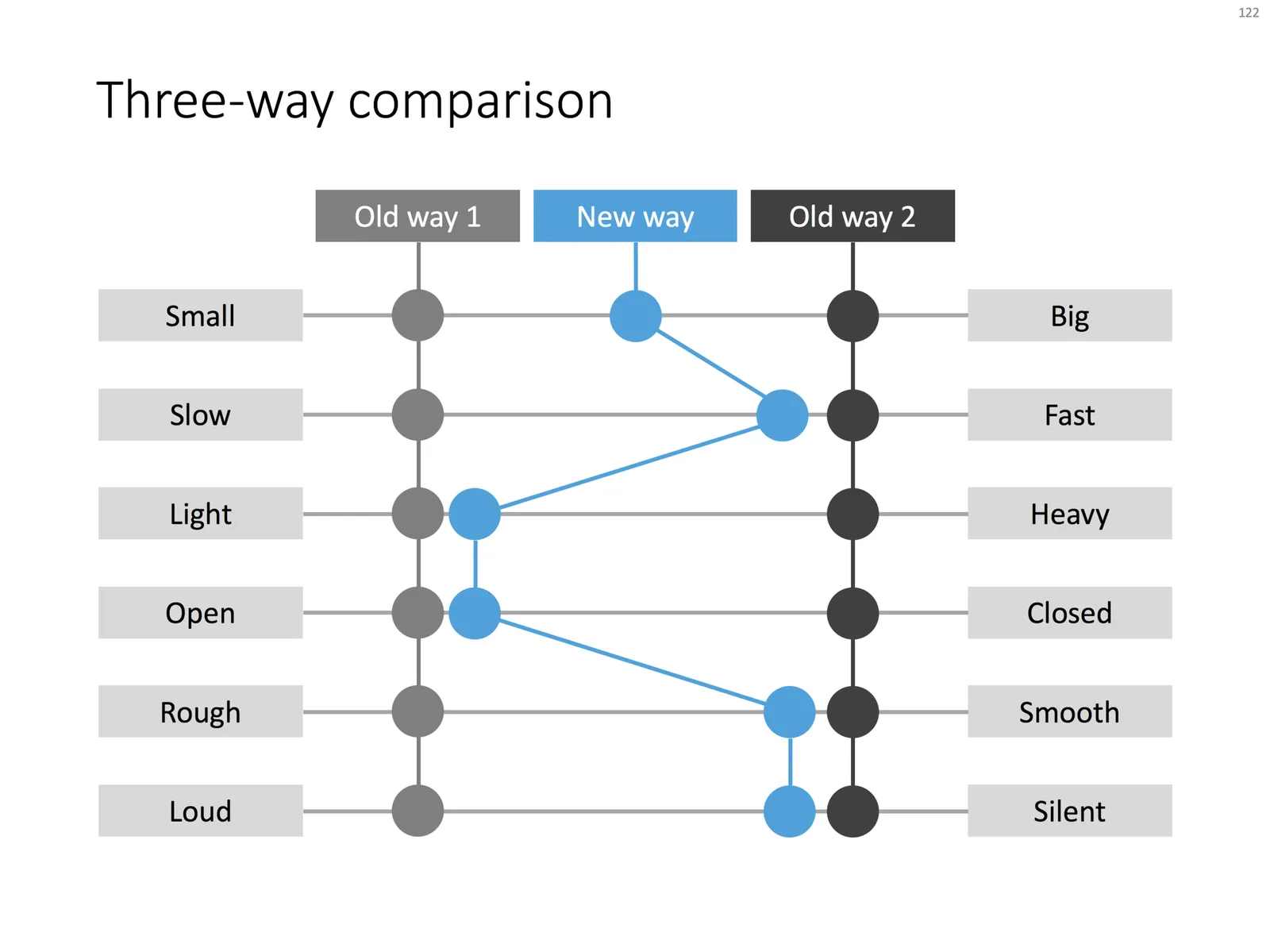
This chart can be your weapon of choice when you need to visualise a complex comparison: multiple options, multiple dimensions, and subtle differentiations (beyond “yes” or “no”). You can position the balls anywhere in between the extremes. When using the slide for your specific situation, it might have to go through a number of iterations. Choose the order of the dimensions in such as way, that the lest complicated line pattern emerges.

Feel free to copy the design, or download the completed slide from the SlideMagic store.

New year, new branding

Christmas and New Year are regular working days in Tel Aviv, so this week was an excellent time to give my branding a major overhaul. The Dutch masters and the quirky vintage images did get a bit stale, so I replaced them with a new fresh look, all in SlideMagic blue. The best wishes for 2018 to everyone!

 The presentation design app

The presentation design app

 The template store

The template store

 The bespoke design business

The bespoke design business

·Concepts

Stuck in a 15 puzzle

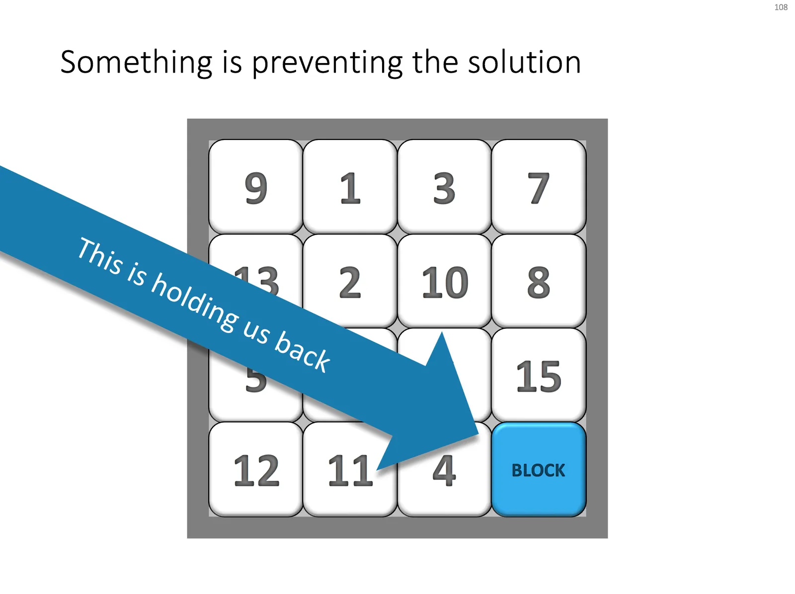
I am going back into the archive of 10 years of SlideMagic, Ideatransplant, Sticky Slides, Slides that Stick to rescue those slide concepts I discussed and put them in the SlideMagic store. Today’s catch is the 15 puzzle that cannot be solved because of some roadblock. Here is the original post from 2009, and below is the slide, ready for download in the SlideMagic store.

Image of a Magic Square in the Sagrada Familia by Alexander Baxevanis on Flickr

·PowerPoint

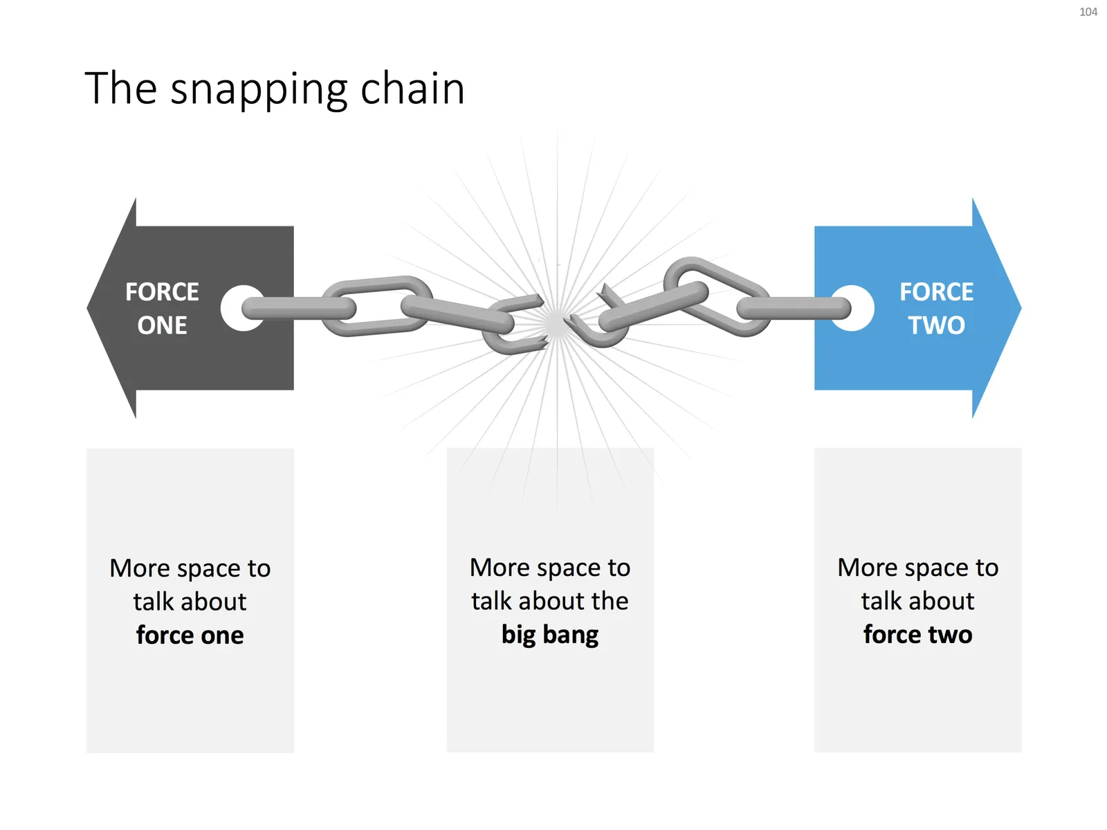
The snapping chain

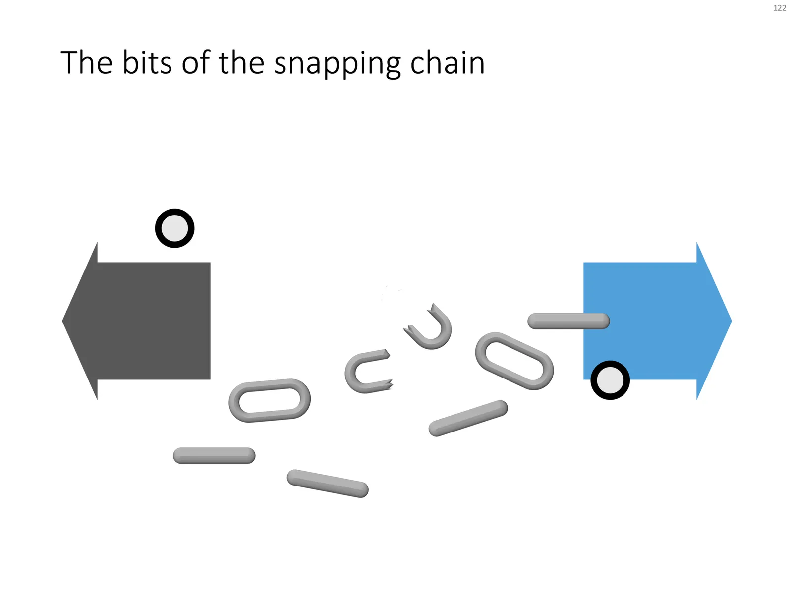
Business presentations usually rely on a few basic concepts. One of them is the snapping chain or rope, where 2 forces pulls something apart. One way to create this is with a stock image of a snapping rope or chain, but it can be hard to find one without an unhelpful 3D rotation, another approach is to create a chain from basic PowerPoint shapes.

Here is what I did

  • Take a rectangle with rounded corners
  • Increase the rounded corners until they become half circles (the small yellow dot in the shape)
  • Copy the shape, make it smaller
  • Centre the 2 shapes, subtract the smaller from the bigger
  • Apply some 3D bevel to to get the basic chain ring
  • The other chain ring is simply a rectangle with rounded corners.
  • Now, scribble a “saw” freehand shape.
  • Copy a chain ring, subtract the saw shape to get the broken ring
  • Copy this broken ring, and subtract it from another ring (to get the exact complement of the break lines)
  • Line everything up for the final composition.

You can follow these steps, or download the finished product from the template store.

Once you have your chain, “store it in a safe place”, there are endless ways you could use it in future slides: multiple chains, longer chains, chains that go all around the slide :-) Here is another possible composition from the SlideMagic archive

The resulting chart is not a master piece illustration, but its unpretentious simplicity can do a decent job in an everyday business presentation. People spent too much time dealing with presentation software, and the objective of SlideMagic (the app, the store) is to help you get business concepts on a decent slide quickly and move on with more important things in life (and business).