SlideMagic Blog

Frequent updates about all things presentations since 2008. Subscribe to never miss a post.

RSS
·Investor presentation

A list of presentation mistakes

Looking back at recent client work, the V1.0 briefing decks I saw, here are some of the mistakes I encountered. Not a complete list, not in the right order, just some examples that came across my desk the past few weeks.

  • Without even reading a single slide, some presentations have an incredibly dated look & feel: standard PowerPoint colors, old, low res, cliche images, even clip art. Look at a presentation you think look good, and simply copy the style elements with the colors of your logo and your presentation will dramatically improve, without changing one bit of its content. And by copying, I mean copying. Look at the positioning of titles and boxes, the amount of white space that is used. With an example design in front of you, your page should be able to look exactly the same, no excuses!
  • You have gotten used to the strategy review slides that have been in all the decks since you started out a couple of months ago. The audience sees them for the first time. Charts you used to evaluate your strategy, and not charts that can be used to pitch investors or customers. These presentations look highly professional, are loaded with content, say all the rights things, but do not change heart and minds.
  • Some presentations look too cute, minimalist infographics, icons, and cartoon characters. It is maybe nice and funny for a 1 minute product video, but people need to feel that there is a proper business behind this. If it fits your brand, it is fine to use the “cute” story as a sales presentation inside your investor deck, but the other slides should provide a bit more gravitas.
  • There are presentations which take too long to get to the point. Endless series of charts with market backgrounds, often providing statistics for trends everybody pretty much agrees with. Cut to the chase earlier, and if required, put a quick placeholder slide to remind the audience of the market context you are working in
  • Most of the time, I am not to strict with structure in a presentation (yes, I am an engineer who used to work for McKinsey). In 20 minutes, a story that flows nicely is more interesting that a highly structured presentation full of tracker pages and sections. Having said that, some companies actually need it. If you are a biotech with a significant portfolio of drugs in development, the audience need to stay on top of what we are actually talking about right now.
  • Dwelling forever about your technology, or doing a very long product demo does not help, but the other extreme is equally worse: summarizing your product in 2 sentences. The audience need to “feel” what the current pain is, how brilliant your product is, and how clever the underlying technology is put together. Each individual case has a different balance of these 3 points.
  • Certain businesses are basically apps. When the app is still in development, crafting a grand pitch deck might be overkill. Money could be better spent on some great-looking screen mock ups to explain investors or potential partners what it is you are actually doing. Graphics quality is not super important here, you can include 1-2 screens that show that your company is able to produce a good looking product. What is more important is the flow of the application demo you are showing. In these cases, designing the app experience, and designing the pitch deck can go hand in hand.
Continue reading →
·PowerPoint

Using perspective in PowerPoint

Today, there are many tools to create 3D visuals: images, videos, evening 360 degree virtual reality simulations. Most of the time, these perfect 3D compositions are overkill for business presentations. But sometimes, 3D compositions can help communicate your message. I am thinking of “road ahead”, “obstacles” and other concepts that are common in business presentations.

PowerPoint which is aimed at non-professional designers, does not have very powerful 3D object manipulation features. If you try to use the few that are there (3D object rotation, adding depth to shapes, putting drop shadows), the result often don’t look realistic.

My PowerPoint 3D abilities more or less followed the 3D development of a child who learns to draw. First, no perspective, then adding the side view without making things vanish into an imaginary horizon, then acknowledging the horizon, but not being consistent about, until finally you get what is actually happening and being able to tell why what you draw somehow does not match reality.

Most of the time, I ignore the built-in PowerPoint 3D features. Instead, I use regular shapes which I put on the slide canvas with some help of temporary lines. You can have a look at the example below. Objects should more or less fit within the boundaries of the lines, and text should be resized accordingly.

So, two principles:

  1. Only use 3D in PowerPoint when you actually need it to express a point. 3D for the sake of 3D does not make your charts look more fancy or clear
  2. When using 3D, keep it simple, and pay more attention to the proportion and positioning of the objects than “sophisticated” 3D effects

Continue reading →
·Typography

Small differences in font sizes (don't)

Visual emphasis is important in graphics design: it creates a sense of hierarchy, what should be viewed first, and what are less important details. In many draft presentations I see, people use tiny variations in font size to create emphasis. For example, the first sentence of a text block might be in font size 16 rather than 14.

This approach does not work. The viewer will hardly notice the difference in font size, and worse, small differences in font size give the text block an unbalanced look when seen from a distance.

It would not be fair to blame the amateur designer for this though, the standard PowerPoint bullet point template has this font size hierarchy baked in.

So, what is a right way to do it?

  • Try to avoid having to resort to this, make your text blocks short enough so they can stand on their own
  • Use white space and location on the slide to differentiate headings from other text blocks
  • For headings, pick other differentiators: bold, all caps, and use the style consistently through your presentation.
  • Inside a text box: subtle use of bold and color (main text dark grey, emphasis black) works great
  • Another don’t: underlining, on a computer screen it almost looks like a correction (or a hyperlink from the 1990s)
  • For major headings (such as slide titles), it is perfectly fine to use font size as a tool, just make it a big size difference when compared to other text elements on your slide.
·Templates

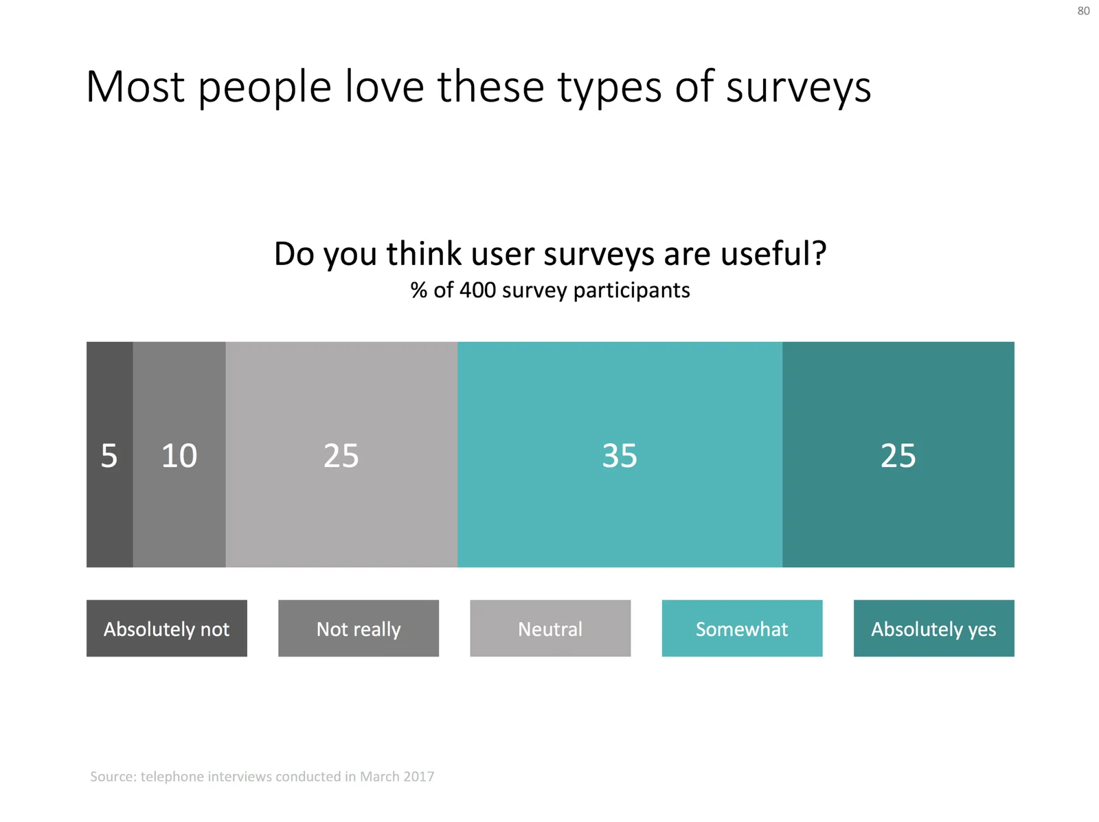
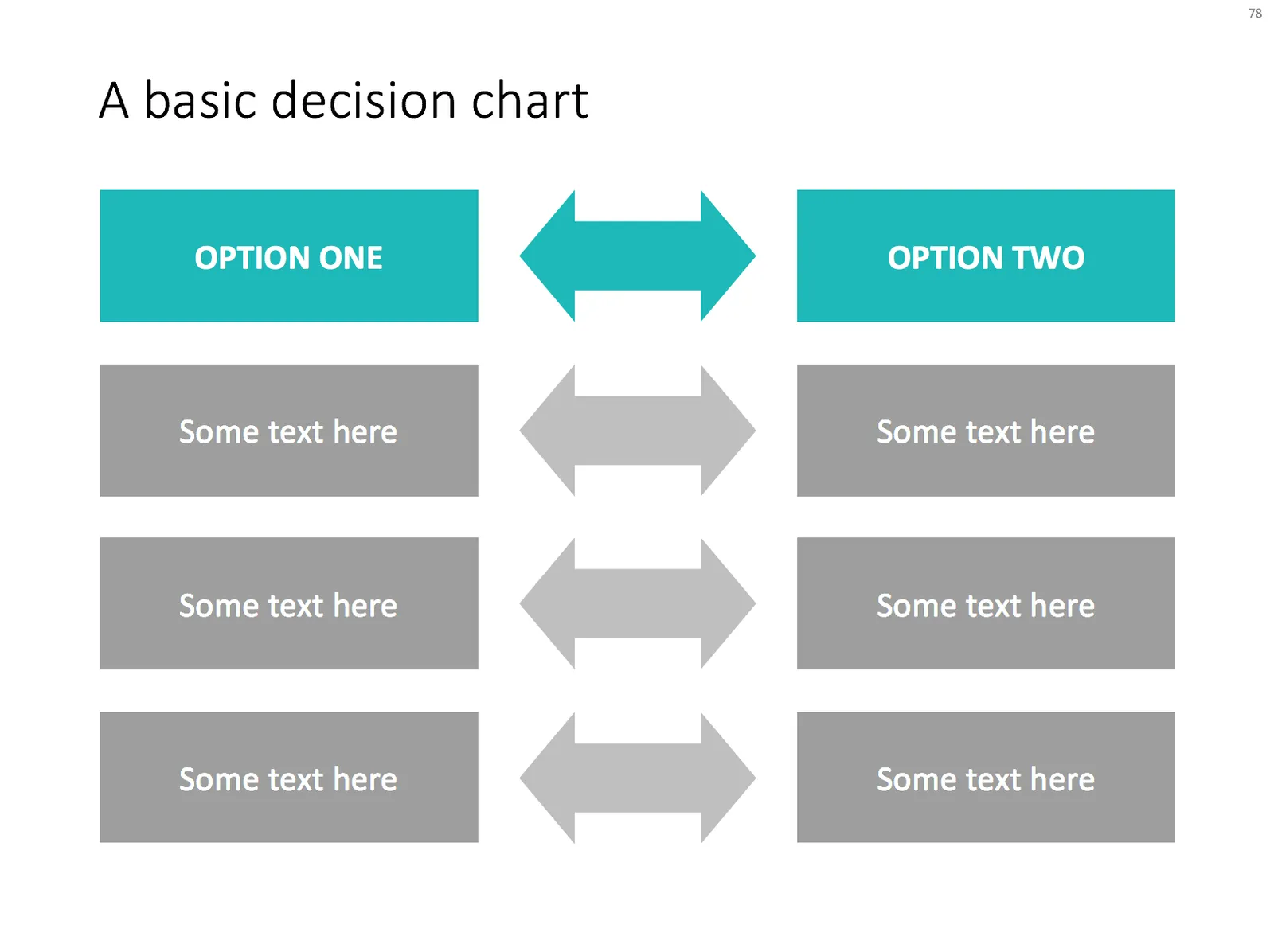
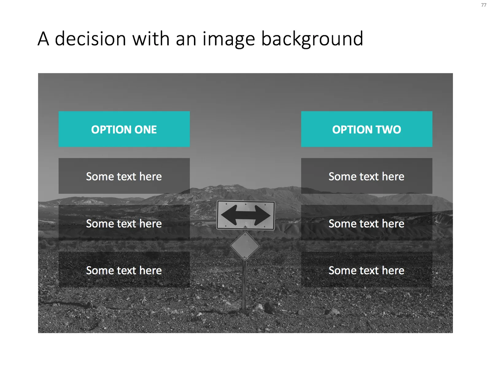
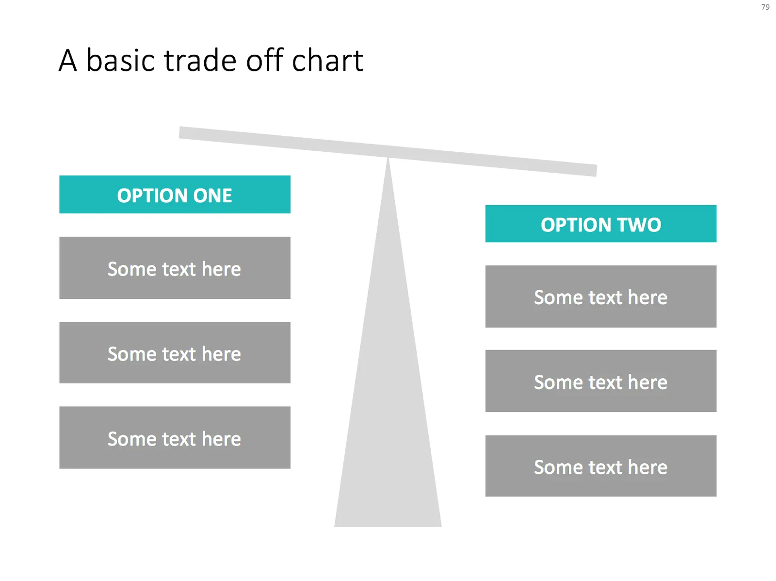
Examples of slides in the SlideMagic slide bank

I am adding new slides almost every day. Here is slide show of some of the designs that are inside already. Let me know which sort of new additions you would like to see. At the moment I am focussing on 2 types of slides:

  1. Super basic slides that every presentation needs, which are properly designed, and save you time when working on a tight deadline. Boxes are aligned, spaced out, it just works
  2. Tricky slide compositions that not everyone can do: more complex data visualisations, diagrams with complex shapes, 3D effects, or slides that feature an appropriate background image
·PowerPoint

How to export PowerPoint slides as high res images on a Mac

I am working with PowerPoint 2016 for Mac

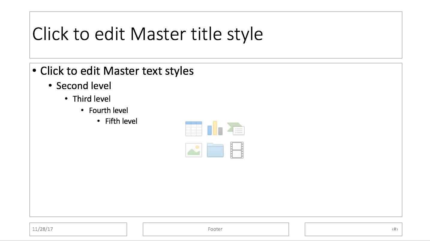
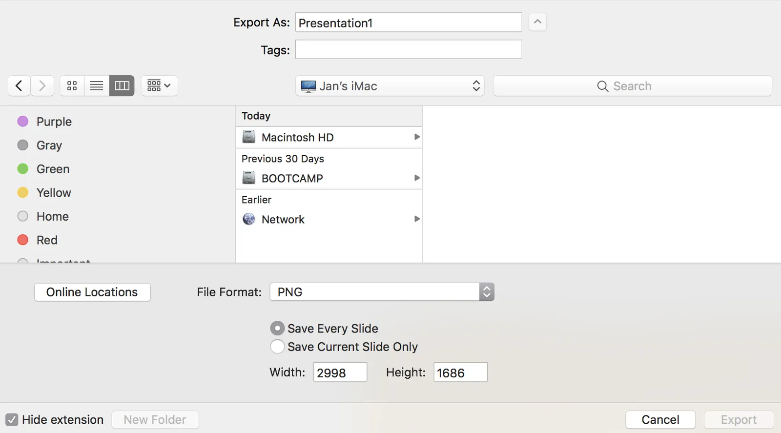
PowerPoint can export your presentation as a series of images. Go to file, export, select PNG, and you can select just one slide, or the entire presentation to be exported. In the latter scenario, images will be saved in a newly created directory.

Probably a left over from earlier PowerPoint versions, the resolution of these images has always been poor when using the standard settings. In previous versions of PowerPoint, you could somehow change DPI (dots per inch), but it did not affect the output. There are also ways to hack registry system variables (on a Windows machine, not a mac). The results have always been unpredictable.

In the most recent version of PowerPoint on mac, you are presentation with a menu in which you can enter the desired slide dimensions. This dialog behaves strangely when entering extreme values has height or width, flipping the orientation of the slides.

For some reason, I get decent pictures both in 4:3 and wide screen aspect ratios when setting the width to 2998, and the height is calculated to 1686. I have tried to understand why, but failed to do so far. It is probably not worth breaking your head over it, just use these numbers.

What does the app actually do?

You have been thinking about your app for 2 years, before this moment when you are ready to talk to investors. You have grand visions of the bigger picture, and how your app could become a major platform in your industry.

Investors have not gone through this process, and see many pitches that claim to be a platform in your industry. You can’t skip the part where you actually explain what your app does, now, today, in very practical terms.

This serves 2 purposes:

  1. The investor actually understands what it is you do, after which she is ready to try to understand your broader vision for the future
  2. The investor can develop a gut feel about whether a user today actually would like to use and keep using the product. Inside an investor pitch, there is always a mini (customer) sales pitch

Photo by Ben White on Unsplash

·Concepts

Merging flows

Here is a chart that visualises the merging of different flows. See in the second image what components I used to build it. Play around with the gradient stops to get the colours right.

Feel free to copy this design, or download it ready-made from the SlideMagic template bank.

Investor pitch in virtual reality (Pixvana)

It was bound to happen soon, a startup active in the field of virtual reality made an investor in pitch in well, virtual reality. (The background of Pixvana’s pitch)

For the company, it was definitely the right thing to do. The introduction of the team in a 360 setting is nice touch, and makes you feel right inside the company. The graphics show of the platform’s capability, which is probably the most important objective of the presentation.

Still, when it comes to transferring specific concepts, VR suffers from a similar problem that we already saw with the spectacular animations in Prezi. Sophisticated visual effects are not always helpful to communicate complex issues. I watched the 2D, non-confidential video, in a casual way, similar as an investor would do a first time around. In the video, the company shows why current video production tools fall short, I understand things more or less (“more data is required”), but somehow I feel that it could have been communicated more clearly.

As I discussed earlier re. Prezi, there are specific situations where animations could be really useful in an investor presentation (beyond spectacular page switches): zooming in and out of complex technical diagrams, showing transformations. The same is true for VR: guided tours of facilities, demos of buildings, etc. etc.

Exciting times for visual communication! If you are in the business of video production, the Pixvana SPIN Studio solution might be worth checking out.

Referral fees (I don't pay them)

People in the HR business complain about this: a headhunter makes a connection between a candidate and a recruiting officer without asking them both first (the double opt-in introduction), and, when the introduction ends up in a match, sends an invoice for a referral fee.

The same starts happening to me for custom design projects: an introduction, an anticipating client, and the request by the introducer to get paid in a separate email. Two things are wrong here.

One, not going for a double opt-in introduction. Ask both sides first whether they want to be introduced, and if you want to get paid for an introduction, ask me before you introduce, without mentioning the name of the potential client.

Two, I don’t work with referral fees. I don’t like padding clients invoices with costs that do not benefit from them. And more importantly, and refer lots of other work to other designers when I don’t have time to do it myself, without asking anything in return for it.

I felt like I had to make a public statement about this: I am always interested to be connected to new potential clients, but I don’t pay referral fees.

·Concepts

Sankey diagrams in PowerPoint

Sankey diagrams are tricky to make in PowerPoint, in the absence of a standard tool, you have to DIY the diagram from individual components. See below the approach I took to recreate a Sankey diagram that is used as an example on WikiPedia.

Here are the steps I took:

  1. Make it easy to make size adjustments by setting the height of the first block to 10cm
  2. Create all the square blocks
  3. Create the quarter circle shape (shape subtract) and put at the appropriate corners
  4. Create the inverse circle shape (take a square and subtract the quarter circle) and place it on the other side of the corners
  5. At triangles where necessary, note that I also used a white triangle at the entrance of the system.

The solution is not perfect, but it works. Feel free to copy this design, or you can download this chart from the SlideMagic template bank.