

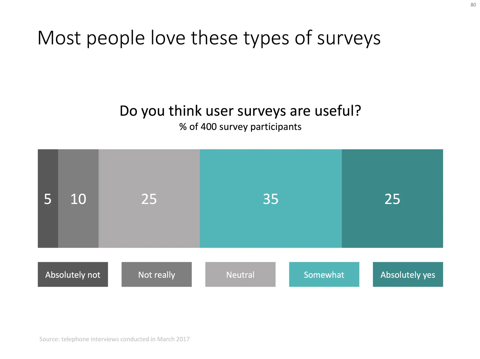
Here is a chart I usually use to present the result of a survey:
- Horizontal bar chart, stripped of all axis labels, data labels, etc.
- Consistent color coding to support the message you want to come out
- Text place holders for the survey’s conclusion, and the factual info: what question was asked, when it was asked etc.
Feel free to copy the design or download the chart from the SlideMagic template store.
Photo by Alex Kotliarskyi on Unsplash