SlideMagic Blog

Frequent updates about all things presentations since 2008. Subscribe to never miss a post.

RSS
·Design

Update

I have entered my usual summer blogger schedule (fewer posts) and am now working really hard to get SlideMagic 2.0 right. The feature list for SlideMagic 2.0 is now almost completely implemented. In software, there are always more things to add, but the product as it stands at the moment is starting to get very useful. Over the last 2 weeks I put in very big changes that might not look big from a user’s perspective, but required huge changes under the hood:

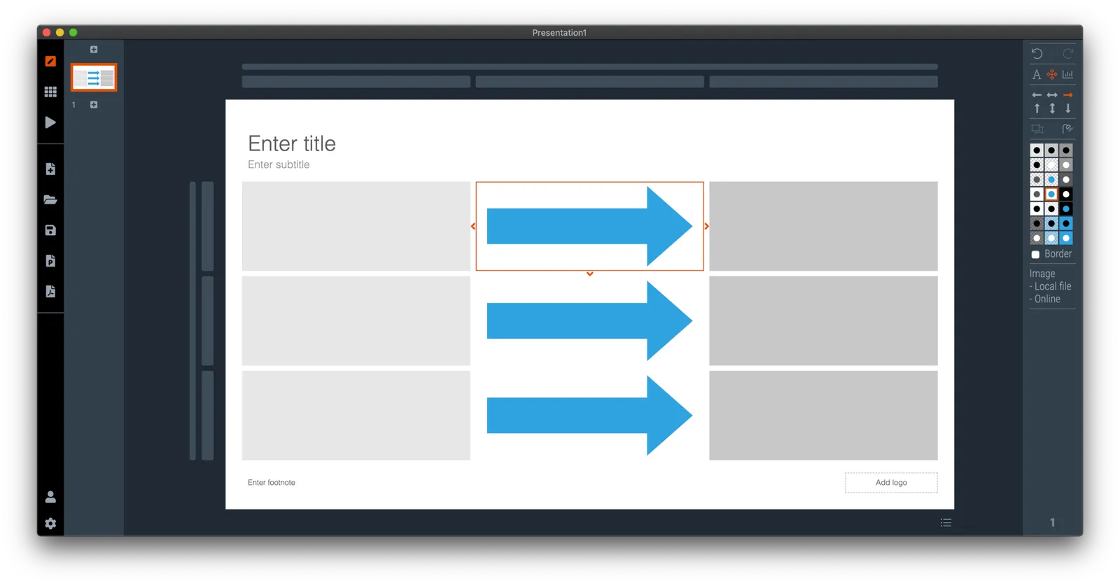
  • The new '“side title” layout (my preferred)
  • Slide search previews in your own preferred colour, layout, font style
  • Horizontal and vertical waterfall charts
  • Dynamically generated slides with a relevant image (i.e., unlimited slide in the template bank)
  • Better rendering of slides and images on higher resolution screens
  • Useful image compression in the background

The only big one that remains outstanding is a better way to make diagrams with lines and arrows, the connector solution is not perfect.

In the background I am now tweaking lots of user interface details: how borders fit around thumbs, mouse behaviour when hovering over things, an “endless scroll” is now working for image search, messages that warn you when things go wrong, or when your app is busy searching, making sure that thumbnails distribute nicely over the screen when zooming, minimising the times when the app needs to re-render a slide or image to make the workflow calmer, etc. etc.

I start to look at app design the way I look at slide design. Things need to be absolutely right, and even tiny deviations, irregularities, small mistakes, can really upset me, while most people won’t even notice them. This is what I think ultimately leads to good design, one by one, these details do not matter, I you add them all though, something works without you having an ability to point your finger at exactly why.

Continue reading →
·Templates

The SlideMagic template bank now has an "unlimited" number of slides

The latest version of the SlideMagic app (download) now has a feature that I wanted to implement for years: automatically generated slide templates.

The basic set of SlideMagic templates are closely related to my consulting background: lists, tables, frameworks, 2x2s, graphs, diagrams, etc. This set will grow into the thousands, but it still relatively small when it comes to the universe of slides.

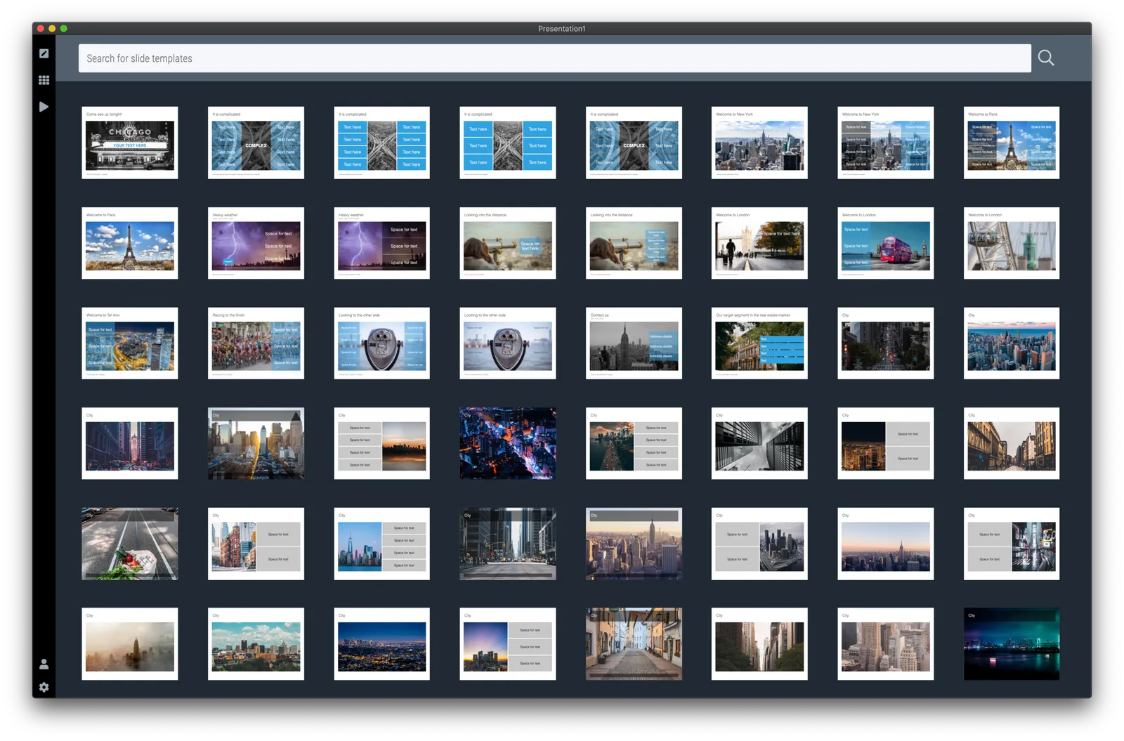
There is a big long tail of slide designs that are impossible to design and store on a server: slides with backgrounds of an image: cities, buildings, buckets, cars, roads. It was already possible to search online for free images in SlideMagic, but now I took a step further.

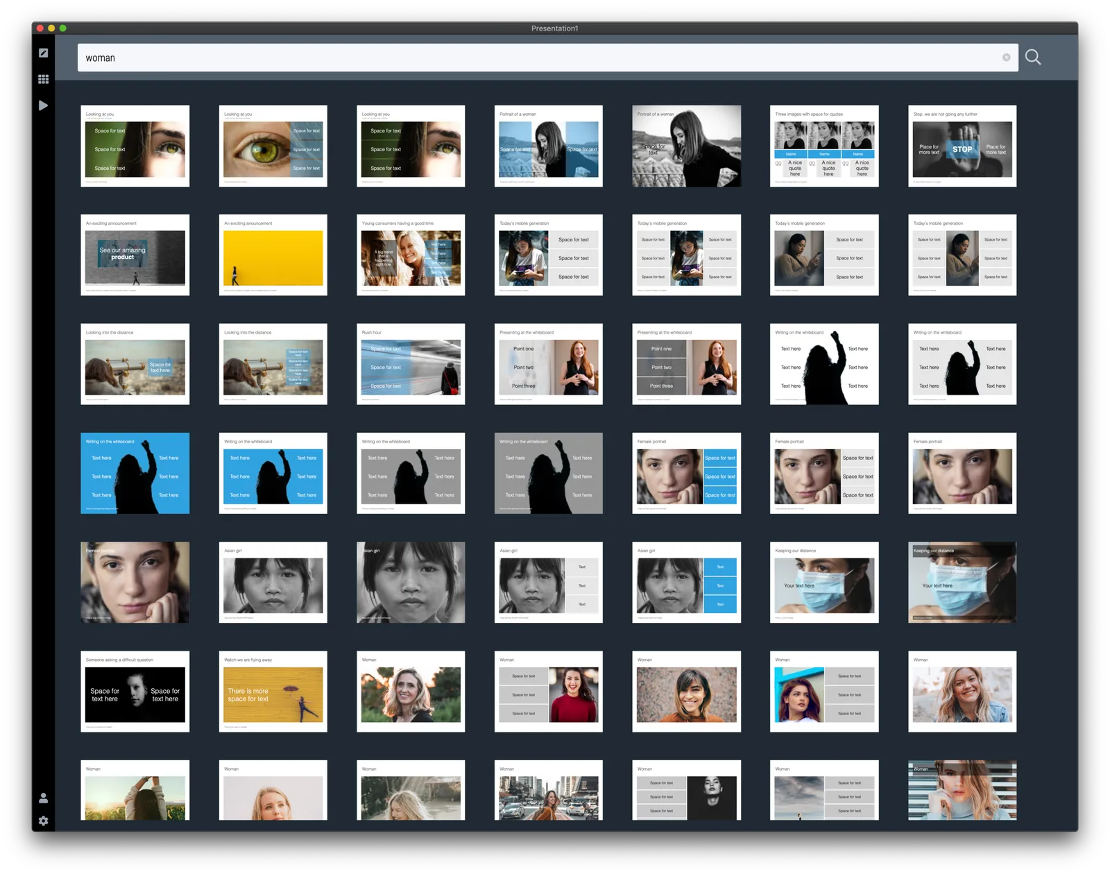
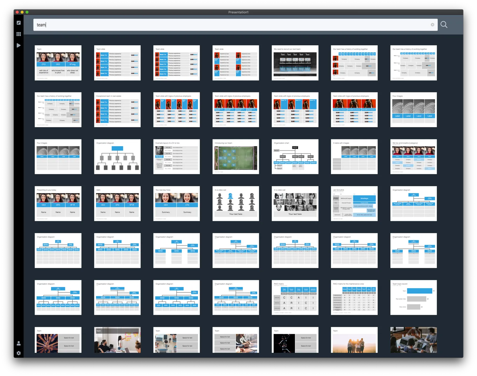
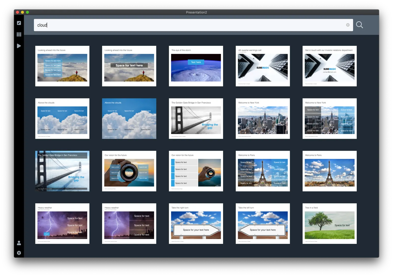
When you hit a search inside the app, first SlideMagic will serve you its own templates that best match your search criteria. But then, the app will add automatically generated layouts with relevant images after that. These slides do not sit on the server, they are generated on the fly. In the screen shots below, you can spot the break between the two types of slides, but you need to look carefully.

This feature is only available inside the SlideMagic and not yet implemented on the web site. I am just starting to scratch the surface of all of this, as usual: work on progress.

·Colors

SlideMagic slide search results now in colour

Another day, another improvement

I stuck to showing images on slide search results in black and white because I would be sure that the photos would not clash with the accent colour for the slide users had picked (most users will swap SlideMagic blue for their own logo colour). That worked, but it came at a price: slide templates all looked a bit sad. This is not only due to the greyscale colours, but also because of the way the greyscale filter was applied: many colours were translated into too dark tints of grey I think.

This morning I re-rendered the entire slide database (the server is still a bit tired) and images in slide templates now show up in colour.

It is worth the trade-off I think. Of course it is possible to go back to a black and white image in the SlideMagic app, simple untick the ‘colour’ box and the image will show up as grey scale (you can always go back to colour if you want).

The colour option is only available for the slides that I added more recently, after I switched off the colour option when ‘flattening’ or compressing slides. Obviously new templates will all appear in colour, or I will set them explicitly to black and white when I feel that it serves the slide’s message better.

This addition of colour coincides nicely with the more mature SlideMagic product I think, slowly but certainly it comes out in its full shiny colours :-)

Continue reading →
·SlideMagic

Waterfall charts in SlideMagic!

Finally, they have arrived. Waterfall charts in SlideMagic. Everything lines up with other elements in your slide. Super easy to make and edit, super easy to convert to editable PowerPoint / Excel charts if needed. Download version 2.4.7 of SlideMagic to try it out (both for Windows and Mac). This is a brand new module in the app, please let me know if you experience any issues or have other suggestions.

·Data visualization

Chart makeover: where do people get infected with COVID-19

Israel is experiencing a very strong second wave of the virus. Its health ministry recently published data about where people get infected.

This graph does not tell the entire picture, I tried making a quick slide in SlideMagic:

What did I add?

  • Providing the overall context: for many patients it is not known where they are infected, and many get infected at home (which are probably secondary infections)
  • There is still important data missing. The most important one is how many people in total actually visit a place. Millions of people visit schools, thousands probably visit gyms and places
  • We need to understand the impact on secondary infections (how big are the typical households that these people are coming from).
  • Then there is the question about impact to society…

This SlideMagic slide is free, you can download it here. It is clearly an example of an analysis slide, rather than a visual to be presented to a large audience. While I am not a big fan of stretched 16:9 layouts, in this case I had to go for it to create space.

PS. My opinion re. the strong second wave in Israel? Yes, Israel got the virus under control and then reopened too quickly (school were the main source of infection initially). But, in the end I believe any country re-opening will go through the same process, may just a bit slower. I think Israel is 1-2 months ahead of other countries re-opening.

Working to add waterfall charts to SlideMagic

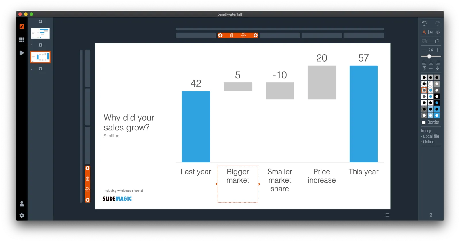
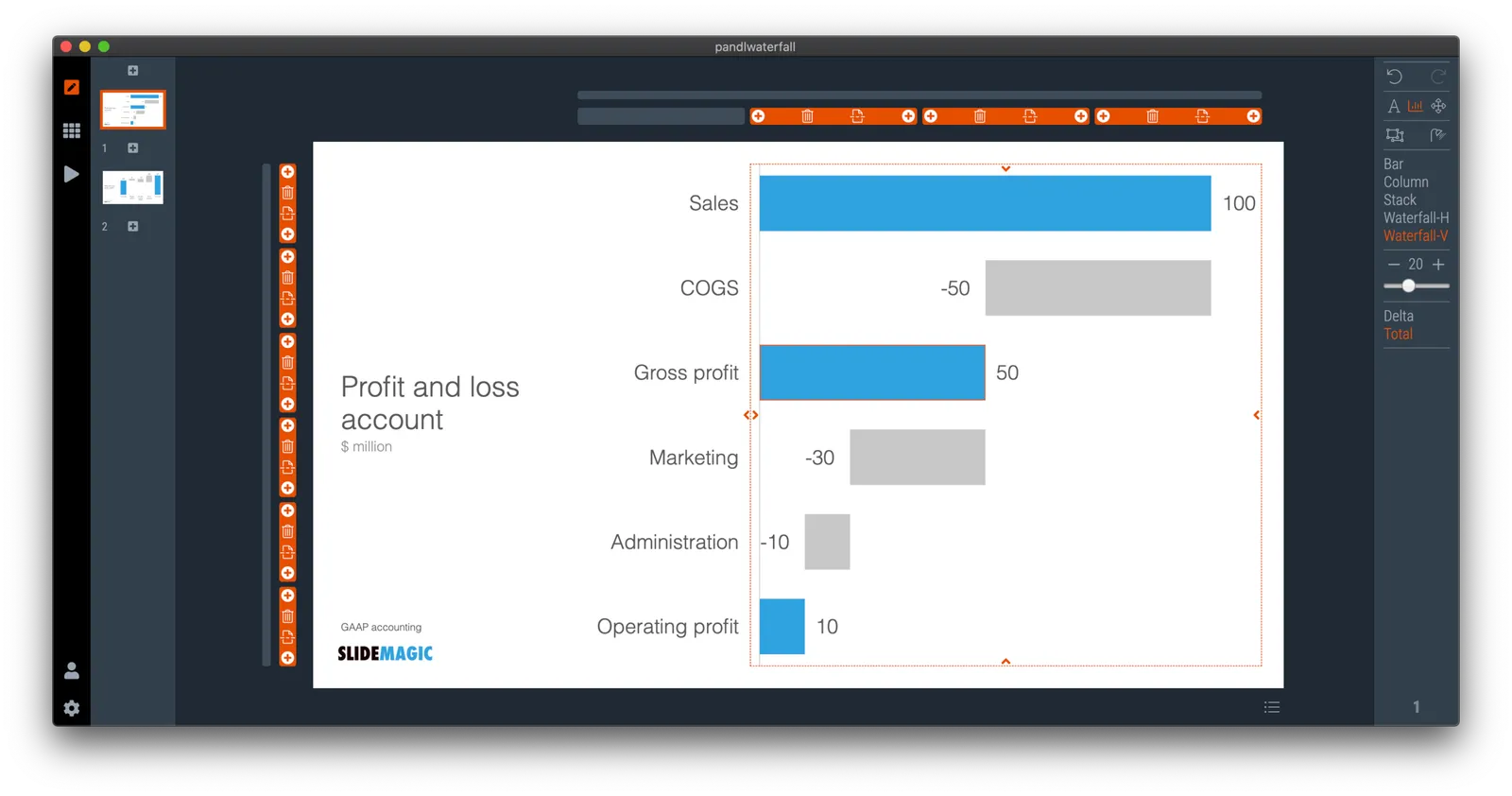
Waterfall charts are always an absolute pain to make. As my coding skills increase, I am getting more confident to add trickier things to SlideMagic ( tricker in terms of coding, not in terms of user interface). So, I have started to work on adding waterfall charts to SlideMagic. Below a screenshot of my development machine.

They should be in line with all the other data charts in SlideMagic, line up perfectly with the grid to make it easy to add data labels and incorporate them into the overall slide composition.

For many corporate users of SlideMagic, the killer feature might be the conversion of these simple waterfalls in a fully editable spreadsheet in PowerPoint/Excel.

Work in progress…

Update: the latest version of SlideMagic now as the waterfall functionality. It should work great in the app. PowerPoint conversions works as well except for the data labels. Let me know if you encounter any issues.

Photo by Robert Lukeman on Unsplash

·SlideMagic

Slide search results in your own colours

After updating to the latest version of SlideMagic, your slide search results will no longer appear in SlideMagic blue, 4x3 aspect, but in your own personal colour palette, and in your own preferred screen size.

Unlike most template banks, SlideMagic now generates slides on the fly the moment when you search for them, rather than serving pre-fab files. This opens interesting opportunities for future features :-). Work in progress.

·Concepts

Using heat maps in your presentation

This is a neat visualisation of the COVID outbreak in Florida:

Why does it work?

  1. It uses colour intensity to introduce another dimension of data in a column diagram: time, number of cases, and age range.
  2. The colours are nicely chosen so the chart gives the impression of some sort of fire being lit (which is unfortunately the case).

These charts cannot easily be created in PowerPoint, this one is generated by some code. But you could give it a go in PowerPoint.

  • Take a standard column chart in PowerPoint
  • Make all the data series have the same value, the age brackets you want to use
  • Set the gap between the columns to zero
  • And now comes the hard part: manually add different colours to each data point. To select a data point click it twice in quick succession (one click will give you the entire data series wiping out your detailed painting effort in one go)

Here is a quick search for heat maps in SlideMagic, I added one design that sort of resembles the COVID chart. You can see how the new slide layout with the side title I introduced a few days ago comes in handy to create more vertical space for data.

·SlideMagic

Coming soon

Search results in the SlideMagic app show up as small screen shots of slides in SlideMagic’s blue colour at the moment. It would take a lot of bandwidth to send over the full slide designs when previewing templates.

I am making changes now on the server to make it possible that slide previews show up in your own colour scheme, with your own corporate logo on it, and in the layout you prefer(4:3, 16x9, black background, dark background).

The app will be upgraded first, after which I will make the feature available for paying subscribers on the web site as well. Users who prefer PowerPoint downloads will be able to download PPTX layouts with their own colours and logos already activated.

Work in progress.

Photo by Lindsay Henwood on Unsplash

Embarrassment...

While cleaning up an old computer, I came across a version of SlideMagic from probably 6 months ago. Back then I thought this was just about as good as it can get, comparing it now to version 2.4.3, I am almost embarrassed to have even released this. I hope I feel the same way about the current version in 6 months.

Only now, I am getting close to the feature set that was in my brainstorm notebook from almost four years ago. I remember coming up with most what is in SlideMagic 2.0 during Web Summit in Lisbon in 2016…

Things still to fix are:

  • Connector editing (it works, but it is not intuitive and efficient enough)
  • Making sure that previews of template slides show up in your own personal slide branding, rather than SlideMagic blue (without wasting a huge amount of bandwidth and/or processing power)

Photo by Abigail Keenan on Unsplash