SlideMagic Blog

Frequent updates about all things presentations since 2008. Subscribe to never miss a post.

RSS
all posts

Category Templates

·Data visualization

Quick makeover: our high-tech industry matters

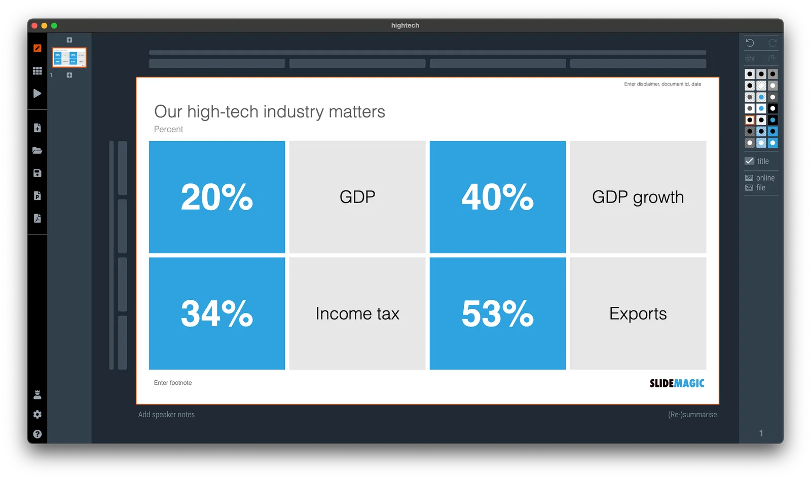
I saw the following slide coming by in my Twitter feed (original post):
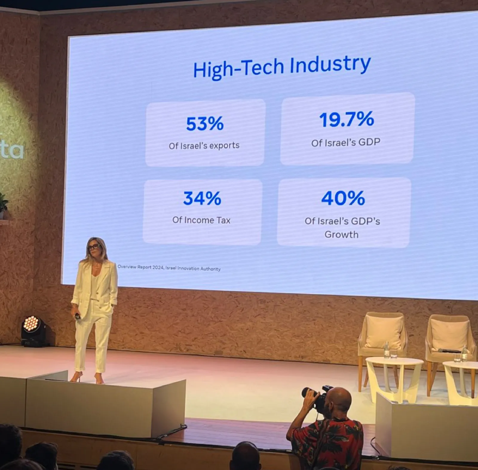
Here are some things I fixed:

  • Message in the title
  • 19.7% -> 20%
  • Simplification of the labels

(For those of you interested in the political context: Israel is fragmented in many population groups, the Israeli high-tech sector which is mostly secular, pro-democracy, situated around Tel Aviv, and not really represented in the current government is making the case that it generates a big chunk of the Israeli economy and is bank rolling many other sectors.)

·Layout

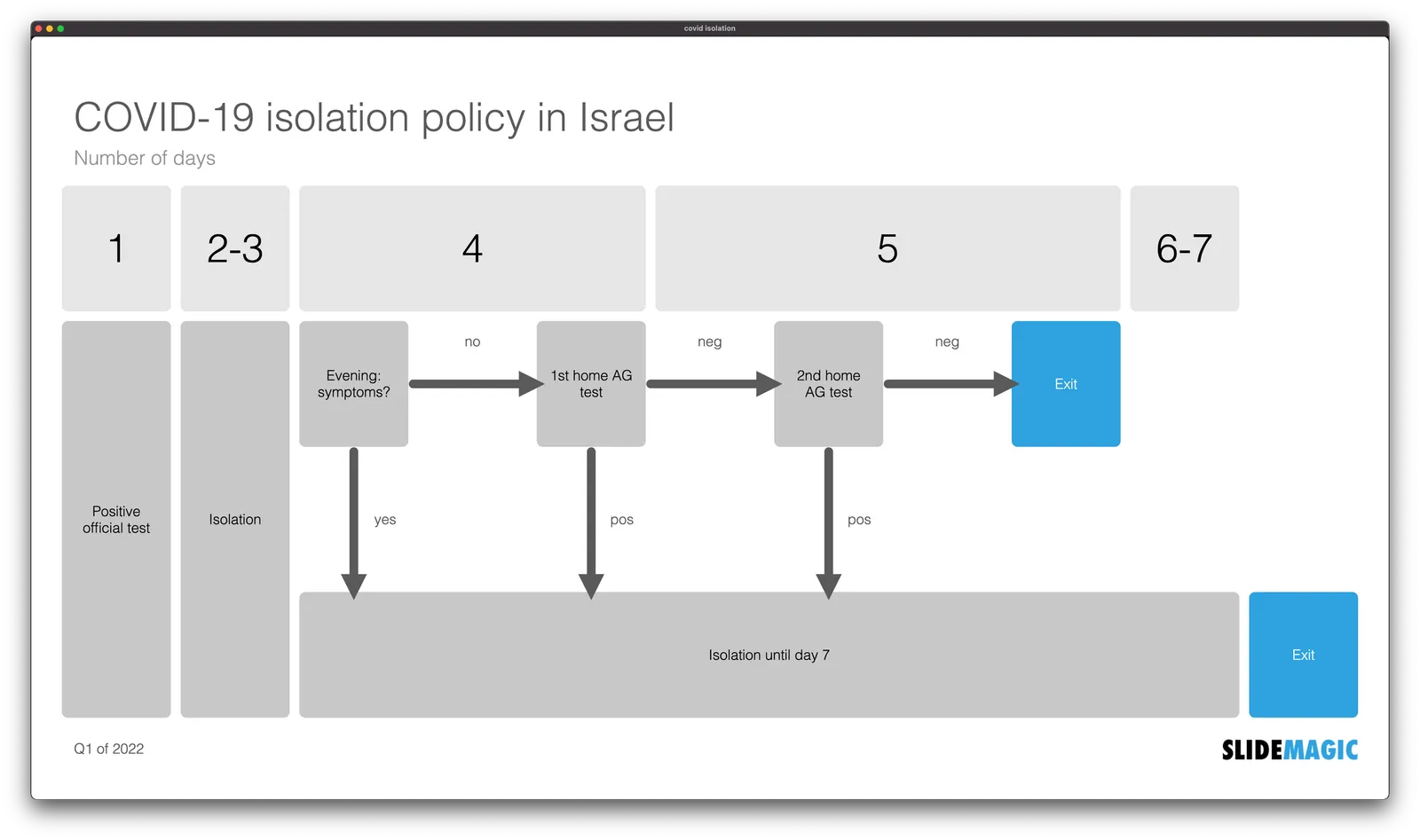
COVID isolation policy

A quick re-make of a graphic with the Israeli COVID isolation policy, here is the original

Below is my version in SlideMagic. I tilted the diagram, to put more emphasis on the timeline. Search for ‘COVID’ in the SlideMagic template bank and the slide will show up for you to use, either exactly as is, or as the basis for another timeline chart.

·Templates

Another slide makeover

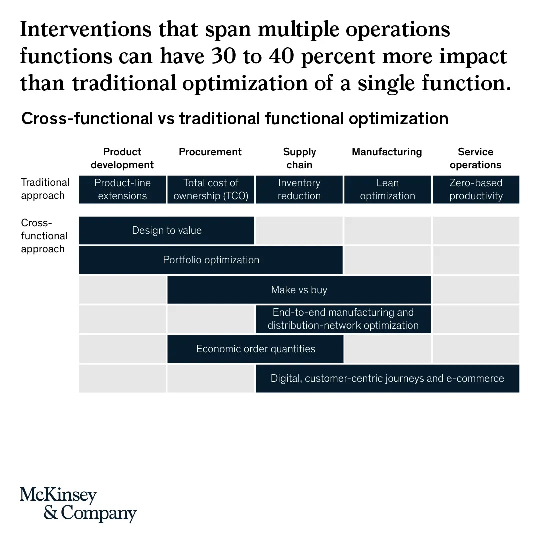
McKinsey’s social media activity provides an excellent stream of slides to work on. The one below could have come straight out of SlideMagic.

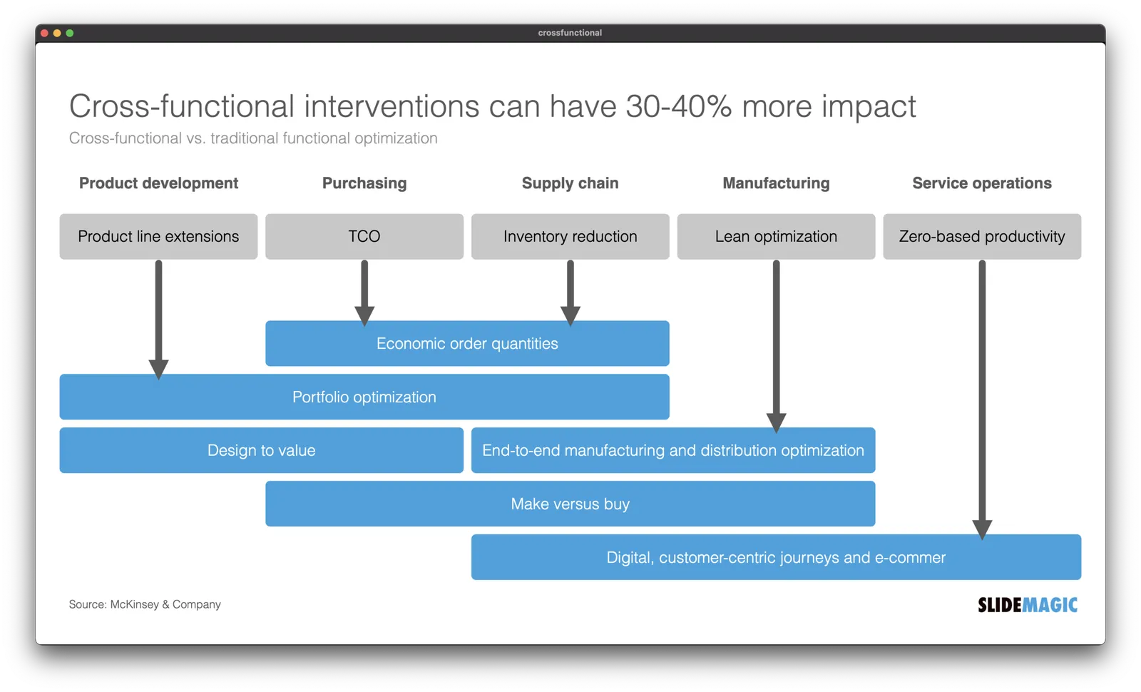
I created a proper SlideMagic version with a few improvements:

  • Emphasized the “from to” theme of the chart with arrows, and two contrasting colors, and a bigger distance between the two options
  • Lighten the colors a bit, especially the dark top row of the original puts a lot fo weight in the chart
  • Actually reduced the font size a bit to give the text more breathing space in the boxes
  • Re-shuffling the bars to get a more pleasing overall composition
  • I eliminated the left column, the audience can guess the description, to add more balance to the composition and gain some extra space

SlideMagic users can use this chart, simply search for a relevant keyword (operations, consulting), and it will pop up for you to adjust to your own project.

·Templates

Different levels in presentation templates

A “presentation template” is usually a PowerPoint file that new employees receive on their first they of work. There is more to a presentation template I think.

  1. Your corporate visual communication style/culture

    • Consulting firms: lots of complicated diagrams and frameworks, meant for solving a problem rather than presenting
    • Investment banks: dense text and tables with graphs, meant for reading rather than presenting
    • Consumer goods company: product packaging shots and bullets
    • University: list of bullets
    • Etc. etc.
  2. The actual software file that holds the basis layouts, logo, and colours (this is the one you get on the first day of your employment)

  3. Running versions of important presentation documents that get constantly updated and tweaked

    • Sales presentations, each for a different lead or a different customer segment
    • Quarterly results presentations with - well - different quarterly results
    • Strategic planning presentations, each one for a different product group
    • Etc. etc.

Most of the day-to-day presentation work in companies is in step 3, the tweaking of existing documents to update it for the latest sales meeting or board meeting. These presentations are in fact the “templates”, not the empty file.

In most presentation design software the tweaking of an existing slide is tricky and over time a slide degrades after many iterations where users insert the wrong fonts, colours, and trip up a decent slide layout that worked for 5 boxes, but not for 6. (“Template rot”).

The above is true for both existing corporate presentations and shiny new templates purchased online. The latter look amazing fresh off the press, but it shows when a non-designer tried to fit it to her needs.

Continue reading →
·Templates

Explained: vaccine 90% effective, vaccinated still expected to be 50% of infected

There is a lot of confusion here in vaccinated Tel Aviv, now that around 50% of people infected with COVID appear to be full vaccinated. Newspapers are heavily quoting the “64% i.s.o 90% for the Delta variant” which does not seem to be based on the correct calculation of vaccine effectiveness.

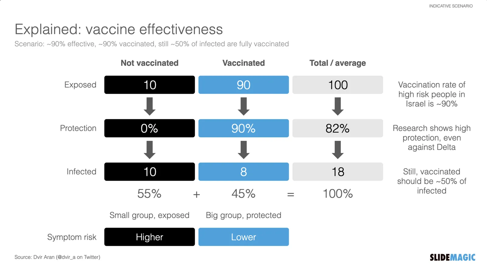
I used an explanation by Dvir Aran to make a slide that explains how it is expected that 50% of infected people are fully vaccinated, even with a 90% vaccine effectiveness.

The logic is as follows:

  • Take 100 people who are seriously exposed to the virus

  • Assume a 90% vaccination rate (the case for the at-risk population in Israel at the moment):

    • A small group is exposed: 10 people
    • A big group is protected 90 people
  • Assume a 90% vaccine effectiveness:

    • 10 out of 10 unvaccinated people will get infected
    • 8 out of the 90 vaccinated people will get infected
  • Of the total of 18 infected people, 8 will be fully vaccinated, so around 50/50

Of those 18, the majority of cases with symptoms and serious complications will be unvaccinated of course.

I have added this slide to the SlideMagic library, search for “COVID” and it will pop up, or download it here. Pro subscribers can convert this chart to PowerPoint, if you have to. (Students, you can claim a free membership!).

·Templates

"Life by SlideMagic"

My amazing wife Anat Naschitz has always supported me in developing SlideMagic behind the scenes. Going forward, she will become more visible to the outside word. Recently, she created a deck to demo SlideMagic to a potential client. We have added these slides and the entire deck to the SlideMagic template database, so they all should be available in the SlideMagic app for you to use in your own presentation, simply search for “anat” and the slides will pop up.

·Templates

An actual presentation as a template

Most companies have some sort of corporate PowerPoint presentation template sitting on the file system. It consists of a title page, some trackers, some bullet point layouts, some picture slides. The template probably looks ago, but as soon as employees start to use it, this is no longer the case.

Why?

  • Most templates are designed as an afterthought, after the logo, web site, letterhead and business card have been approved
  • PowerPoint templates are created by designers who understand graphics design, web/print design software, but NOT PowerPoint and as a result a lot of technicalities go wrong
  • But most importantly: templates are designed on a blank canvas, encouraging the designer to “do something” with all that white space.

A better approach: start with an actual presentation. The general company introduction, a product sales pitch, last quarter’s analyst presentation. Make that deck look perfect and put on the on the file system as a starting point.

  1. The template is designed around actual content, rather than content being forced to fit around a template
  2. Most companies need very specific templates. Consumer goods companies: products/packaging demos, market shares and sales across many channels, consumer research data. Pharma: scientific clinical trial data. Chemicals: process layouts, project maps. Consulting firms: fancy frameworks.

I am contemplating some new ideas for SlideMagic to make the above all a bit easier.

Photo by MagicPattern on Unsplash

·Concepts

Busy economics slide in SlideMagic

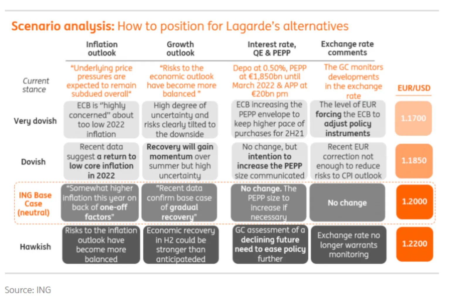
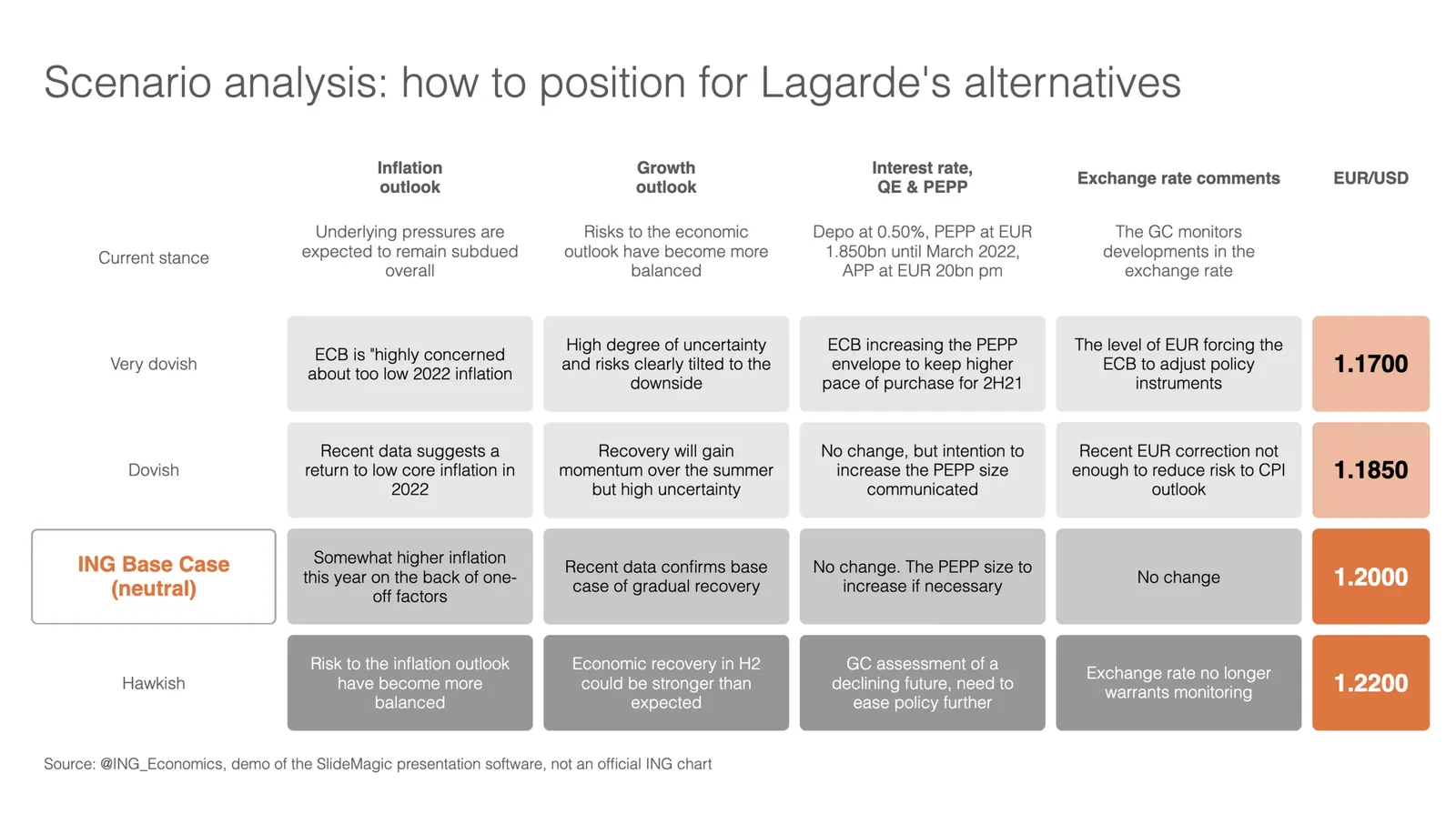
I stumbled on the slide below by @ING_economics.

This is a slide intended for reading, rather than serve as the backdrop for a TED Talk. It can be improved on a number of fronts:

  • Move the aspect ratio to 16 x 9 to make more space for text in the boxes
  • Actually reduce the font size (we are reading anyway), to make the text fit better in the boxes, with more white space, and less irregular sentence wrapping
  • Make the rounded edges less extreme
  • Make the dark colour accents a bit less strong
  • And most importantly, fix those misalignments that make me cringe…

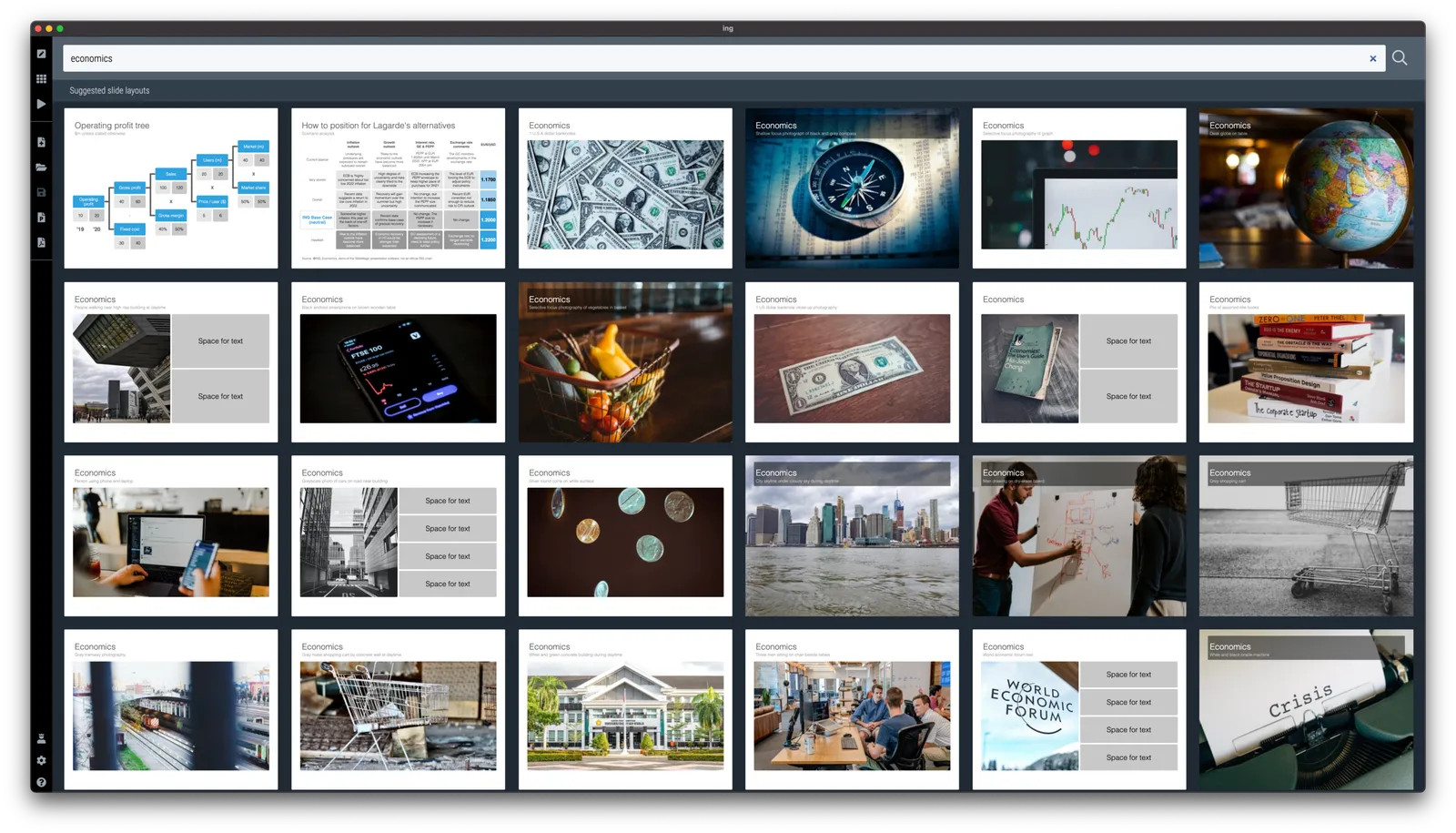
I did a quick re-do in SlideMagic, with is particularly powerful when it comes to text tables. I added the slide to the SlideMagic library, search for “economics” in the desktop and it will show up.

·Concepts

CMMI template

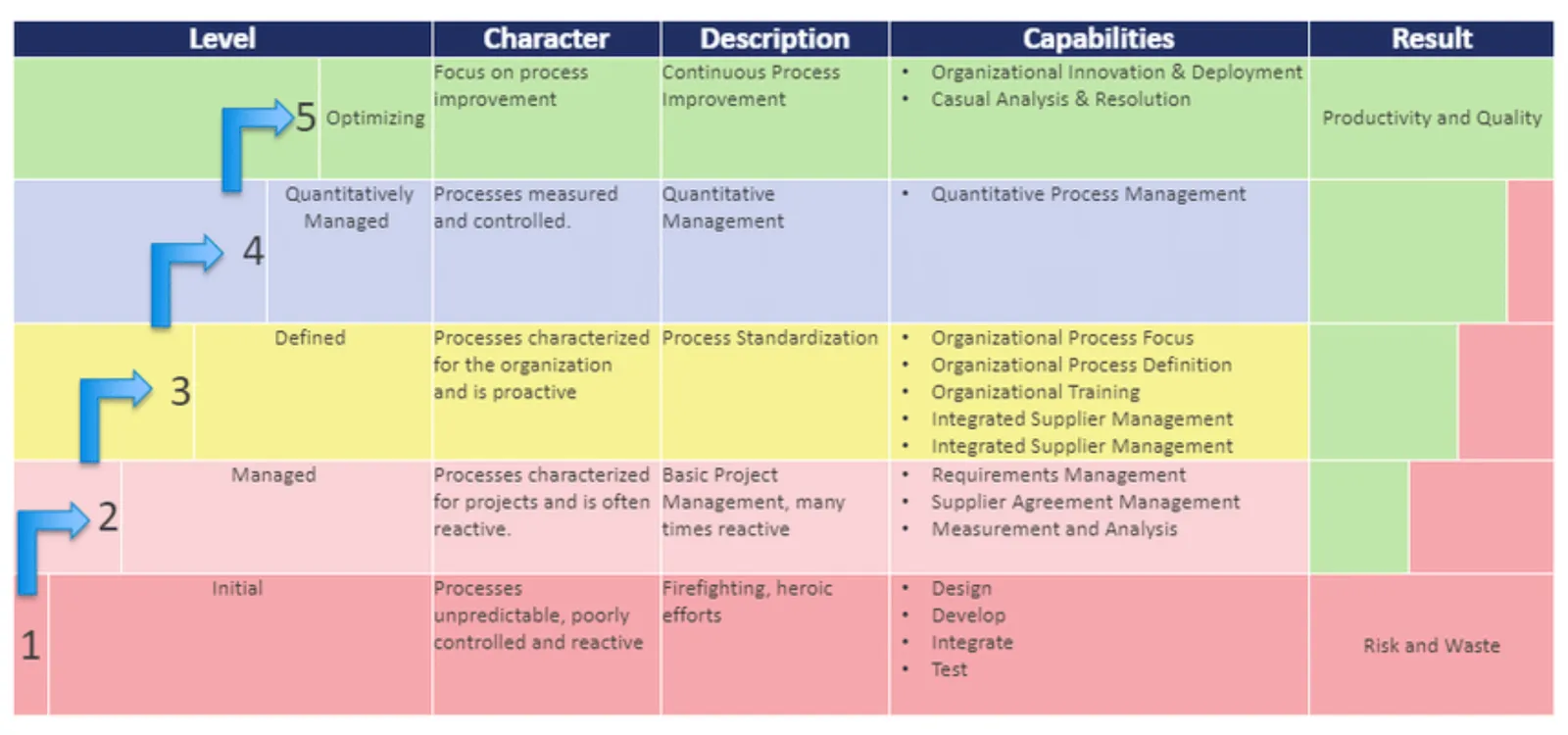
One of the users requested a template for the Capability Maturity Model Integration framework (more information on the site of ISACA’s CMMI Institute).

I worked of the following original (not created by CMMI):

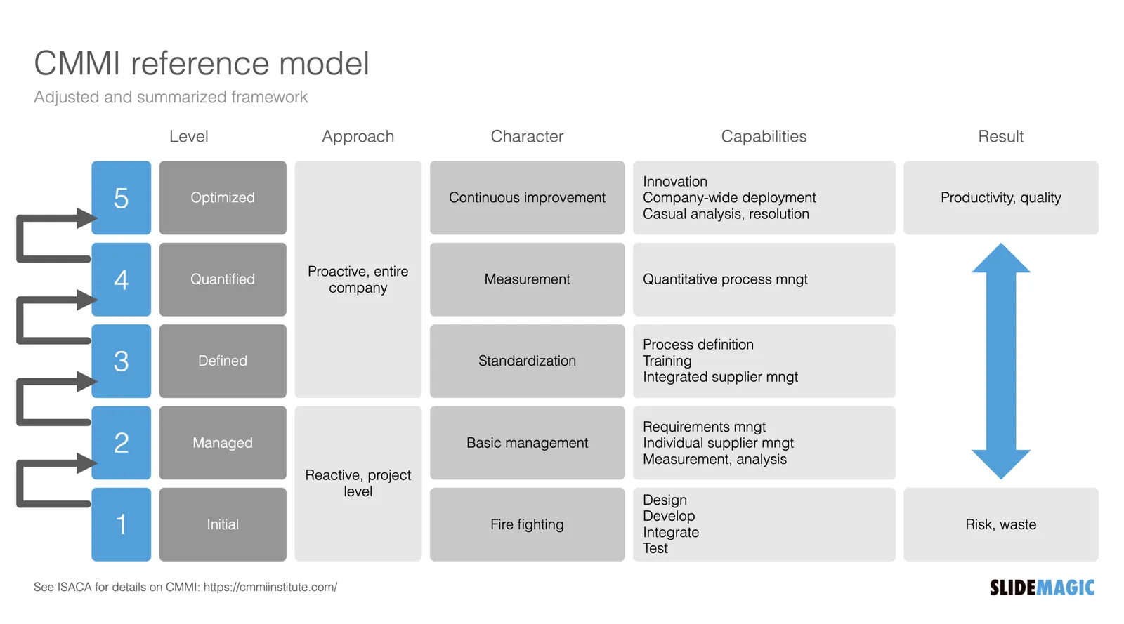
Next to the general layout, there is also a lot of improvement possible in the text. Overlaps, and jargon can be removed. Here is the template that I added to SlideMagic, search for “CMMI” and it will pop up in the SlideMagic app.

This is my interpretation of the framework, and not endorsed by the Institute. But this reflects how I think you should treat all these diagrams by consulting firms, academics, and business schools: use and adapt them for your own situation. If the jargon does not make sense for you, take it out.

·Templates

"What are the best presentation templates for business models?"

Some questions on Quora seem to be a setup for people with a solution to answer them. SlideMagic is not in the business of selling slide templates, still, I could not resist answering:

I think it is the wrong question to ask first. You should start with “What is my business model?”

A business model can have an endless number of options, no one is the same, hence it is hard to fit into a standard template. Even worse, trying to fit your business model into a PowerPoint template that actually does not fit gets your audience confused of what your business model actually is.

Once you have decided on your business model, you can find a suitable template, and it can be very simple and straightforward. For example, if you charge a set up fee, and an hourly rate, that is a table with 4 boxes… Clean simple, unambiguous.

Photo by Element5 Digital on Unsplash