

See below how you can shape arrows in PowerPoint. Most people don’t really pay attention to the way their arrows look, but it can make a huge difference to the professional look of a chart. This is even more important when you need multiple arrows on a chart, make sure their proportions are all the same.
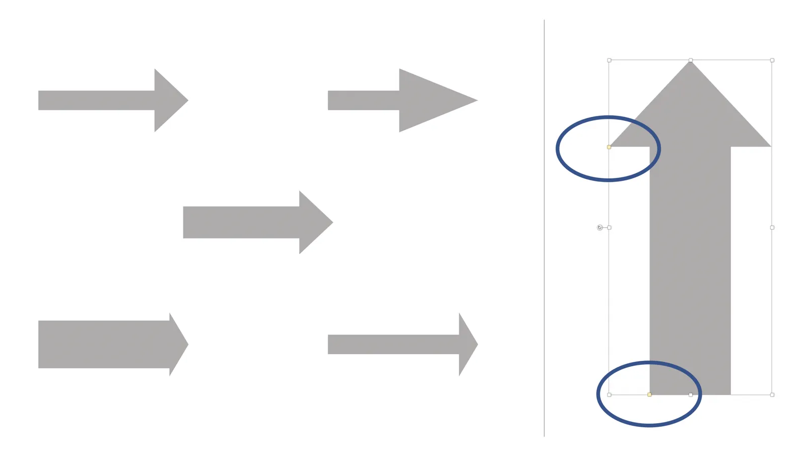
You can change the shape of an arrow in PowerPoint by dragging the little yellow dots that I have circled in the image.