SlideMagic Blog

Frequent updates about all things presentations since 2008. Subscribe to never miss a post.

RSS
·Layout

My preferred 16:9 layout for presentations

I just pushed a big update to SlideMagic (2.4) to the server and it contains a brand new 16:9 slide layout, the slide title. Most monitors today are widescreen, but unlike movies, I think 4:3 slides look much better. Text lines that run across the entire slide are hard to read, and wide screen slides always force you to make very “stretched” slide layouts.

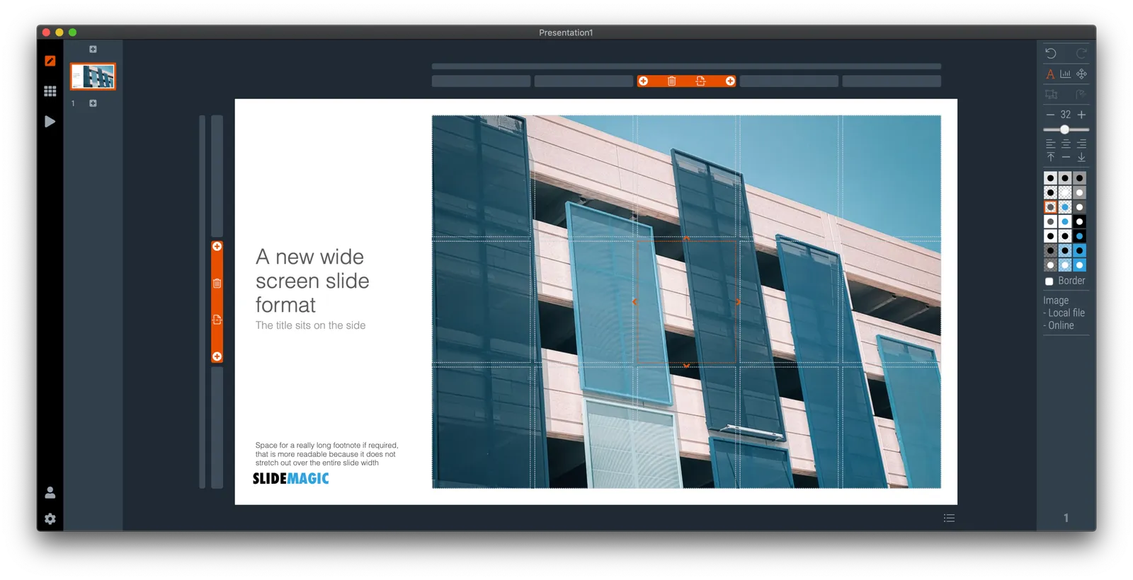
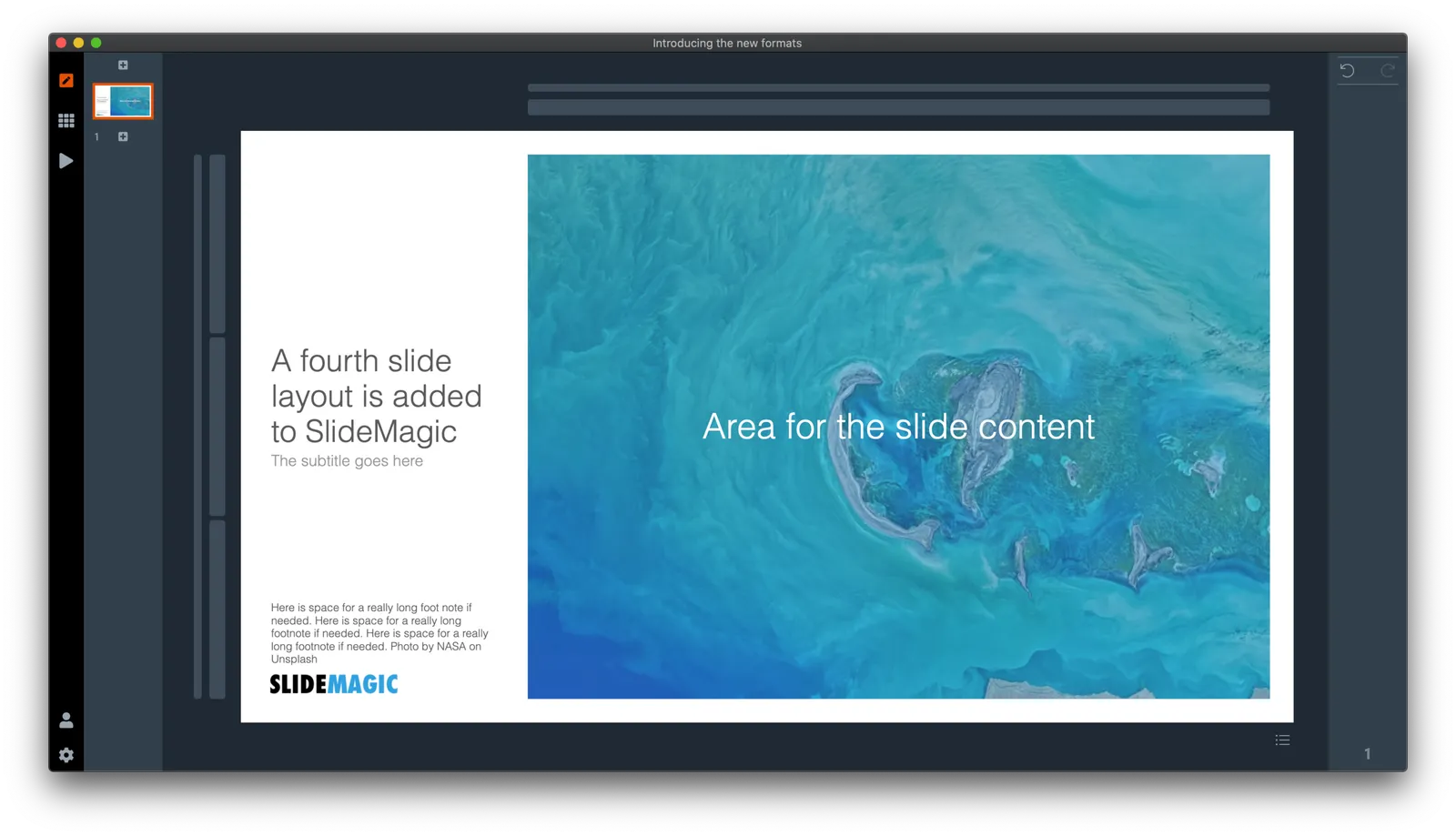
The side title is the best of both worlds. The title of the slide is moved to the left, and the slide contain area is scaled up now that it has more space at the top. It stays in a 4:3 ratio though. The footer and logo is also moved to the left, creating even more space. The entire design shows up without black bars on a wide screen monitor. Below is an example.

It follows an approach I already blogged about in 2016

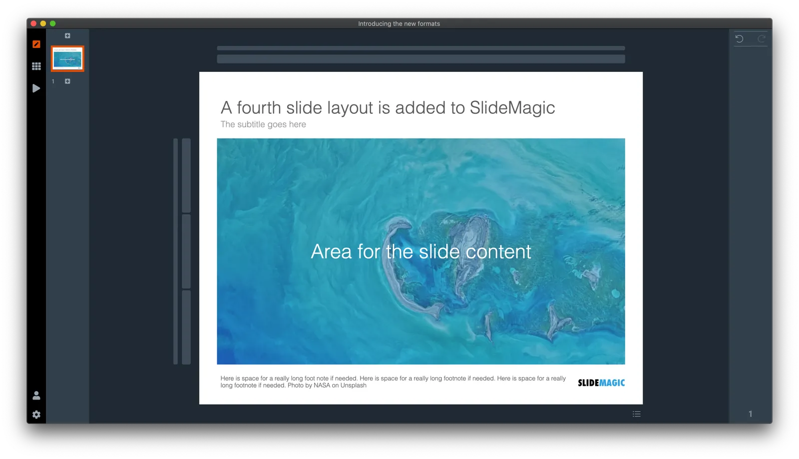
SlideMagic has now 4 screen modes, and you can switch instantly between them:

  1. Traditional 4:3 narrow
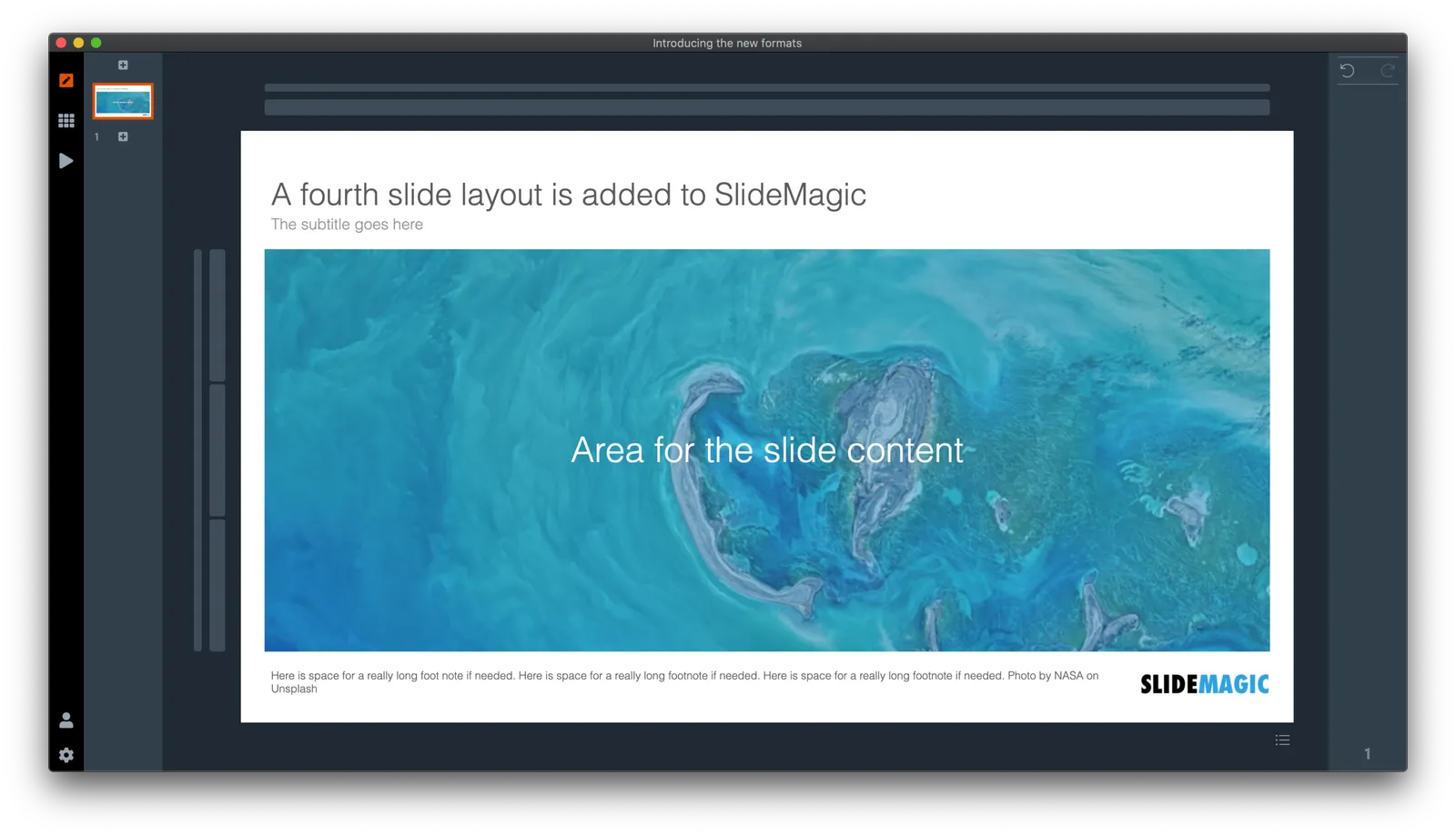
  2. 16:9 wide screen
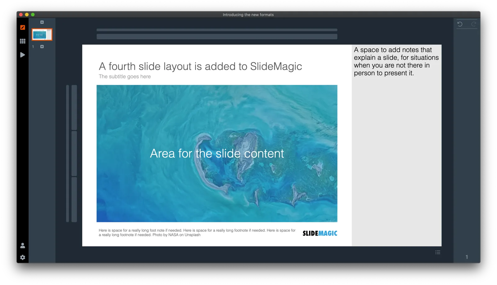
  3. A 4:3 slide with an explanation panel to the side to leave notes for when you are not there in person to present the slide
  4. The new and shiny 16:9 side title

Soon, I will rerun the PowerPoint conversion algorithms on the server to increase the size of the SlideMagic PoiwerPoint template database with 25%, each slide will now be available in the new format as well,.

(Hmm, the side panel needs some more padding, I will fix that [Fixed in 2.4.1]). There are a number of other new features introduced in version 2.4.

Continue reading →
·SlideMagic

"Operating system updates" for presentations

Every year Apple releases operating system upgrades for computers, tablets, and phones. Your apps and documents have the same content, but look slightly different. I am trying to push this concept to the world of presentations.

It has already happened (sort of). The slide-out panel to right changes the look and feel of your presentation without changing the content. Over time, I have made subtle changes to font sizes and layout proportions, which means that every SlideMagic presentation in the world will have a slightly different look. Switching to a dark slide background turn the colours of your presentation upside down (in a good way), far beyond just making the background black.

I will try to push this further, by adding more layout options , your slides will look entirely different, including the ones you made 6 months ago, but you can always switch back to another layout format.

Photo by Michael Held on Unsplash

Borders!

I succumbed to pressure from some users of SlideMagic and added the ability to put a small border around a shape. In general I am not a big fan of borders (hence my initial hesitation). Most of the time a slide element just looks nicer when its shape is carried by its colour rather than a surrounding line. In nature, things do not have lines around them.

But.

I can see situations where you might need them. Especially when working with a grid of images of irregular sizes on white backgrounds (for example logos). Adding a tiny box around the shape makes the page look more balanced.

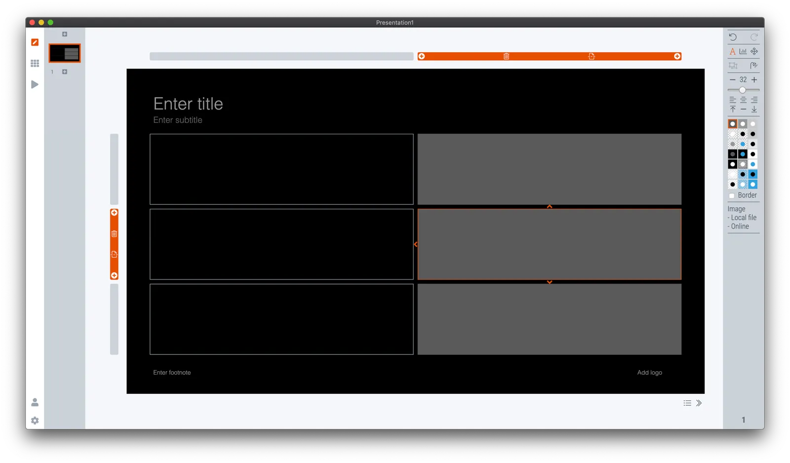
After installing the latest version of SlideMagic (V2.3.24), you will see a tick box appear under the colour menu. The tick does what it expects you to do. Let me know what you think, or update me if you find glitches in the .magic file rendering, or in PowerPoint conversion.

I will now also start using this new design element when I add new templates to the SlideMagic slide database.

While we are on user pressure, other requests that are being lobbied hard:

  • One, just one, more colour…. Please.
  • If we could somehow make something round (not boxy) in your app… Please.
  • Yes, I know that the “connectors” are a bit cumbersome at the moment

Let’s see…

Photo by Spencer Davis on Unsplash

·SlideMagic

What is new in V23

Some new features in version 2.3.23 of the SlideMagic desktop app:

  • Super-fast responses when resizing your main window, or reshuffling slides in the story view, even if they contain big images. If the app does not need to re-render an image, it won’t. Rescaling slides is now done by your computer’s graphics processor directly, rather than my bespoke code.
  • More clever image repositioning when you change the aspect rate of a shape by expanding and collapsing boxes. Still not perfect, but the app starts to do the right thing.
  • Changing the slide aspect or background has now been added to the “view” drop down menu, so you can switch back and forth really fast without having to go through the settings menu.
  • Subtle changes to the user interface, that makes the app look sharper on higher resolution displays.

The app will try to update itself in the background, or if you are impatient, go here to download the latest version immediately.

Photo by gdtography on Unsplash

·SlideMagic

Slide template for a RACI matrix

On request of a user, I have added templates with a RACI matrix to the SlideMagic database. (It does not happen often, but this is the first time I actually heard about this consulting framework, the responsibility assignment matrix). In SlideMagic it is super easy to manage all the columns and rows of the table. If your colleagues are not ready for SlideMagic yet, use the app to create the chart, then export to PowerPoint.

·SlideMagic

How to change the default colour in SlideMagic

SlideMagic has a simple colour scheme: lots of variations of white, black, and grey, and one strong accent colour. Why?

SlideMagic is all about making presentation design efficient. This simple colour layout almost always looks great, and is very recognisable when you set the accent colour to the dominant colour in your logo.

How do you customise SlideMagic to your own preferred colour instead of SlideMagic blue?

  1. Go to the settings menu by clicking the cog wheel in the bottom left of the screen

  2. You have 2 options to set the new accent colour:

    • Upload an image, after which the app will extract suggested colours from the photo (pro-tip: upload your logo)
    • Enter an RGB code directly
  3. Go back to your slides and the whole deck will be set in the new colour scheme. Also notice that the app itself changes its user interface colour to the complement of the presentation colour you picked.

·SlideMagic

Quick update

As usual during the summer, things are a bit quieter on the blog at the moment. But instead of me and my family traveling the world, I am turning the SlideMagic rendering engine upside down. I focus mainly on performance. You might not have noticed, but the current app is re-rendering slides frequently, especially with screen resizes and in the story view mode. In the new version, these re-renders will go down to almost zero. Furthermore, I am making the app respond better to different screen resolutions and sizes.

My approach to writing the app is similar to the way I (used to) build financial models. Start simple, complicate and add things, and then clean up and simplify again. Dramatic simplification fo the code will enable me to think about a selective number of new features again

Photo by Lukas ter Poorten on Unsplash.

·Images

The "corona crop" to change the appearance of crowd sizes

A recent tweet:

Why does the crowd look denser in the second image? When you make an extreme zoom in an image your brain loses the context in which the original photo was taken. Images are 2D, so no sense of depth here.

Lessons:

  • When news outlets publish images to show crowd sizes, see at what angle they are taken. Drone shots from above are the most reliable
  • If you need an image of a crowded street or other public place in your presentation, you can use this effect to your advantage. Download a very high resolution image with a flat camera angle, and apply a big zoom/crop.

Photo by chuttersnap on Unsplash

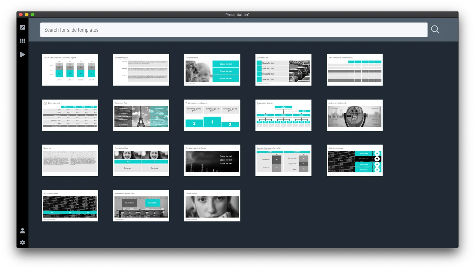
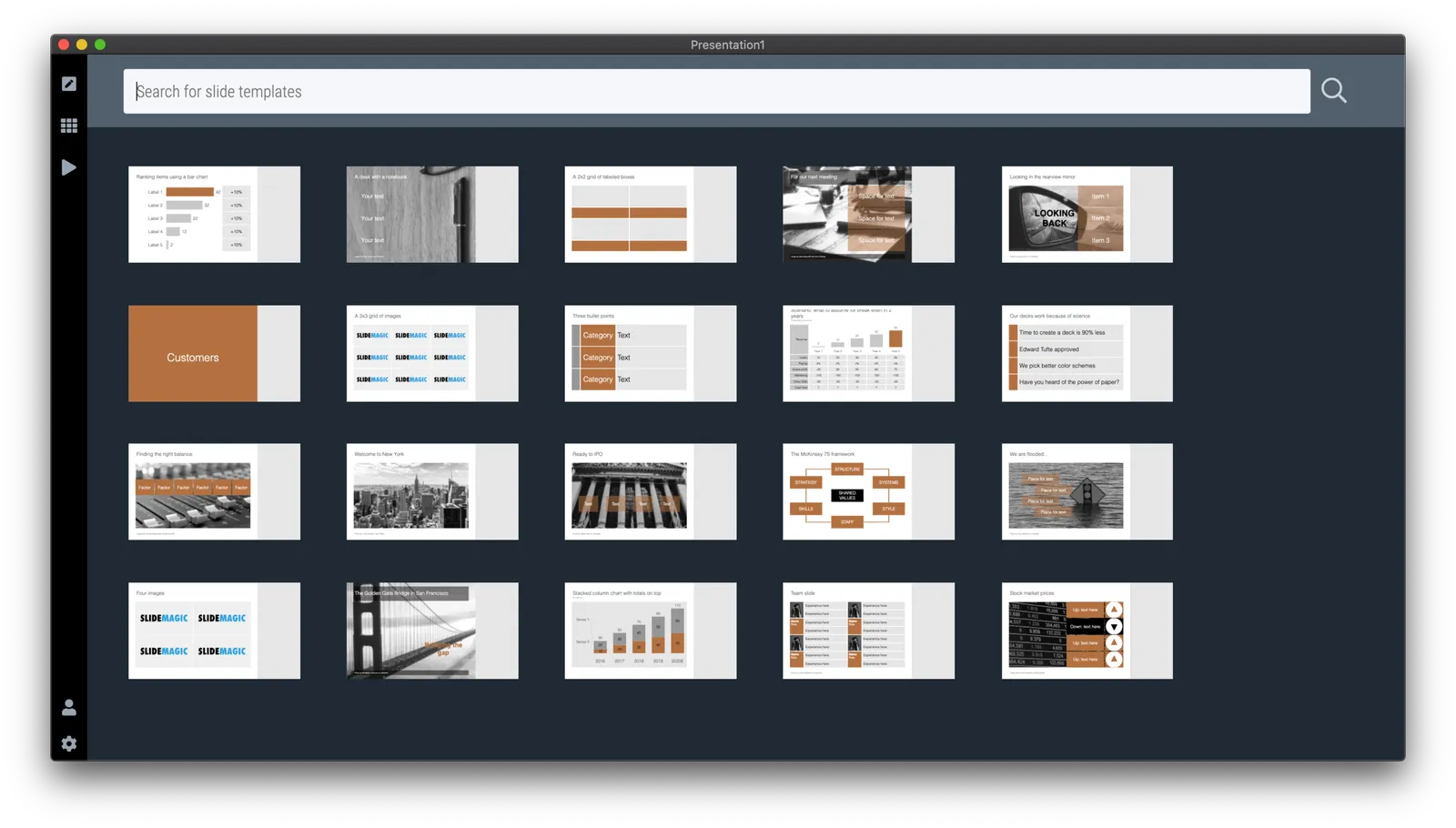
How to get all the slides...

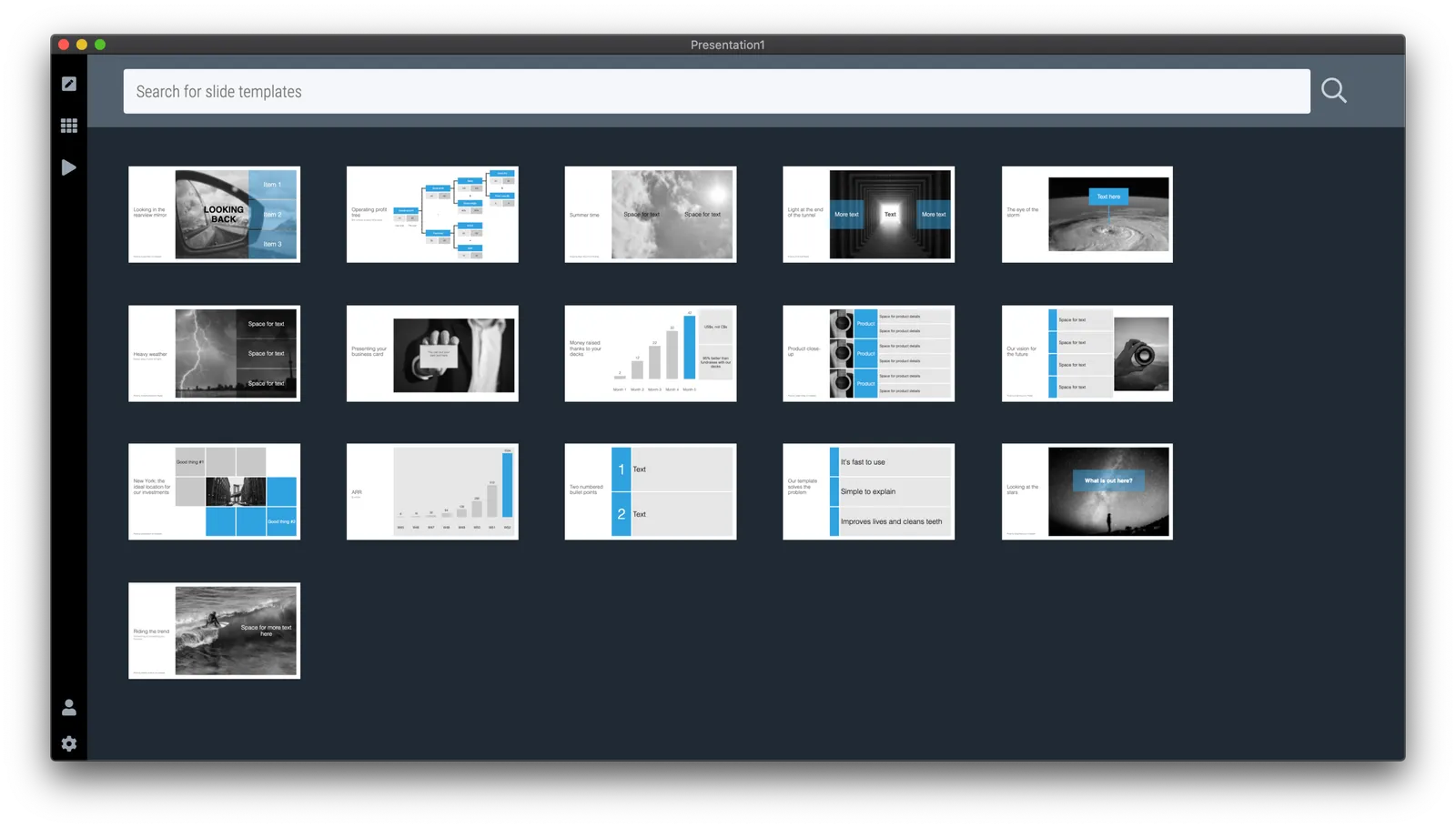
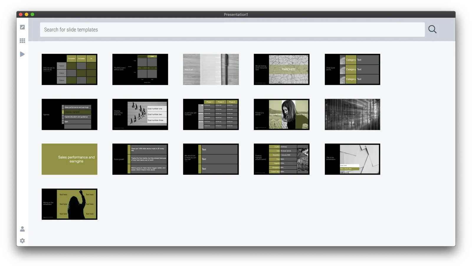
Many users ask for this. It is possible today to browse slides in the template bank by simply hitting an empty return in the search bank, you get served a dozen of random slides.

Still, I am not making this the core of SlideMagic. “Getting all the slides” is a very PowerPoint-like workflow. In PowerPoint it is hard to customise templates (adding/deleting boxes), which encourages you to eyeball a large number of slides you designed previously and pick the one that closest matches what you need today.

SlideMagic is different for a number of reasons:

  • It is super easy to customise templates: no need for eye balling. Simply start with a layout that is vaguely in the right direction and make a few adjustments
  • Many slides in the SlideMagic template bank are image-based, which generates a huge number of slides that are only usable for very specific situations. Eye balling to get inspired will take too much time and might give you a headache.
  • The database starts to get lots of slides that are almost-duplicates: title pages with different titles, small variants of the same concept. Not good for browsing

In general, the template bank gets too big for browsing, and I am only just getting started….

Photo by HelpStay.com on Unsplash

What's new in version 21

Two big changes:

  • More intuitive image cropping, where you see parts of the image that are not covered in the box as semitransparent when editing the image. (When you click away or go into presentation mode, the cropped image will show).
  • I simplified the settings menu: now there are 2 screen modes, 4x3 and 16x9, and the explanation box slider will go to and from these screen ratios as needed.

Existing users will updated automatically, or you can download the latest version instantly.

Photo by sept commercial on Unsplash