SlideMagic Blog

Frequent updates about all things presentations since 2008. Subscribe to never miss a post.

RSS
·Software

Customer service

This tweet exactly applies to SlideMagic:

SlideMagic had a few glitches, but unlike established software products, users that suffered got the CEO himself to add designs to the template bank, recover presentations, gave refunds after people claimed they ‘never intended to make that purchase’, deploy patches within a few hours, and say ‘thank you’ even in the very few cases where feedback was not worded that nicely.

I think SlideMagic is getting close to the finish line as a proper and robust product as I am using it intensely myself now. Thank you all for your patience.

Photo by Alexander Andrews on Unsplash

·Software

Further cleanups

Things are a bit quiet here on the blog, as I am using my annual blogging summer holiday to cleanup SlideMagic further. New features are frozen for the moment, as I am 100% focussed on making the app as stable as possible and have been posting regular updates frequently. If you are a frequent user of SlideMagic, you should now be running version 2.4.28.

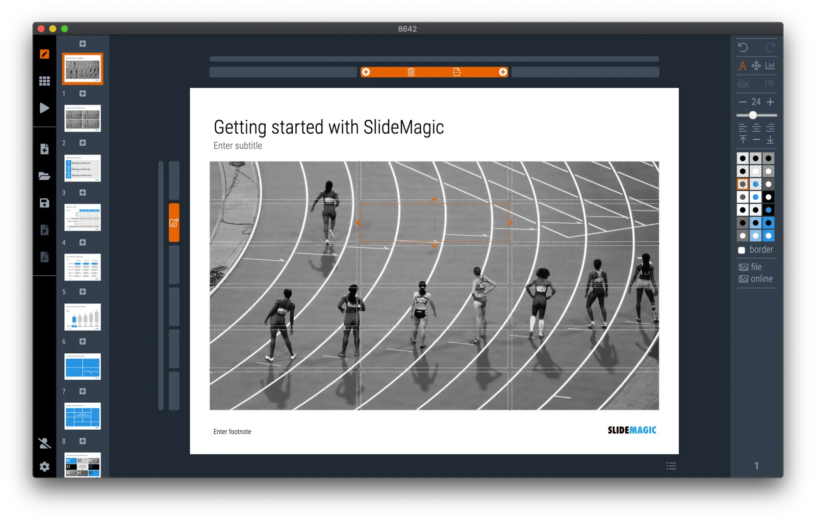
One visible change I have made in the latest version is a slightly larger image zoom slider, you can see it in the screen shot below. I rotated the slider, it now appears vertically, allowing me to give it more space and make image zooming more precise.

Updates should install automatically eventually but you can force an update by downloading the latest version of SlideMagic manually.

·Design

What do you mean, "presentation"?

This is a comment by my 15 year old daughter. She sees SlideMagic or PowerPoint as software that you can use to create your school project or make a photo compilation to share with your friends.

She is right. “Presentations” are mostly documents that capture an idea. Only a small percentage of these slides actually get presented on a screen in front of a live audience. “Presentation Zen”, TED Talks, Steve Jobs, and others have taught us how to make good live presentations, and SlideMagic can support this.

Now it is time to take on the quality of the other 95% of slides that get produced in businesses (and schools).

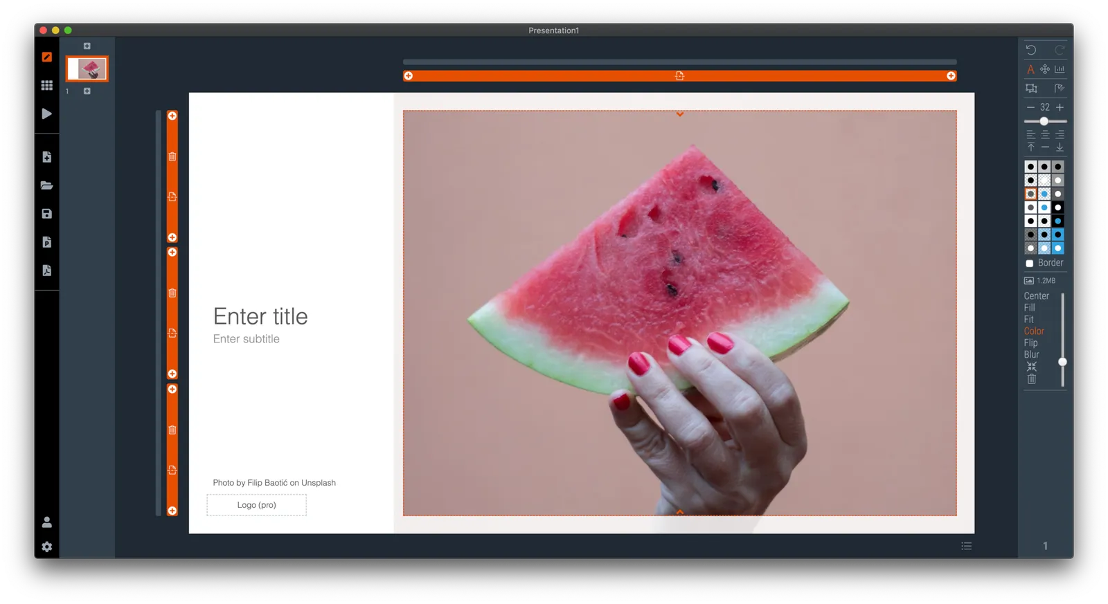
Photo by Alex Litvin on Unsplash

·Images

Image cropping with a focal point

SlideMagic can switch back and forth between multiple layouts, and needs to handle rapid changes in the grid of a slide. As a result, aspect ratios of images get changed all the time, tripping up your carefully selected image composition. At the moment, the app is storing different crop and zoom levels for different aspect ratios, but that solution is not ideal. (You see how Squarespace gets it wrong with the banner image of this blog post).

I want to get to the point where a SlideMagic user can click a focal point of an image, after which the app will do the hard work of re-adjusting the crop automatically. Doing research, I see a lot of “AI” applications that can figure out what the focal point of an image should be, there seems to be nothing that deals with focal point-based cropping itself. The solutions I see, are ones where you can store multiple crops of the same image, after which the most appropriate one gets selected.

I started scribbling a manual algorithm to come up with reasonable compositions. Here are the first (manual but automateable) results applied to some cows on a beach in Africa, the first image is the original.

It works pretty well, on the the extremely horizontal one gets cropped too low, I would have shown a bit more sky on that one. Let’s see if we can get this to work, both in terms of the algorithm, and the user interface.

Continue reading →
·SlideMagic

An OKR slide template (Objectives and Key Results)

Not enough SlideMagic users have discovered that I try to respond to requests for new or missing templates. Today I added a template for an OKR sheet, Google’s approach to managing Objectives and Key Results.

SlideMagic is particularly useful for slides like this, it is easy to add rows, adjust the layout, and now those boring percentages can be visualised easy with a bar chart that always lines up with your table.

Search for “OKR” in the SlideMagic desktop app and it will pop up and ready to work on for free, alternatively, pro subscribers can download the template (in .magic or .pptx format) from the online template bank.

Let me know if you need more/different types of OKR templates.

·Layout

New arrows are now live

Thelatest version of SlideMagic has the new arrow feature available, finally enabling me to discontinue the dreaded connectors. Arrows are big and bold to show cause-effect relationships or other forces. I made an algorithm to let them do the right thing in terms of layout in various box sizes, and in various aspect ratios, both for horizontal and vertical shapes. In PowerPoint and Keynote it is fiddly to get arrows to look exactly the same once you start changing the angles of the pointer by hand.

When converting to PowerPoint (a pro feature), your arrows will show up as editable PowerPoint arrow shapes.

I can now call SlideMagic 99% feature complete (hmm, line charts?) and will focus on hardening the application to make it absolutely stable.

The legacy connector feature will stay in the background. If you load an old slide that uses it, the legacy arrows will be rendered and you can edit them. If you have to add more legacy connectors, simply shift-click on the connector icon, and you will be given the option to use the old feature.

The new arrows also give me more design freedom to start expanding the template library with new slide layouts that features these ‘fat’ arrows.

 Fat arrows are great for showing cause-effect relationships

Fat arrows are great for showing cause-effect relationships

 Arrows follow the color scheme of the cell, black on accent, will give you this result

Arrows follow the color scheme of the cell, black on accent, will give you this result

Continue reading →
·Design

The perfect arrow...

I am replacing the connectors in SlideMagic with 2 features. The relatively thin lines that connect boxes in a diagram went live yesterday. Currently I am working on the 2nd feature: fat arrows to show cause-effect relationships or other forces.

As I already discussed back in 2017, it is tricky to get arrows to look right in presentation software. The aspect ratio of the containing box, the angles of the arrow, some come out great, others won’t.

And even if you got one right on your slide by moving the various sliders in the shape, how do you make sure that the 3 below it look exactly the same? Oh, and then you need to insert a fifth one and squeeze everything a bit…

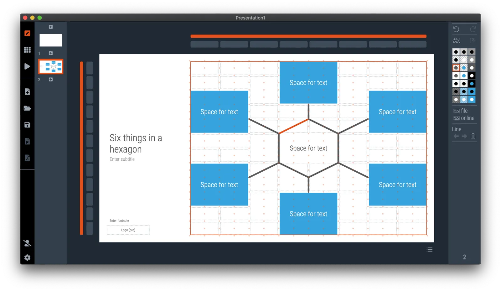
I think I am on to a possible solution. I scribbled an algorithm on a piece of paper, now let’s see how to bring it to life in SlideMagic, and then convert them to PowerPoint. The latter might have to be via an image rather than a dynamic shape. Below is a screenshot of my development machine. Work in progress.

·Software

The new line drawing mode

I just deployed version 2.4.16 on the server that has the first version of the new line drawing engine of SlideMagic built in. This will be the replacement of the cumbersome ‘connector’ feature that was inherited from SlideMagic 1.0.

Any presentation app needs some sort of approach to drawing lines, especially to connect boxes in diagrams. Freehand drawing and line dragging goes straight against the philosophy of SlideMagic, which forces you to keep everything lined up, evenly spaced out on a grid.

The connectors solved this by micromanaging lines, you have designate a box to be a line box, and then meticulously set the line configuration inside it. The result is a line grid that perfectly scales up and down with your grid. But this can be a pain to maintain, especially if you are working in a very fine grid.

So I can came up with a compromise and added a separate line drawing layer to the ‘frame; of the slide, the background that sits behind the work area of the slide (i.e., not the title and the footnote). Selecting the frame will highlight a Manhattan-like grid of dots, between which you can draw any (straight) line or arrow you want, across the entire slide. This line patter will move with changes to the grid, but - and this is the concession - is not 100% tied to the boxes in your chart. But I think it is a price well worth paying, imperfections are easy to fix.

A side effect, it is now also easy to draw a fat border around a group of boxes if needed.

Continue reading →
·Investor presentation

YC advice on pitching

YCombinator has made library of support material for startup founders available online for free. One of the results for a search on ‘pitch decks’ produces this. Some things to highlight:

“Be excited. Your pitch should not sound memorized. Intonation, cadence, and projecting help a lot”

“Actually explain what you do, and do it quickly”

“Don’t be “cute” with your points, be declarative”

“If you make a joke, telegraph it. If you’re not sure the joke will land, cut it

“Charts should be easy to understand - make one point with any graphic or chart. Don’t make people read charts - they’ll stop listening to you.”

“Line graphs are better than bar graphs when showing growth” (Not sure this is the case)

“TAM should be bottom up, not top down” (I.e., not 0.5% of $5billion)

“Coolness and legibility are not orthogonal, they’re diametrically opposed”

It is important to understand where these suggestions are coming from: very experienced investors that are focusing on very, very early startups and hence need to sit through many, many, pitches with a huge range in quality (both in terms of pitch quality and company/founder quality). That explains the feedback of make your title readable, don’t use thin fonts, make your slide clear that when I look up from answering an email on my phone, I still know what is going on, don’t be cute, tell what you actually do, etc.

Still, if you are an early stage company looking for funding, this is your audience, better give them what they want. And remember, part of your startup pitch is testing your ability to sell a product to a matching audience. Selling your company to investors, or selling your product to customers, or helping investors sell their stake in your company to another investor in the future, all require similar skills.

Continue reading →
·SlideMagic

Fixing the connectors

SlideMagic 2.0 is almost getting to a point where I can call it ‘feature complete’. Once reached, I will be spending most of my time on hardening the application to make it 100% enterprise-grade, before venturing into adding more capabilities.

The last obstacle on the road are the ‘connectors’, a left over from the SlideMagic 1.0 UI that are not very intuitive to use. The connectors where meant to cover the 2 minimal line drawing elements that any presentation app needs to have:

  • The ability to connect boxes in diagrams (flow charts, org charts) with lines and arrows
  • The ability to create a visual flow in a slide with big arrows that show cause and effect

This is very tricky to accomplish in SlideMagic, as the app stubbornly insists on not requiring any freehand drawing or dragging that breaks the slide’s grid, and the current ‘connectors’ make that tension perfectly clear.

I think I might have come up with an elegant solution to this problem:

  1. Simplify the current ‘connectors’ and use them solely for fat/big cause effect arrows
  2. Add a simple grid based drawing capability for connecting boxes.

I got number 2 to work on my development machine, but it still requires a lot of work to make things intuitive, but the hardest part of the work has been cracked.

Luckily there is an advantage that SlideMagic does not have millions of users yet, we can still wiggle the software to get product/market fit, something almost all presentation design apps have failed to reach. Work in progress.

Continue reading →