SlideMagic Blog

Frequent updates about all things presentations since 2008. Subscribe to never miss a post.

RSS
·Templates

10 steps to clean up a PowerPoint/Excel data chart

When you hit “insert chart” in Excel or PowerPoint, a pretty ugly graph shows up. Here are the steps I take to clean things up:

  1. Horizontal axis: 2pt line instead of 0.75pt
  2. Horizontal axis: smaller font until labels show up horizontally
  3. Horizontal axis: no tick marks
  4. No chart title, instead I use the consistent PowerPoint headings
  5. No grid lines
  6. No vertical axis
  7. No legend (I use PowerPoint boxes to make those)
  8. Data labels on top of the columns
  9. Data label values rounded up
  10. “Gap width” between series 50% instead of 150%

I am not going into the details of PowerPoint menus here, but you can usually change most of these things by right-clicking an element in your chart. (Click on images for larger picture)

Re-run: did PowerPoint crash shuttle Columbia?

Weekend reading. Edward Tufte’s analysis of how a PowerPoint slide loaded with bullets full of technical information and an inconsistent summary heading might have contributed to the 2003 disaster of the space shuttle Columbia. (Original post in September 2005).

Image no longer available
·Story

Persuasive sales story - buying a rug in Turkey

Guy Kawasaki re-discovered this post about persuasion tactics in the Middle East. Worth thinking about when crafting that sales presentation that has the message “buy our product” written on every slide, starting with slide 1, rather than taking a bit of time to establish a relationship with the prospect and get him in a receptive mood.

·Animations

Flypaper - flash technology for the layman

A mini review. Earlier this week TechCrunch reported on a $3.5m fundraising round for Flypaper, a company that enables anyone to create flash-based presentations, and publish them on the web without any technical knowledge. I did install the application and had some time to play around with it. Contrary to my initital expectations, Flypaper is actually a full blown downloadable desktop application (60MB plus a lot of updates after a first install). The good: it works very fast (exactly like PowerPoint would run). The bad: a slightly tricky installation process (you need the latest Microsoft .NET). The user interface looks great and is very intuitive. Creating objects, moving them around, planning the time line of the chart, all easy and simple. If the introduction demo is a benchmark of what Flypaper can do, then this is certainly a powerful application. The big question: powerful graphics processing power often does not give the best results in the hands of the layman (the target segment of Flypaper). The clearest examples of this are the animations in PowerPoint, often used for spectacularly animated transitions between slides that usually annoy the audience or makes the audience laugh at the presenter instead of taking him seriously. Some of the example presentations posted on the Flypaper web site use effects that in my opinion do not necessarily add to the communication impact of the presentation. A big pro is a much clearer framework to build a structure of clickable links in a presentation. This can be tricky and complicated to do in PowerPoint. I can see some useful applications:

Continue reading →
·McKinsey

How to create a McKinsey-style waterfall chart

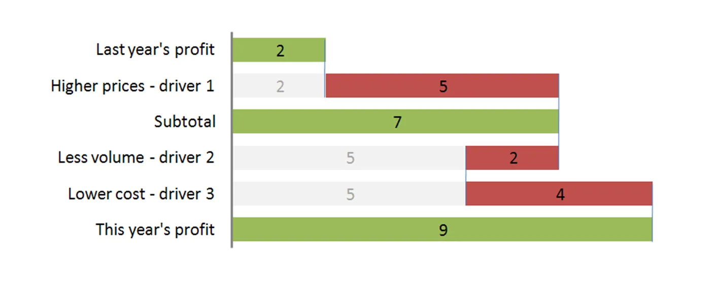
The “water fall” chart is an effective way to summarize the quantitative impact of a number of drivers. For example, you need to put the following story in a chart: “Our profits went up by 7, the positive effect of higher prices and lower cost was offset by a lower sales volume.” A waterfall chart would look something like this:

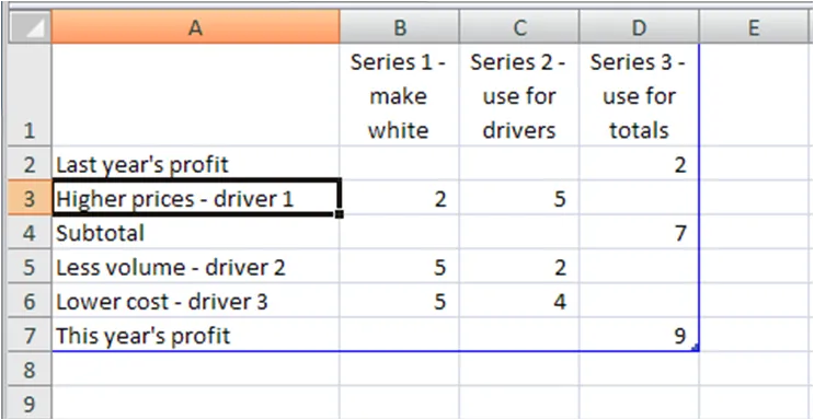
For illustration purposes I left the light grey color and data labels of the supporting series in so you can see how to make the chart: it is basically a stacked bar chart with 3 series:

  • A “white” series to support the drivers
  • One series for the drivers
  • One series for the (sub)totals

The data table for this chart (Powerpoint 2007):

For a final touch, make the color of the light grey series white, take out the data tables and that’s it. There is the temptation to make automated tools (in Excel) that do the work for you. Like almost all my charts, I start with a piece of paper and make my waterfalls manually, to make sure that they

  • Are correct (negative numbers can make these charts a bit tricky to get right sometimes)
  • The chart tells the story I want it to tell (what subtotals to use, in what order to list factors, etc.).

UPDATE 1: here are two other posts related to McKinsey waterfall charts:

Continue reading →

PowerPoint on a napkin

I added the book “The back of the napkin” to my Amazon wish list and hope to review it here soon. It reminds me how I always start the design of every PowerPoint chart I make: on a piece of paper. I guess the practice was hardwired in my brain when I started as an analyst at McKinsey that - in the early 90s - still employed graphics designers to create charts from paper.

  • Step 1: think of the general concept you would like to show: a trend, that something is too complicated, the something is small, very big, that we want to change direction, that there is a tension we need to resolve, that we can stand up as David to Goliath, etc. etc.
  • Step 2: Now think of a visual analogy that can make this single point. I often prefer using a page-filling picture to make a point (a hammer hitting a nail, cracks in a wall, a rope that is about to snap) , other symbols such arrows that show forces, a simple and clean column chart to show a series of numbers, a huge font number to show that something is indeed huge, etc.
  • Step 3: Scribble the chart and put it in PPT. Lack of a good image, or graphical skill shortcomings (I am only human) often force me to go back to step 2 at this point.

This is process is also very important when thinking about data charts. There are always 15,000 ways to show quantitative data and picking the right representation makes all the difference.

·Software

Free Powerpoint to PDF conversion

Until recently, I used PDFs mainly for sending out formal/final presentations that could not be edited anymore. That has changed: increased use of images have made PPT so large that the PDF format is now my preferred exchange format with clients. At the end of the project we send the source file across.

I purchased Adobe Acrobat 8, but have since then found that Microsoft’s PDF plugin (you can find it here) is actually much better:

  1. It’s free (too bad for me, I already purchased Acrobat)
  2. It’s (much) faster
  3. It converts better, especially the new sophisticated drop shadows of PPT 2007 do not come out well in a PDF converted by Acrobat 8

I have not yet tried Adobe Acrobat 9, maybe problems 2 and 3 are solved by now, problem 1 definitely not.

·McKinsey

Googling for free McKinsey PowerPoint templates

Doing a Google search for “McKinsey PowerPoint templates” highlights many entries that are almost all a violation of copy right. Moreoever, the templates are of little use to someone who is not working at McKinsey team on a client engagement. First of all: presentation starts with substance, then follow the frameworks (if any) A bit of historical context. I recognize the frameworks from my time at McKinsey, almost all of them are from the early 90s, when McKinsey was still working with an early pre-PowerPoint presentation tool called “Solo”. Solo was developed specifically for McKinsey, later marketed as an independent application. It vanished when PowerPoint emerged, not because PowerPoint at that time was neccesarily better, but all of McKinsey’s clients were running it and using it to edit presentations. (A slightly outdated looking site is still offering it for sale?). Your graphics assistant (nobody knew how to make charts themselves then), would dive into the template database to find “something that uses 4 arrows”. All these frameworks were meant to be used in densely written strategy/micro-economics documents, not in convincing on-screen presentations. If you would like to learn about McKinsey’s approach to graphics and presentations, try this:

  • The content available on the McKinsey Quarterly site (most of which look actually better than “day-to-day” work)
  • For the chart “Bible” that was used in the early 90s, flick through a copy of the book “Say it with charts” by Gene Zelazny. (I see he’s updated it since I last saw it).
  • The foundation of McKinsey’s approach to writing logical story lines (but not always the most compelling stories that are important in presentations) can be found in Barbera Minto’s book “The Pyramid Principle
  • UPDATE: I posted about a question I get often: how to make a McKinsey waterfall chart here.
Continue reading →

Presentation ice breaker: sell!, sell!, sell!

One of the best ways to open a company sales conference is the Muppets “Sell! sell! sell!” video. Watch the demo here. Make sure to listen to the audio as well. It still works, even for people that have seen the video (many times) before.

·Investor presentation

Startup pitch advice available on the web

There is some useful material available on the web for entrepreneurs seeking to pitch their startup to potential investors. I will use this post to bookmark a few of them. Some of these are great, some of these are less good. Anyhow, here we go:

To be continued/updated later.