

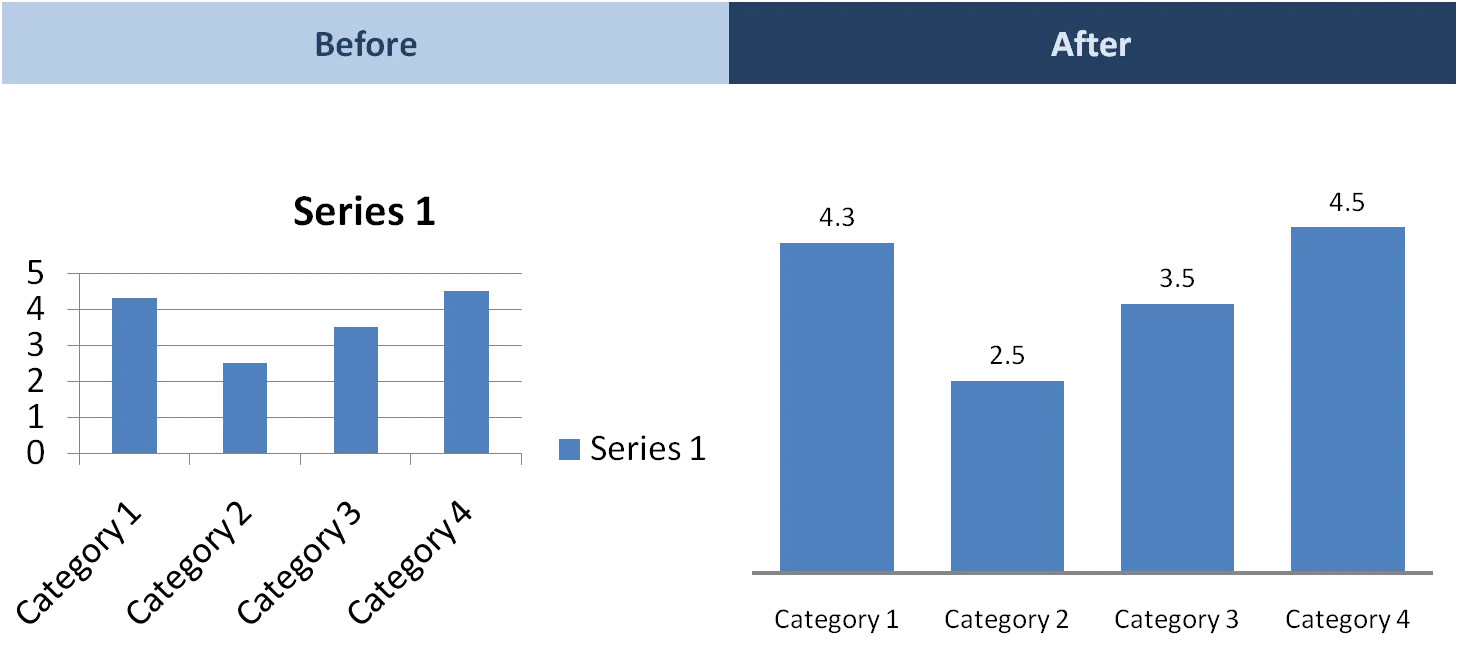
When you hit “insert chart” in Excel or PowerPoint, a pretty ugly graph shows up. Here are the steps I take to clean things up:
- Horizontal axis: 2pt line instead of 0.75pt
- Horizontal axis: smaller font until labels show up horizontally
- Horizontal axis: no tick marks
- No chart title, instead I use the consistent PowerPoint headings
- No grid lines
- No vertical axis
- No legend (I use PowerPoint boxes to make those)
- Data labels on top of the columns
- Data label values rounded up
- “Gap width” between series 50% instead of 150%
I am not going into the details of PowerPoint menus here, but you can usually change most of these things by right-clicking an element in your chart. (Click on images for larger picture)