SlideMagic Blog

Frequent updates about all things presentations since 2008. Subscribe to never miss a post.

RSS

Application screenshots in PowerPoint

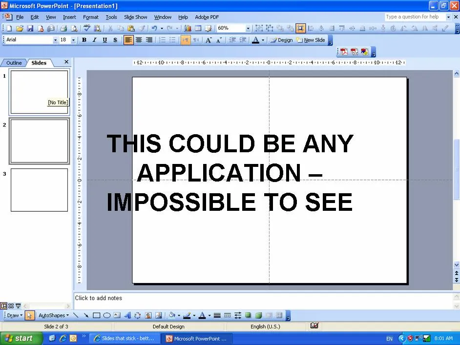
Inevitably, presentations by technology providers will have to include some of them. The usual approach is to make a full screen dump and paste it as an image in PowerPoint that covers arond 75% of the screen to leave room for title etc. The problem is that for the audience, this slide looks like any PC application open on the screen.
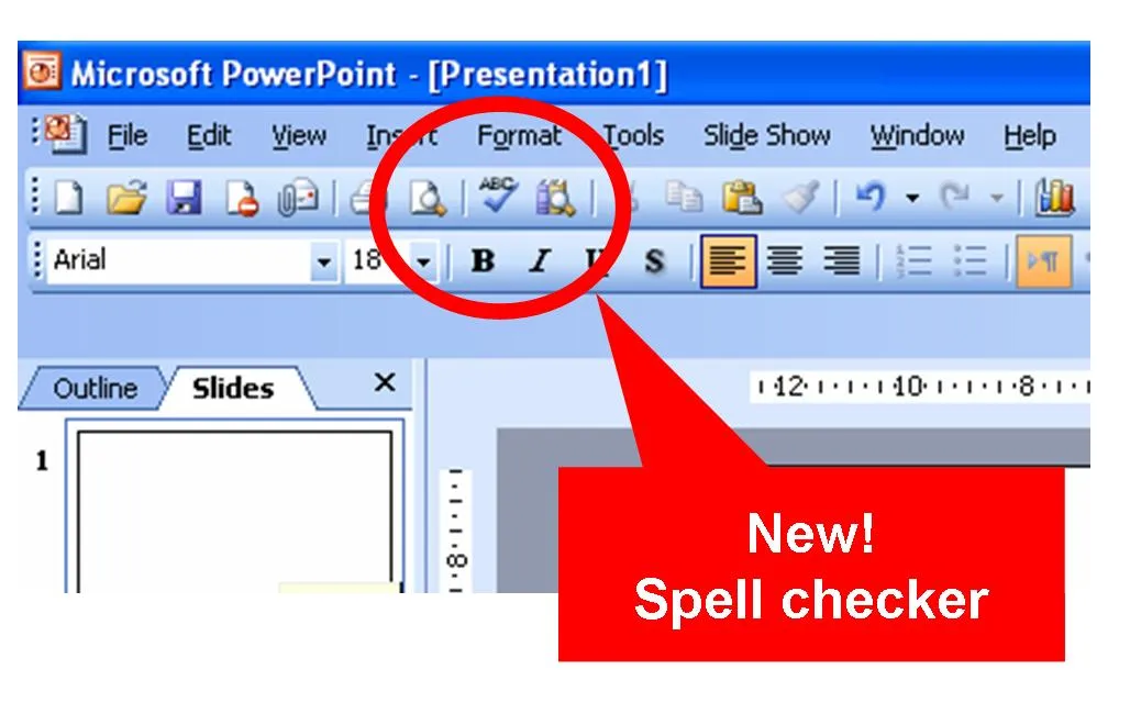
Different approach 1. Think about what feature you would like to highlight. Crop the image to just show that. Expand this very small image to full PowerPoint screen size, put a big bright circle around the area you want the audience to focus, together with a big bright arrow with a few words.
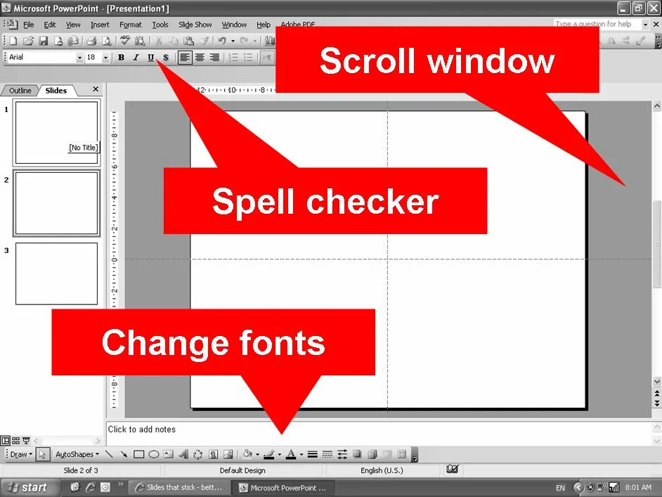
Different approach 2. Keep the big bland screen shot but fade it out by selecting the image, clicking format, clicking re-color and picking a soft grey overlay. Now put a number of bright arrows with 3-4 words to highlight a number of features. It doesn’t really matter that the audience can’t see the screen detail, what matter is that they understand the 3 messages you want them to understand (which are written in the boxes)
Making these screendumps is easy, press ctrl-shift-prtsc in the application, then press paste in the PowerPoint slide you want to put them in. In case of different approach 2, make sure to crop out your other personal applications from the Windows bar at the bottom of the screen. It is always fun to read private instant message windows in professional presentations.


·Images

Managing big PowerPoint files

Increasing use of images creates very large PowerPoint files. Many web hosters cap the size of e-mail attachments at around 10MB, a limit that is now very easy to exceed. Some suboptimal solutions:

  • Upgrade to PowerPoint 2007, files are a lot smaller, but many of my (corporate) clients do not have this software yet, so you end up saving in the 2003 format anyway
  • Compress pictures: select the picture, in the format menu pick “compress” and select the appropriate DPI rate. I personally don’t use it a lot: it does not save that much space if you use larger images, and the quality of your source file deteriorates forever. A big issue, especially when putting your presentation on a big overhead screen.
  • Zipping files does not have a big impact when using images

What I end up doing is

  • Keep file sizes (and image quality) to the maximum
  • Use PDF files to exchange drafts with my clients
  • Finally, send the master file across using a file transfer utility such as YouSendIt.com (note that YouSendIt is not secure in its basic version, anyone “guessing” the URL can download the file).
·Animations

Making a buildup slide with minimal animations

I don’t like animations, but in some cases they cannot be avoided. Sometimes I need to make a relatively complex technical diagram, for example for a technology startup needing to explain the IT architecture of their product (obviously for a conference room presentation, rather than a townhall meeting). The only animation effects I use are simple “appears” and “disappears”, or the occasional change of color, no flying objects or other spectacular effects here. The problem with complex animations is that they are impossible to edit. Especially when the layers are starting to pile up. Here is what I do. Copy the slide over a number of PowerPoint slides, sometimes going into 10 slides are more. In that way you have the complete overview of what’s happening when. The only thing to watch out for is to make sure that objects on each slide are located in the exact same position (control-c on 1 slide, control-v on the other). Old-fashioned, but it works. UPDATE. Glen Turpin pointed me to the selection pane in PowerPoint 2007. It actually solves many of the issues I talked about. You can find it at the bottom of the arrange menu in the drawing ribbon. One more reason to upgrade to PowerPoint 2007.

Design PowerPoint for the 16:9 screen

Image no longer availablePicking the screen aspect ratio is an important decision. Changing it is difficult, because it is more than just a simple format adjustment: a long rectangular slide is built up completely different than an almost square 4:3 one.

The origins of the 4:3 screen size go back to IBM punched cards: they were 12 rows high and 80 columns wide (see the image attached to this post), a 25x80 screen could nicely fit 2 of those (computers in the early 70s). Only untill recently, we have been stuck with this aspect ratio. Why do I like widescreen:

  • I like the “movie screen look” better
  • The human eye is more capable of digesting rectangular screens (the reason why Holywood switched over) than square ones
  • It is already adapted for use on big LCD screens, more and more available in conference rooms, exhibition centers and increasingly present in PC monitors or laptop screens.
  • I like the long format better for “left-to-right” slides, showing a logic in 3 steps that flow from left to right (fitting nicely with the rule of thirds). Also, it supports long slide message titles that still fit in 1 line.
·Images

Chart concept - torn by opposing forces

Finding the right symbolic comparison is often more difficult than making the actual PowerPoint chart. In a series of “chart concepts” I will give some ideas how to represent common business concepts with images. To show that something is torn by 2 opposing forces (for example laptop user mobility and computer security) you could use this iStockPhoto image. After downloading/purchasing, paste it in PowerPoint and stretch it to full screen size and add a few big-font words on each side. Make sure not to distort the original width/height proportions of the image. Disclosure: no commercial interest.

·PowerPoint

pptPlex - tool for zooming inside PowerPoint

Microsoft has released a new tool for PowerPoint: pptPlex. It allows you to zoom in and out of PowerPoint slides during a presentation. I will experiment with it more over time, but an initial application that comes up already in my mind is to start designing a presentation around just 1 huge map, or time line, and take your audience through various sections of it over the course of a presentation. Kawasaki’s 10/20/30 rule suddenly becomes 1/30/6… (1 slide, 20 minutes, font 6). An example video below: Thank you TechCrunch for leading me to this.

14 August - last voting day in SlideShare contest

You can find the contest here. I clicked around a few of the “business” entries and found some of the presentations beautiful, but I have yet to discover a presentation that is likely to be used in a “real” business setting. When you introduce yourself, raise awareness about an environmental issue, etc., you can go all the way in creating a “Girl-effect”-type presentation, but (repeating myself), what to do with the presentation of the final results of the customer database data cleaning project?

·McKinsey

First content, then structure

It might sound obvious, but it is not. Consulting projects start with a structure to lay out all the questions that need to be solved (let’s look at the market, let’s check our competitive advantages, etc. etc.) Some branches of theses “issue trees” (I made hundreds of them at McKinsey, Google “McKinsey issue tree” and you get a lot of examples) might turn out to be dead end streets, some branches might have to be expanded, re-written later on in the project. As more analysis comes in, the solution of the project will emerge, documented alongside the structure of your initial workplan. At this point I would say: cut, take a break, throw away the structure. Now that you have something to say, worry about how to say it. With the benefit of hine sight, build the structure that tells your story from scratch. Problem structure does not equal presentation structure.

·Colors

Putting a color overlay on an image in PowerPoint

Slides that stick logo with a blue overlay

Often, the colors of images do not fit the color scheme of a presentation. One solution to this is to “take out the colors” of the image and replace it with a monochrome overlay with the most important color of your color scheme. As an example I have added some nice blue to my title page picture. How to do it (PowerPoint 2007):

  • Select the image
  • Click the “format” menu in the top menu bar
  • In the “adjust” ribbon, pick the “recolor” drop down
  • Pick one of the suggested colors (“light variations” work best), or hard-key a RGB color code from you color schema in the more variations/more colors box

This technique works particularly well with noisy images full of colors, or pages that contain a lot of logos with irregular colors. Not as elaborate as Adobe Photoshop, but sufficient for most situations.

·PowerPoint

Critical PowerPoint patch this Tuesday 12 August

See the latest Microsoft Security Bulletin.