SlideMagic Blog

Frequent updates about all things presentations since 2008. Subscribe to never miss a post.

RSS
·Images

An alternative to a logo

When you need to list a handful of companies on a presentation slide, the main visualisation people use is a logo. It always looks great. Make sure you have the latest one (they tend to change rapidly), and pick one in a nice high resolution. If the colours clash too much, consider toning them down by making them black and white.

But the alternative to the logo, is actually getting an image of the company in action. An ad on the street, the neon on the corporate headquarters (no, not the HQ reception desk), a store front, etc. Make sure you don’t have any copy right issues. I usually search for photographs on Google Image search that are “labelled for reuse” Below an example for Vodafone:

 Image by Moyan Brenn on Flickr: https://www.flickr.com/photos/aigle_dore/15754634911

Image by Moyan Brenn on Flickr: https://www.flickr.com/photos/aigle_dore/15754634911

If you need to deal with a lot of company names, there is no escaping to the logo page. My presentation app SlideMagic makes lining up lots of logos very easy. Use the black and white toggle to mute logos if the colours get too busy.

Banner image from Wikipedia

·Story

Corporate language simplification is next

A lot of the progress of humanity boils down to improving and simplifying communication. There were huge wins when we figured out how to speak and coordinate hunting strategies, learned how to read/write/print books, speak long distance instead of taking the ocean liner, video, etc. etc.

More subtle improvements happened as well. Clear, simple language impacts the premium/position that bosses, priests, doctors, lawyers, politicians, can command. Long-winded corporate memos and formal letters made way for informal emails and now messaging to get to the point, quickly.

What we lose in style, we gain in efficiency and clarity. Gone are the beautifully hand-written letters without grammatical errors. Now we have the universal “business English” with a tiny vocabulary, full of mistakes, and pronunciation can be whatever you see fit. The English might not be perfect, or sophisticated, its meaning is crystal clear.

The same happens to corporate language. Management consultants took a first stab at making memoranda logical and structured. The exhibits in these documents slowly become more important than the written words themselves. And now presentation software/slides has become the main language in which we do business.

We need a crisp, simple, visual language to get a business concept across. Everyone can understand it, everyone can use it. That’s what I am trying to do in the presentation app SlideMagic.

Art: Pieter Breugel the Elder, The Tower of Bable, 1563

The market and company history - you care, they probably not

It is interesting to hear/see that when older startup companies (let’s 5 or or more years) always start with a background of the market and the company. Back in 2005, this happened, we did that, then this, then we got acquired, then this.

The audience is probably not really interested, they want to find out about today’s products or investment opportunity.

So why this habit? It is hard to change your company pitch once you have gotten used to it. Back in 2006, that intro about what happened in 2005 probably was really important to the story. In 2016, it no longer is.

Contradicting myself, this is probably not true in all cases. The company Slack, for example, was born out of a side project for team communication of a failing game development company. That’s an interesting detail to bring forward. Keep it short though.

·Typography

Lining up text, lining up text boxes

A post for the purists today. In PowerPoint, a text box and a rectangular coloured shape with text line up the same way: you hover them across the slides and “snap” lines appear that encourage you to line things up with items above or below. To do it correctly though, you need to make a small adjustment.

 A text box with a transparent background: line up the edges of the text (without padding) to the object below

A text box with a transparent background: line up the edges of the text (without padding) to the object below

 A text box with a coloured background: line up the edge of the box with the item below

A text box with a coloured background: line up the edge of the box with the item below

With my presentation app SlideMagic, you don’t have to worry about this. I remember “arguing” with my developer why this was an important feature :-)

·Templates

A new way to organise my presentation templates

I am experimenting with a new way to organise SlideMagic presentation templates and started adding them to www.slidemagic.com/templates. I will be adding more over the coming days. Please let me know if you have request for specific slide concepts I should add and I will see whether I can help you.

·Data visualization

Overdoing the animations

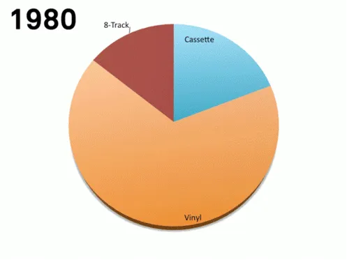
This animation (GIF alert) shows the distribution of music sales over time. Wait a few seconds and you see the pie chart changing for multiple years. This data can be represented much better by a series of stacked column charts. The animation takes too long, and the audience does not have the overview of all the years.

 I copied this image from a Tweet that did not include the reference to the source.

I copied this image from a Tweet that did not include the reference to the source.

There are other problems as well with this chart, gradients, standard Microsoft Office colours, drop shadows, small data labels, and ambiguous labelling (“Internet”, “mobile”, “video”, etc.).

·Sales presentation

Keep the CEO in the loop

Investor presentations usually start with the CFO (who naturally puts a finance spin on the story), then the Marketing Director adds product positioning, the Sales Director puts in a highly detailed benefit analysis: the result 3 presentations.

Why is it so important to have the CEO involved early in the process? She is the only one who has a view on the story that cuts across finance, marketing, sales. An equity investor audience is different from a client, is different from a tech conference, is different from a traditional bank that provides loans. More importantly, she is likely to have to make the pitch herself, and so she better is in sync with the slides.

You cannot delegate the investor pitch design, or give the super high level input “you know the story, pitch that we are more flexible”. Time to roll up the sleeves.

Art: Gustave Caillebotte, The Floor Scrapers, 1876

·Creativity

Full circle

Most presentation design processes go through the following circle:

  1. You scribble  a clean, crisp, story on a white board
  2. That scribble gets translated into the first series of charts/placeholders
  3. Now the dilution starts: lots of data, backgrounds, footnotes, and story line restructuring until we have a bloated, generic collection of charts

The successful presentation design project goes further: cutting things back to reach that level of freshness of stage 1. But there is a danger of cutting too much. Throughout the process, the team has gotten so familiar with the material that they have lost track of the starting point of a cold audience. Things that might seem totally obvious to them (after 2 months of work) are not that clear to a first time audience.

Was all the data digging a waste of time? No, it is good to get your facts straight, as long as you don’t lose the creativity you had in that first kick off meeting.

As a professional presentation designer, I usually come in in stage 3, lots and lots of data, and my kick interview brings back the thoughts that came up in stage 1. An unfair advantage of the outsider…

Art: Kandinsky: Circles in a circle, 1923

·Delivery

The old tricks won't work anymore

Because they have been used so many times, or maybe better, disappointed so many times, some of the old (and often expensive) tricks of presentation design are not at all that effective anymore.

  • Complicated language. Buzzwords, complicated sentences, clarifying footnotes. This person must know what she is talking about, better believe her.
  • Scientific frameworks. Management consultants loved these. It looked complicated, scientific, they were delivered by smart people. Even if you don’t understand the framework, the message must be true.
  • Excel-generated hockey sticks. The highly complicated spreadsheet produces the $500m revenue in year 5 number, all assumptions seem sound, it must be true
  • Noisy/flashy/spectacular videos. Stuff is flying in, drum rolls, this looks professional, these people probably tell the truth.
  • Stunning images. “Yes! We should follow the guy who jumps of a a building with a parachute!” That sun set looks amazing.

I am afraid we are back to humble, human communication again.

And here is the pitch for my presentation design app SlideMagic: make it easy to create slides that look pretty decent/professional, and let you spend the majority of your time creating your story.

Image: fake cathedral ceiling in Rome’s Sant Ignazio Church

·Layout

Counting the boxes

The first thing I do for almost any slide is “counting the boxes”: how many points does each argument have, how many people are there on the team, how many layers to the technology, how many steps in the process.

This drives the layout of the slide: 2 columns with options and 3 arguments each, a 5-step value chain, a 6 x 4 grid of logos, 5 management bios next to each other, 10 columns of sales data, etc. This layout will make sure that your slide looks evenly spaced out. You are also see that in most cases, the (bullet point) list grid structure is actually not the one you need.

PowerPoint and Keynote do not have very strong grid capabilities. Spacing out equally sized boxes across a slide is a pain, and table editing is not much better. And that is why I made the grid structure the central feature of my own presentation app SlideMagic, try it out!

Art: Perspective box, Pieter Janssens Elinga, 1623